

August 6th, 2012 in Photoshop Tutorials by Peter Kinney
Short-Run Booklet Design Pt. 1
 1 Votes, Rating: 5.00
 Loading ...
Hello everybody as requested heres the PSD sitebuild for Hosting Layout #2. If you havent already download the FREE PSD here.
Right lets get started
Preparing Our Folders And Files
Create a new folder on your desktop called “Hosting Layout”, inside this folder create another two new folders. Rename one folder “Stylesheets” and the other “Images”.
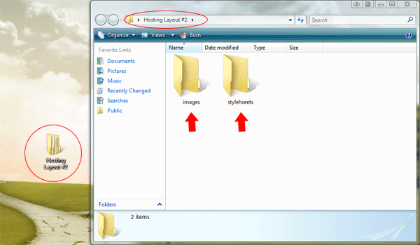
Inside the folder “Stylesheets” create two empty CSS files, one called “styles.css” and another called “reset.css”. Inside the main directory create a blank HTML file called “index.html”.

Preparing Our HTML And CSS Files
Open up your HTML file in your favourite code editor, il be using adobe dreamweaver. Inside your empty HTML file add the doctype, website title and link the styles.css stylesheet. The code should look something like this.
<!DOCTYPE html PUBLIC "-//W3C//DTD XHTML 1.0 Transitional//EN" "http://www.w3.org/TR/xhtml1/DTD/xhtml1-transitional.dtd"> <html xmlns="http://www.w3.org/1999/xhtml"> <head> <meta http-equiv="Content-Type" content="text/html; charset=utf-8" /> <title>YOUR HOSTING - Template By Richard Carpenter | www.hv-designs.co.uk</title> <link href="stylesheets/styles.css" rel="stylesheet" type="text/css" /> </head> <body> </body> </html>
Now open up the “reset.css” file in your code editor. Inside the “reset.css” file were going to add a global reset for the whole website, the reset im using is based upon the “Yahoo! User Interface Library“.
*, html, body, div, dl, dt, dd, ul, ol, li, h1, h2, h3, h4, h5, h6, pre, form, label, fieldset, input, p, blockquote, th, td { margin:0; padding:0 } table { border-collapse:collapse; border-spacing:0 } fieldset, img { border:0 } address, caption, cite, code, dfn, em, strong, th, var { font-style:normal; font-weight:normal } ol, ul, li { list-style:none } caption, th { text-align:left } h1, h2, h3, h4, h5, h6 { font-size:100%; font-weight:normal } q:before, q:after { content:''} /* Global reset-RESET */ /* The below restores some sensible defaults */ strong { font-weight: bold } em { font-style: italic } a img { border:none } /* Gets rid of IE's blue borders */
Close the “reset.css” file as we won’t be needing it again. Now open up the “styles.css” file, at the very top of the file were going to import our “reset.css” file. We do this by adding the code below.
/*--------------- ADDITIONAL STYLESHEETS ---------------*/ @import url(/files/includes/quot-reset.css-quot-.css);
Coding The PSD Background
Now all our prep work has been done lets get down to business. Open up the hosting layout PSD file, then select the rectangular marquee tool. Scroll down to the very bottom of the canvas and make a rough selection.

The size of the selection isn’t really that important hence why i said rough selection. Now you’ve made the selection go to “edit > copy merged”, then go to “file > new” (the dimensions should automatically be entered) then “edit > paste”. Save the file as “background.png” inside the images folder.
Inside the “styles.css” file create a style for the body tag, inside the style for the body tag enter the following styles.
/*--------------- MAIN BODY ---------------*/ body { font-family: Verdana, Arial, Helvetica, sans-serif; font-size: 12px; color: #898989; background-image: url(../images/background.png); background-repeat: repeat; margin-top: 30px; margin-bottom: 30px; }
Lets just go through the styles above, we first set our font family for our website, i used the font “verdana” mostly inside the PSD file so we’l set that our as primary font. We then add our font size of 12 pixels along with the primary color of our text.
The chunk of background we just copied from the PSD file we set as our background image then set the background to repeat. Finally we add a top and bottom margin to the body which in turn will give us a gap at the top and bottom of our layout, just like the PSD file.
Coding The Website Title
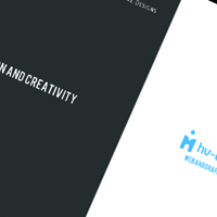
Head over to the PSD file, select the rectangular marquee tool then make a selection around the website title and slogan.

Try and get the selection as close as possible. Before we copy and paste to a new document we need to hide the background layer, as we need the image to be on a transparent background. Once you’ve hid the background layer go to “edit > copy merged” then paste to a new document. Save the image as “title.png” inside the images folder.
Lets now mark-up some code in our HTML file. We start off with a “container DIV” which is what our site will be contained in.
</head> <body> <div id="container"> </div><!--CONTAINER ENDS--> </body> </html>
Inside our “container DIV” we then add another DIV called “title”, inside the “DIV title” we insert our website title image.
<div id="container"> <div id="title"> <a href="http://www.hompage.com"><img src="images/title.png" alt="Website Title Here" /></a> </div><!--TITLE ENDS--> </div><!--CONTAINER ENDS-->
Lets style the two DIV’s we just created. We’ll start with the “container DIV”, our website PSD was based upon the website being 900px wide, so we first set a width of 900px, we then want the website to be centered in our browser so we set our margin’s to auto. The code looks like this.
/*--------------- MAIN CONTAINER ---------------*/ #container { margin: auto; width: 900px; }
For our “title DIV” we need to create a fixed width and height, the dimensions for the width and height should be the same as our title image.

The dimensions on your image might be slightly different compared to mine. We then float our DIV left and add a margin at the top of 2px. The margin at the top of 2px will bring the title DIV level with our navigation, you wont know this yet but i will as ive pre-coded my layout. The code looks like this.
/*--------------- TITLE ---------------*/ #title { float: left; height: 43px; width: 250px; margin-top: 2px; }
Coding The Navigation
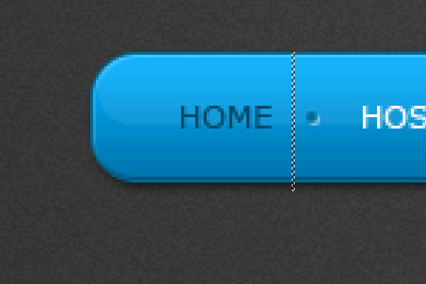
Lets move onto the navigation bar, now because the navigation is rounded were going to have to slice the navigation into 3 seperate images. In your PSD file make a selection around the left side of the naviagtion.

Copy the selection to a new document on a transparent background, then save the image as “nav_left.png” inside the images folder. Either repeat the same process for the right side of the navigation or just go to “image > rotate canvas > flip horizontally” then save the image again as “nav_right.png”.
For the middle part of the navigation we just need to make a small selection about 1 pixel wide, make sure the selection is the same height as the two left and right images.
Save the middle slice as “nav-middle.png” inside the images folder. Right lets move onto marking up our navigation in our HTML file.
The Navigation Mark-Up
For our navigation we start off with a DIV called “navigation” inside this DIV we then add 3 classes. “navigation-left”, “navigation-middle” and “navigation-right”, the left and right classes will contain our rounded corners, while the middle will hold our content.
Inside the “navigation-middle” class add an unorder list (UL) with a class of “nav-links” then add your navigation items in list form. Give the very last list item a class of “no-divider”, the no-divider class will remove the bullet point from the very last link in the navigation.
In the left and right navigation classes insert your left and right images. The code looks like this.
<div id="navigation"> <div class="navigation-left"> <img src="images/nav_left.png" /> </div> <div class="navigation-middle"> <ul class="nav-links"> <li><a href="#" title="Homepage">home</a></li> <li><a href="#" title="Hosting Plans">hosting plans</a></li> <li><a href="#" title="Support">support</a></li> <li><a href="#" title="Forum">forum</a></li> <li><a href="#" title="Members Login">members login</a></li> <li class="no-divider"><a href="#" title="Contact Us">contact us</a></li> </ul> </div> <div class="navigation-right"> <img src="images/nav_right.png" /> </div> </div><!--NAVIGATION ENDS-->
Before we add our styles for our navigation lets first slice the little bullet point between each link.

Save the little bullet point as “nav_divider.png” inside the images folder. Lets now add our navigation styles to our style sheet.
The first item we style will be our main navigation DIV. We start off by floating the DIV to the right then add a fixed height, the height of the navigation DIV should be the same height as our navigation slices. All my slices have a height of 49px, the code looks like this.
/*--------------- NAVIGATION ---------------*/ #navigation { float: right; height: 49px; }
We can now style our left, right and middle part of the navigation, now because we inserted the rounded corners as images into the HTML file we dont need to add them as backgrounds or anything in our CSS file, which also means the left and right class styles can be grouped together.
First we float our two classes left inside of our navigation DIV, we then add a fixed width and height which should be the same pixels as our left and right images. If your images are not the same width and height then id suggest you modify them so they are, it will make life much easier. The code looks like this.
.navigation-left, .navigation-right { float: left; height: 49px; width: 18px; }
The middle class is very similar as the left and right styles, the only difference is we add our navigation middle image as a background and repeat it horizontally, the fixed width is also removed which will allow the navigation to expand with the amount of content that is added.
.navigation-middle { background-image: url(../images/nav_middle.png); background-repeat: repeat-x; float: left; height: 49px; }
Lets now style our lists and hyperlinks. Each list element will be displayed as a block and floated left, the little bullet point image will be added as a background on each list, then the little bullet points background position will have to be adjusted to align in the middle of the navigation, the position should be set to the right and shifted down 22px.
We then remove the background style from the class “no-divider” which will remove the bullet point from the last navigation item.
.nav-links li { display: block; float: left; background-image: url(../images/nav_divider.png); background-repeat: no-repeat; background-position: right 22px; } li.no-divider { background-image: none; }
Finally we style navigation links and set the hover state of each link. The links will also be floated left and displayed as a block element, each link will have a height of 49px the same as our navigation DIV and images. We can seperate each link item by adding a left and right margin, adding some top padding will also push down our links to the middle of the navigation.
.nav-links li a { display: block; float: left; height: 49px; margin-right: 15px; margin-left: 15px; padding-top: 16px; color: #FFFFFF; text-decoration: none; text-transform: uppercase; font-size: 11px; } .nav-links li a:hover { color: #004869; }
Coding The Featured Sentance
In our PSD file we had a featured sentance, we’ll achieve the same look in CSS by using span classes. Start off by creating a DIV called “featured-text”, inside the DIV add your featured sentance wrapped in a H1 tag. Insert a span class of “featured-text2″ on the words you want in a different color. The code looks like this.
<div id="featured-text"> <h1><span class="featured-text2">Upgraded. Improved. Better. </span>With more features than ever, our hosting packages are the best way to get your sites online.</h1> </div><!--FEATURED TEXT ENDS-->
The “featured-text DIV” will be floated left inside our container and will have a fixed width of 900px, no fixed height is set as we want the DIV to expand with the amount of content added. Finsh it off with a top and bottom margin of 40px which will provide a nice decent size gap between the sentance and the other content.
The H1 tag will contain our primary text color, size and font style, then the span class will will provide the additional styles for the blue bigger words. The code looks like this.
/*--------------- FEATURED TEXT ---------------*/ #featured-text { float: left; width: 900px; margin-bottom: 40px; margin-top: 40px; } h1 { text-align: center; font-size: 24px; font-style: italic; color: #FFFFFF; } span.featured-text2 { font-size: 30px; color: #14aff7; }
Stay Tuned…
Thats it for part one, look out for part two tomorrow, i suggest you subscribe VIA our RSS feeds if you havent already. I’ll look forward to all your comments, questions and part one results.

Be Part Of The Community!
Become part of the hv-designs community.
Subscribe Via RSS or Follow Us On Twitter.


10 Responses to “Coming Soon Page :: PSD Sitebuild”