Subscribe Via RSS

3901 Subscribers

Subscribe Via RSS
Subscribe Via Twitter

Followers

Subscribe Via Twitter
Desk Environments Layouts

September 28th, 2009 in Articles by Richard Carpenter

Desk Environments Layouts

1 Star2 Stars3 Stars4 Stars5 Stars2 Votes, Rating: 5.00
Loading ... Loading ...

Hello, welcome to another round up of inspiration. This time we’ll be looking at desk environments made with photoshop.

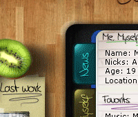
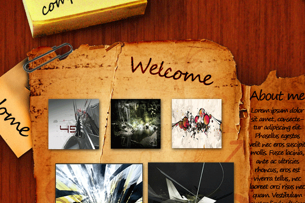
System Six Desk Design

Desk01

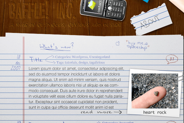
Desk Layout #2

Desk02

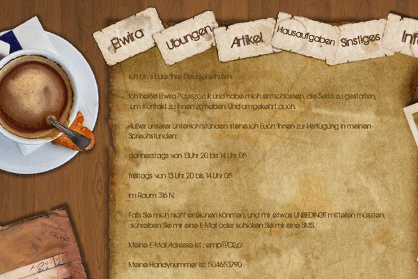
Desk Layout #3

Desk013

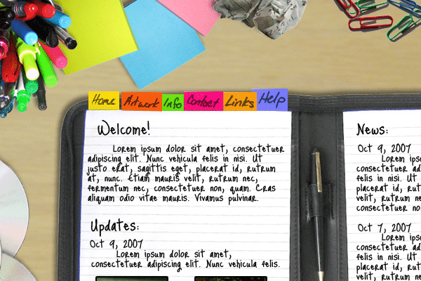
Desk Portfolio

Desk04

Classical Desk

Desk05

Desk Layout #6

Desk06

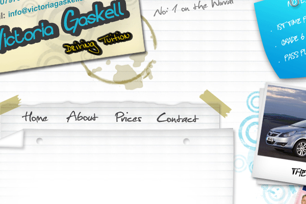
Learner Driving Desk Environment

Desk07

Desk Layout #8

Desk08

Spring Blog

Desk09

Desk Layout #10

Desk10

Desk Layout #11

Desk11

Have you made a desk environment layout you’d like to share with us???? feel free to list them in the comments area below. Thanks for reading.

About The Author

About The Author: Richard Carpenter

Hi im Richard Carpenter and im a freelance web and graphics designer from England. I am also a regular Blogger, Tutorial Writer, and owner of Photoshop Plus. You can follow me on twitter HERE. You may also view my portfolio HERE.


Richard Carpenter has written 364 posts.

Be Part Of The Community!

Become part of the hv-designs community.

Subscribe Via RSS or Follow Us On Twitter.

Subscribe Via RSS Follow Us On Twitter

12 Responses to “Desk Environments Layouts”

  1. EC says:

    sweet

  2. hello123456 says:

    Looks like a nice collection, gonna check it out for sure.

    What still annoys me tough is that you still use .gif images, they might be small, but take away alot of quality, to much imo, guess you already knew that as designer. I’d prefer PNG or JPG instead tough.

  3. deborajon says:

    Really nice collection. I am also using a desk environment layout for the currently version my my website.
    http://www.deboraparentes.com

    Check it out and let me know what you think!
    :o)

  4. guny says:

    license? it’s free?

  5. I love the desktop themed designs. Working on a desktop theme for my blog site.

  6. Geo... says:

    I am actually a developer who is looking to get more into the website game. Always worked the back end of the sites, never the design. So my question is, how would you “cut up” this type of design in order to use it for a site? Thanks

    Geo…

  7. IconsGator says:

    soo cool designs thanx mate

  8. Roberto says:

    cool blog

  9. xphunt3r says:

    that’s really too good. you can also use them for twitter background

  10. Some nice examples of desktop layouts. I am working on a version myself, for a little project that I will be releasing soon. Will keep you all posted.

    As for a couple of the comments I have seen earlier in this conversation, Deborajon – I like your site, however, I would of made it more browser compatible and stretchy, I found that it was quite wide and went of my screen, which is 1280×1024. Don’t get me wrong wide sites are great but you could be cutting out a large proportion of visitors with smaller screens.

    Geo – In terms of cutting up a site with this kind of design, I would probably use a large number of textures and transparent gifs or PNGs depending on there complexity. Make a texture tile for the background and then for the other elements either take each image into its own file, or slice the composition in PS with varying file attributes and transparent backgrounds. Once you have your image set it’s a case of using CSS to position your elements around the desktop. Simples!!!

  11. javad says:

    hi
    Coooooool

    Tnx :x

Leave a Reply