October 9th, 2007 in Photoshop Tutorials by Richard Carpenter
Vista Themed Layout #2 Tutorial
Create a new document 800×900 pixels with the color #1e1e1e, select the rectangular marquee tool and draw a rectangle at the top of your canvas about 20 or so pixels high. Add these layer styles.

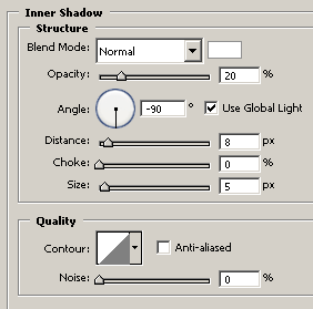
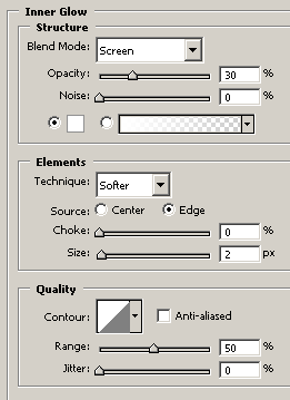
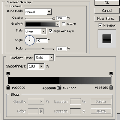
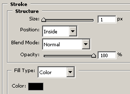
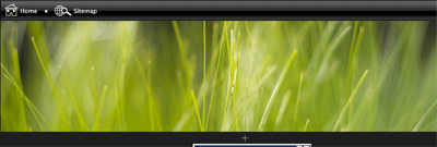
Your rectangle should now be transformed into a windows vista style taskbar. Using the custom shapes provided by photoshop add a home button and sitemap button at the top left corner of your rectangle. You should have something like this.

Open up your desired image for your header, im going to use vistagrass which is a vista wallpaper and can be found HERE. Copy & paste your wallpaper into your canvas resize/cut to fit under your rectangle.
Select the pentool and make a selection like this (see image below).

Fill with the color white. Now add a layer mask and drag the gradient diagnally towards the top left of the screen, you should end up with this.

Now add your site title & slogan.

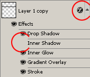
Duplicate your rectangle you created in step one, drag down above your vista grass. This will be our navigation. In the layers window click the little arrow by the side of the layer and hide the “inner shadow”. Add your navigation text to the navbar.
You should have something like this. (see link below)
CLICK HERE TO SEE RESULT SO FAR.
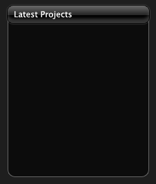
Now select the rounded rectangle tool and draw out a small rectangle big enough to fit a label in there for our content box. Add these layer styles.


Still with the rounded rectangle tool draw out an area for your content. Add a 1 pixel grey stroke to the rectangle. You should have something like this.
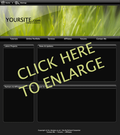
Follow these steps untill you have created all of your content boxes. Heres a quick layout ive throw together.
Be Part Of The Community!
Become part of the hv-designs community.
Subscribe Via RSS or Follow Us On Twitter.




6 Responses to “Vista Themed Layout #2 Tutorial”