October 1st, 2007 in Photoshop Tutorials by Richard Carpenter
Car Club Layout Tutorial
Create a new document 900×600, fill the background with a gradient using colors below.
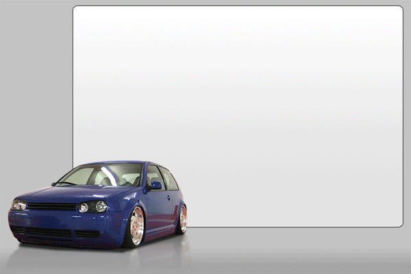
Now create a box with the “rounded rectangle tool” this will act as our content box, also add a “1 pixel black stroke” to the rectangle and a “gradient overlay”, you should have something like this.

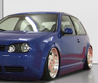
Now lets give it a 3d look, find a picture of a car, or a image of your choice, cut it out with the pen tool, and paste it onto your canvas resize the image to fit into the bottom left hand corner, (see image below), ive also added a reflection to the car and a shadow. If you dont no how to do reflections i suggest you do my reflection tutorial. Heres how mine looks at this stage.
Now lets create a menu, type your menu options at the top of the rectangle, space the menu options out enough to add some symbols or logos next to the text, like this.
![]()
Now lets add our little logos, either make one your self one or go grab one from google images. im just going to use a vw badge.
![]()
Now lets add out website slogan and title, type your slogan and title at the top left corner like so.
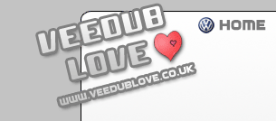
Ive just added a few layer styles to my font type and added a picture of a heart which i also got from google images. Now lets add our content, i wont create a specific content layout for you eles you aint going to learn lol, just use your imagination and see what you can come up with, its just trial and error see what works and what doesnt, here is a quick 2 minute job of mine.
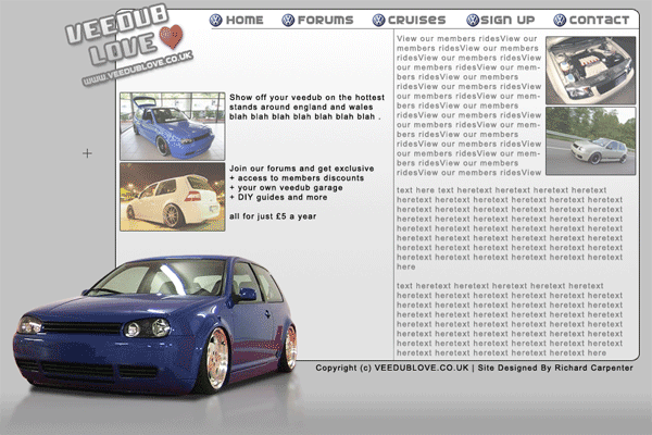
Now all thats left is just slice up your image and code it.!
View high res image here.
Be Part Of The Community!
Become part of the hv-designs community.
Subscribe Via RSS or Follow Us On Twitter.




One Response to “Car Club Layout Tutorial”