Hosting Layout

Your ads will be inserted here by

AdSense Now!.

Please go to the plugin admin page to paste your ad code.

Create a new document with the dimensions 850×1030 pixels. Double click your background layer then press ok on the box that pops up, your background layer should now be “unlocked” double click your background layer once more and add this gradient overlay.

Select the rectangle tool and create a rectangle at the top of your canvas.

Add these layer styles to your rectangle so it looks the same as the image above.

Now add some content onto your top rectangle, il use this area for a login form, the icons on the image below were from the custom shapes libary within photoshop.

Select the rounded rectangle tool and draw out two rectangles about 140 pixels wide and about 60 pixels high “big button size”. Place them underneath your top rectangle.

Right-click your top rectangle layer and goto copy layer styles, then right click your two buttons you made in the step above and goto paste layer styles. You buttons should be transformed to look like the image above. Add some text to your buttons and maybe some icons from the custom shapes libary.

Find an image of some sort of server and place it somewhere in the middle underneath your buttons.

Duplicate your server image onto a new layer, press “ctrl + T” to free transform it, hold the shift key and make it alittle bit smaller than the orginal. Holding the shift key while re-scaling will keep its orginal aspect ratio. Move your duplicated server image across a little bit so it looks like its behind the 1st one. With the 2nd server image layer selected goto “filter > blur guassian blur” blur it by about 2 pixels.

Your ads will be inserted here by

AdSense Now!.

Please go to the plugin admin page to paste your ad code.

Repeat the steps above and 2nd time only this time make the image abit smaller than the 2nd one and blur it by 3 pixels instead of 2. You should have something like this.

Duplicate each server image, and drag the layers underneath there orginal layers. Goto “edit > transfrom > distort”. Distort them so the front of the server image match like the image below.

Now add a layer mask to the duplicates so they look like a small reflection.

Add your website logo, title and slogan to the right of the servers.

Select the rounded rectangle tool and create three boxes underneath each other.

Add these layer styles to your boxes so they match the image above.

Fill your boxes with some kick ass hosting plans. Use the server images as icons.

Duplicate your website title and place in a content filled area with some nifty typography.

Add your footer in the space thats left at the bottom, i dont think the footer needs much explaining.

Finished.

Your ads will be inserted here by

AdSense Now!.

Please go to the plugin admin page to paste your ad code.

PSD to CSS to WordPress PT.1 (removed)

Your ads will be inserted here by

AdSense Now!.

Please go to the plugin admin page to paste your ad code.

Your ads will be inserted here by

AdSense Now!.

Please go to the plugin admin page to paste your ad code.

The tutorial has been asked to be removed as it looks to much like THIS. Apparantly they said i purchased the template and past it off as my own. I just want a moment to defend myself as its untrue. Most of the styles i copied from my own site I.E the navigation is the same as mine, just smaller. The whole site was pretty much based on my current design with just a few tweaks here and there. Sorry folks.

Your ads will be inserted here by

AdSense Now!.

Please go to the plugin admin page to paste your ad code.

Finance

Your ads will be inserted here by

AdSense Now!.

Please go to the plugin admin page to paste your ad code.

Your ads will be inserted here by

AdSense Now!.

Please go to the plugin admin page to paste your ad code.

Your ads will be inserted here by

AdSense Now!.

Please go to the plugin admin page to paste your ad code.

page-25-

Your ads will be inserted here by

AdSense Now!.

Please go to the plugin admin page to paste your ad code.

Your ads will be inserted here by

AdSense Now!.

Please go to the plugin admin page to paste your ad code.

Your ads will be inserted here by

AdSense Now!.

Please go to the plugin admin page to paste your ad code.

tutorials-jquery_fade2-image

Your ads will be inserted here by

AdSense Now!.

Please go to the plugin admin page to paste your ad code.

Your ads will be inserted here by

AdSense Now!.

Please go to the plugin admin page to paste your ad code.

Your ads will be inserted here by

AdSense Now!.

Please go to the plugin admin page to paste your ad code.

Compass Tutorial

Your ads will be inserted here by

AdSense Now!.

Please go to the plugin admin page to paste your ad code.

Create a new document 500×400 with any desired background. Select the elliptical marquee tool and draw a circle, fill the circle with a temporary color. In the layers window click on your layer whilst holding the “CTRL” key on the keyboard to load a selection, now goto “select > modify > contract”. when the box comes up enter a value of around 20-30 pixels. Now goto “select > modify > smooth” and enter a value of 20. You should now have a ring like this.

Now add these layer styles to your ring.

You should have something like this.

Now create a shape like this.

All done with the elliptical marquee tool using to shapes, merge both shapes together on one layer and place behind your ring.

Right-Click your ring layer and goto “copy layer styles” then right-click your shape you just made and goto “paste layer styles” you should have something like this.

Using the same concept as the 1st step create another ring, only this time make it smaller to fit inside the first one we made.

Now add these layer styles.

Your ads will be inserted here by

AdSense Now!.

Please go to the plugin admin page to paste your ad code.

You should have something like this.

Now create another circle big enough to fill whats left inside. Add these layer styles.

You should have something like this.

Add your letters N, E, S and W.

Add your lines that go around the compass, to do this we create a circle from the custom shapes menu, then select the type tool and use type on a path. Ive already written a tutorial about type text along a path check that out for more detail.

Select the pen tool and create a shape like this.

Fill the shape with the color white and set opacity to 25%.

Now goto the custom shapes tool within photoshop and select a custom shape same as the image below. Stretch it out to fit the inside of the compass also set layer opacity to 50%.

Now add your little arrows which are also shapes from the custom shapes menu, just fill each side of the shape a darker shade of the main color.

Your ads will be inserted here by

AdSense Now!.

Please go to the plugin admin page to paste your ad code.

Web Design Layout #3 Tutorial

Your ads will be inserted here by

AdSense Now!.

Please go to the plugin admin page to paste your ad code.

Create a new document 800×800 pixels with a white background. Select the rectangle tool and draw a black rectangle at the the top of your canvas, then add these layer styles.

Your rectangle should now look like this.

Still with the rectangle tool create a 2nd rectangle underneath the one you just created, but this time make it a little bit bigger and add these layer styles.

You should have something like this.

Now duplicate your blue rectangle and place it at the bottom of your canvas, this will be our footer later.

Now with the color #88763d select the type tool and type out your navigation, also with the color white type your site slogan and title.

You will notice i have alligned my text and title on the right, you will see why in the next few steps. Select the rounded rectangle tool and draw out a rectangle as seen below.

Here are the layer styles to get it looking like mine, first thou set the opacity to 60%.

Now you have it looking like mine add the rest of your navigation, ive also used some icons from the custom shapes menu.

Your ads will be inserted here by

AdSense Now!.

Please go to the plugin admin page to paste your ad code.

Now find a picture, this can be a picture of anything that reflects your site, but for this example im going to use some grass. Once you have your image, resize and allign it like so (see image below).

On my site i want to have a members section, so i have created an example form of how i want it too look. (which can all be done using CSS).

Now im going to split my site into 3 sections, this is how i want it too look.

Now i shall enter my example content, which is mainly text.

Once you have your example content etc… im going to add some buttons for other stuff. Select the rectangle tool and draw a small long button, the same size as the buttons shown above (not a member & register now buttons).Once you have your rectangles drawn add these layer styles.

GREEN BUTTON

BLUE BUTTON

Once you have added your buttons you should have something like this.

Now all thats left is to add some details on your footer.

Heres is the full size view. PSD is available below also.

Your ads will be inserted here by

AdSense Now!.

Please go to the plugin admin page to paste your ad code.

Archive for the ‘JQuery Tutorials’ Category

Your ads will be inserted here by

AdSense Now!.

Please go to the plugin admin page to paste your ad code.

Your ads will be inserted here by

AdSense Now!.

Please go to the plugin admin page to paste your ad code.

Your ads will be inserted here by

AdSense Now!.

Please go to the plugin admin page to paste your ad code.

customer #1

Your ads will be inserted here by

AdSense Now!.

Please go to the plugin admin page to paste your ad code.

Your ads will be inserted here by

AdSense Now!.

Please go to the plugin admin page to paste your ad code.

Your ads will be inserted here by

AdSense Now!.

Please go to the plugin admin page to paste your ad code.

Tracing Tutorial

Your ads will be inserted here by

AdSense Now!.

Please go to the plugin admin page to paste your ad code.


Open up your image that you want to trace, then goto “layer > new > layer from background” rename this layer “original” then create 2 more layers one called “white” and the other one called “lines” your layers pallet should look like this.

Now select your “white layer” and fill it with the color white by using the paint bucket tool. Once filled hide that layer, i do this so we can see how our line drawing is going by hiding and unhiding the layer.

Select your orginal layer and goto “image > adjustments > brightness/contrast” and brighten your layer by about +50, this makes it easier to see the lines. (well i think so anyway).

Select your brush tool and select a “1 pixel” “black” brush. Now select lines layer and then the pen tool and just start tracing. (zooming in will help for tricky bits)

Here is the shoulder from the picture im am tracing, notice the marker points created by the pen tool.

Your ads will be inserted here by

AdSense Now!.

Please go to the plugin admin page to paste your ad code.

Dont try and select everything all in one go, just do bits at a time. Once you have traced abit of the image right-click and goto “stroke path”.

This will then create a 1 pixel line where your points were, then after that right-click again and goto delete path.

If you “unhide” your “white” layer you will see the line you have created.

Once you have done the whole image you should have something like this.

Your ads will be inserted here by

AdSense Now!.

Please go to the plugin admin page to paste your ad code.

Business Layout Tutorial

Your ads will be inserted here by

AdSense Now!.

Please go to the plugin admin page to paste your ad code.

Create a new document 800×800 pixels with a white background. Double click your background layer and press ok when the new layer box pops up, doing this will unlock the background layer. Add this layer style to your background layer.

Now select the rounded rectangle tool with a radius of 20pixels.

Draw out a rectangle in the middle of your canvas, then right click and goto “fill path”. Select the pen tool then right click on your canvas and goto “delete path”, you should be left with a white box with nice curved edges.

Add these layer styles to your rectangle.

Duplicate your content box you just created and make a new layer above it, hide your background layer and your orginal content box layer. Select your new layer and then goto “layer > merge visable”. Head over to “filter > blur > guassian blur” blur the content box by 6pixels, change layer opacity to 60% and layer blending mode to screen. You should have something like this.

Thats our content box done, select the type tool and type your site title and slogan.

Select the custom shapes tool and select this arrow (see image below).

Add the arrow by your site title and slogan.

Your ads will be inserted here by

AdSense Now!.

Please go to the plugin admin page to paste your ad code.

Whilst holding down the “ALT” key on your keyboard hit the down arrow key then the right arrow key, do this about 10-15 times depending on how thick you want your arrow to look. Everytime you hit the down and right arrow button (not together) a new layer should be created. Once your down merge all your layers together APART FROM THE ORGINAL. Drag the duplicated layer underneath your orginal, then label them top and bottom so you dont get mixed up. Add these layer styles to your bottom layer.

Your arrow should look like this.

Now add these layer styles to your top layer.

You should have something like this.

Create a new layer above your top layer select the newly created layer and click on your top layer whilst holding “CTRL”, once the selection has been activated goto “edit > stroke”, fill with a white 1 px stroke.

You should have something like this.

Ive also added a shine as you can see on the image above, you should no how to do that by now. Select various custom shapes from the custom shapes tool and create your navigation.

Duplicate Your header elements and transfer them under your content box change the text to suit your footer.

Now fill your content box with your content.

Your ads will be inserted here by

AdSense Now!.

Please go to the plugin admin page to paste your ad code.

Photo Blog Layout Tutorial

Your ads will be inserted here by

AdSense Now!.

Please go to the plugin admin page to paste your ad code.

Your ads will be inserted here by

AdSense Now!.

Please go to the plugin admin page to paste your ad code.

Your ads will be inserted here by

AdSense Now!.

Please go to the plugin admin page to paste your ad code.

Cloth, Patch & Stitches

Your ads will be inserted here by

AdSense Now!.

Please go to the plugin admin page to paste your ad code.

Hello and welcome to another tutorial by the hv-designs team, in this tutorial il show you how to create a neat little patch, as in a patch on some clothes. We’l be creating everything from scratch, the material texture, stitches even a safety pin.

Right lets get started the first thing you need to do is create a document 3 times bigger as you want it, im just using 600×200 pixels for the purpose of this tutorial so i would start with 1800×600 pixels. Double click your background layer to unlock it. Doing this will allow you to add layer styles to the background layer. Add the gradient overlay and the settings in the image below.

create a new a layer above your background layer called texture. Fill this layer with a greyish color #808080. Press D on the keyboard to reset your background and forground colors. Now goto “filter > pixelate > color halftone” use the settings below.

You should have something like this. (dont get dizzy).

Now goto “filter > sketch > chalk and charcoal” use settings below.

You should have something like this.

Now goto “image > image size” and re-size your image to what you wanted in the 1st place in my case 600×200 pixels. Then goto “image > adjustments > brightness/contrast” change your brightness to -100. Also set your layer blending mode to overlay. You should hopefully have something like this.

Select the color #505050 and create two in rectangles within the canvas area, this is best done with the rectangle tool using stroke path with a 1pixel brush. (NOT RECTANGULAR MARQUEE TOOL).

Add this drop shadow to your two inner rectangle lines.

With the rectangular marquee tool make a small selection that covers both lines then hit the delete key, move the selection across then hit the delete key, do this all the way around when your finished you should have something like this.

Create a new layer above the rest and fill with the color black, reset your forground and background colors with the letter D on your keyboard. Goto “filter > render > clouds” set the clouds layer to overlay with an opacity of 50%. You should have something like this.

Your ads will be inserted here by

AdSense Now!.

Please go to the plugin admin page to paste your ad code.

Select the rounded rectangle tool and the color #d6c8ae, with a radius of 10 pixels drag out a small – medium rectangle.

Click your layer with the rectangle on whilst holding down the CTRL key this should load a selection. Goto “filter > noise > add noise” enter 3% in the amount and make sure uniform and monochromatic are selected. Using the lasso tool make a crazy selection like this.

Goto “select > inverse” then hit the delete key you should be left with something like this.

To make finer rips like i have in the corner, use the “polygonal lasso tool” after you have complete the steps above. Download some crack brushes (ive had mine for a while and cant remember where i got them from) theres plenty around the internet so shouldnt be hard to find. Add some cracks to your patch, set layer opacity to 25%. Apply them using the color #9b9281.

Now you need to add your stitches to your patch, do this in the same way we did our background stitches but only use one rectangle, try and leave a few missing as we’ll be adding loose bits of cotton and our saftey pin.

Where your stiches are missing use the type tool and add some periods (….), also use the pen tool to create swirly bits of loose cotton.

For the saftey pin select the rounded rectangel and create a small rectangle. Right click with the pen tool and goto stroke path. We only need the outline for this.

Using the elliptical marquee tool create a cirlce at one end of the rectangle, use the rubber or the rectangular marquee tool to cut out a peice of the outline.

Add these layer styles to your pin.

Move your need into one of the corners where you have threads missing. Where we cut part of the saftey pin away add two lines at each end, these will look like small creates where the pin has gone through the fabric (shown in red) Its hard to see close up but when u look at 100% they are visable.

Thats it all done, hope you’ve enjoyed this tutorial. dont forget to subscribe to out twitter & RSS.

Your ads will be inserted here by

AdSense Now!.

Please go to the plugin admin page to paste your ad code.

Clan Website Design Tutorial

Your ads will be inserted here by

AdSense Now!.

Please go to the plugin admin page to paste your ad code.

Start a new document size 800×600 with a background color of #131313. Select the “rectangular marquee tool” and draw a rectangle three quarters of the way down from the top fill with the color #222222 and add a 1 pixel black stroke to it. You should have something like this.

Now draw a rectangle at the top about 20-25 pixels high and as wide as your document, fill this rectangle with a gradient 2 types of grey also add a 1 pixel black stoke. You should have something like this.

Select the type tool and add some important text like this.

Now go to google images or a wallpaper gaming site and get some images of the game your clan is about, ive chosen a counter strike image i found on google. Copy/paste & resize your chosen image to fit into the right side of our bigger rectangle we created in step1, also add a mask and drag your gradient over the image so the right side of the image blends in with the background. Here’s how mine looks.

Also on my travels i found some 3D models of some counter-strike characters which ive cut out and placed on my rectangle.

Your ads will be inserted here by

AdSense Now!.

Please go to the plugin admin page to paste your ad code.

Now lets add our clan title, logo and slogan, select the type tool and type your slogan and name of clan and place it next to where the models are, please experiment with the layer styles, ive just added a 1 pixel stroke onto my main title and used the counter-strike logo for my logo. Here’s mine.

Select the rectangular marquee tool again and draw a rectangle under your clan images fill with a gradient (2 types of grey). Also add a 1 pixel black stroke. This will be our navigation, also add your site sections like server details, links etc…

We could also add maybe some little graphics by the side of our text to make our navigation abit more interesting. The little graphics are just the counter-stike logo resized down and inverted with the opacity lowered.

The main part has been done, the content il leave for you to do but here are two examples ive made for you to look at. My content boxes are just light grey rectangles with a 1 pixel stoke. Off course there are many ways you can make good looking content boxes, just let your imagination do the thinking. (click images for a bigger version)

Your ads will be inserted here by

AdSense Now!.

Please go to the plugin admin page to paste your ad code.

2009-09-24-psd-pack-1-comment-page-1-

Your ads will be inserted here by

AdSense Now!.

Please go to the plugin admin page to paste your ad code.

Your ads will be inserted here by

AdSense Now!.

Please go to the plugin admin page to paste your ad code.

Your ads will be inserted here by

AdSense Now!.

Please go to the plugin admin page to paste your ad code.

Portfolio Layout #10

Your ads will be inserted here by

AdSense Now!.

Please go to the plugin admin page to paste your ad code.

Hello, welcome to my next tutorial on hv-designs sorry for the slight delay its been abit hectic. In this tutorial were going to be creating a simple straight to the point portfolio. Ive had tons of emails requesting for a portfolio layout. So here it is.

Il also be showing you how to code this layout in the next tutorial. Right lets get started, create a new document 800×750 pixels double click your background layer then press ok when the box pops up. Your background layer should now be unlocked and editable. Add this gradient overlay to your background layer.

At the top of your canvas create a rectangle about 33 pixels in height and the same width as the canvas, you can create the rectangle using the rectangular marquee tool or the rectangle tool. Fill your rectangle with any color then add these layer styles.

You should have something like this.

Select the rounded rectangle tool with a radius of 10px, Draw out a fairly decent size rectangle, move the rectangle to the top of your canvas on the left.

Right click the rectangle and goto “fill path” color doesnt matter at this time. Then select the pen tool, right click your rectangle and goto “delete path”. Add these layer styles to your rectangle.

Set layer blending mode to 50%, you should have something like this.

Inside the box add your name and the word digital portfolio, the font i used is arial with a style of black (after bold). On the right hand side in the little bar add your portfolio sections.

With the rounded rectangle tool once more create a bigish rectangle underneath everything eles.

Add these layer styles to get it looking like mine.

Your ads will be inserted here by

AdSense Now!.

Please go to the plugin admin page to paste your ad code.

For this next bit we need to make a diagonal lines pattern, create a new document 25×25 pixels copy the pattern below.

Once you’ve copied the pattern got to “edit > define pattern” Close your document and head back over to your orginal document, create a new layer above your content box layer. Click the little thumbnail image in your content box layer whilst holding down the CTRL key on the keyboard this should load a selection. Select your new layer and the paint bucket tool at the top of your document change forground to pattern, select your pattern from the drop down box and fill your selection. Set layer opacity to 21% and give the pattern a white color overlay from within the layer styles window. You should have something like this.

With the rounded rectangle again create another rectangle inside your big rectangle.

Add these layer styles to your inner rectangle to match mine.

Click the thumbnail in your layers pallette on the inner rectangle layer whilst holding the CTRL key, this will load the selection. Goto “select > modify > contract”. Contract the selection by 8 pixels. Copy your desired thumbnail preview to the clipboard, now goto “edit > paste into”, your desired image will now be pasted within the boundries of your selection.

Add a simple inner glow to your thumbnail image user the settings below.

On the right side of your image add your descriptive text, title, created date and the program your created it in.

Duplicate all the content layers as required, although you only really need one as it can be duplicated using CSS when coded. Duplicate your top bar and drag to the bottom of the canvas, add your copyright information with the bar. Your end result should looke something like this.

In the next tutorial il show you how to code this into a working CSS website. See you in a day or two. Dont forget to subscrive via twitter and our RSS feeds.

Your ads will be inserted here by

AdSense Now!.

Please go to the plugin admin page to paste your ad code.

2007-10-09-orb-site-icons-tutorial-

Your ads will be inserted here by

AdSense Now!.

Please go to the plugin admin page to paste your ad code.


Create a new document 640×480 with a white background, select the elliptical marquee tool and draw out your circle, fill with any color as this will change in a minute.

Now add these layer styles, im going for a blueish looking icon, just change the colors accordingly in the layer styles to suit your needs.

You should now be left with this.

Still with the elliptical marquee tool draw another cirlce at the top like this.

Fill with the color white, then click the “add layer mask button”.

Now select the gradient tool making sure you have the color black as your forground, and simply drag from the middle of the white circle to the top of the white cirle, set the opacity to about 54% You should then have something like this.

Do the same as above creating a total of 3 cirlces two at the top making one smaller one and one at the bottom. You should have something like this.

Your ads will be inserted here by

AdSense Now!.

Please go to the plugin admin page to paste your ad code.

Now for your actual icon, select the custom shapes tool.

At the top where it says “shape:” click the little arrow and select your desired shape.

Drag out your shape onto your orb, once you have done that select the “pen tool” and right click your canvas then goto “fill path” press ok when the dialog box pops up. You should be left with this.

Now you can leave it as it is OR add these layer styles to you icon image.

Your icon should now look like this.

Thats it all done, now resize it to your desired size.

Your ads will be inserted here by

AdSense Now!.

Please go to the plugin admin page to paste your ad code.

Windows Vista/XP Icons Tutorial

Your ads will be inserted here by

AdSense Now!.

Please go to the plugin admin page to paste your ad code.


Create a new document 250×250, select the “elliptical marquee tool” and draw out a circle.

Fill with a “radial gradient” with your 2 chosen colors, ive chosen 2 shades of blue. (#295ea3 and #214b83).

Create a new layer under your blue circle (or wot ever color you have chosen). Hold down “ctrl” and click on your blue circle layer to make a selection. Then goto “select > modify > expand” expand it by 8 pixels. Now fill the selection with a grey color.

Now hold down “ctrl” again and click on the blue cirle to make a selection again, click on your grey circle layer and hit the delete key. If you hide your colored circle layer you should have this.

Now add these layer styles to your grey ring shape.

Your ads will be inserted here by

AdSense Now!.

Please go to the plugin admin page to paste your ad code.

You should have something like this.

Now select the type tool, a nice bold font and a font size of about 200, then type your symbol ive used a “!” sign, you could also use a picture if you wanted.

Now right click your grey ring layer and goto “copy layer style”, then right click your text or logo layer and goto “paste layer style”, you text or logo should turn out like this.

Now select the “elliptical marquee tool” again and draw out a smaller circle at the top, and fill with the color white.

Set the opacity to 15% and add a layer mask.

Duplicate your layer, press “ctrl +t” to enter into free transform mode, resize your white circle, make it a bit bigger and place slighty above your other one.

Thats it all done, heres a few more.


Your ads will be inserted here by

AdSense Now!.

Please go to the plugin admin page to paste your ad code.

Number Plate Tutorial

Your ads will be inserted here by

AdSense Now!.

Please go to the plugin admin page to paste your ad code.


Create a new document, select the “rounded rectangle tool” and draw out a rectangle, color it black.

With the same tool draw out another rectangle but this time about 8 pixels smaller, color this #ddb105, place the layer over your black rectangle layer.

Select the rectangular marquee tool and make a selection on the yellow rectangle layer like so.

Press “ctrl + u” put a tick in the colorize box and select a light blue color using the sliders.

Add this layer style to your yellow/blue rectangle.

Add this layer style to your black rectangle.

Your ads will be inserted here by

AdSense Now!.

Please go to the plugin admin page to paste your ad code.

You should be left with this.

Add your licence plate text.

Add these layer styles to your licence plate numbers/letters (not the GB sign).

You should have something like this.

And last but not least add the euro stars (search goole images). All done.

Your ads will be inserted here by

AdSense Now!.

Please go to the plugin admin page to paste your ad code.

Youthfull Looking Skin Tutorial

Your ads will be inserted here by

AdSense Now!.

Please go to the plugin admin page to paste your ad code.


Open up your photo, select the pen tool and draw around the whole face area, excluding vital features like eyes and mouth also dont get to close to the hair line.

Copy & paste your selection to a new layer, then goto “filter > blue > guassian blur” blur the layer by about 2 pixels if it looks over blurred then take it down to about 1 or 1.5.

Add a layer mask to your layer.

Your ads will be inserted here by

AdSense Now!.

Please go to the plugin admin page to paste your ad code.

Select a reasonable brush size and the color black. Start to brush over things like the eyebrows, little bit of the hair line, nose holes, around the lips etc…, basically just vital features that make the face, ive also brushed over some facial lines. Heres mines.

Now the before and after.

Your ads will be inserted here by

AdSense Now!.

Please go to the plugin admin page to paste your ad code.

Custom Hard Drive Icon

Your ads will be inserted here by

AdSense Now!.

Please go to the plugin admin page to paste your ad code.

In this tutorial il show you how to create a custom hard drive icon in various colors.

Create a new document 600×460 pixels with your desired background, create a new layer called “hd_top” select the rounded rectangle tool, once you have the rounded rectangle selected we need to change a few options, change the selection type to “shape layers” and change “radius” to 20 pixels.

Select the color black then drag out your rectangle whilst holding down the shift key, this will ensure we get a nice even square. Goto “edit > transform > perspective” drag the top right or left anchor point inwards untill you have a look like this.

The rectangle we just created will be the top of our hard drive so lets give it abit of depth and add these layer styles.

The gradient overlay is not really important you can change that to any color you like. You should now have something like this.

Duplicate your layer “hd_top” then drag the new layer underneath its orginal, right click it and goto “clear layer styles” now add a color overlay using the color “#5e5e5e”. Name this layer “hd_middle” then move it down a couple of times.

Duplicate the “hd_top” layer then right click and clear the layer styles. Now whilst holding the “ALT” key on the keyboard press the down arrow key about 40-42 times. Now doing this will create 40-42 new layers and with each press of the down arrow key it shifts it down 1 pixel. HIDE all layers apart from the ones you just duplicated, then goto “layer > merge visable” the 40-42 layers should now have been merged into one layer, unhide all your other items then drag the layer underneath “hd_middle”. Name this new layer “hd_bottom”.

Now add these layer styles to “hd_bottom”.

You should be left with this.

Now we have our basic shape for our hard drive, now its time to dress it up with some extras, firstly create a new layer above “hd_top” called “hd_shine” select the pen tool and create a selection like this.

Fill the selection with the color white then set layer opacity to about 15%.

Your ads will be inserted here by

AdSense Now!.

Please go to the plugin admin page to paste your ad code.

Now were going to make the indent in the top of our hard drive, duplicate “hd_top” then press “CTRL + T” now whilst holding down the shift key resize it and place in the middle of the hard drive. rename this layer “hd_indent”.

Add this inner shadow to your indent shape.

Now set layer blending mode to “lighten”, your indent layer should now look like this.

Select the rectangular marquee tool and create 2 small squares, make sure the two squares are on seperate layers labelled “light 1 on” and “light 2 off”.

Add these layer styles to your “light 1 on” layer.

Add these layer styles to your “light 2 off” layer.

You should now have something like this.

Now create a long rectangle in the middle, and a small square on the right. Add these layer styles to these two items.

On the small square change the color overlay to white, you should have something like this.

Inside the long rectangle add a 1 pixel yellow line then add a 2 pixel dark grey line using the rectangular marquee tool. In the small white box add 4 dots. (see image below).

To finish the icon add a simple name for your hard drive.

Your ads will be inserted here by

AdSense Now!.

Please go to the plugin admin page to paste your ad code.

Personal Portfolio Layout #2

Your ads will be inserted here by

AdSense Now!.

Please go to the plugin admin page to paste your ad code.

Hello there, welcome to another tutorial, in this tutorial il show you how to make a personal portfolio layout.

Create a new document 850×790 pixels, fill your background layer with the color #080808. Create a rounded rectangle by using the rounded rectangle tool, make it slighly smaller than 850 pixels so its fits nicely on the canvas. Place the rectangle at the very top.

Find yourself a nice image to use as your header, im going to use the same image i used in one of my previous tutorials located HERE. Copy and paste your desired image to the clipboard. Head back over to your canvas click your rectangle layer whilst hold the CTRL key on the keyboard, this will load the selection. Now goto “edit > paste into” you image should now be inside the rectangle, you can still resize the image while its inside the rectangle, resize the image to suit. Heres mine.

Ive also desaturated my image to make it black and white, ive also added some layer styles which are listed below.

Select the rectangle marquee tool and create a small selection to the left of the header.

Fill with the color white and set opacity to 12% now add these layer styles to it.

Add your website title and slogan inside the box. Now select the rounded rectangle tool and create a your navigation under your header, make sure the two shapes align nicely on the sides. Add these layer styles to your rectangle.

You should have something like this.

Create a selection on top of the navigation like in the image below, fill with the color white then lower opacity to about 18%, add your navigation text, and add two 1pixels lines between each bit of text for a divider.

Thats the header and navigation sorted now for the content boxes. For this bit your going to need some diagonal line pattern, im not going to show you how to make the pattern as there are loads of tutorials out there already for that, althou i shall include the pattern file in the PSD download. Select the rounded rectangle tool and create a square.

Fill with the color black then delete the rounded part from the top of the square using your desired cutting tool then add these layer styles.

Your ads will be inserted here by

AdSense Now!.

Please go to the plugin admin page to paste your ad code.

You should be left with this.

Still with the rounded rectangle tool create a selection like this.

Fill with the color black then add this stroke to it.

Now click your rounded rectangle layer that you just created (the small one out the two) whilst holding the ctrl key on the keyboard to load the selection, create a new layer and select your diagonal lines pattern, fill the selection. If your diagonal lines are black you might want to add a white color overlay to it, then lower opacity to around 8%.

Repeat the steps above to create more content boxes. Im going to add a further 3 to this layout.

Label your content boxes with the type tool, ive used a small arial font using the colors white (ffffff) and the green color (#afd107).

Now begin to add your content to each box.

Now for the footer, select the rectangular marquee tool and create a rectangle across the bottom of your canvas fill with the color black then add a simple stroke layer style.

Fill your footer box also with the diagonal lines pattern and add your copyright text.

To the right of the footer add a 1 pixel green line (#afd107).

Now select a small arrow from photoshop’s custom shapes libary and add that to the line, fill the arrow with the same green color as the line then add a black 1 pixel stroke to it.

Thats it all done.

Your ads will be inserted here by

AdSense Now!.

Please go to the plugin admin page to paste your ad code.

Video Sharing Layout #2

Your ads will be inserted here by

AdSense Now!.

Please go to the plugin admin page to paste your ad code.

In this tutorial il show you how to create a video sharing layout, an ideal layout for you video bloggers.

Create a new document 850×1200 pixels. Select the colors #141217 and #14171f then select the gradient tool, drag a linear gradient over your canvas. Goto “filter > noise > add noise” enter 2% in the amount, set distribution to uniform then stick a tick in monochromatic. Select the rounded rectangle tool and create a rectangle like in the image below.

Fill the rectangle with the color #20242d, add a 1 pixel stroke to the rectangle but dont do it the normal way by double clicking the layer style, instead goto “edit > stroke” use the color #20242d. Next add a layer mask to the rectangle, then drag a linear gradient over it, make sure background and forground are set to black and white. You have something like this.

Add your website title, slogan and logo. I created my logo by selecting a shape from photoshops custom shape libary. Add it to the canvas then whilst holding the ALT key on the keyboard tap the left arrow key, with every tap on the keyboard a new layer is created and the shape is shifted 1 pixel to the left. Merge all the duplicated layer together then drag the merged layer underneath your orginal. Add your layer styles.

Select the rounded rectangle tool with a radius of 10, create a small rectangle. The edges of the rectangle will both be rounded, select the polygonal marquee tool and make a selection like this at the right end of the shape.

Fill in the 2 corners to make the edge of the shape square.

Now for the next button you just want a normal rectangle, when you get to the end of the navigation duplicate and flip your 1st button, so you have something like this.

Add these layer styles to your buttons to complete the effect.

Your ads will be inserted here by

AdSense Now!.

Please go to the plugin admin page to paste your ad code.

Next select an image from your favourite image source, add it within the box. Add a simple 1 pixel grey stroke to it. Select the pen tool and create a shape like this.

Fill the selection with the color white then add layer mask to it. Drag a linear gradient from the right to the left to give you a shine effect. Add a sample player button and lower the opacity.

Finish this section by adding more sample videos and some community items.

Select the rounded rectangle tool, and corner off the left side of the shape like we did for the navigation, Fill with the color #1e212a and add a 1 pixel stroke using the color #2f3541. On the rounded part of the shape add a rectangle over the top and fill with the color #ba267d. Inverse the selection and delete the excess. Add a small circle with a white heart in it used from adobes custom shapes libary.

Inside the content box add more videos and comunity icons., ive also added some hearts to give the videos some love ;) .

Using the same method above create another content box like the image below.

Again add your content items. Create a rectangle at the bottom of your page add the same layer styles to it as the content boxes. Duplicate your navigation menu, logo, site title etc.. and place inside the rectangle. Underneath add your footer information.

Your final image should look like this.

Your ads will be inserted here by

AdSense Now!.

Please go to the plugin admin page to paste your ad code.

PSD to CSS to WordPress Pt.3

Your ads will be inserted here by

AdSense Now!.

Please go to the plugin admin page to paste your ad code.

Hello welcome to part 3 of the PSD to CSS to WORDPRESS tutoral, in this part of the tutorial we’ll be converting our CSS template into a working wordpress theme. You can download the theme for free using the button below you can also down all 3 tutorials in PDF format.

DOWNLOAD ALL 3 TUTORIALS IN PDF format HERE.

Before we start converting our theme over to wordpress you might want to download and install “xamp” this will allow you to run wordpress on your local hard drive saving on bandwidth and internet load times. Your also going to need a theme by “elliot jay stocks” called “starkers”. The theme is a completely naked theme, its been stripped of all its CSS and HTML, basically giving you a blank wordpress canvas to work on, its ideal for wordpress developers to start from. The theme uses files from wordpress 2.6.2. But this doesnt mean its not going to work with the latest wordpress software, i started with the exact same theme to build my hv-designs website and thats running in wordpress 2.7. If your thinking “bummer i wanted threaded comments” well you can easily grab a 2.7 comments file and replace it. Hopefully “elliot jay stocks” will release a naked 2.7 theme soon. Any way lets press on once you’ve downloaded the “stalkers theme” extract it to your desktop, rename the stalkers theme folder to “mywordpress”, you can also change the screenshot if you wish.
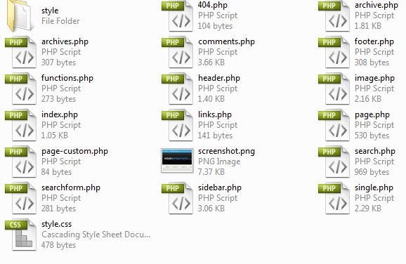
Step1

In your stalkers theme there is a folder called “style” inside this folder are some additional CSS files for IE hacks, typography and reset files. You dont really need this folder so if you want to you can delete it, but keep it by all means if you wish to keep it. Open up the “style.css” file in the main “mywordpress” theme directory. Once its open you’ll be greeted with this.

 /* Theme Name: Starkers Theme URI: http://elliotjaystocks.com Description: The totally nude WordPress theme. Phwoar! (Based on the famous <a href="http://binarybonsai.com/kubrick/">Kubrick</a> by <a href="http://binarybonsai.com/">Michael Heilemann</a>) Version: 2 (WP2.6.2) Author: Elliot Jay Stocks Author URI: http://elliotjaystocks.com Tags: starkers, naked, clean, basic */  @import "style/css/reset.css"; @import "style/css/typography.css"; @import "style/css/layout.css"; 

Delete the 3 imported .CSS files at the bottom of the page, then edit the theme name, description etc… Mine looks like this.

 /* Theme Name: MyWordpress Theme URI: http://www.hv-designs.co.uk Description: A wordpress theme Version: 1 Author: Richard Carpenter */ 

Save your .CSS file when you load up the theme in wordpress under the appreance tab you’l now see this.
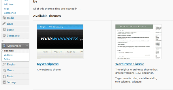
Step2

If you havent changed your image you should see a wooden naked body. Which was the orginal starkers theme screenshot. Back to your .CSS file underneath the information we just edited, copy and paste the whole of your CSS templates CSS file into it save and exit. Now open up the “header.php” file, you’ll now be greeted will loads of PHP mixed in with some HTML, the first thing we can do is remove all the code from the TITLE tag at the top of document.

 <!DOCTYPE html PUBLIC "-//W3C//DTD XHTML 1.0 Transitional//EN" "http://www.w3.org/TR/xhtml1/DTD/xhtml1-transitional.dtd"> <html xmlns="http://www.w3.org/1999/xhtml" <?php language_attributes(); ?>>  <head profile="http://gmpg.org/xfn/11">  <title> <?php if (is_home()) { echo bloginfo('name'); } elseif (is_404()) { echo '404 Not Found'; } elseif (is_category()) { echo 'Category:'; wp_title(''); } elseif (is_search()) { echo 'Search Results'; } elseif ( is_day() || is_month() || is_year() ) { echo 'Archives:'; wp_title(''); } else { echo wp_title(''); } ?> </title> 

Once you’ve deleted the php from the title tag, just replace it with what ever you want to display at the top of the browser.

 <!DOCTYPE html PUBLIC "-//W3C//DTD XHTML 1.0 Transitional//EN" "http://www.w3.org/TR/xhtml1/DTD/xhtml1-transitional.dtd"> <html xmlns="http://www.w3.org/1999/xhtml" <?php language_attributes(); ?>>  <head profile="http://gmpg.org/xfn/11">  <title>MYWORDPRESS "your wordpress slogan can go here"</title> 

If you didnt want to manually add your wordpress title instead you can use your blogname, when you installed wordpress it asked for the name of your blog, it is also displayed in your wordpress admin panel at the top. If you wanted to dynamically display that instead of the manual title you can use this bit of code.

 <!DOCTYPE html PUBLIC "-//W3C//DTD XHTML 1.0 Transitional//EN" "http://www.w3.org/TR/xhtml1/DTD/xhtml1-transitional.dtd"> <html xmlns="http://www.w3.org/1999/xhtml" <?php language_attributes(); ?>>  <head profile="http://gmpg.org/xfn/11">  <title> <?php bloginfo('name'); ?> </title> 

Next still inside the header.php file at the very bottom delete everything underneath the body tag your header.php document should look like this.

 <!DOCTYPE html PUBLIC "-//W3C//DTD XHTML 1.0 Transitional//EN" "http://www.w3.org/TR/xhtml1/DTD/xhtml1-transitional.dtd"> <html xmlns="http://www.w3.org/1999/xhtml" <?php language_attributes(); ?>>  <head profile="http://gmpg.org/xfn/11">  <title>MYWORDPRESS "your slogan can go here"</title>  <meta http-equiv="content-type" content="<?php bloginfo('html_type') ?>; charset=<?php bloginfo('charset') ?>" /> <meta name="description" content="<?php bloginfo('description') ?>" /> <?php if(is_search()) { ?> <meta name="robots" content="noindex, nofollow" /> <?php }?>  <link rel="stylesheet" type="text/css" href="<?php bloginfo('stylesheet_url'); ?>" media="screen" /> <link rel="alternate" type="application/rss+xml" title="<?php bloginfo('name'); ?> RSS Feed" href="<?php bloginfo('rss2_url'); ?>" /> <link rel="pingback" href="<?php bloginfo('pingback_url'); ?>" />  <?php wp_head(); ?>  </head>  <body> 

All the content we add now will be pasted in underneath the body tag. Copy your images folder from your CSS templates directory and paste it into the themes directory. Open up your index.html file from your CSS template. Copy everything from the opening “container DIV” to the ending “navigation DIV”. Paste it underneath the body tag. Save your header.php file, if you check the theme in your browser it should look like this.
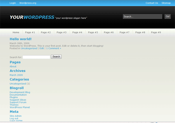
Step3

Pretty quick eh??, we just need to make a few tweaks and the header file should be complete. On our navigation we have a list that we created page #1, page #2, page #3 etc… well we want wordpress to add our pages dynamically when we goto add page in our admin panel. To do this we change our navigation to look like this.

 <div id="navigation"><!--navigation starts-->  <ul class="nav_links"> <li> <a href="http://www.your_page_here.com">Home</a></li> <li class="withdiv"><?php wp_list_pages('sort_column=menu_order&amp;amp;amp;title_li='); ?></li> </ul>  </div><!--navigation ends--> 

We can keep the 1st button “home” just link it to your main domain name “http://www.what_ever.com. But underneath we can delete page #1 – page #9 and just add the one line off php wrapped in out LI tag. The php basically gets your wordpress pages from the database and displays them in page order. If you only had say one wordpress page and loads of external pages you wanted to use then just add another page underneath like this.

 <div id="navigation"><!--navigation starts-->  <ul class="nav_links"> <li><a href="http://www.your_page_here.com">Home</a></li> <li class="withdiv"><?php wp_list_pages('sort_column=menu_order&amp;amp;amp;title_li='); ?></li> <li class="withdiv"><a href="http://www.your_external_page.com">External Page</a></li> </ul>  </div><!--navigation ends--> 

You can have as many as you like within reason, anything that overflows the 900px navigation will just mess the layout up so be carefull. Another item we need to tweak is our search field, delete the form structure from your search DIV and add the following peice of PHP.

 <div id="search"><!--search starts--> <?php include (TEMPLATEPATH . "/searchform.php"); ?> </div><!--search ends--> 

If you check your theme in your browser now, you’l notice the search form has lost all its styling. Open up “searchform.php” from your “mywordpress theme folder”. This file contains our search form and looks like this.

 <form method="get" id="searchform" action="<?php bloginfo('url'); ?>/"> <label class="hidden" for="s"><?php _e('Search for:'); ?></label> <input type="text" value="<?php the_search_query(); ?>" name="s" id="s" /> <input type="submit" id="searchsubmit" value="Search" /> </form> 

All’s we need to do is add our class of “search-field” and “search-button” which we created when we created our CSS template. The form now looks like this.

 <form method="get" id="searchform" action="<?php bloginfo('url'); ?>/"> <label class="hidden" for="s"></label> <input type="text" class="search-field" value="Search..." name="s" id="s" /> <input type="submit" id="searchsubmit" class="search-button" value="Go!" /> </form> 

We’ve applyed our search form classes, deleted the the “search for” text before the search field and changed the word on the submit button from “search” to “go!”. Close the searchform.php file and check your theme in your browser to see the changes you can also test out your search form it should now work, you wont see anything exciting as we need to style our search results page. Thats it for the header.php file you can now close it. Now open up your “index.php” file in from your themes directory. The index.php file is the main page of our website, this is the 1st page people will see when logging onto your website. We have quite abit of work to do, to get it working. All the PHP code wrapped inside the H2 tag is the title of the post.

 <h2><a href="<?php the_permalink() ?>" rel="bookmark" title="Permanent Link to <?php the_title_attribute(); ?>"><?php the_title(); ?></a></h2> 

The PHP code wrapped in the P tag underneath is the date.

 <p><?php the_time('F jS, Y') ?> <!-- by <?php the_author() ?> --></p> 

Then there a line of PHP code underneath the P tag which says.

 <?php the_content('Read the rest of this entry &amp;amp;amp;raquo;'); ?> 

This displays the content of the post, and when you use the wordpress more tag to cut off your posts the text “read the rest of this entry” is displayed. Then finally we have another P tag.

 <p><?php the_tags('Tags: ', ', ', '<br />'); ?> Posted in <?php the_category(', ') ?> | <?php edit_post_link('Edit', '', ' | '); ?> <?php comments_popup_link('No Comments &amp;amp;amp;#187;', '1 Comment &amp;amp;amp;#187;', '% Comments &amp;amp;amp;#187;'); ?></p> 

This PHP displays the tags if there any for the post, it displays what catergorie the post was posted in and shows how many comments were made on the posts. Now we need to jumble all this PHP around so it displays the way we want, like our CSS template. Firstly we need to copy and paste a couple of DIV tags in there from our CSS template. The 1st two DIV tags we need to add are DIV ID content and DIV ID content-left. We add these two DIV’s at the very top underneath GET HEADER.

 <?php get_header(); ?>  <div id="content"><!--content starts--> <div id="content-left"><!--content left starts-->  <?php if (have_posts()) : ?> 

Then at the very bottom of our page above GET SIDEBAR we need to end our content left DIV.

 <?php endif; ?>  </div><!--content left ends-->  <?php get_sidebar(); ?>  <?php get_footer(); ?> 

Now we need to add our “a-post” class to the document we add this just above div class post and end it underneath the PHP code containing the tags and number of comments etc…

 <!--p while (have_posts()) : the_post();--> <div class="a-post"><!--wordpress post starts--></div> <div id="post-<?php the_ID(); ?>" class="post"> <h2><a href="<?php the_permalink() ?>" rel="bookmark" title="Permanent Link to <?php the_title_attribute(); ?>"><?php the_title(); ?></a></h2> <p><?php the_time('F jS, Y') ?> <!-- by <?php the_author() ?> --></p></div> <?php the_content('Read the rest of this entry &amp;amp;amp;raquo;'); ?>  <p><?php the_tags('Tags: ', ', ', '<br />'); ?> Posted in <?php the_category(', ') ?> | <?php edit_post_link('Edit', '', ' | '); ?> <?php comments_popup_link('No Comments &amp;amp;amp;#187;', '1 Comment &amp;amp;amp;#187;', '% Comments &amp;amp;amp;#187;'); ?></p>  <!--wordpress post ends-->  <!--p endwhile;--> 

We now need to start sorting through the PHP code and get rid of what we dont want to be displayed. At the very bottom around line 34 you should see.

 <?php include (TEMPLATEPATH . "/searchform.php"); ?> 

This line will display a search field when a post cant be found, we have a search field in our header already so we dont really need a 2nd one. Delete the one line of code. Scroll up to the PHP code which contains the post tags and amount of comments.

 <p><?php the_tags('Tags: ', ', ', '<br />'); ?> Posted in <?php the_category(', ') ?> | <?php edit_post_link('Edit', '', ' | '); ?> <?php comments_popup_link('No Comments &amp;amp;amp;#187;', '1 Comment &amp;amp;amp;#187;', '% Comments &amp;amp;amp;#187;'); ?></p> 

On our main page we dont really need the tags, or the edit post link, so the delete these two lines.

 <?php the_tags('Tags: ', ', ', '<br />'); ?> 
 <?php edit_post_link('Edit', '', ' | '); ?> 

Your code should now look like this.

 <p>Posted in <?php the_category(', ') ?> | <?php comments_popup_link('No Comments &amp;amp;amp;#187;', '1 Comment &amp;amp;amp;#187;', '% Comments &amp;amp;amp;#187;'); ?></p> 

We now need to start copying and pasting our post classes over to our theme. The first one we need to copy over will be for our thumbnail code. Copy the class “post-img” from our CSS template, paste it underneath the “div class post”. The code looks like this.

 <div class="a-post"><!--wordpress post starts-->  <div class="post" id="post-<?php the_ID(); ?>">  <div class="post-img"> <img src="images/post_thumbnail.png" alt="Test Image" /> </div> 

We then had some PHP wrapped in a H2 tag, change the H2 tag to a H1 tag then wrap the whole thing in our “post-title class” from our CSS template.

 <div class="post-title"> <h1><a href="<?php the_permalink() ?>" rel="bookmark" title="Permanent Link to <?php the_title_attribute(); ?>"><?php the_title(); ?></a></h1> <p><?php the_time('F jS, Y') ?> <!-- by <?php the_author() ?> --></p> </div> 

We then need to move over our “post-desc class” from our CSS template, we wrap this class around the post content PHP.

 <div class="post-desc"><?php the_content('Read the rest of this entry &amp;amp;amp;raquo;'); ?></div> 

Our index.php all in all should now look like this.

 <?php get_header(); ?>  <div id="content"><!--content starts--> <div id="content-left"><!--content left starts-->  <?php if (have_posts()) : ?>  <!--p while (have_posts()) : the_post();--> <div class="a-post"><!--wordpress post starts--></div> <div class="post-img"> <img src="images/post_thumbnail.png" alt="Test Image" /> </div>  <div class="post-title"> <h1><a href="<?php the_permalink() ?>" rel="bookmark" title="Permanent Link to <?php the_title_attribute(); ?>"><?php the_title(); ?></a></h1> <p><?php the_time('F jS, Y') ?> <!-- by <?php the_author() ?> --></p> </div> <div class="post-desc"><?php the_content('Read the rest of this entry &amp;amp;amp;raquo;'); ?></div> <p>Posted in <?php the_category(', ') ?> | <?php comments_popup_link('No Comments &amp;amp;amp;#187;', '1 Comment &amp;amp;amp;#187;', '% Comments &amp;amp;amp;#187;'); ?></p>  <!--wordpress post ends-->  <!--p endwhile;--> <ul> 	<li><!--p next_posts_link('&laquo; Older Entries')--></li> 	<li><!--p previous_posts_link('Newer Entries &raquo;')--></li> </ul> <!--p else :--> <h2>Not Found</h2> Sorry, but you are looking for something that isn't here.  <?php endif; ?>  </div><!--content left ends-->  <?php get_sidebar(); ?>  <?php get_footer(); ?> 

Underneath our “post-desc” class we have this code.

 <p>Posted in <?php the_category(', ') ?> | <?php comments_popup_link('No Comments &amp;amp;amp;#187;', '1 Comment &amp;amp;amp;#187;', '% Comments &amp;amp;amp;#187;'); ?></p> 

We want to delete the first chunk which basically says “posted in and then some php code”. We dont really need this bit. So the code would look like this after its been deleted.

Your ads will be inserted here by

AdSense Now!.

Please go to the plugin admin page to paste your ad code.

 <p><?php comments_popup_link('No Comments &amp;amp;amp;#187;', '1 Comment &amp;amp;amp;#187;', '% Comments &amp;amp;amp;#187;'); ?></p> 

We then need to delete the starting P tag and ending P tag from the code above, then cut the PHP code and paste it into the post title class next to the PHP code for the time and date.

 <div class="post-title"> <h1><a href="<?php the_permalink() ?>" rel="bookmark" title="Permanent Link to <?php the_title_attribute(); ?>"><?php the_title(); ?></a></h1> <p><?php the_time('F jS, Y') ?> <!-- by <?php the_author() ?> --> | <?php comments_popup_link('No Comments &amp;amp;amp;#187;', '1 Comment &amp;amp;amp;#187;', '% Comments &amp;amp;amp;#187;'); ?></p> </div> 

Thats it for the index.php file for now. Now lets get the sidebar sorted, open up your sidebar.php, most of the code at the top can go. Delete from.

 <ul> <?php /* Widgetized sidebar, if you have the plugin installed. */ if ( !function_exists('dynamic_sidebar') || !dynamic_sidebar() ) : ?> 

All the way down to.

 <?php wp_list_pages('title_li=<h2>Pages</h2>' ); ?> 

Now above the code above add

 <div class="side-bar"><!--sidebar starts--> 

At the very bottom of the page add your sidebar ending and content ending DIV’s.

 </div><!--sidebar ends--> </div><!--content ends--> 

Now change ALL H2 tags to H1 tags. Your search bar is complete, if you test your theme in the browser you will see the sidebar is not the same as our CSS template. If your not really that bothered about having all the catergores, archives etc.. in the sidebar and want to create something on your own, then just remove all the code from inbetween the sidebar opening and ending tags. Then just create your own sidebar as we did in our CSS template. Id highly recommend wrapping your “custom” sidebar content in the sidebar-content class.

 <div class="side-bar-content"> 

Which we used in our CSS template. I always find it best to create your own sidebar from scratch. Now lets sort out our footer, open your footer.php file, there shouldn’t be alot of content in there just highlight it all and hit the delete key. In your index.HTML file from the CSS template copy this chunk of code.

 </div><!--container ends-->  <div id="footer"><!--footer starts-->  <div id="footer-topbar"> <h1>mywordpress<span> "Your fancy wordpress slogan here"</span></h1> </div>  <div id="footer-content"> <p>Copyright &amp;amp;amp;copy; mywordpress.co.uk | All Rights Reserved<br /> Design By <a href="http://www.hv-designs.co.uk">HV-Designs.co.uk</a></p> </div>  </div><!--footer ends-->  </body> </html> 

Paste it into your footer.php file, save and exit. Refresh your theme in your browser to see the changes. The footer is as easy as that. The theme is nearly complete we just need to tweak a few more pages. Open up “page.php” this file relates to single pages which we add through the wordpress admin panel. The tags we added to our index.php file can also be used in this file. Underneath the “get header php code” add this code.

 <div id="content"><!--content starts--> <div id="content-left"><!--content left starts--> <div class="a-post"> 

At the very bottom above the “get sidebar php” code add.

 </div> </div> 

Your “page.php” code should now look like this.

 <!--p get_header();-->  <div id="content"><!--content starts--> <div id="content-left"><!--content left starts--> <div class="a-post">  <!--p if (have_posts()) : while (have_posts()) : the_post();--> <h2><!--p the_title();--></h2> <!--p the_content('<br--> <p class="serif">Read the rest of this page ยป</p>  '); ?> <!--p wp_link_pages(array('before'-->'<strong>Pages:</strong> ', 'after' => '  ', 'next_or_number' => 'number')); ?>  <!--p endwhile; endif;--> <!--p edit_post_link('Edit this entry.', ' <div  mce_tmp="1">', '</div> <div  mce_tmp="1">');-->  </div> </div>  <!--p get_sidebar();-->  <!--p get_footer();--> 

If you check a page on your theme it should now be wrapped in a box like we used for our main posts in the index.php file. This wont be the first time you’ll reuse the code, we can use the same code in our search.php file which displays our search results within our wordpress theme, which brings me to our next file. Open up your index.php file and goto “file > save as” save the index.php as “search.php” overwrite the existing file. All done, when you search using the search field in the header, the search results will be displayed the same as our posts. Obvisouly you can make your search results look how they want by applying different styles and DIV’s to the file. Now open up “archive.php” underneath the “get header php code” add the following.

 <div id="content"><!--content starts--> <div id="content-left"><!--content left starts--> <div class="a-post"> 

At the very bottom of above the “get sidebar php” code add two ending DIV’s.

 </div> </div> 

Everything thats in your wordpress archive like posts by categorie, posts with the same tags, posts posted on the same day etc… all this information will be displayed like our single pages are. If you make a post with a couple of tags or click a month under the “archives” section in the sidebar you’ll see how its displayed. Again you can make it display what you want how you want. Have you noticed a pattern emerging????? most of the files use the same PHP tags but its just displayed in a different way. You can make your archives page look the same as your search page and index.php page, you just need to add the relative “classes / DIV’s” to the “post loop”. Right now time for our 404 page. Open up the 404.php file. again add the post code from our CSS template.

 <?php get_header(); ?>  <div id="content"><!--content starts--> <div id="content-left"><!--content left starts-->  <div class="a-post"><!--wordpress post starts-->  <h2>Error 404 - Not Found</h2>  </div> </div>  <?php get_sidebar(); ?> <?php get_footer(); ?> 

Theres only two more files left to edit then your theme is complete. Ive left these two files till last because they are sometime abit fiddley. Open up your “single.php” file underneath the “get header php code” add the post classes.

 <?php get_header(); ?>  <div id="content"><!--content starts--> <div id="content-left"><!--content left starts-->  <div class="a-post"><!--wordpress post starts--> 

Scroll down to the very bottom above the “get footer code” add the two ending DIV’s. The sidebar is not included in the single.php file so we need to add it manually. Underneath the two ending DIV’s add the get sidebar php code.

 <!--p endif;-->  </div> </div>  <!--p get_sidebar();-->  <!--p get_footer();--> 

Load up your theme in the browser and check what your post pages look like. Look ok, the comments field looks abit big for our theme, so our next job is to shorten it. Open up your “comments.php” file. Near the bottom locate the form. Which looks like this.

 <form action="<?php echo get_option('siteurl'); ?>/wp-comments-post.php" method="post" id="commentform">  <?php if ( $user_ID ) : ?>  <p>Logged in as <a href="<?php echo get_option('siteurl'); ?>/wp-admin/profile.php"><?php echo $user_identity; ?></a>. <a href="<?php echo get_option('siteurl'); ?>/wp-login.php?action=logout" title="Log out of this account">Log out &amp;amp;amp;raquo;</a></p>  <?php else : ?>  <input type="text" name="author" id="author" value="<?php echo $comment_author; ?>" size="22" tabindex="1" <?php if ($req) echo "aria-required='true'"; ?> /> <label for="author">Name <?php if ($req) echo "(required)"; ?></label>  <input type="text" name="email" id="email" value="<?php echo $comment_author_email; ?>" size="22" tabindex="2" <?php if ($req) echo "aria-required='true'"; ?> /> <label for="email">Mail (will not be published) <?php if ($req) echo "(required)"; ?></label>  <input type="text" name="url" id="url" value="<?php echo $comment_author_url; ?>" size="22" tabindex="3" /> <label for="url">Website</label>  <?php endif; ?>  <p><strong>XHTML:</strong> You can use these tags: <code><?php echo allowed_tags(); ?></code></p>  <textarea name="comment" id="comment" cols="100%" rows="10" tabindex="4"></textarea>  <input name="submit" type="submit" id="submit" tabindex="5" value="Submit Comment" /> <input type="hidden" name="comment_post_ID" value="<?php echo $id; ?>" /> <?php do_action('comment_form', $post->ID); ?>  </form> 

At the bottom of this code you should see the text area.

 <textarea name="comment" id="comment" cols="100%" rows="10" tabindex="4"></textarea> 

Notice the “columns” are set to 100%, thats where our problem lies. Remove the “%” and change to 70. It should now look like this.

 <textarea name="comment" id="comment" cols="70" rows="10" tabindex="4"></textarea> 

Test the changes in your browser, the text area is now a snug fit my end. Our next problems lie’s with our text input fields, there is a quick fix for these. At the begining of each form field add the P tag then at the end add the ending P tag.

 <p><input type="text" name="author" id="author" value="<?php echo $comment_author; ?>" size="22" tabindex="1" <?php if ($req) echo "aria-required='true'"; ?> /> <label for="author">Name <?php if ($req) echo "(required)"; ?></label></p>  <p><input type="text" name="email" id="email" value="<?php echo $comment_author_email; ?>" size="22" tabindex="2" <?php if ($req) echo "aria-required='true'"; ?> /> <label for="email">Mail (will not be published) <?php if ($req) echo "(required)"; ?></label></p>  <p><input type="text" name="url" id="url" value="<?php echo $comment_author_url; ?>" size="22" tabindex="3" /> <label for="url">Website</label></p> 

You can add your own styles to the form boxes, just make a class with some styless in your CSS file, then apply the class to the input form boxes. Another problem with have is our text boxes sit right on top of our XHTML text. To sort this add a BR tag after the last form box.

  <input id="url" name="url" size="22" type="text" value="<?php echo $comment_author_url; ?>" tabindex="3" /> <label for="url">Website</label>  <!--p endif;-->  <!--BR TAG GOES HERE-->  <strong>XHTML:</strong> You can use these tags: <code><!--p echo allowed_tags();--></code>  <textarea name="comment" id="comment" cols="70" rows="10" tabindex="4"></textarea>  <input id="submit" name="submit" type="submit" value="Submit Comment" tabindex="5" /> <input name="comment_post_ID" type="hidden" value="<?php echo $id; ?>" /> <!--p do_action('comment_form', $pos-->ID); ?> 

Now make some example comments on your theme, you’ll notice they aint very nice too look at, everything is close together, theres basically no styling or nothing. This is where we need to start adding some basic styling of our own. In our comments.php file scroll towards the top to locate the comments loop. We need to add two new classes the first class is a class of “comment-box” this wraps the whole comments loop, dont forget to end the class at the bottom. The second class is a class for our gravatar, you can see where the gravatar is called in php by looking at the code below.

 <?php foreach ($comments as $comment) : ?>  <div class="comment-box"><!--NEW CLASS-->  <li <?php echo $oddcomment; ?>id="comment-<?php comment_ID() ?>">  <div class="gravatar"><!--NEW CLASS--> <?php echo get_avatar( $comment, 32 ); ?><!--GRAVATAR IS CALLED--> </div>  <cite><?php comment_author_link() ?></cite> Says: <?php if ($comment->comment_approved == '0') : ?> <p>Your comment is awaiting moderation.</p> <?php endif; ?> <p><a href="#comment-<?php comment_ID() ?>" title=""><?php comment_date('F jS, Y') ?> at <?php comment_time() ?></a> <?php edit_comment_link('edit','&amp;amp;amp;nbsp;&amp;amp;amp;nbsp;',''); ?></p> <?php comment_text() ?> </li> </div> 

Open up your CSS file for the theme and add your classes.

 .comment-box { border: 1px dashed #666666; margin-bottom: 10px; padding: 5px; float: left; text-align: justify; width: 565px; }  .gravatar { float: right; margin: 5px; } 

To the whole comment loop were going to add a 1 pixel dashed border, a bottom margin to seperate each comment, then add 5 px padding so the content inside the comments box arn’t right against the dashed lines, we then float out box left, justify our text and set a width of 565px. We then add our styling for our gravatar image, We just want to float the gravatar image to the right and add a 5px margin all the way around the image. The comment text should flow around our gravatar image. You can also change the size of your gravatar image by altering the number in the code.

 <div class="gravatar"> <?php echo get_avatar( $comment, 32 ); ?> </div> 

The number 32 in the code means the image will be 32px by 32 px. Try changing to something eles, i find 72 is a nice size. Save and test what your comments look like in your browser. They dont look too bad. Still think it needs some work. Lets insert a line break inbetween the date and time, locate the time and date in the loop.

 <?php foreach ($comments as $comment) : ?> <div class="comment-box"> <li <?php echo $oddcomment; ?>id="comment-<?php comment_ID() ?>">  <div class="gravatar"> <?php echo get_avatar( $comment, 72 ); ?> </div>  <cite><?php comment_author_link() ?></cite> Says: <?php if ($comment->comment_approved == '0') : ?> <p>Your comment is awaiting moderation.</p> <?php endif; ?> <p><a href="#comment-<?php comment_ID() ?>" title=""><?php comment_date('F jS, Y') ?> at <?php comment_time() ?></a> <?php edit_comment_link('edit','&amp;amp;amp;nbsp;&amp;amp;amp;nbsp;',''); ?></p>  <br /><!--ADD THE BR TAG HERE-->  <?php comment_text() ?> </li> </div> 

Thats pretty much it for the comments, obviously you can take more time to per-fect the look of your theme. Test your theme in the browser, ive tested mine in firefox and internet explorer and it works fine, there are a few minor bugs which we’ll sort now. If you notice in firefox there are numbers next to the comments and bullet points here and there. Open up the CSS file and paste in the following rule.

 ul, ol { list-style:none; } 

Another bug you’ll notice is that wordpress doesnt include the line breaks inbetween text on pages (NOT POSTS) and comments. To sort this we just need to add.

 #content p { margin: 5px 0 10px; padding: 0; }  .comment-box p { margin: 5px 0 10px; padding: 0; } 

I am sorry if ive missed any bugs. The theme is complete the only snippet of code id add now is so we can use custom fields for our post images. Open up your index.php file and locate the class “post-img” within the post loop.

 <div class="post-img"> <img src="images/post_thumbnail.png" alt="Test Image" /> </div> 

Delete the code containing the image and replace with the code below. The code below basically means if a post used a custom field of image display the thumbnail, if the post uses an image apply the url.

 <a href="<?php $values = get_post_custom_values("url"); echo $values[0]; ?>" title="<?php the_title(); ?>"> <img src=" <?php $values = get_post_custom_values("image"); echo $values[0]; ?>" alt="<?php the_title(); ?>" /></a> 

So when were in wordpress and we make a post instead of inserting it into the actual post we goto our custom fields section at the bottom.

Step4

Enter our first custom field of “image”.

Step5

Click add custom field, do the same for the next field, enter “url” then enter the url of the post.
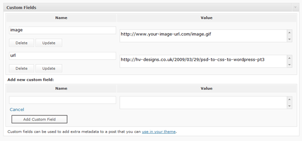
Step6

Once you have entered the custom fields once, when you add more posts the custom fields will be available within a drop down box.

Finally The End

The end, you should now have a working wordpress theme from a PSD file we created a couple of days ago, although this tutorial wont make you a wordpress developer over night…. its a start. The PHP part of a wordpress theme is pretty simple and isnt hard to work out whats what. There is loads of documentation over at wordpress.org to help you with certain things if you ever get stuck. Id also suggest downloading a wordpress cheat sheet, someone made one a while back but i dont have the link. Also diving into wordpress can be a right pain and i can safely say it will piss you off big time. You’ve just got to work at it and work at it, another thing id suggest is to make and code each file before you start the wordpress side of coding, that way most of the hard work would of been done, it will just be a case of sifting through the loops. Il try to make a couple more wordpress tutorials in the near future. Any questions just ask. See you next time.

Your ads will be inserted here by

AdSense Now!.

Please go to the plugin admin page to paste your ad code.

Car Layout #4

Your ads will be inserted here by

AdSense Now!.

Please go to the plugin admin page to paste your ad code.

Good morning everyone, in todays tutorial were going to be making a stylish car layout, although the layout isnt particularly car “related” it does featured some awsome content box styling.

Enough talk lets get started, create a new document 850x830pixels with any background color. Set #3b3b3b as your forground color and #181818 as your background color, select the gradient tool and with a radial gradient start from the top in the middle of your canvas and drag downwards towards the bottom of your canvas.

In the top left hand corner of the canvas add your website title and slogan.

The layer styles for the website title are as follows.

Inbetween the website title and slogan add a small 1 pixel line about 2 pixels wide in the color #ff0e00. Then add this outer glow.

Select the rounded rectangle tool with a radius of 10px, draw out a navigation size rectangle underneath your website title and slogan.

Add these layer styles to your navigation bar.

Now set your navigations layer opacity to 25%. Hold down the CTRL key on the keyboard and click the little thumbnail in your layers pallette on the navigation layer, create a new layer directly above and select the new layer but leave the selection active. Goto “select > modify > contract” contract the selection by 6pixels then press ok. Fill the active selection with the color black.

Right-click your navigation layer and goto “copy layer styles” right click your new layer which holds the black rounded rectangle and goto “paste layer styles”. Set opacity of the new layer back to 100%. You should have something like this.

Your ads will be inserted here by

AdSense Now!.

Please go to the plugin admin page to paste your ad code.

Add your navigation text to your nav bar then select the rectangular marquee tool draw a white box across your navigation that covers the navigation only half way down.

Hold down the CTRL key and click on your navigation layer make sure the navigation layer isn’t selected, goto “select > inverse” then hit the delete key. Set white rectangles layer opacity to about 4%. Your navigation should now look like this.

Using the rounded rectangle tool and create a big rectangle underneath your navigation. Follow the same steps and layer styles as we did for our navigation.

Find yourself an image you see fit for your featured content area, im using a merc-brabus. Copy your desired image to your clipboard. Create a new layer above your featured content box, click your inner content box layer whilst holding the ctrl key on the keyboard to load a selection. Click your newly created layer and goto “edit > paste into” Your image should now be moveable inside the inner rectangle. If your image doesnt fill the whole width of the rectangle then resize the images background to fit doesnt mater if its slightly bigger. Hold ctrl and click on your inner content box once more to load the selection, click your pasted image layer and goto “select > inverse” then hit the delete key on the keyboard. Press CTRL+D to deselect the selection. Load the inner content box selection once more, select your pasted image layer and goto “select > modify > contract” and contract your pasted image by 6 pixels, inverse the selection and hit the delete key.

Add this stroke layer style to your pasted image, then add some featured content text.

Create more content boxes using the methods explained in creating the navigation.

For the content in each content box, create a black rounded rectangle with this gradient stroke.

Add your content box titles, after each title, add the little red light that we made in the header.

Add your example content and footer information and your done.

Hope you enjoyed this tutorial, dont forget to subscribe to our RSS feeds and Twitter. Many thanks for reading, look forward to your comments.

Your ads will be inserted here by

AdSense Now!.

Please go to the plugin admin page to paste your ad code.