Category Archives: PSD Sitebuilds

Coding The Creative Design Layout

Welcome, in this tutorial il teach you how to convert my “creative design layout” into a working CSS/HTML valid website.


Firstly id do the tutorial on creating the layout or skip it and download the PSD file from the hv-designs shop, if you do my tutorial try and get it as close to my design as possilable, changes you wish to make can be done easily once coded. Right lets begin…

Create a folder on your desktop call it what ever you want, within the folder create another folder called “images”. Open up notepad then just goto “file > save as” then enter “styles.css” as the filename make sure you include the .css bit. Open up dreamweaver and click HTML under create new column.

You should now have a blank HTML document in dreamweaver, goto “file > save as” then save it as “index.html”. You should now be all set to go. In dreamweaver you need to be in code view and the CSS panel should be open. The CSS panel is the box on the right, if you cant see it click the little grey arrow. Also in dreamweaver there are 3 views available code, split and design, let me just explain what these are. Code is to view the code to the HTML document that is open. Split is a split screen version half design and half code. Design is how your website looks BUT dont go by what is actually in the design view as sometimes layouts look split up, not aligned properly etc… its very rare i used the design view, i always check what the layout looks like in my browsers, IE and Firefox. You can do this by pressing F12 on the keyboard.

Right enough explaining lets get on, once the CSS panel is open click the “attach style sheet” button.

Click browse in the box that pops up and navigate to the style sheet you created (the styles.css file).

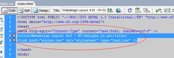
Notice in the HTML code in your index.html file you have a new line of code.

This line of code is VERY important as it tells the HTML file to look in this file (styles.css) to style the actual document. But most of you new that right…! Okay the way i code my templates are i work from the top of the PSD file and work my way down, i also slice this way also, most people slice everything first the start coding each item. I find it easier my way, but feel free to experiment.

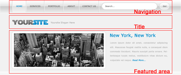
Lets start by laying out the 1st foundations of our website, we need a container, header, navbar and logo. The container is the box which will basically hold our layout, the header is the header the navbar is the navbar and the
logo is the logo. Pretty simple ah?! All these elements will be wrapped in divs and looks like this.

  Untitled Document  <!--CONTAINER--> <div id="container"> <!--HEADER BACKGROUND--> <div id="header"> <!--MENU BAR--> <div id="nav"></div> <!--MENU BAR END-->  <!--HEADER LOGO-->  <!--HEADER LOGO END--></div> <!--HEADER BACKGROUND END--></div> <!--CONTAINER END-->

Lets explain the code above in more detail now you no what it looks like. The 1st div is the the container which like i said above is the box that basically holds the website. Everything for the website will be inside this div. Then theres the header div, now this div will only hold a background image as you will see when we add the styles. Now beacuse we want the background image behind the menu bar and logo we need to place these item inside the header div and as you can see the header div ends at the bottom of the html file with the container. When we add our website content we must place it after the header end div but before the container end div. Now lets being to style our divs. Open up your styles.css file in dreamweaver, use the tabs to flick between the two files.

The first bit of CSS code we need to add is to style the body of the document which looks like this.

 *{ padding:0; margin:0; }  body { font-family:Verdana, Arial, Helvetica, sans-serif; background-image:url(images/bg.png); background-repeat:repeat-x; background-color:#eae5cf; padding:0; margin:0; }

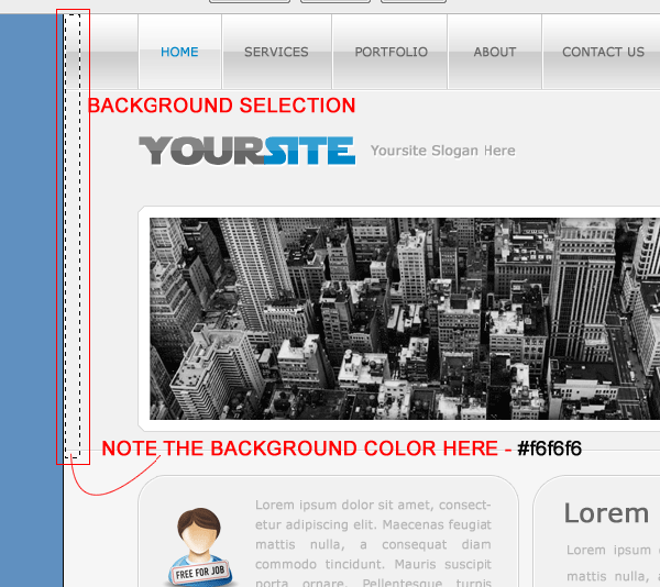
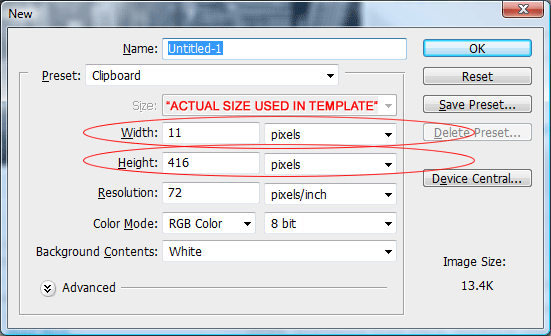
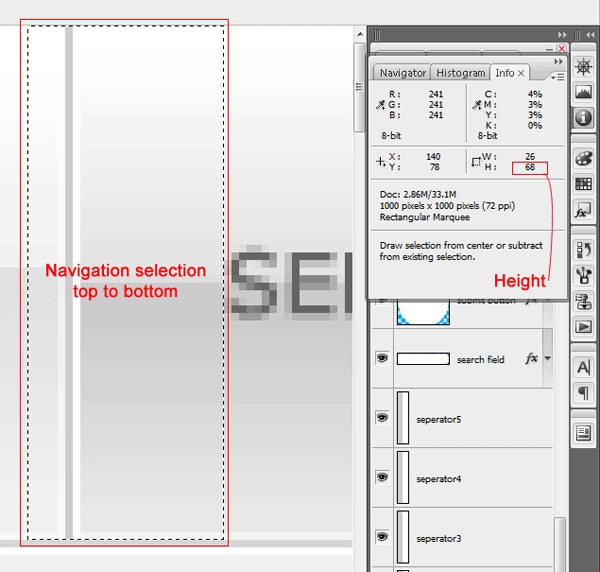
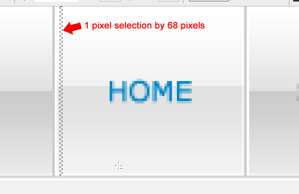
We dont want any margin or padding around the edges of the website so we set the padding and margin to 0, we need to add our font family which is the fonts were going to be using through out the layout. Then theres a background image which is our background, il show you how to create that in a minute. We want our background image to repeat along the X axis which is horizontally. Background color is the color of our background which relates to the background on the PSD file. To create the background image header over to your PSD file and create a 1 or 2 pixel selection like this. Make sure all your layers are flattened, BUT DONT SAVE IT THE PSD FILE, just copy and paste the selection to a new document then undo everything on your PSD file. Save the image you copied as “bg.PNG” save it in your images folder.

Head back over to your HTML file and press F12, you should see your background in action.

Now lets create our container and the background image for the header. We’l create the background image 1st, hide all your header elements on your PSD file then just select the background part of the header (again make sure you flatten your PSD file when you’ve hidden the header elements, but dont forget to undo once the image is made). Copy and paste the header background to a new document then save as “header_bg.png” in your images folder.

Now lets add the CSS styles for our container and header divs.

1
2
3
4
5
6
7
8
9
10
11
12
13
14
15
16
#container {
width:900px;
padding:0;
margin:auto;
}
/* HEADER BACKGROUND IMAGE */
#header{
background-repeat:no-repeat;
background-image: url(images/header_bg.png);
height: 298px;
width: 900px;
float:left;
margin:auto;
}
/* HEADER BACKGROUND IMAGE END */
My PSD file width is 900pixels, so we’ll use a container of 900px, again with no padding, BUT set margin to auto this will center our webpage in the browser. For the header div we need to add the header image which is the “header_bg.png” image. We dont want the header background to repeat as its a fixed item. You need to check the width and height of your image that you saved, mine is 900px wide and 298px high. Yours might be different so adjust accordingly. Save our css file then head back to your HTML file press F12 and take alook. You should be able to see your background image where the header is surposed to be.

Now lets add our logo which will be our website title, slogan and the man image. Head back over to PSD file and copy and paste your logo to a new document and save as “logo.png” heres my mine.

Lets add the CSS styles to the css file for the logo image.

1
2
3
4
5
6
7
8
9
/* HEADER LOGO */
#logo {
background-repeat:no-repeat;
background-image: url(images/logo.png);
height: 298px;
width: 315px;
float:left;
}
/* HEADER LOGO END*/

Again pretty much the same as the header styles apart from the filename is different and the width and height corrospond to the image you just saved (logo.png). Save your CSS file then head back over to your HTML file press F12. Heres what mine looks like in the browser.

Time to code our navigation in your HTML code under the nav div you need to add your menu code which looks like this.

1
2
3
4
5
6
7
8
9
10
<!--MENU BAR-->
<div id="nav">
<ul class="menu">
    <li id="about"><a href="#"><span>#</span></a></li>
    <li id="portfolio"><a href="#"><span>#</span></a></li>
    <li id="clients"><a href="#"><span>#</span></a></li>
    <li id="contact"><a href="#"><span>#</span></a></li>
</ul>
</div>
<!--MENU BAR END-->

The new bit code “ul class=”menu” means unordered list, all the navigation items have a “li id” which means list id. The links have a list id beacause we wont be using plain text for our navigation we will be using images. Head over to your PSD file copy and paste each navigation item and save as seperate images label them according to the image as it will make it easier. You should have 4 images in total. Also big tip when saving PNG files, make sure the images are on transparant backgrounds. The CSS code for the navigation is as follows.

1
2
3
4
5
6
7
8
9
10
11
12
13
14
15
16
17
18
19
20
21
22
23
24
25
26
27
28
29
30
31
32
33
34
35
36
37
38
39
40
41
42
43
44
45
46
47
48
49
50
51
52
53
54
55
56
57
58
59
/* NAVIGATION */
#nav{
width:480px;
padding-top:20px;
float:right;
height:40px;
margin-right: 40px;
}
.menu ul{
padding:0;
margin:0;
list-style-type:none;
list-style:none;
display:inline;
}
.menu li{
padding-right:10px;
margin:0 5px 0 0;
height:40px;
list-style-type:none;
list-style:none;
display:inline;
float:left;
}
span{
display:none;
}
#about a{
background:url(images/about.png);
width:107px;
height:39px;
display:block;
}
#portfolio a{
background:url(images/portfolio.png);
width:106px;
height:39px;
display:block;
}
#clients a{
background:url(images/clients.png);
width:98px;
height:39px;
display:block;
}
#contact a{
background:url(images/contact.png);
width:109px;
height:39px;
display:block;
}
/* NAVIGATION END*/

The nav div is the box that holds the navigation images. So we need to add a width, the width should be the size of all the images together so for EXAMPLE: if each image is 200px thats 200px x 4 = the width of the box. Then we need to add some padding to the top of the box so it isnt stuck right at the top of the browser. Height is the height of the navigation images which should all be the same. Then we need to stick it more to the right so add a margin of 40 pixels to the right. Now the next part is of code relates to the ul and li tags which are both classes not divs, a class starts with a period (.) the difference between a class and div is that a class can be used over and over and a div should be unique and used once. The most important styles on the ul and li classes are the list-style ones, these styles remove the bullets from the list and place the images in a line next to each other opposed to being displayed vertically. The span style is also important as span allows us to add styles to the content, or manipulate the content with for example JavaScript. Next comes the actual code for our navigation images, as you can see each li id relates to each style, keeping the names of items simple and straight to the point will make your life more easier. Each background URL relates to the navigation images we created previously. Width & height relate to the dimensions of each image. The display:block style means “The element will be displayed as a block-level element, with a line break before and after the element”. Save your CSS file then head back over to your HTML file press F12.

The next part is to create the welcome text under the navigation bar. We need to add some new HTML code for this part so in your HTML file code in between and

add this code.

1
2
3
4
5
6
7
8
9
<!--HEADER LOGO END-->
<!--FEATURED TEXT-->
<div id="featured">
<h1>Welcome...</h1>
SOME TEXT HERE</div>
<!--FEATURED TEXT END-->
<!--HEADER BACKGROUND END-->

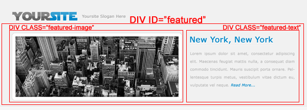
So we basically need another box for our text which is the div id featured, the h1 tag means header#1 you can have as many of these as you want. i called it h1 beacause its the 1st header we’ve done so far. The p tag means paragraph which is where our text will be. So in this chunk of HTML code there are 3 elements we need to style the div tag “featured”, the h1 tag and the p tag. The CSS code looks like this.

1
2
3
4
5
6
7
8
9
10
11
12
13
14
15
16
17
18
19
20
21
22
23
24
25
26
27
28
29
/* FEATURED*/
#featured {
height: 200px;
width: 480px;
font-family: Verdana, Arial, Helvetica, sans-serif;
font-size: 12px;
color: #eae5cf;
margin-top: 90px;
margin-left: 380px;
}
h1 {
padding:0;
margin:0;
font-size:20px;
color:#eae5cf;
text-transform:uppercase;
font-family: Impact;
font-weight: normal;
}
p {
padding:0;
margin:0;
font-size:11px;
color:#eae5cf;
font-family: Verdana;
}
/* FEATURED END*/

The height and width in the #featured tag corrospond to the height and width of the box that the text will be in. Margin -top push’s the block of text down 90px and the margin-left moves it to the right 380px. The other styles corrospond to the text being displayed, here you can set which ever font you want, in any color you want and what ever size you want. Viewing your HTML file in your browser should now look like this.

The next part we need to do is create our content area which has one snazy title and 6 content boxes which need to be expandable. So the first we need code is the snazy header. Goto your PSD file and copy and paste the snazy title to a new a document and save it in your images folder.

Goto your HTML document and add this code between and the last div which is the container end div.

1
2
3
4
5
6
7
<!--HEADER BACKGROUND END-->
<!--CONTENT LEFT-->
<div id="content"></div>
<!--CONTENT LEFT END-->
<!--CONTAINER END-->

The div id content will represent the big box in which our content boxes and sidebar boxes will sit, at the moment though there is only a h2 tag which we’l use for our snazy title we just sliced and saved. Add this CSS code for your content div and h2 tag.

1
2
3
4
5
6
7
8
9
10
11
12
13
14
15
/* CONTENT*/
#content {
width:800px;
padding-top: 20px;
margin:auto;
}
h2 {
background:url(images/h2.png);
width:302px;
height:67px;
margin-bottom:20px;
margin-left: 10px;
}
/* CONTENT END*/

The content box which will hold our content only needs to be 800px wide as the content boxes arnt that wide them selves you can set it at 900px if you want to but that means the gao between the content boxes and sidebar boxes will be greatly increased. We have set 20px padding at the top of the div content so that it isnt stuck right beneath the header. Then we set the margin to auto, this will center everything that falls in the content div. The h2 styles are for our snazy title we just sliced up background url is the filename and path to the image. Width and height have to be the same as the actual image itself. Then finally we add our 20px margin to the bottom so that the content boxes dont sit right underneath the snazy title, the margin-left simply push’s the snazy title over to the right. View your HTML file and you should have something like this.

Now for the content boxes themselves. The content boxes all have top and bottom rounded corners so basically there will be 3 elements to each content box. The top rounded corners, the middle bit which will be expandable then the bottom rounded corners.

Slice these parts of the content boxes into 3 individual files save them as .png on a transparant background in the images folder.

Lets add our HTML code for the content boxes. Now because these content boxes will be repeated we need to use classes not div’s remember when i said before div’s should only be used once. Well nows a perfect example. Inside the content div inbetween the h2 tags and the end div you need to add this code.

1
2
3
4
5
6
7
8
<div class="content_box">
<div class="content_top">
<h3>Content Box One</h3>
</div>
<div class="content_main">
some text</div>
<div class="content_bottom">
Posted on 04/01/2009</div>

the 1st class is content_box, this will be the box our content box sits in, so it will be a content box inside a box. Then theres a class content_top, thats our top bit of the content boxes. In the top half of the content box i want to be able to add a header so i can label each content box so ive used a h3 tag. The content_main class is our expandable bit of the box so the box will adjust to the amount of text and images that inside. Then finally content_bottom…. you’ve guessed it, its the bottom half of the box. The p tag in the bottom half the box is just like a content box footer that ive added. So the CSS code to go with these elements are as follows.

1
2
3
4
5
6
7
8
9
10
11
12
13
14
15
16
17
18
19
20
21
22
23
24
25
26
27
28
29
30
31
32
33
34
35
36
37
38
39
40
41
42
43
44
45
46
47
48
49
50
51
52
53
54
55
56
57
58
59
60
/* CONTENT BOX*/
.content_box {
width:485px;
float:left;
margin:auto;
}
.content_top{
background:url(images/content_top.png);
background-repeat:no-repeat;
width:485px;
height:38px;
}
.content_top h3{
color: #5C5741;
font-family: Impact;
font-size: 24px;
font-weight: normal;
padding-top: 6px;
padding-left: 20px;
}
.content_main{
background:url(images/content.png);
background-repeat:repeat-y;
width:485px;
padding-top: 6px;
padding-left: 20px;
padding-right: 0px;
}
.content_main p {
font-family: Verdana;
color: #A09484;
font-size: 11px;
padding-right: 30px;
}
.content_bottom {
background:url(images/content_bottom.png);
background-repeat:no-repeat;
width:485px;
height:36px;
margin-bottom: 10px;
}
.content_bottom p {
font-family: Verdana, Arial, Helvetica, sans-serif, Impact;
color: #5C5741;
font-size: 9px;
float: right;
padding-top: 10px;
padding-right: 15px;
padding-left: 15px;
padding-bottom: 10px;
}
/* CONTENT BOX END*/

The class content_box has a style width:480px the width of our content boxes image are all 485px so that should be sufficient to hold it all in, we also want it on the left side so we float it left, we also want the content boxes to lye equally in the middle of the surrounding div so we set a margin of auto. The next set of classes are our actual content boxes and these classes contain our images that form the box. The 2nd class is content_top this will represent the top rounded corners of our box so we set the background image to the top box image we created in photoshop, we dont want the background to repeat and the width and height are the actual dimensions of our content top image. Our content_bottom class is exactly the same, the only difference is it has a bottom marhin of 10px. Ive added this so there is a 10px gap inbetween each box eles there boxes will just be right underneath each other. The class content_main is where our main content will be, now this is a little bit different from the others, the background image is the image we created in photoshop but because we want the background to repeat we set the repeat on the y axis, also notice there is only a width and no height the width should be the same width as the image. There is no height because we want it to expand if we did set a height then you wouldnt see all the text and it wouldnt expand it would be like a fixed object. Then theres the padding, we need to pad the top and left so the text lie’s nicely inside our box. If you save your HTML and CSS files press F12 and preview in your browser you should see you content box.

To add more content boxes all’s you need yo do is copy HTML code and paste the html classes. So three content boxes would look like this.

1
2
3
4
5
6
7
8
9
10
11
12
13
14
15
16
17
18
19
20
21
22
23
<!--CONTENT LEFT-->
<div id="content">
<div class="content_box">
<div class="content_top">
<h3>Content Box One</h3>
</div>
<div class="content_main"></div>
<div class="content_bottom"></div>
<div class="content_box">
<div class="content_top">
<h3>Content Box Two</h3>
</div>
<div class="content_main"></div>
<div class="content_bottom"></div>
<div class="content_box">
<div class="content_top">
<h3>Content Box Three</h3>
</div>
<div class="content_main"></div>
<div class="content_bottom"></div>
          <!--CONTENT LEFT END--></div>
</div>
</div>

Now for the right sidebar, its constructed in exactly the same way as the main content boxes, they contain 3 images, sidebar_top, middle and bottom open up your PSD file and begin to chop up your sidebar box. The markup will be the same just different div and class names. Lets start preping it in our HTML file. The markup looks like this.

1
2
3
4
5
6
7
8
9
10
<!--SIDEBAR RIGHT-->
<div id="sidebar">
<div class="sidebar_top">
<h4>stay connected...</h4>
</div>
<div class="sidebar_main">
some text here</div>
<div class="sidebar_bottom"></div>
</div>
<!--SIDEBAR END-->

The starting div is sidebar which will be the box that all our sidebar boxes sit in, the first class is the top bit of the sidebar. The h4 tag is our header 4 then theres the sidebar_main which will be our expandable area then last but not least the sidebar_bottom which is the bottom of our sidebar content box.

The styles to go with all this is also pretty much the same minus a few little options. The CSS looks like this.

1
2
3
4
5
6
7
8
9
10
11
12
13
14
15
16
17
18
19
20
21
22
23
24
25
26
27
28
29
30
31
32
33
34
35
36
37
38
39
40
41
42
43
44
45
/* SIDEBAR*/
#sidebar {
width:305px;
float:right;
}
.sidebar_top {
background:url(images/sb_top.png);
background-repeat:no-repeat;
width:305px;
height:40px;
}
.sidebar_top h4 {
font-family: Impact;
font-size: 30px;
font-weight: normal;
color: #5C5741;
padding-top:2px;
padding-left:20px;
}
.sidebar_main {
background:url(images/sb_main.png);
background-repeat:repeat-y;
width:305px;
padding-left:15px;
}
.sidebar_main p {
font-family: Verdana;
color: #A09484;
font-size:11px;
padding-right: 10px;
}
.sidebar_bottom {
background:url(images/sb_bottom.png);
background-repeat:no-repeat;
width:305px;
height:22px;
margin-bottom: 10px;
}
/* SIDEBAR END*/

The 1st thing to be styled is the div sidebar two simple styles, the width of our box in which the content boxes will sit, pretty easy that will be the same width as our images which are all 305px. Then we need to float it right so it will sit inline next door to our main content boxes. Sidebar_top and sidebar_bottom are pretty much the same apart from bottom has the margin as like the main content boxes. The class sidebar_main is the same as the others but again like our main content boxes it has no height and the background is repeated. Once you’ve added your code give it and preview it with F12. Heres mine.


Just copy the classes to add more boxes in your sidebar, the code for three boxes looks like this.

1
2
3
4
5
6
7
8
9
10
11
12
13
14
15
16
17
18
19
<!--SIDEBAR RIGHT-->
<div id="sidebar">
<div class="sidebar_top">
<h4>stay connected...</h4>
</div>
<div class="sidebar_main">
some text</div>
<div class="sidebar_top">
<h4>whats new...</h4>
</div>
<div class="sidebar_main">
some text</div>
<div class="sidebar_top">
<h4>monthly poll...!</h4>
</div>
<div class="sidebar_main">
some text</div>
</div>
<!--SIDEBAR RIGHT END-->

Now its time for the footer, the footer div should be placed outside the container div as we want the footer to be like the header and repeat all the way across. The footer code looks like this.

1
2
3
4
5
6
7
8
<!--FOOTER-->
<div id="footer">
Copyright &amp;amp;amp;amp;amp;amp;copy; Yoursite.com | All Rights Reserved
DO NOT REMOVE THE LINK BELOW
Designed By <a href="http://www.hv-designs.co.uk">HV-Designs.co.uk</a></div>
<!--FOOTER END-->

Pretty simple just a simple div with a p tag for the text. The CSS for the footer looks like this.

1
2
3
4
5
6
7
8
9
10
11
12
13
14
15
16
17
18
19
20
/* FOOTER*/
#footer {
height:101px;
font-family:Verdana, Arial, Helvetica, sans-serif;
background-image:url(images/footer.png);
background-repeat:repeat-x;
background-color:#2F2519;
clear:both;
}
#footer p {
font-family: Arial, Helvetica, sans-serif;
font-size: 12px;
color: #EAE5CF;
margin: auto;
text-align: center;
padding-top: 20px;
}
/* FOOTER END*/

The footer div has a height of 101 pixels as thats what the dimensions of the image is there is no width as we want the footer to span right the way across the browser, so we also set background repeat to x. The clear:both style is important, this means we dont want any items either side of our header. The footer p style is the styles for the paragraph which are pretty much self explanetry. Thats it all done, The only things left to do now is style things like rollovers if you want any, active, visited, rollover links, additional headers and font colors. Heres how mine looks in the browser.


Thank you for reading, dont forget to subscribe to our RSS feeds.

Freelance Home Page Conversion

Today I will be walking you through the process of turning our Freelance Home Page PSD into a working HTML / CSS template.

The Live Version

You can check out the Live Version of the template by clicking here. The template has been tested in the following browsers without any problems; however, due to our use of CSS3 the website will render a bit differently in each web browser that you choose.

  • Firefox 2.0, 3.0 and 3.5
  • Internet Explorer 7 and 8
  • Chrome 3.0
  • Safari 3.0 and 4.0

Preparing Your Files

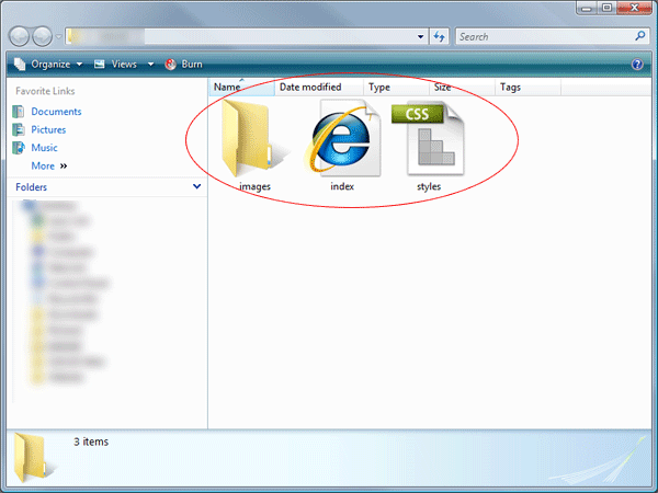
You will need to create a new folder on your desktop titled “Coming Soon”. Please create the following files: index.html, style.css, and a folder titled images. It should be set up like below:

Begin Slicing Your Images

Before we begin working on coding our website we need to slice our images. Since we can use CSS for most of our website we will only be slicing a few images to use in our website.

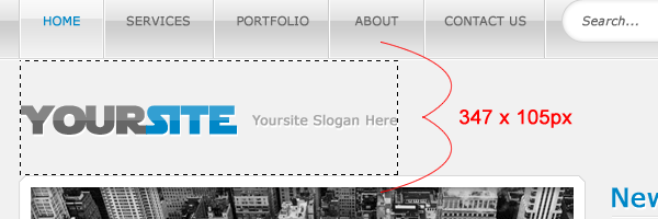
Start out slicing your logo image. Make a selection like below:

Hide your background layer and save it as logo.PNG

For our navigation we only need to slice a portion of the hover state, as the rest of it can be accomplished with CSS. Make a selection like below:

Now save your document as nav_hover.PNG

Your Search Bar is a little bit more difficult to do because there is an extra step added in there. You need to select your search box layer, right click, and choose “Convert to Smart Object”; like below:

Now hide your Search My Site Text Layer and your Search Icon. Make a selection like below:

Now save that as search_bg.png

Like I said this part is complicated because now we have to slice our input layers background. Unhide your Search Icon Layer. Now make a selection like below:

Now save is as search.png

Now leave your layers the way there were and make a selection like below:

Now save that selection as search_submit_bg.PNG

Time to start working on our Center Content. We will only need to slice two images for our center content; our image collage and our spacer.

For our image collage make a selection like below:

Now save that as center_images.png

For your spacers make a selection like below:

Now save that as center_spacers.PNG

Now we will be working on slicing our three icons. Make three selections like below:

We will now be slicing our white content background. Make a selection like below:

Now save this as white_box_overlay.png

For our last two images we will be slicing we will be working in the newsletter group. We will be slicing out our newlsetter input area and our submit button.

To slice your input layer you will need to right click your document again and choose “Convert to Smart Object” again. Now make a selection like below:

Save this as newsletter_input.png

Now make a selection like below for your submit button:

Save your image as newsletter_submit.png.

And we are done, that’s all we need to slice for our document. Time to start coding!

Set Up Main Document

To set up our main document we need to get our body and .container CSS setup as well as the beginning to our HTML file. The container class will have the width and height of our page. You can get this measurement from photoshop, but I always add a little bit more because things never add up exactly. You could also set the height to auto for right now, but your document will not be auto centered by our left and right auto margins until you set a definite height.

1
2
3
4
5
6
7
8
9
10
11
12
13
14
15
16
@charset "utf-8";
/* CSS Document */
body {
background-image: url(images/bg.png);
background-repeat: repeat;
}
.container {
height: 900px;
width: 1100px;
margin-right: auto;
margin-left: auto;
border-top-style: none;
border-right-style: none;
border-bottom-style: none;
border-left-style: none;
}

And our HTML:

1
2
3
4
5
6
7
8
9
10
<!DOCTYPE html PUBLIC "-//W3C//DTD XHTML 1.0 Transitional//EN" "http://www.w3.org/TR/xhtml1/DTD/xhtml1-transitional.dtd">
<html xmlns="http://www.w3.org/1999/xhtml">
<head>
<meta http-equiv="Content-Type" content="text/html; charset=utf-8" />
<title>My Freelance Home Page</title>
<link href="style.css" rel="stylesheet" type="text/css" />
</head>
<body>
<div class="container">

Set Up The Logo

Setting up our logo is really simple. We get all our CSS measurements from our logo.png file and then we need to add a few other tidbits to make it work. Of course you can take out the Text Indent attribute if you don’t want to put any text in your logo and just want to stick to the title.

The CSS:

1
2
3
4
5
6
7
8
9
10
#logo {
background-image: url(images/logo.png);
float: left;
height: 53px;
width: 252px;
background-repeat: no-repeat;
text-indent: -999in;
margin-left: 20px;
margin-top: 15px;
}

The HTML:

1
<a href="index.html" id="logo" title="My Freelance Home Page Logo :: Go Back Home">My Freelance Home Page</a>

The Upper Navigation

Our upper navigation is going to be where our CSS3 comes into play. In our photoshop document we had rounded corners for our navigation, and we can accomplish this with a simple snidbit of CSS. This will render without rounded corners in documents that don’t support CSS3 and may render differently between Safari, Firefox, Opera, and IE.

We will be using the ul and li attributes in CSS to create our navigation. Here is our full navigation CSS:

1
2
3
4
5
6
7
8
9
10
11
12
13
14
15
16
17
18
19
20
21
22
23
24
25
26
27
28
29
#navigation {
float: right;
height: auto;
width: 400px;
}
#navigation ul {
list-style-type: none;
display: block;
}
#navigation li {
list-style-type: none;
display: inline;
}
#navigation li a {
color: #FFF;
text-decoration: none;
font-family: "Lucida Sans Unicode";
font-size: 16px;
padding: 3px;
margin-right: 25px;
}
#navigation li a:hover {
background-image: url(images/nav_hover.png);
background-repeat: repeat;
height: auto;
width: auto;
-moz-border-radius: 5px;
border-radius: 5px;
}

Now our html is going to be very simple. We will just be setting up our ul class and then the lines. Here it is:

1
2
3
4
5
6
<ul id="navigation">
<li><a href="index.html">Home</a></li>
<li><a href="#">Portfolio</a></li>
<li><a href="#">About Me</a></li>
<li><a href="#">Hire Me</a></li>
</ul>

Set Up the Search Bar

Now we get a little bit complicated. We need to set up our overall search bar to be a bit taller and wider than our actual inputs so there are no discrepancies in our design. This will be accomplish with a simple bit of CSS, but we had to use a lot of trial and error to get it just right with the input and submit fields. Here is our CSS:

1
2
3
4
5
6
7
8
9
10
11
12
13
14
15
16
17
18
19
20
21
22
23
24
25
26
27
28
29
30
31
32
33
34
35
36
#searchbar_overall {
clear: both;
float: right;
height: 20px;
width: 210px;
background-image: url(images/search_bg.PNG);
background-repeat: repeat-x;
margin-right: 40px;
}
.searchbar {
background-image: url(images/search.PNG);
background-repeat: repeat;
float: left;
height: 18px;
width: 169px;
text-decoration: none;
padding-left: 5px;
border-top-style: none;
border-right-style: none;
border-bottom-style: none;
border-left-style: none;
font-family: "Lucida Sans Unicode", "Lucida Grande", sans-serif;
color: #FFF;
}
.searchbar_submit {
background-image: url(images/search_submit_bg.PNG);
background-repeat: no-repeat;
height: 18px;
width: 32px;
float: left;
border-top-style: none;
border-right-style: none;
border-bottom-style: none;
border-left-style: none;
text-indent: -999in;
}

Now our CSS is the full CSS styling for what we used. There are several areas, like the border style, that you could shorten to make less CSS code and faster load times while you are working on your own website.

The HTML for our inputs are very easy. We are not going to have a working Search Bar in this tutorial, but you can use a free one from Google or create on in PHP yourself and still style it simply with the CSS above and some slight additions.

Here is our HTML:

1
2
3
4
<div id="searchbar_overall">
<input name="searchbar" type="text" class="searchbar" id="input" value="TEST" size="30" maxlength="30" />
<input name="button" type="submit" class="searchbar_submit" id="button" value="Submit" />
</div>

STOP! Lets see what you have so far!

I just wanted to stop here to make sure that your CSS and HTML is matching up so far. This is what you should have, so far, for both your CSS and your HTML:

1
2
3
4
5
6
7
8
9
10
11
12
13
14
15
16
17
18
19
20
21
22
23
24
25
26
27
28
29
30
31
32
33
34
35
36
37
38
39
40
41
42
43
44
45
46
47
48
49
50
51
52
53
54
55
56
57
58
59
60
61
62
63
64
65
66
67
68
69
70
71
72
73
74
75
76
77
78
79
80
81
82
83
84
85
86
87
88
89
90
91
@charset "utf-8";
/* CSS Document */
body {
background-image: url(images/bg.png);
background-repeat: repeat;
}
.container {
height: 900px;
width: 1100px;
margin-right: auto;
margin-left: auto;
border-top-style: none;
border-right-style: none;
border-bottom-style: none;
border-left-style: none;
}
#logo {
background-image: url(images/logo.png);
float: left;
height: 53px;
width: 252px;
background-repeat: no-repeat;
text-indent: -999in;
margin-left: 20px;
margin-top: 15px;
}
#navigation {
float: right;
height: auto;
width: 400px;
}
#navigation ul {
list-style-type: none;
display: block;
}
#navigation li {
list-style-type: none;
display: inline;
}
#navigation li a {
color: #FFF;
text-decoration: none;
font-family: "Lucida Sans Unicode";
font-size: 16px;
padding: 3px;
margin-right: 25px;
}
#navigation li a:hover {
background-image: url(images/nav_hover.png);
background-repeat: repeat;
height: auto;
width: auto;
-moz-border-radius: 5px;
border-radius: 5px;
}
#searchbar_overall {
clear: both;
float: right;
height: 20px;
width: 210px;
background-image: url(images/search_bg.PNG);
background-repeat: repeat-x;
margin-right: 40px;
}
.searchbar {
background-image: url(images/search.PNG);
background-repeat: repeat;
float: left;
height: 18px;
width: 169px;
text-decoration: none;
padding-left: 5px;
border-top-style: none;
border-right-style: none;
border-bottom-style: none;
border-left-style: none;
font-family: "Lucida Sans Unicode", "Lucida Grande", sans-serif;
color: #FFF;
}
.searchbar_submit {
background-image: url(images/search_submit_bg.PNG);
background-repeat: no-repeat;
height: 18px;
width: 32px;
float: left;
border-top-style: none;
border-right-style: none;
border-bottom-style: none;
border-left-style: none;
text-indent: -999in;
}
1
2
3
4
5
6
7
8
9
10
11
12
13
14
15
16
17
18
19
20
<!DOCTYPE html PUBLIC "-//W3C//DTD XHTML 1.0 Transitional//EN" "http://www.w3.org/TR/xhtml1/DTD/xhtml1-transitional.dtd">
<html xmlns="http://www.w3.org/1999/xhtml">
<head>
<meta http-equiv="Content-Type" content="text/html; charset=utf-8" />
<title>My Freelance Home Page</title>
<link href="style.css" rel="stylesheet" type="text/css" />
</head>
<body>
<div class="container"><a href="index.html" id="logo" title="My Freelance Home Page Logo :: Go Back Home">My Freelance Home Page</a>
<ul id="navigation">
<li><a href="index.html">Home</a></li>
<li><a href="#">Portfolio</a></li>
<li><a href="#">About Me</a></li>
<li><a href="#">Hire Me</a></li>
</ul>
<div id="searchbar_overall">
<input name="searchbar" type="text" class="searchbar" id="input" value="TEST" size="30" maxlength="30" />
<input name="button" type="submit" class="searchbar_submit" id="button" value="Submit" />
</div>

Ok, now that everything is straight we can move on again :)

Setting Up Your Center Content

Time to start working on setting up our main content. We will accomplish most of the main content through CSS with only two images being placed into the document (via the CSS). Our CSS for all parts should look like this:

1
2
3
4
5
6
7
8
9
10
11
12
13
14
15
16
17
18
19
20
21
22
23
24
25
26
27
28
29
30
31
32
33
34
35
36
37
38
39
.center_content_container {
clear: both;
float: left;
height: 246px;
width: 1100px;
margin-top: 34px;
background-color: #CE8B32;
}
#content_images {
background-image: url(images/center_images.png);
background-repeat: no-repeat;
float: left;
height: 243px;
width: 349px;
margin-left: 50px;
}
#content_spacer {
margin-left: 95px;
background-image: url(images/center_spacers.png);
float: left;
height: 237px;
width: 9px;
margin-top: 3px;
}
#content_text {
float: left;
height: 220px;
width: 500px;
margin-left: 40px;
color: #FFF;
font-family: "Qlassik Bold";
font-size: 20px;
margin-top: 15px;
}
#content_text h1 {
padding: 0px;
font-size: 38px;
margin: 0px;
}

And the HTML will be even easier. We have our container div, our two empty image divs, and then our div to display our text. Now we have used the font Qlassik but have found that it does not render well with the web so you may want to change it.

1
2
3
4
5
6
7
8
9
<div class="center_content_container">
<div id="content_images"></div>
<div id="content_spacer"></div>
<div id="content_text">
<h1>Lorem ipsum dolor sit
amet just lectus.</h1>
<p>lorem impsum dolor sit amet just lectus. lorem impsum dolor sit amet just lectus. lorem impsum dolor sit amet just lectus. lorem impsum dolor sit amet just lectus. lorem impsum dolor sit amet just lectus. lorem impsum dolor sit amet just lectus. lorem impsum dolor sit amet just lectus. </p>
</div>
</div>

Setting Up Our Main Business Content

Now we are going to start working on our three boxes, with our three icons. I see these boxes being used to draw attention to the three most important things that you want to draw attention to on your website (ie. pricing, cms/wordpress, development). The CSS for our main content is simple CSS that will bring everything within a container div.

The CSS:

1
2
3
4
5
6
7
8
9
10
11
12
13
14
15
16
17
18
19
20
21
22
23
24
25
26
27
28
29
30
31
32
33
34
35
36
37
38
39
40
41
42
43
44
45
46
.middle_content {
float: left;
height: 135px;
width: 1100px;
margin-top: 25px;
}
.three_boxes {
float: left;
height: 135px;
width: 270px;
margin-left: 40px;
font-family: "Qlassik Medium";
font-size: 11pt;
color: #FFF;
margin-right: 50px;
}
#mailbox_icon {
background-image: url(images/mailbox_icon.png);
background-repeat: no-repeat;
float: left;
height: 135px;
width: 60px;
margin-right: 15px;
}
#pencil_icon {
background-image: url(images/pencil_icon.png);
background-repeat: no-repeat;
float: left;
height: 135px;
width: 60px;
margin-right: 15px;
}
#gears_icon {
float: left;
height: 135px;
width: 77px;
background-image: url(images/gears_icon.png);
background-repeat: no-repeat;
margin-right: 15px;
}
.three_boxes h1 {
font-family: "Qlassik Medium";
font-size: 20px;
color: #FFF;
margin: 0px;
}

And the HTML:

1
2
3
4
5
6
7
8
9
10
11
12
13
<div class="middle_content">
<div class="three_boxes">
<div id="mailbox_icon"></div>
<h1>Lorem Ipsum Dolir</h1>
<p>lorem ipsum dolir lorem ipsum dolir lorem ipsum dolir lorem ipsum dolir lorem ipsum dolir lorem ipsum dolir lorem ipsum dolir lorem ipsum.</p>
</div>
<div class="three_boxes"><div id="pencil_icon"></div>
<h1>Lorem Ipsum Dolir</h1>
<p>lorem ipsum dolir lorem ipsum dolir lorem ipsum dolir lorem ipsum dolir lorem ipsum dolir lorem ipsum dolir lorem ipsum dolir lorem ipsum.</p></div>
<div class="three_boxes"><div id="gears_icon"></div>
<h1>Lorem Ipsum Dolir</h1>
<p>lorem ipsum dolir lorem ipsum dolir lorem ipsum dolir lorem ipsum dolir lorem ipsum dolir lorem ipsum dolir lorem ipsum dolir lorem ipsum.</p></div>
</div>

The Blog Post and Contact Box

Our “White Box” as we call it is an area on our home page where we can show off our Latest Blog Post so that people can see and drive more traffic to the website and blog. In this tutorial we will not be creating the PHP to show you how to accomplish this and will be merely placing static content in the container.

We can accomplish the styling we need on this with just one image and the rest will be CSS and HTML. Here is our CSS:

1
2
3
4
5
6
7
8
9
10
11
12
13
14
15
16
17
18
19
20
21
22
23
24
25
26
27
28
29
30
31
32
33
34
35
36
37
38
39
40
41
42
43
44
45
46
47
48
49
50
51
52
53
54
55
56
57
58
59
60
61
62
63
64
65
66
67
68
69
70
71
72
73
74
75
76
77
78
79
80
81
82
83
84
85
86
87
88
89
90
91
92
93
94
95
96
97
98
99
100
101
102
103
104
105
106
107
108
109
110
111
112
113
114
115
116
117
118
119
120
121
122
123
124
125
126
127
128
129
130
131
132
133
134
135
136
137
138
139
140
141
.white_box_overall {
float: left;
height: 185px;
width: 1100px;
background-image: url(images/white_box_overlay.png);
background-repeat: repeat-x;
margin-top: 35px;
}
.blog_post_overall {
float: left;
height: 165px;
width: 750px;
margin-top: 10px;
margin-left: 15px;
}
#blog_post_title {
font-family: Nyala;
font-size: 24px;
color: #000;
float: left;
height: auto;
width: auto;
}
#blog_post_date {
float: left;
height: auto;
width: auto;
font-family: Nyala;
font-size: 11px;
color: #CCC;
padding-top: 10px;
padding-left: 15px;
font-variant: small-caps;
}
.blog_thumb_post_overall {
clear: left;
float: left;
height: 130px;
width: 745px;
margin-top: 8px;
}
#blog_thumb {
float: left;
height: 120px;
width: 160px;
background-color: #000;
padding: 5px;
}
#blog_post{
float: left;
height: auto;
width: 560px;
margin-left: 15px;
font-family: "Lucida Sans Unicode", "Lucida Grande", sans-serif;
font-size: 13px;
color: #000;
font-variant: small-caps;
margin-top: 5px;
}
.contact_overall {
float: right;
height: 190px;
width: 260px;
}
#contact_header {
font-family: "Qlassik Bold";
font-size: 30px;
height: auto;
width: auto;
float: left;
}
#contact_subheader {
font-family: "Qlassik Medium";
font-variant: small-caps;
color: #CCC;
float: left;
height: auto;
width: auto;
margin-top: 15px;
margin-left: 20px;
}
.contact_phone_overall {
clear: left;
float: left;
height: 25px;
width: 200px;
margin-top: 15px;
margin-left: 20px;
font-family: Nyala;
font-size: 24px;
}
#contact_phone {
font-family: Nyala;
font-size: 24px;
color: #000;
float: left;
height: 24px;
width: 60px;
margin-right: 8px;
}
.contact_email_overall {
clear: left;
float: left;
height: 25px;
width: 240px;
margin-top: 15px;
margin-left: 10px;
font-family: Nyala;
font-size: 14px;
}
#contact_email_main {
float: left;
height: auto;
width: auto;
font-family: Nyala;
font-size: 24px;
margin-right: 5px;
}
#contact_email_text {
margin-top: 5px;
float: left;
width: auto;
}
.contact_address_overall {
clear: left;
float: left;
height: 50px;
width: 240px;
margin-top: 15px;
margin-left: 10px;
font-family: Nyala;
font-size: 14px;
text-align: center;
}
#contact_address {
font-size: 24px;
float: left;
height: auto;
width: auto;
margin-right: 5px;
}
1
2
3
4
5
6
7
8
9
10
11
12
13
14
15
16
17
18
19
20
21
22
23
24
25
26
27
<div class="white_box_overall">
<div class="blog_post_overall">
<div id="blog_post_title">Your Latest Blog Post Here</div>
<div id="blog_post_date">posted on oct 6, 2010 by me</div>
<div class="blog_thumb_post_overall">
<div id="blog_thumb"><img src="images/blog_post_thumb.PNG" width="160" height="120" alt="Latest Blog Thumb" /></div>
<div id="blog_post">lorem impsum dolor sit amet just lectus. lorem impsum dolor sit amet just lectus. lorem impsum dolor sit amet just lectus. lorem impsum dolor sit amet just lectus. lorem impsum dolor sit amet just lectus. lorem impsum dolor sit amet just lectus. lorem impsum dolor sit amet just lectus lorem impsum dolor sit amet just lectus. lorem impsum dolor sit amet just lectus. lorem impsum dolor sit amet just lectus. lorem impsum dolor sit amet just lectus. lorem impsum dolor sit amet just lectus. </div>
</div>
</div>
<div class="contact_overall">
<div id="contact_header">Contact</div>
<div id="contact_subheader">Get In Touch With Me
</div>
<div class="contact_phone_overall">
<div id="contact_phone">Phone:</div>
xxx-xxx-xxxx
</div>
<div class="contact_email_overall">
<div id="contact_email_main">Email:</div>
<div id="contact_email_text">[email protected]</div>
</div>
<div class="contact_address_overall">
<div id="contact_address">Address:</div>
Your Address Here<br />Your City, State and Zip
</div>
</div>
</div>

Time For Our Footer

Now our footer will be set up in two different areas, the Bottom Navigation and the Newsletter.

Our Bottom Navigation will be using the ul and li attributes in CSS as well and will be full CSS styling, no images. To get the proper color we used our color picker tool in Photoshop to grab the right Hex Code for our bottom navigation. Here is our bottom nav CSS:

1
2
3
4
5
6
7
8
9
10
11
12
13
14
15
16
17
18
19
20
21
22
23
24
.bottom_navigation {
float: left;
height: 30px;
width: 400px;
padding: 0px;
margin-top: 45px;
margin-right: 0px;
margin-bottom: 0px;
margin-left: 35px;
}
.bottom_navigation ul{
}
.bottom_navigation li{
list-style-type: none;
display: inline;
color: #b47004;
font-family: "Qlassik Bold";
font-size: 20pt;
margin-right: 20px;
}
.bottom_navigation li a {
text-decoration: none;
color: #B47004;
}

And our HTML:

1
2
3
4
5
<ul class="bottom_navigation">
<li><a href="index.html">Home</a></li>
<li><a href="#">About</a></li>
<li><a href="#">Portfolio</a></li>
<li><a href="#">Hire Me</a></li></ul>

Now our Newsletter is a matter of an overall container, an input container, two simple inputs, and a right aligned submit button. All will be accomplished with CSS and background images. Again we will not be actually setting up the PHP for the newsletter form, but you can find a nice mail form on our Coming Soon PSD to HTML Tutorial.

The CSS:

1
2
3
4
5
6
7
8
9
10
11
12
13
14
15
16
17
18
19
20
21
22
23
24
25
26
27
28
29
30
31
32
33
34
35
36
37
38
39
40
41
42
43
44
45
46
47
48
49
50
51
52
53
54
55
56
57
58
59
.newsletter_overall {
float: right;
height: 105px;
width: 270px;
font-family: "Qlassik Bold";
color: #FFF;
font-size: 20pt;
margin-top: 15px;
}
#newsletter_text {
float: left;
height: auto;
width: auto;
margin-bottom: 10px;
}
#newsletter_input_overall {
float: left;
height: 60px;
width: 180px;
clear: left;
}
#newsletter_input {
border-top-style: none;
border-right-style: none;
border-bottom-style: none;
border-left-style: none;
background-image: url(images/newsletter_input.png);
background-repeat: no-repeat;
float: left;
height: 22px;
width: 178px;
margin-bottom: 10px;
}
#newsletter_two_input {
border-top-style: none;
border-right-style: none;
border-bottom-style: none;
border-left-style: none;
background-image: url(images/newsletter_input.png);
background-repeat: no-repeat;
float: left;
height: 22px;
width: 178px;
margin-bottom: 10px;
}#newsletter_submit {
background-image: url(images/newsletter_submit.png);
background-repeat: no-repeat;
float: right;
height: 30px;
width: 68px;
margin-right: 20px;
margin-top: 15px;
text-indent: -999in;
border-top-style: none;
border-right-style: none;
border-bottom-style: none;
border-left-style: none;
}

Now in our final HTML to finish out the newsletter we will also need to close out our main container div. Here is our HTML:

1
2
3
4
5
6
7
8
9
<div class="newsletter_overall">
<div id="newsletter_text">Newsletter</div>
<div id="newsletter_input_overall">
<input type="text" name="textfield" id="newsletter_input" />
<input type="text" name="textfield" id="newsletter_two_input" />
</div>
<input type="submit" name="button2" id="newsletter_submit" value="Submit" />
</div>
</div>

The Copyright

The copyright for our website will actually be placed in its own div, outside our main container div. You will see most of the same styles from our container div used in our copyright CSS. Overall though the copyright is one simple CSS class and one simple line of HTML coding.

The CSS:

1
2
3
4
5
6
7
8
9
10
.copyright {
font-family: "Qlassik Bold";
font-size: 14px;
color: #FFF;
height: 20px;
width: 215px;
margin-right: auto;
margin-left: auto;
margin-top: -15px;
}

The HTML:

1
2
3
<div class="copyright">Copyright Aaron Nichols and HV-Designs</div>
</body>
</html>

Conclusion

As you can see you can use CSS to create a good majority of most sites you design in Photoshop. Having to rely less on images and more on CSS will greatly improve your page load speeds. Keep the HTML short and to the point, not adding in meaningless tidbits of HTML.


Before we begin working on coding our website we need to slice our images. Since we can use CSS for most of our website we will only be slicing a few images to use in our website.Start out slicing your logo image. Make a selection like below:

Hide your background layer and save it as logo.PNG

For our navigation we only need to slice a portion of the hover state, as the rest of it can be accomplished with CSS. Make a selection like below:

Now save your document as nav_hover.PNG

Your Search Bar is a little bit more difficult to do because there is an extra step added in there. You need to select your search box layer, right click, and choose “Convert to Smart Object”; like below:

Now hide your Search My Site Text Layer and your Search Icon. Make a selection like below:

Now save that as search_bg.png

Like I said this part is complicated because now we have to slice our input layers background. Unhide your Search Icon Layer. Now make a selection like below:

Now save is as search.png

Now leave your layers the way there were and make a selection like below:

Now save that selection as search_submit_bg.PNG

Time to start working on our Center Content. We will only need to slice two images for our center content; our image collage and our spacer.

For our image collage make a selection like below:

Now save that as center_images.png

For your spacers make a selection like below:

Now save that as center_spacers.PNG

We will now be slicing our white content background. Make a selection like below:

Now save this as white_box_overlay.png

For our last two images we will be slicing we will be working in the newsletter group. We will be slicing out our newlsetter input area and our submit button.

To slice your input layer you will need to right click your document again and choose “Convert to Smart Object” again. Now make a selection like below:

Save this as newsletter_input.png

Now make a selection like below for your submit button:

Save your image as newsletter_submit.png.

And we are done, that’s all we need to slice for our document. Time to start coding!

Digital Curriculum Vitae: PSD Conversion

Good evening everybody, today i’ll be walking you through the process of coding your “Digital Curriculum Vitae” into a working HTML/CSS Template. Lets get started.


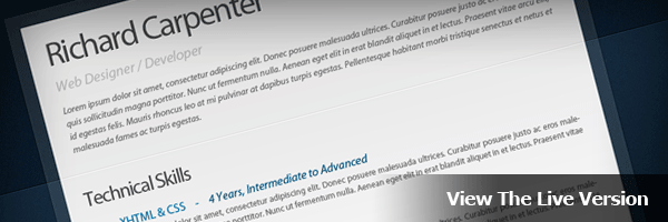
The Live Version

You can check out the Live Version of the template by clicking the image below. The template has been tested in the following browsers without any problems.

  • Firefox 2.0, 3.0 and 3.5
  • Internet Explorer 7 and 8
  • Chrome 3.0
  • Safari 3.0 and 4.0

View The Template Live

Preparing Your Files

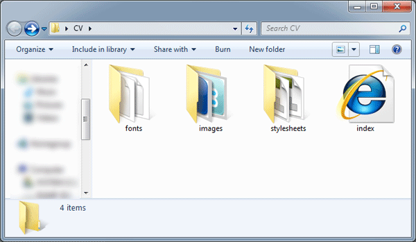
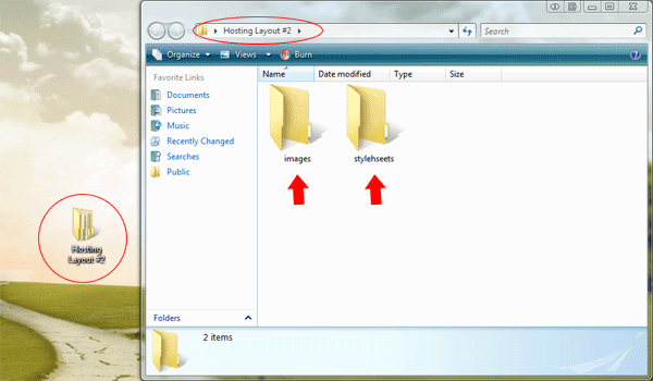
Create a new folder on your desktop called “Digital Curriculum Vitae”, within this folder create three more folders called “fonts”, “images” and “Stylesheets”.

The “Fonts” folder will be used for our fonts, if you can remember from part #1 of the tutorial we used a font called “Myriad Pro”. This font won’t work on a live webpage unless we use some CSS3 (@font Face), more on this later.

The “Images” folder will be for our template images, all images will be saved in PNG format.

Finally the “Stylesheets” folder will contain our stylesheets, i this template there will be two stylesheets. A “Reset.CSS” and “Styles.CSS”.

Once you’ve created your folders, create a blank HTML file called “Index.HTML”. Save the blank HTML file inside the main folder. Next create two blank CSS files inside your stylesheets folder.

Digital CV Template

Setting Up The HTML File

Open your HTML file in your favorite code editor, in the “HEAD” section of the HTML file add your template title and link your CSS document.

<title>Digital Curriculum Vitae - Richard Carpenter - HV-Designs.co.uk</title>
<link href="stylesheets/styles.css" rel="stylesheet" type="text/css" />

In the “BODY” of your document add a DIV called “Container”, the container will be our main DIV in which our template will be held.

<div id="container">
</div><!--CONTAINER ENDS-->

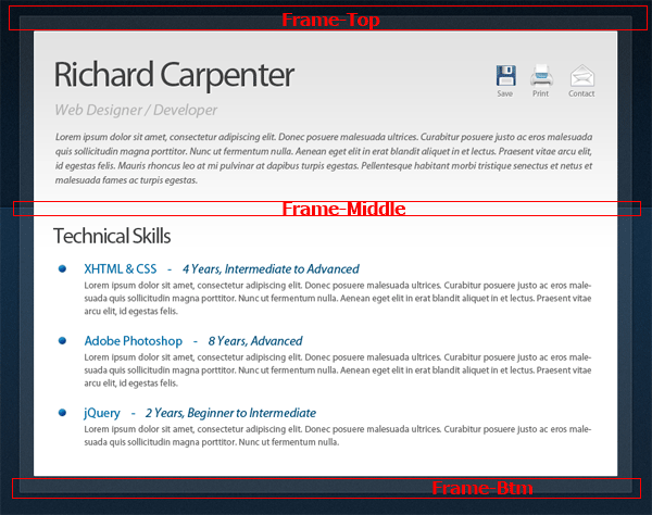
Inside the container DIV were going to create 3 more DIV’s, “Frame-Top”, “Frame-Middle” and “Frame-Btm”.

<div id="container">

<div id="frame-top">
</div><!--FRAME TOP ENDS-->

<div id="frame-middle">
</div><!--FRAME MIDDLE ENDS-->
<div id="frame-btm">
</div><!--FRAME BOTTOM ENDS-->

</div><!--CONTAINER ENDS-->

The 3 DIV’s will each contain the top, middle and bottom portions of the transparent box which is behind the white rectangle on our layout.

Digital CV Template

Finally the actual white rectangle on our layout we can do all in CSS, so we’ll just create 1 more DIV called “Page”. Place the DIV inside the “Frame-Middle” DIV.

<div id="container">

<div id="frame-top">
</div><!--FRAME TOP ENDS-->

<div id="frame-middle">

<div id="page">
</div><!--PAGE ENDS-->

</div><!--FRAME MIDDLE ENDS-->
<div id="frame-btm">
</div><!--FRAME BOTTOM ENDS-->

</div><!--CONTAINER ENDS-->

So just to recap then we have our “Container DIV” which will contain a whole template, “Frame-Top”, “Frame-Middle” and “Frame-Btm” which will contain our transparent rectangle cut into 3 separate images. Then finally our “Page” DIV which will contain our white main rectangle for our content.

Slicing The Background Image

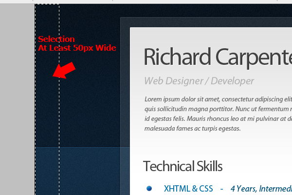
Now our HTML mark-up is finished lets start slicing our images, We’ll start with the background. Select the rectangular marquee tool then drag out a selection about 50 pixels wide and the whole length of your background.


Digital CV Template

Once the selection has been made go to “Edit > Copy Merged”, then go to “File > New” and create a new document. (The size of your selection should automatically be entered into the dimension boxes)

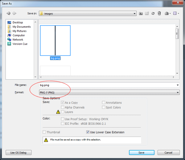
Save the background image as “bg.PNG” inside the images folder.

Digital CV Template

Slicing The Transparent Rectangle

Hide all your layers apart from the background layers and the transparent rectangle. Select the rectangular marquee tool then make a selection around the top half of the rectangle.

Digital CV Template

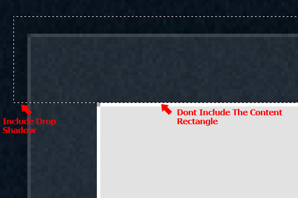
In the selection include your drop shadow, but don’t include the content rectangle. Once you’ve made the selection hide the background layers and go to “Edit > Copy Merged”, paste the selection into a new document then save the file as “frame_top.PNG”.

Repeat the process for the bottom of the rectangle and also the middle, make sure all slices are the same width.

Slicing The Template Title

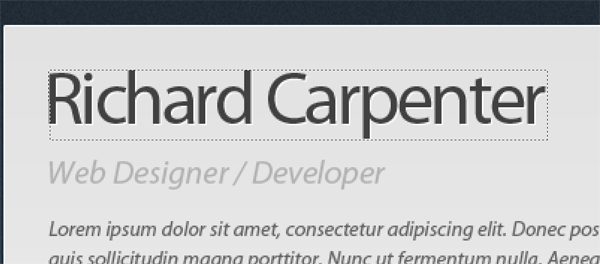
Still with the rectangular marquee tool make a selection around your website title.

Digital CV Template

Once you’ve made the selection hide all your layers apart from the title layer itself then go to “Edit > Copy Merged”. Create a new document by going to “File > New” and then paste your selection into the new document.

In your new document hide the background layer then go to “File > Save As”, save the image as “title.PNG” inside the images folder.

Slicing The Navigation

For our little 3 button navigation were going to keep all the buttons as one image, we’ll then use CSS to adjust the background image for our template.

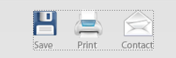
Start off by making a selection around all 3 buttons using the rectangular marquee tool.

Digital CV Template

Hide all your layers apart from the 3 button icons and there text, once you’ve hidden your layers go to “Edit > Copy Merged”.

Paste your copied selection to a new document, hide the background layer then save the images as “right_navigation.PNG” inside your images folder.

Slicing The Page Background

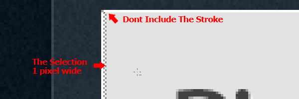
Using the rectangular marquee tool make a selection 1 pixel wide starting from the top of your white rectangle. The starting point should be underneath the 1 pixel white border.

Digital CV Template

Drag the selection all the way down until you come into the white portion of the rectangle. You can use the eye dropper tool to make sure the selection ends on white (#ffffff). The reason for this is because where the background image ends the color white will continue on down the page which will be set in our stylesheet.

Slicing The Bullet Points And Divider Line

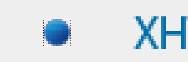
Make a selection around one of your bullet points using the rectangular marquee tool.

Digital CV Template

Once you’ve made the selection hide all your layers apart from the bullet layer itself then go to “Edit > Copy Merged”. Create a new document by going to “File > New” and then paste your selection into the new document.

In your new document hide the background layer then go to “File > Save As”, save the image as “bullet.PNG” inside the images folder.

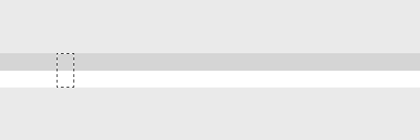
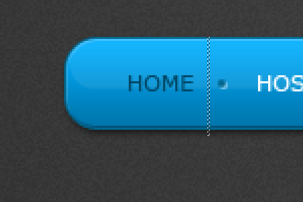
For our divider line you only need to make a 1 x 2 pixel selection as the image will be repeated using CSS. Make a selection on your divider line as shown in the image below.

Digital CV Template

Once the selection has been made go to “Edit > Copy Merged”. Paste the selection into a new document then save the image as “divider.png” inside the images folder.

Slicing The Social Icons

Finally we need to slice our individual social icons. Using the same methods listed above slice each button, then save each button on a transparent background inside your images folder.

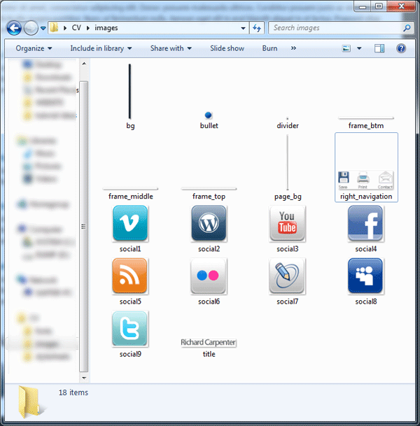
Once your finished thats all the slicing done. Here’s a screen shot of all my images inside the images folder.

Digital CV Template

The Background CSS

Open up your styles.CSS stylesheet inside your favorite code editor, then add the body as your first style.

body {
}

Inside your body style we need to set our background image, to do this we add your “bg.PNG” image as a background then repeat the background horizontally (X-Axis).

We don’t want the background to move when scrolling down the page so we also set the background to fixed. Finally we need to push our template downwards so its not flush with the top of our browser, we do this by adding a top margin. The CSS code looks like this.

body {
background-image: url(../images/bg.png);
background-repeat: repeat-x;
background-attachment: fixed;
margin-top: 35px;
}

Styling The Container

The next set of DIV’s we need to style are the foundations of our template, these DIV’s are the main container and the transparent rectangle which goes all the way around our template. We’ll start with the container DIV.

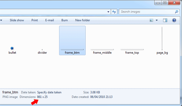
We first set our container width, to find out the width of the container you can check the size of your transparent rectangle images.


Digital CV Template

Notice the width of 861px, this will be our container width. We then set our containers margins to auto, doing this will center our template in the browser.

#container {
margin: auto;
width: 861px;
}

Styling The Transparent Rectangle

Inside your HTML file locate the DIV’s “frame-top” and “frame-btm”. Inside the frame top DIV insert your frame top image from your images folder.

<div id="frame-top">
<img src="images/frame_top.png" alt="Curriculum Vitae" />
</div><!--FRAME TOP ENDS-->

Repeat the same for the frame btm DIV.

<div id="frame-btm">
<img src="images/frame_btm.png" alt="Curriculum Vitae" />
</div><!--FRAME BOTTOM ENDS-->

For our top and bottom frame DIV’s we need to float them left then add a fixed height and width. The width and height of our DIV should be the same width and height as images which we sliced earlier.

Instead of creating two separate styles for frame top and frame btm we can join them together as both DIV’s share the same styles. We do this by separating the DIV’s with comma’s in our stylesheet.

#frame-top, #frame-btm {
float: left;
height: 25px;
width: 861px;
}

Styling Frame Middle DIV

Our “frame-middle” DIV is styled in a similar way as body background, the only difference being we repeat the background vertically (Y Axis), float the DIV to the left and add a fixed width. The fixed width should match the frame middle image, which should also be the same width as our container DIV.

#frame-middle {
background-image: url(../images/frame_middle.png);
background-repeat: repeat-y;
float: left;
width: 861px;
}

Styling The Page DIV

This DIV is the final DIV we need to style, we should then have the foundations of our template ready for our content.

Float the DIV left, add a fixed width of 809px (the width is the same size as our content rectangle in our PSD file) then set a white solid 1 px border.

#page {
float: left;
width: 809px;
border: 1px solid #FFFFFF;
}

Set your “page_bg.PNG” as the DIV’s background repeating it horizontally (X Axis), set the DIV’s background color to white (#ffffff) then set a top and bottom margin of 30px.

#page {
float: left;
width: 809px;
margin-left: 25px;
border: 1px solid #FFFFFF;
background-image: url(../images/page_bg.png);
background-repeat: repeat-x;
background-color: #FFFFFF;
padding-top: 30px;
padding-bottom: 30px;
}

Adding Some Content

In your HTML file inside the “#page” DIV add a “H1″ heading tag then insert your “title.PNG” file inside. Add a link to your image if you wish.

<h1><a href="#"><img src="images/title.png" alt="Richard Carpenter CV" /></a></h1>

Underneath your “H1″ tag add an unordered list “UL” with a class of “right-nav”. Inside your list add your 3 list items also known as your 3 button navigation each with there own classes to represent that list (LI) Item.

<ul class="right-nav">
<li class="save"><a href="#" title="Save">Save</a></li>
<li class="print"><a href="#" title="Print">Print</a></li>
<li class="contact"><a href="#" title="Contact">Contact</a></li>
</ul>

Underneath your small navigation add a simple paragraph “P” tag with a class of “job-title”. Inside your “P” tag add your desired text.

<p class="job-title">Web Designer / Developer</p>

Finally we need to add our intro text, create another “P” tag but with a class of “intro”.

<p class="intro">INTRO TEXT GOES HERE</p>

Styling Our Header Content

We’ll start with our “H1″ tag, set a fixed width and height the same dimensions as your title image, float the title left then add a bottom margin of 10px. To push the tag over from the left add a left margin of 30px.

We could of added the left padding to the “page” DIV which would automatically push everything from the left over 30px, but if we used this method then our little lined divider would also have 30px padding which we don’t want. We want the divider to start and end at either side of the page layout. We’ll add the 30px left margin to all items inside the “page” DIV.

h1 {
height: 47px;
width: 334px;
margin-bottom: 10px;
float: left;
margin-left: 30px;
}

Styling Our P Tag Classes

There are two “P” tag classes we need to style, “P class job-title” and “P class intro”. The styles for these classes are just changes in the way the text looks. Notice we haven’t set any font-family yet as we’ll be doing this at the as it requires some CSS3.

The “P” class “job-title” looks like this.

p.job-title {
color: #b1b1b1;
font-size: 20px;
letter-spacing: -1px;
font-style: italic;
clear: both;
margin-left: 30px;
}

The “P” class “intro” styling looks like this.

p.intro {
font-style: italic;
color: #646464;
font-size: 12px;
margin-top: 20px;
text-align: justify;
margin-left: 30px;
margin-right: 30px;
line-height: 18px;
}

Styling The Navigation

For our navigation start off by styling the unordered-list “UL”. Simply float the navigation to the right then add 30px of right margin.

ul.right-nav {
float: right;
margin-right: 30px;
}

The next few styles are for our navigation list “LI” items and the link “A” associated with our buttons. For our list “LI” items we float each of them left, to add spacing in between each button we add a left margin of 22px.

For our list “LI A” links we display each of them as a block and add a text-indent which will push the text off the page (We’ll be using images don’t forget).

Finally we need to add a fixed width and height to our buttons to find out how big you need to set them you have to measure each button then use the biggest one as your fixed width and height.

.right-nav li {
float: left;
margin-left: 22px;
}

.right-nav li a {
display: block;
height: 46px;
text-indent: -9999px;
width: 38px;
}

We now have to style our list “LI” classes, each list class will have our navigation background image set as a background. You can merge these styles into one by separating each style with a comma.

li.save a, li.print a, li.contact a {
background-image: url(../images/right_navigation.png);
background-repeat: no-repeat;
}

All’s we have to do now is adjust our list background image position so that the buttons display correctly. Your positions might be different to mine depending on how big your buttons are.

li.save a {
background-position: 5px top;
}

li.print a {
background-position: -44px top;
}

li.contact a {
background-position: -101px top;
}

Adding The Divider

Inside your HTML file create an empty DIV with a class of divider. The DIV should live underneath your intro text inside the “page” DIV.

<div class="divider"></div>

Inside your stylesheet add the divider class then set the “divider.PNG” image as a background repeated horizontally (X Axis). Float the DIV left with a top and bottom margin of 27px. Finally add a fixed width and height, the height should be 2px the same height as the image the width should be the same width as the “page” DIV.

.divider {
clear: both;
background-image: url(../images/divider.png);
background-repeat: repeat-x;
float: left;
height: 2px;
width: 809px;
margin-top: 27px;
margin-bottom: 27px;
}

Adding Your Section Titles

Inside your HTML file, underneath your divider simply add an “H2″ tag. Inside the “H2″ tag add one of your section titles I.E – Technical Skills.

<h2>Technical Skills</h2>

Inside your stylesheet add your “H2″ tag then set the text color, font size, letter spacing and some bottom margin to separate the title from the content which will lie underneath. Finally add a left margin of 30px to push the title over inline with everything else.

h2 {
margin-left: 30px;
font-size: 25px;
color: #414141;
letter-spacing: -1px;
margin-bottom: 15px;
}

All your section titles should be wrapped within the “H2″ tag.

Adding Your CV Details

All the CV information/details will be added using an unordered list “LI”. In your HTML file underneath your H2 tag create an unordered list “LI” with a class of “details”.

<ul class="details">
</ul>

Inside the unordered list add a list “LI” item containing an “H3″ tag. Inside the “H3″ tag add your title E.G XHTML & CSS – 4 Years, Intermediate to Advanced.

<ul class="details">
<li>
<h3>XHTML & CSS - 4 Years, Intermediate to Advanced</h3>
</li>
</ul>

Inside the “H3″ tag where you have the details of the “H3″ tag E.G 4 Years, Intermediate to Advanced, add a span class of “color2″. Doing this will enable us to add additional styling to that specific bit of text.

<ul class="details">
<li>
<h3>XHTML & CSS - <span class="color2">4 Years, Intermediate to Advanced</span></h3>
</li>
</ul>

Underneath the “H3″ tag create a “P” tag will your text.

<ul class="details">
<li>
<h3>XHTML & CSS - <span class="color2">4 Years, Intermediate to Advanced</span></h3>
<p>TEXT GOES HERE</p>
</li>
</ul>

When adding more details simply create another list containing the “H3″ and “P” tags.

<ul class="details">
<li>
<h3>XHTML & CSS - <span class="color2">4 Years, Intermediate to Advanced</span></h3>
<p>TEXT GOES HERE</p>
</li>

<li>
<h3>Adobe Photoshop - <span class="color2">8 Years, Advanced</span></h3>
<p>TEXT GOES HERE</p>
</li>
</ul>

Styling Our Details

Inside your stylesheet you need to add your unordered list classes, start with the “UL” Attribute.

Float your list to the left then add left and bottom margins. The left margin will push the list over inline with everything else and the bottom margin will space out the lists.

ul.details {
float: left;
margin-left: 30px;
margin-bottom: 10px;
}

For your list elements add your “bullet.PNG” image as a background then using some left padding push the list elements over so the text is by the side of the bullet. Finally add a bottom margin which will space out the list elements.

.details li {
background-image: url(../images/bullet.png);
background-repeat: no-repeat;
background-position: left 6px;
padding-left: 35px;
margin-bottom: 20px;
}

Finally, we need to style our “P” tags within our list. Set your font size and color along with any thing else you want to add. Don’t forget to add a right margin of 30px which will push the text over from the right.

.details li p {
margin-right: 30px;
text-align: justify;
color: #646464;
font-size: 12px;
line-height: 18px;
}

Using a combination of H2, H3 and the list items make up the rest of your CV details.

Adding Your Custom Font With CSS3

Move your desired font to your desktop then go to “Font Squirrel” and convert your font into a “TrueType”, “EOT” and “SVG” file. These 3 types of fonts are needed for the custom font to work in our browsers.


Font Squirrel

Once you’ve converted the font move the 3 files into your fonts folder. Open your CSS file then add the @fontface code to the top.

1
2
3
4
5
@font-face {
font-family: 'MyriadProRegular';
src: url('myriadpro.eot');
src: local('Myriad Pro'), local('fonts'), url('myriadpro.ttf') format('truetype'), url('myriadpro.svg#MyriadPro-Regular') format('svg');
}

Also inside your CSS file add the font family to your “page” DIV.

1
font-family: MyriadProRegular, Verdana, Arial;

Test your template in your browser and see how it looks. I’ll be releasing the template for download soon along with the PSD file.

Take care and thanks for reading.


Personal vCard Pt.2

Hello everybody welcome to the second part of the vCard layout tutorial. In today’s tutorial we’ll be converting the vCard into a 4 page template, if you haven’t already id download the free PSD file i released earlier OR feel free to follow along with your own PSD FILE.


Setting Up Our Local Files

Create a new folder on your hard drive labeled “vCard”, inside the folder called “vCard” create two more folders “images” and “stylesheets”.

vCard Part Two

Inside the stylesheets folder create 3 separate CSS files with the following names. “ie.css”, “reset.css” and “styles.css”.

You can easily create CSS files using notepad, just open up a blank notepad document and save it as “filename.css” inside the stylesheets folder. Alternatively you can probably use your favorite code editor.

vCard Part Two

Finally in your favorite code editor create a blank HTML document called “index.html”, save the HTML file inside the main folder with your two folders.

vCard Part Two

Linking Our Stylesheets

Inside your HTML file add your own personal title within the “TITLE” tags.

 <title>Personal vCard - HV-DESIGNS.CO.UK By Richard Carpenter</title>

Next we need to link our stylesheets the first one we’ll link will be our main one “styles.css”.

 <link href="stylesheets/styles.css" rel="stylesheet" type="text/css" />

The next stylesheet will be our internet explorer specific stylesheet “ie.css”, we’ll link this stylesheet using a conditional statement. Basically the way it works is if someone browses the site using internet explorer 7 then the elements within the “ie.css” stylesheet will become active.

 <!--[if IE 7]> <link href="stylesheets/ie.css" rel="stylesheet" type="text/css" /> <![endif]-->

We have one more style sheet to link (reset.css), but we wont link the stylesheet within the HTML file. Instead the stylesheet will be imported into our “styles.css”. Open up your “styles.css” stylesheet, at the top add the following code.

 @import url(/files/includes/quot-reset.css-quot-.css);

Drafting Some Div’s

Inside the “BODY” tag of your HTML document start off with a DIV of “container”, this DIV will be our main box which will contain all our website elements.

 <body>  <div id="container"> </div><!--CONTAINER ENDS-->  </body>

We now need to add 3 more DIV’s which will make up our layout, because the way our layout is designed we can’t make the framework using CSS. So instead we’ll be using 3 separate images.

vCard Part Two

The first DIV will contain our top rounded corners, the middle DIV will be our main DIV where we add all our content, the middle DIV will also contain a 1 pixel background image which will repeat over and over again. Finally the last DIV will contain our bottom rounded corners and reflection.

We draft the DIV’s out like this.

We draft the DIV’s out like this.

1
2
3
4
5
6
7
8
9
10
11
12
13
14
<body>
<div id="container">
<div id="vcard-top"></div><!--VCARD TOP ENDS-->
<div id="vcard-middle">
</div><!--VCARD MIDDLE ENDS-->
<div id="vcard-bottom"></div><!--VCARD BOTTOM ENDS-->
</div><!--CONTAINER ENDS-->
</body>

Slicing Our Main Images

Open up your PSD file, hide your background layer then select the rectangular marquee tool and make a selection around the top half of your layout including some of the drop shadow. My selection is “856 pixels x 18 pixels”.


vCard Part Two

Once you’ve made the selection and your happy with it go to “edit > copy merged”. Create a new document, the dimensions of the copied selection should automatically be inputted into the new document box.

Paste the selection into the new document, delete the background layer then save the document as “vcard_top.PNG” inside the images folder.

You need to do the steps listed above for every image your create unless stated otherwise. Remember the steps as i wont be repeating the steps for every image we slice.

Head back over to your original PSD document, select the rectangular marquee tool once again and a make a selection any where across the middle part of your layout. The selection should be equal width to the last image you created and the selection should contain the same amount of drop shadow.

vCard Part Two

Once you’ve made the selection and your happy with it go to “edit > copy merged”. Create a new document, the dimensions of the copied selection should automatically be inputted into the new document box.

Paste the selection into the new document, delete the background layer then save the document as “vcard_middle.PNG” inside the images folder.

Finally repeat the steps above only this time for the bottom part of the layout including the reflection. Remember to include the same amount of drop shadow into the selection.

vCard Part Two

Last but not least we need to slice our background image. Hide all the layout elements in your PSD file leaving the background layer un-hidden. Make a 1 pixel high selection spanning 850 pixels wide across the middle part of the radial gradient.

vCard Part Two

Copy the selection then save it as “bg.PNG” inside the images folder.

Bringing It Together With Some CSS

Open up your “styles.css” file inside your code editor, the first tag we need to style is our body tag. The body tag contains all the contents of an HTML document, such as text, hyperlinks, images, tables, lists, etc.

Our body styles look like this.

1
2
3
4
5
6
7
8
9
body {
background-image: url(../images/bg.png);
background-repeat: repeat-y;
background-position: center;
background-color: #D6D6D6;
color: #9a9a9a;
font-size: 12px;
font-family: Verdana, Arial, Helvetica, sans-serif;
}

We add our background image “bg.PNG” as our body background, we then repeat our background along the Y-Axis (vertically). For our background to be situated in the middle of our browser we need to set the background position to center. Finally we set our main background color, font color and font size.

The next DIV we add CSS styles to is our container DIV.

 #container { margin: auto; width: 856px; padding-top: 50px; }

Our container should have a width of 856 pixels the same as our images we created earlier. To center the layout in our browser we set our margins to auto, finally I’ve added 50 pixels of top padding which will push the layout down away from the top of the browser.

Finally we can add our CSS styles to the last 3 DIV’s. The reason why I’m showing all 3 together is because there basically all the same.

1
2
3
4
5
6
7
8
9
10
11
12
13
14
15
16
17
18
19
20
21
22
#vcard-top {
background-image: url(../images/vcard_top.png);
background-repeat: no-repeat;
float: left;
height: 18px;
width: 856px;
}
#vcard-middle {
background-image: url(../images/vcard_middle.png);
background-repeat: repeat-y;
float: left;
width: 856px;
}
#vcard-bottom {
background-image: url(../images/vcard_bottom.png);
background-repeat: no-repeat;
float: left;
height: 62px;
width: 856px;
}

For our 3 left over DIV’s we add our background images, the top and bottom DIV’s the background should be set to no repeat, where as the middle background we need it to repeat vertically. Each element is floated left and has a width and height that corresponds to the images we created earlier, apart from the “vcard-middle” DIV, there should be no height set as we want the DIV to expand with our content.

Test your layout inside your browser to see how it looks. Hopefully you should have something that looks like this.

vCard Part Two

Creating Our Sidebar And Content Div’s

For use to add our sidebar elements and content we need to create two DIV’s inside the “vcard-middle” DIV. To determine the width and margins of each DIV we have to do some measuring in photoshop.

We need to measure from our drop shadow to the sidebar area.

vCard Part Two

From the start of our drop shadow to the sidebar area is “15 pixels”, so we know that we need to add 15 pixels of left margin to our sidebar DIV. We now need to measure our actual sidebar area.

vCard Part Two

Our sidebar area will need a width of 162 pixels. We create our DIV for the sidebar like this.

1
2
3
4
5
6
<div id="vcard-middle">
<div id="sidebar">
</div><!--SIDEBAR ENDS-->
</div><!--VCARD MIDDLE ENDS-->

The styles for our sidebar DIV look like this.

1
2
3
4
5
#sidebar {
float: left;
width: 162px;
margin-left: 15px;
}

The styles for our sidebar DIV look like this.

 #sidebar { float: left; width: 162px; margin-left: 15px; }

We first float the DIV left so that the content DIV will align-up next to it. We then add our width of 162px and add a left margin of 15px. The sidebar DIV should now be perfectly aligned up.

We do exactly the same for the content area. We know there are three 1 pixel lines in between the sidebar and content area, so the margin for our content area will be 3 pixels.

vCard Part Two

Next measure the content area but don’t include the right frame and drop shadow. Just measure to the end of the white area.

vCard Part Two

Our content DIV HTML looks like this.

1
2
3
4
5
6
7
8
9
<div id="vcard-middle">
<div id="sidebar">
</div><!--SIDEBAR ENDS-->
<div id="content">
</div><!--CONTENT ENDS-->
</div><!--VCARD MIDDLE ENDS-->

The CSS for our content DIV looks like this.

1
2
3
4
5
#content {
float: left;
width: 662px;
margin-left: 3px;
}

Your content area should now all be aligned up nicely, lets add some content.

Creating The Sidebar Menu

Inside the “sidebar” DIV create a simple unordered list with a class of navigation. Add the names for your links including the title attribute. Each list item you also have its own CLASS relating to that list link. Your list should look like this.

1
2
3
4
5
6
7
8
<div id="sidebar">
<ul class="navigation">
<li class="about"><a href="#" title="About Me">ABOUT</a></li>
<li class="work"><a href="#" title="My Online Portfolio">WORK</a></li>
<li class="social"><a href="#" title="My Social Network">SOCIAL</a></li>
<li class="contact"><a href="#" title="Contact Me">CONTACT</a></li>
</ul>
</div><!--SIDEBAR ENDS-->

Before we start adding the styles for our navigation we first need to slice our icons, the hover state for our buttons and the little navigation dividers.

The way I’m going to style the navigation in this tutorial is going to be slightly different from all the rest of my tutorials, as in this tutorial we’ll be using sprites. The way it works is we have one big image of all the navigation buttons in there normal state and hover state. The image looks like this.


vCard Part Two

The image can be either in vertical form or horizontal form, we can adjust the position of the background using CSS. Each button should be equal height and length, all mine are 162px 65px.

Lets add the CSS for our navigation.

1
2
3
4
.navigation li {
display: block;
float: left;
}

We’ll start with styling our list items. Each list item will be displayed as a block and floated left.

1
2
3
4
5
6
7
8
9
.navigation li a {
display: block;
height: 65px;
width: 162px;
text-indent: -9999px;
background-image: url(../images/nav_divider.png);
background-repeat: repeat-x;
background-position: bottom;
}

Each list item link will also be displayed as a block and must have a width and height which match our buttons, which were 162px X 65px. I’ve added a text indent to shift our text descriptions off the page, the text descriptions will still be accessible by search engines.

We then add our navigation divider image as a background and repeat it horizontal (X axis), positioning the background at the bottom will ensure the background image is displayed at the bottom of each button.

1
2
3
4
li.about, li.work, li.social, li.contact {
background-image: url(../images/navigation.png);
background-repeat: no-repeat;
}

The above code adds our navigation “sprite” image as a background to each one of our list classes. We can merge styles that are the same saving space and loads times.

All’s we have to do now is adjust the background position on a list classes. The code looks like this.

1
2
3
4
5
6
7
8
9
10
11
12
13
14
15
li.about {
background-position: left top;
}
li.work {
background-position: -162px top;
}
li.social {
background-position: -324px top;
}
li.contact {
background-position: right top;
}

The math’s arn’t that hard too work out, we also style our hover states in the same way.

1
2
3
4
5
6
7
8
9
10
11
12
13
14
15
li.about:hover {
background-position: left bottom;
}
li.work:hover {
background-position: -162px bottom;
}
li.social:hover {
background-position: -324px bottom;
}
li.contact:hover {
background-position: right bottom;
}

Test the navigation in your browser to see how it looks.


vCard Part Two

Adding Our Textual Content

We’ll now add our text for our content area, all our text will go inside the “content” DIV. We’ll start off with our main title and slogan. We’ll start by creating an H1 tag with our title then we’ll add our slogan within the H1 tag wrapped inside a span class of slogan. The HTML looks like this.

1
<h1>Richard Carpenter <span class="slogan">Front-End Web Developer</span></h1>

On the next line underneath our H1 tag we’ll add an H2 tag with our welcome message.

1
2
<h1>Richard Carpenter <span class="slogan">Front-End Web Developer</span></h1>
<h2>Hello, Welcome...</h2>

To finish off the page we’ll add the rest of our text wrapped in P tags.

1
<p>Lorem ipsum dolor sit amet, consectetur adipiscing elit. Mauris sit amet sem libero, vitae rhoncus orci. Suspendisse enim sem, iaculis a dapibus eleifend, laoreet vitae tellus. Cras vitae dignissim purus. Nunc mattis luctus eleifend. Aliquam vel felis risus. Quisque imperdiet gravida consequat. Fusce volutpat tortor ac lectus pellentesque congue. Integer non lacus non felis congue egestas vel et erat. Donec elit nunc, posuere in semper id, pharetra vitae dolor. Nam imperdiet, risus vel fringilla placerat, enim erat cursus lorem, sit amet vulputate ante sapien sed dolor.</p>

The CSS for our H1, H2 and P tags look like this.

1
2
3
4
5
6
7
8
9
10
11
12
13
14
15
16
17
18
19
20
21
22
23
24
25
h1 {
font-size: 30px;
color: #595858;
text-align: center;
letter-spacing: -2px;
margin-top: 10px;
margin-bottom: 20px;
}
h2 {
font-size: 16px;
color: #4e4e4e;
margin-bottom: 5px;
}
span.slogan {
color: #858585;
font-size: 14px;
vertical-align: middle;
letter-spacing: -1px;
}
#content p {
text-align: justify;
}

Done

Test your layout inside your browser, you should have something like the image below.


vCard Part Two

Still not convinced, you can view the live demo by clicking the image below. All that’s left for you to do now is create your additional pages which shouldn’t be too hard. Look out for the complete layout which il be giving away for free soon.

Hosting Layout #2: Sitebuild Pt.2

PART TWO of the PSD sitebuild for Hosting Layout #2. If you havent already download the FREE PSD here.


Welcome to part two, lets get started.

Slicing And Marking-Up The Content Area

The content area will be sliced and coded similar to the navigation, there will be top part, a middle part and a bottom part. The top and bottom parts will contain one image, while the middle part will contain a small image which will repeat over and over with the flow of content.

The only dis-advantage of doing it this way is the sidebar will always be as big as the content area, but because the layout has the 3D part seperating the sidebar from the content area, i dont see how else it can be done.

Open up your PSD file, then hide all sidebar and content text layers, leaving just the content box and sidebar. Select the rectangular marquee tool then make a selection around the top half of the main content area and also the sidebar.

Step9

Repeat the same process for the bottom area, then save both images as “content_top.png” and content_bottom.png” inside the images folder, if both images are the same dimensions it will make life alot easier. Next, make a selection around the middle part of both the content and sidebar area. The selection doesnt need to be any bigger than 1 pixel high, just as long as its 900 pixel’s wide.

Step10

In your HTML file create 3 class, “content-top”, “content-middle” and “content-bottom”. In the top and bottom classes insert your top and bottom images.

1
2
3
4
5
6
7
8
9
10
<div class="content-top">
<img src="images/content_top.png" />
</div>
<div class="content-middle">
</div>
<div class="content-bottom">
<img src="images/content_bottom.png" />
</div>

We can now add our CSS styles, because our top and bottom styles will be the same we can group our top and bottom set of styles just like we did on our navigation. Both styles should be floated left and have a fixed width and height which match the dimensions of the images. If your images are different dimensions you’ll have to seperate the styles.

For the middle class we do exactly the same only this time remove the fixed height and apply the content_middle.png image as a background. Finally the background should be repeated vertically.

1
2
3
4
5
6
7
8
9
10
11
12
13
14
/*--------------- MAIN CONTENT IMAGES ---------------*/
.content-top, .content-bottom {
    float: left;
    height: 20px;
    width: 900px;
}
.content-middle {
    background-image: url(../images/content_middle.png);
    background-repeat: repeat-y;
    float: left;
    width: 900px;
}

Creating The Sidebar

Now all our images are setup we can begin to add template content. All our content will be adding inside a DIV inside the content-middle class. We’ll start with the sidebar.

Inside the content-middle class create a new DIV called sidebar. Inside the DIV sidebar create an H2 tag with a class of plan, this is where we add our plan number (PlanOne). Around the number add a span class of “plan-color2″.

1
2
3
<div id="sidebar">
<h2 class="plan">Plan<span class="plan-color2">One</span></h2>
</div><!--SIDEBAR ENDS-->

Before we add the CSS for our sidebar elements we must first slice our little icons. Make a selection around the plan and list icons using the rectangular marquee tool.


Step11

Save each icon in PNG format on transparent backgrounds inside the images folder. Now for the sidebar CSS.

Give the sidebar a fixed width of 229px, i know the size of the sidebar as it was measured in photoshop before hand. Add 10px padding all the way around the DIV then finally float the DIV left.

1
2
3
4
5
6
7
/*--------------- LEFT CONTENT ---------------*/
#sidebar {
    float: left;
    width: 229px;
    padding: 10px;
}

The span class we added inside the H2 tag is just to change the color of the text. The 2H2 tag styles you should already be familar with so il move straight onto the the H2 class “plan”. In the class we need to add our little icon, we simply set it as a background then use padding to shift the text over away from the icon.

1
2
3
4
5
6
7
8
9
10
11
12
13
14
15
16
17
span.plan-color2 {
    color: #14a7ec;
}
h2 {
    font-size: 24px;
    text-transform: capitalize;
    color: #373737;
    letter-spacing: -2px;
    margin-bottom: 10px;
}
h2.plan {
    background-image: url(../images/plan_icon.png);
    background-repeat: no-repeat;
    padding-left: 40px;
}

Creating The Sidebar Plan Lists

Before we attempt to style and code the sidebar plan lists, lets slice our final image from the PSD file, the learn more button. Slice the learn more button from the PSD file using the methods already explored, then save it inside the images folder.


Step12

The HTML mark-up for the plan lists is quite easy, we first create an unorderlist with a class of “plan-list”, then add our individual list items (LI).

1
2
3
4
5
6
7
8
<ul class="plan-list">
<li>100MB Webspace</li>
<li>1.5GB Bandwidth</li>
<li>15 Mailboxes</li>
<li>1 Database</li>
<li>1 Domain Name</li>
<li>24 Hour Support</li>
</ul>

We can also add our learn more image inside the actual list, underneath th last list item create a new list item with a class of “learn-more”. Inside the learn more list item just insert the image using the normal image code. Finally, add a class of “learn-more-image” to the actual image.

1
<li class="learn-more"><img src="images/learn_more.png" alt="Learn More" class="learn-more-image" /></li>

The CSS for our list looks like this.

1
2
3
4
5
6
7
8
9
10
11
12
13
14
15
16
17
18
19
20
21
22
23
24
25
26
27
28
ul.plan-list {
    margin-top: 20px;
}
.plan-list li {
    background-image: url(../images/list_icon.png);
    background-repeat: no-repeat;
    padding-left: 20px;
    border-bottom-width: 1px;
    border-bottom-style: dotted;
    border-bottom-color: #c7c7c7;
    padding-bottom: 5px;
    margin-bottom: 5px;
    margin-top: 5px;
    padding-top: 5px;
    background-position: left center;
}
li.learn-more {
    background-image: none;
    border-bottom-style: none;
    margin-top: 20px;
    margin-bottom: 20px;
}
.learn-more-image {
    float: right;
}

We can now add as many lists as we like. Heres all 3 plans together.

1
2
3
4
5
6
7
8
9
10
11
12
13
14
15
16
17
18
19
20
21
22
23
24
25
26
27
28
29
30
31
32
33
34
35
36
37
38
<div id="sidebar">
<h2 class="plan">Plan<span class="plan-color2">One</span></h2>
<ul class="plan-list">
<li>100MB Webspace</li>
<li>1.5GB Bandwidth</li>
<li>15 Mailboxes</li>
<li>1 Database</li>
<li>1 Domain Name</li>
<li>24 Hour Support</li>
<li class="learn-more"><img src="images/learn_more.png" alt="Learn More" class="learn-more-image" /></li>
</ul>
<h2 class="plan">Plan<span class="plan-color2">Two</span></h2>
<ul class="plan-list">
<li>100MB Webspace</li>
<li>1.5GB Bandwidth</li>
<li>15 Mailboxes</li>
<li>1 Database</li>
<li>1 Domain Name</li>
<li>24 Hour Support</li>
<li class="learn-more"><img src="images/learn_more.png" alt="Learn More" class="learn-more-image" /></li>
</ul>
<h2 class="plan">Plan<span class="plan-color2">Three</span></h2>
<ul class="plan-list">
<li>100MB Webspace</li>
<li>1.5GB Bandwidth</li>
<li>15 Mailboxes</li>
<li>1 Database</li>
<li>1 Domain Name</li>
<li>24 Hour Support</li>
<li class="learn-more"><img src="images/learn_more.png" alt="Learn More" class="learn-more-image" /></li>
</ul>
</div><!--SIDEBAR ENDS-->

Creating The Content Area

As soon as the sidebar ends we can add another DIV called “main-content”.

1
2
<div id="main-content">
</div><!--MAIN CONTENT ENDS-->

Inside this DIV is where all our main content will go. The CSS looks like this.

1
2
3
4
5
6
7
8
9
#main-content {
    float: left;
    width: 614px;
    margin-left: 17px;
    padding-right: 10px;
    padding-left: 10px;
    line-height: 20px;
    text-align: justify;
}

We float our DIV left which will bring it inline with the sidebar, we then need to add a left margin to push the content across away from the 3D part of the image. The content area has a fixed width, which was measured in photoshop, we then add padding to the left and right of the DIV to push the text away from the edges, top and bottom padding is not needed on the main content DIV as the top and bottom images provide a decent enough gap.

You should be able to add some paragraphs inside the “main-content” DIV and any other content you might want.

Coding The Footer

For the footer we need to create a DIV outside of the container area.

1
2
3
4
5
6
7
8
9
</div><!--CONTAINER ENDS-->
<div id="footer">
<p>Copyright Yourwensite | All Rights Reserved</p>
<p>Design By <a href="http://www.richard-carpenter.co.uk">Richard Carpenter</a></p>
</div><!--FOOTER ENDS-->
</body>
</html>

Once you’ve created the DIV add the following CSS styles.

1
2
3
4
5
6
7
8
9
/*--------------- FOOTER ---------------*/
#footer {
    clear: both;
    margin-right: auto;
    margin-bottom: auto;
    margin-left: auto;
    padding-top: 20px;
    text-align: center;

For the footer to remain under the container we need to clear both floats. For the footer to remain in the middle of the browser we need to set left and right margins to auto, just like we did our container.

Things Left To Do

You should now have a complete layout, however there are some elements which still need to be styled things like, hyperlinks, headers 3 onwards and anything else you might want to add. Ive uploaded my coded version for you all to look at, take alook at the code and take alook at the CSS stylesheet.


Hosting Layout #2: Sitebuild Pt.1

Hello everybody as requested heres the PSD sitebuild for Hosting Layout #2. If you havent already download the FREE PSD here.


Right lets get started

Preparing Our Folders And Files

Create a new folder on your desktop called “Hosting Layout”, inside this folder create another two new folders. Rename one folder “Stylesheets” and the other “Images”.

Step1

Inside the folder “Stylesheets” create two empty CSS files, one called “styles.css” and another called “reset.css”. Inside the main directory create a blank HTML file called “index.html”.

Step2

Preparing Our HTML And CSS Files

Open up your HTML file in your favourite code editor, il be using adobe dreamweaver. Inside your empty HTML file add the doctype, website title and link the styles.css stylesheet. The code should look something like this.

1
2
3
4
5
6
7
8
9
10
11
12
13
<!DOCTYPE html PUBLIC "-//W3C//DTD XHTML 1.0 Transitional//EN" "http://www.w3.org/TR/xhtml1/DTD/xhtml1-transitional.dtd">
<html xmlns="http://www.w3.org/1999/xhtml">
<head>
<meta http-equiv="Content-Type" content="text/html; charset=utf-8" />
<title>YOUR HOSTING - Template By Richard Carpenter | www.hv-designs.co.uk</title>
<link href="stylesheets/styles.css" rel="stylesheet" type="text/css" />
</head>
<body>
</body>
</html>

Now open up the “reset.css” file in your code editor. Inside the “reset.css” file were going to add a global reset for the whole website, the reset im using is based upon the “Yahoo! User Interface Library“.

1
2
3
4
5
6
7
8
9
10
11
12
13
14
*, html, body, div, dl, dt, dd, ul, ol, li, h1, h2, h3, h4, h5, h6, pre, form, label, fieldset, input, p, blockquote, th, td { margin:0; padding:0 }
table { border-collapse:collapse; border-spacing:0 }
fieldset, img { border:0 }
address, caption, cite, code, dfn, em, strong, th, var { font-style:normal; font-weight:normal }
ol, ul, li { list-style:none }
caption, th { text-align:left }
h1, h2, h3, h4, h5, h6 { font-size:100%; font-weight:normal }
q:before, q:after { content:''}
/* Global reset-RESET */
/* The below restores some sensible defaults */
strong { font-weight: bold }
em { font-style: italic }
a img { border:none } /* Gets rid of IE's blue borders */

Close the “reset.css” file as we won’t be needing it again. Now open up the “styles.css” file, at the very top of the file were going to import our “reset.css” file. We do this by adding the code below.

1
2
3
/*--------------- ADDITIONAL STYLESHEETS ---------------*/
@import url("reset.css");

Coding The PSD Background

Now all our prep work has been done lets get down to business. Open up the hosting layout PSD file, then select the rectangular marquee tool. Scroll down to the very bottom of the canvas and make a rough selection.


Step3

The size of the selection isn’t really that important hence why i said rough selection. Now you’ve made the selection go to “edit > copy merged”, then go to “file > new” (the dimensions should automatically be entered) then “edit > paste”. Save the file as “background.png” inside the images folder.

Inside the “styles.css” file create a style for the body tag, inside the style for the body tag enter the following styles.

1
2
3
4
5
6
7
8
9
10
11
/*--------------- MAIN BODY ---------------*/
body {
    font-family: Verdana, Arial, Helvetica, sans-serif;
    font-size: 12px;
    color: #898989;
    background-image: url(../images/background.png);
    background-repeat: repeat;
    margin-top: 30px;
    margin-bottom: 30px;
}

Lets just go through the styles above, we first set our font family for our website, i used the font “verdana” mostly inside the PSD file so we’l set that our as primary font. We then add our font size of 12 pixels along with the primary color of our text.

The chunk of background we just copied from the PSD file we set as our background image then set the background to repeat. Finally we add a top and bottom margin to the body which in turn will give us a gap at the top and bottom of our layout, just like the PSD file.

Coding The Website Title

Head over to the PSD file, select the rectangular marquee tool then make a selection around the website title and slogan.


Step4

Try and get the selection as close as possible. Before we copy and paste to a new document we need to hide the background layer, as we need the image to be on a transparent background. Once you’ve hid the background layer go to “edit > copy merged” then paste to a new document. Save the image as “title.png” inside the images folder.

Lets now mark-up some code in our HTML file. We start off with a “container DIV” which is what our site will be contained in.

1
2
3
4
5
6
7
8
</head>
<body>
<div id="container">
</div><!--CONTAINER ENDS-->
</body>
</html>

Inside our “container DIV” we then add another DIV called “title”, inside the “DIV title” we insert our website title image.

1
2
3
4
5
6
7
<div id="container">
<div id="title">
<a href="http://www.hompage.com"><img src="images/title.png" alt="Website Title Here" /></a>
</div><!--TITLE ENDS-->
</div><!--CONTAINER ENDS-->

Lets style the two DIV’s we just created. We’ll start with the “container DIV”, our website PSD was based upon the website being 900px wide, so we first set a width of 900px, we then want the website to be centered in our browser so we set our margin’s to auto. The code looks like this.

1
2
3
4
5
6
/*--------------- MAIN CONTAINER ---------------*/
#container {
    margin: auto;
    width: 900px;
}

For our “title DIV” we need to create a fixed width and height, the dimensions for the width and height should be the same as our title image.


Step5

The dimensions on your image might be slightly different compared to mine. We then float our DIV left and add a margin at the top of 2px. The margin at the top of 2px will bring the title DIV level with our navigation, you wont know this yet but i will as ive pre-coded my layout. The code looks like this.

1
2
3
4
5
6
7
8
/*--------------- TITLE ---------------*/
#title {
    float: left;
    height: 43px;
    width: 250px;
    margin-top: 2px;
}

Coding The Navigation

Lets move onto the navigation bar, now because the navigation is rounded were going to have to slice the navigation into 3 seperate images. In your PSD file make a selection around the left side of the navigation.


Step6

Copy the selection to a new document on a transparent background, then save the image as “nav_left.png” inside the images folder. Either repeat the same process for the right side of the navigation or just go to “image > rotate canvas > flip horizontally” then save the image again as “nav_right.png”.

For the middle part of the navigation we just need to make a small selection about 1 pixel wide, make sure the selection is the same height as the two left and right images.

Step7

Save the middle slice as “nav-middle.png” inside the images folder. Right lets move onto marking up our navigation in our HTML file.

The Navigation Mark-Up

For our navigation we start off with a DIV called “navigation” inside this DIV we then add 3 classes. “navigation-left”, “navigation-middle” and “navigation-right”, the left and right classes will contain our rounded corners, while the middle will hold our content.

Inside the “navigation-middle” class add an unorder list (UL) with a class of “nav-links” then add your navigation items in list form. Give the very last list item a class of “no-divider”, the no-divider class will remove the bullet point from the very last link in the navigation.

In the left and right navigation classes insert your left and right images. The code looks like this.

1
2
3
4
5
6
7
8
9
10
11
12
13
14
15
16
17
18
19
20
21
22
<div id="navigation">
<div class="navigation-left">
<img src="images/nav_left.png" />
</div>
<div class="navigation-middle">
<ul class="nav-links">
<li><a href="#" title="Homepage">home</a></li>
<li><a href="#" title="Hosting Plans">hosting plans</a></li>
<li><a href="#" title="Support">support</a></li>
<li><a href="#" title="Forum">forum</a></li>
<li><a href="#" title="Members Login">members login</a></li>
<li class="no-divider"><a href="#" title="Contact Us">contact us</a></li>
</ul>
</div>
<div class="navigation-right">
<img src="images/nav_right.png" />
</div>
</div><!--NAVIGATION ENDS-->

Before we add our styles for our navigation lets first slice the little bullet point between each link.


Step8

Save the little bullet point as “nav_divider.png” inside the images folder. Lets now add our navigation styles to our style sheet.

The first item we style will be our main navigation DIV. We start off by floating the DIV to the right then add a fixed height, the height of the navigation DIV should be the same height as our navigation slices. All my slices have a height of 49px, the code looks like this.

1
2
3
4
5
6
/*--------------- NAVIGATION ---------------*/
#navigation {
    float: right;
    height: 49px;
}

We can now style our left, right and middle part of the navigation, now because we inserted the rounded corners as images into the HTML file we dont need to add them as backgrounds or anything in our CSS file, which also means the left and right class styles can be grouped together.

First we float our two classes left inside of our navigation DIV, we then add a fixed width and height which should be the same pixels as our left and right images. If your images are not the same width and height then id suggest you modify them so they are, it will make life much easier. The code looks like this.

1
2
3
4
5
.navigation-left, .navigation-right {
    float: left;
    height: 49px;
    width: 18px;
}

The middle class is very similar as the left and right styles, the only difference is we add our navigation middle image as a background and repeat it horizontally, the fixed width is also removed which will allow the navigation to expand with the amount of content that is added.

1
2
3
4
5
6
.navigation-middle {
    background-image: url(../images/nav_middle.png);
    background-repeat: repeat-x;
    float: left;
    height: 49px;
}

Lets now style our lists and hyperlinks. Each list element will be displayed as a block and floated left, the little bullet point image will be added as a background on each list, then the little bullet points background position will have to be adjusted to align in the middle of the navigation, the position should be set to the right and shifted down 22px.

We then remove the background style from the class “no-divider” which will remove the bullet point from the last navigation item.

1
2
3
4
5
6
7
8
9
10
11
.nav-links li {
    display: block;
    float: left;
    background-image: url(../images/nav_divider.png);
    background-repeat: no-repeat;
    background-position: right 22px;
}
li.no-divider {
    background-image: none;
}

Finally we style navigation links and set the hover state of each link. The links will also be floated left and displayed as a block element, each link will have a height of 49px the same as our navigation DIV and images. We can seperate each link item by adding a left and right margin, adding some top padding will also push down our links to the middle of the navigation.

1
2
3
4
5
6
7
8
9
10
11
12
13
14
15
16
.nav-links li a {
    display: block;
    float: left;
    height: 49px;
    margin-right: 15px;
    margin-left: 15px;
    padding-top: 16px;
    color: #FFFFFF;
    text-decoration: none;
    text-transform: uppercase;
    font-size: 11px;
}
.nav-links li a:hover {
    color: #004869;
}

Coding The Featured Sentance

In our PSD file we had a featured sentance, we’ll achieve the same look in CSS by using span classes. Start off by creating a DIV called “featured-text”, inside the DIV add your featured sentance wrapped in a H1 tag. Insert a span class of “featured-text2″ on the words you want in a different color. The code looks like this.

1
2
3
4
<div id="featured-text">
<h1><span class="featured-text2">Upgraded. Improved. Better. </span>With more features than ever,
our hosting packages are the best way to get your sites online.</h1>
</div><!--FEATURED TEXT ENDS-->

The “featured-text DIV” will be floated left inside our container and will have a fixed width of 900px, no fixed height is set as we want the DIV to expand with the amount of content added. Finsh it off with a top and bottom margin of 40px which will provide a nice decent size gap between the sentance and the other content.

The H1 tag will contain our primary text color, size and font style, then the span class will will provide the additional styles for the blue bigger words. The code looks like this.

1
2
3
4
5
6
7
8
9
10
11
12
13
14
15
16
17
18
19
20
/*--------------- FEATURED TEXT ---------------*/
#featured-text {
    float: left;
    width: 900px;
    margin-bottom: 40px;
    margin-top: 40px;
}
h1 {
    text-align: center;
    font-size: 24px;
    font-style: italic;
    color: #FFFFFF;
}
span.featured-text2 {
    font-size: 30px;
    color: #14aff7;
}

Stay Tuned…

Thats it for part one, look out for part two tomorrow, i suggest you subscribe VIA our RSS feeds if you havent already. I’ll look forward to all your comments, questions and part one results.


Web Design Layout #10: Sitebuild

Hello welcome to the web design layout sitebuild tutorial, today i’ll be taking you through the process of converting it into a one page template.


You can download the template already coded by clicking the button above. You can also view a live version of the website by clicking here.

Getting Started

Before we even start diving into any HTML and CSS, lets create our files and its structure. On your desktop create a new folder and give it a name. Inside the folder create another folder called images. Also in the main folder create a blank HTML document called index.html and a blank CSS document called styles.css.

Step1

Mocking Up Our HTML

We’ll start by adding a few DIV tags into our HTML document, so go ahead and load up your HTML file in your favourite code editor. Set your website title within the “title tag” then link your style sheet using the usual method.

Step2

Inside the body area of our document create a DIV called “container”, everything for our website will be contained within this DIV.

<div id="container"><!--CONTAINER STARTS-->
</div><!--CONTAINER ENDS-->

Inside our DIV “container” add 3 more DIV’s “navigation”, “title” and “featured”.

<div id="container"><!--CONTAINER STARTS-->

<div id="navigation"><!--NAVIGATION STARTS-->
</div><!--NAVIGATION ENDS-->

<div id="title"><!--TITLE STARTS-->
</div><!--TITLE ENDS-->

<div id="featured"><!--FEATURED AREA STARTS-->
</div><!--FEATURED AREA ENDS-->

</div><!--CONTAINER ENDS-->

The DIV navigation will contain our navigation elements, the title DIV will contain our website title and the featured DIV will contain our featured area.


Step3

Slicing Our Background

There arn’t any seperate images for the navigation and our featured area, infact the navigation and the featured area is just a snippet and repeated over and over again. Open up the layout PSD in photoshop, using the rectangular marquee tool make an all in one selection covering the navigation bar and the featured area. Also note down the color code for the background using the eye dropper tool.

Step4

Once you’ve made the selection go to “edit > copy merged”, then go to “file > new”. Once the new document dialog opens the selections dimensions you just copy merged should be automatically input into the width and height areas.

Step5

The dimensions in the image above are the actual sizes used for the template image. Finally save the image as “bg.PNG” inside your images folder.

Adding Some CSS

Now we have a few DIV’s setup and our background image ready to rock ‘n’ roll we can begin to add some CSS. Open up your CSS style sheet in your favourite code editor, inside the style sheet were going to add a simple reset, our body tag and then our DIV tags. The code looks like this.

* {
	margin: 0px;
	padding: 0px;
}

body {
	background-color: #f6f6f6;
	background-image: url(images/bg.gif);
	background-repeat: repeat-x;
	font-family: Verdana, Arial, Helvetica, sans-serif;
}

#container {
	margin: auto;
	width: 850px;
}

#navigation {
	float: left;
	height: 68px;
	width: 850px;
}

#title {
}

#featured {
	float: left;
	height: 223px;
	width: 850px;
}

Lets look at the styles in abit more detail. Our first style displayed by an asterix (*) is our simple CSS reset. There are many methods to apply a CSS reset, but for the sake of the beginners, i’ve chosen to use this following method. The reset just resets all padding and margins to 0.

The next style is our body tag, on this tag we set our website background image (bg.PNG), background color and font family. Make sure the background is repeated along the X-axis (horizontally).

We then have our container style, this ones real simple, the container need to have a auto margin, this will center our website, the container also has a width of 850 pixels this will be the width of website.

Our navigation DIV is floated left inside our container, it has a fixed width the same as our container and has a fixed height of 68px. The height was measured in photoshop.


Step6

The title DIV style has been left empty for now as we need to slice up our image.

Finally we have our featured DIV, the same as our navigation it has a fixed width and height which was also measure in photoshop (down to the last pixel) again we also float the DIV left.

Slicing Up Our Title

For the website title make a selection 347 x 105 pixels using the rectangular marquee tool.

Step7

Save the website title and slogan on a transparent background, save the file as “title.PNG”.

Adding The Title Styles

The styles for our title DIV are as follows.

#title {
	float: left;
	height: 105px;
	width: 850px;
	background-image: url(images/title.png);
	background-repeat: no-repeat;
	background-position: left top;
}

We float the DIV left and give it a fixed height (same dimesion as our title.PNG image). We also give the DIV a fixed width but its not going to be the same as our title.PNG image, instead it will be 850px same as our container. We’ll then add our image as a background, set it to no repeat and position it in the top left corner.

Adding Our Navigation

Now we have some basic foundations we can start adding in some of our elements starting with the navigation. The navigation is the same as any other, we present it in list form.

<div id="navigation"><!--NAVIGATION STARTS-->
<ul>
<li><a href="#">home</a></li>
<li><a href="#">services</a></li>
<li><a href="#">portfolio</a></li>
<li><a href="#">about</a></li>
<li><a href="#">contact us</a></li>
</ul>
</div><!--NAVIGATION ENDS-->

There are of course two more slices we need to make to get the navigation working as intended. The first slice will be one of those little seperators (2 pixels by 68 pixels). The second slice will be the hover state on the home button, the selection on the hover state should be 1 pixel wide by the height of the navigation, we can then repeat the background in CSS.


Step8

Navigation CSS

The navigation CSS looks like this,

#navigation li {
	display: block;
	list-style-type: none;
	float: left;
	background-image: url(images/nav_seperator.gif);
	background-repeat: no-repeat;
	background-position: left;
}

#navigation li a {
	color: #666666;
	font-weight: bold;
	width: 108px;
	height: 42px;
	text-align: center;
	text-transform: uppercase;
	font-size: 12px;
	padding-top: 26px;
	float: left;
	text-decoration: none;
	margin-left: 2px;
}

#navigation li a:hover {
	background-image: url(images/nav_hover.gif);
	background-repeat: repeat-x;
	color: #0087c7;
	margin-left: 2px;
}

On each LI element we add our navigation seperator image with a background position of left. The list style type should be set to none this will remove the bullet points.

On the list links (a) we style everything to do with our text, we also need to add some sort of padidng to push the text down into the middle. We’ve added a fixed width and height, the width has gone by the longest word, again measured in photoshop. The height matches the navigation bar height just remember to take the padding into account as this also makes up the height.

Our hover style is pretty simple we just add our hover image as background repeating along the X-axis. The left margin of 2 px pushes the background image away from our navigation dividers. This in turn makes the hover image load directly between them instead of covering them up.

The Search Box

The search bar ive decided to include inside the LI of the navigation. The search itself will be made up of 2 DIV’s, the left rounded side and the right rounded side.


Step9

When i coded the layout to make things easier i removed the inner shadow within photoshop. Make your selection around the ends of the search form, each end should 21 x 40 pixels. The navigation code looks like this.

<div id="navigation"><!--NAVIGATION STARTS-->
<ul>
<li><a href="#">home</a></li>
<li><a href="#">services</a></li>
<li><a href="#">portfolio</a></li>
<li><a href="#">about</a></li>
<li><a href="#">contact us</a></li>

<li>
<form action="" class="form" method="get">

<div id="search-left">
</div>

<input type="text" class="search-field" value="Search" size="25" />

<div id="search-right">
</div>

<input name="submit" type="image" src="images/search_btn.png" class="search-btn" value="Go!" />

</form>
</li>

</ul>
</div><!--NAVIGATION ENDS-->

So in our last LI tag we have a simple form with a class of “form”, we then have an empty DIV of search-left which will be our left search bar image. We then have our actual search field with class of “search-field”, underneath that we have our last DIV “search-right”, this will be our right search field image. Then finally we have our actual search button which you’ll also need to turn into a single image. The search button also has its own class assigned called “search-btn”. We can now style each element by using the following styles.

.form {
	float: left;
	padding-left: 20px;
	height: 54px;
	padding-top: 14px;
}

#search-left {
	background-image: url(images/search_field_left.png);
	background-repeat: no-repeat;
	float: left;
	height: 40px;
	width: 21px;
}

#search-right {
	background-image: url(images/search_field_right.png);
	background-repeat: no-repeat;
	float: left;
	height: 40px;
	width: 21px;
}

.search-field {
	float: left;
	background-color: #FFFFFF;
	border-top-width: 1px;
	border-bottom-width: 1px;
	border-top-style: solid;
	border-bottom-style: solid;
	border-top-color: #d1d1d1;
	border-bottom-color: #d1d1d1;
	padding-top: 11px;
	padding-bottom: 11px;

}

.search-btn {
	float: left;
}

Lets break each style down,

“.form” – Is the class we assigned to our form element or form container, we need to float this left to align it in the navigation. It has a fixed height of 68 pixels same as our navigation, remember the top padding also makes up the height. The left padding pushes the search form away from our last navigation button.

“#search-left & #search-right” – These are our two DIV’s which contain our search end images which we sliced in photoshop, they both have a fixed width and height which matches the dimensions of the images. These elements are also floated left.

“.search-field” – The search field class is style to replicate the photoshop version of the form, we add a 1pixel top and bottom solid border in the same color as our stroke. We must also set the background color to white and add sufficient padding.

Mocking Up Our Featured Area

Our featured contain’s two classes within our featured DIV.


Step10

The code looks like this.

<div id="featured"><!--FEATURED AREA STARTS-->

<div class="featured-image"><!--FEATURED IMAGE STARTS-->
<img src="images/featured_image.png" alt="Featured Image" />
</div><!--FEATURED IMAGE ENDS-->

<div class="featured-text"><!--FEATURED TEXT STARTS-->

<h2></h2>
<p></p>

</div><!--FEATURED TEXT ENDS-->

</div><!--FEATURED AREA ENDS-->

The class featured image contains our image within the featured area (without the white background/border). The class “featured-text” contains our title (H2) and a simple paragraph (P).

Featured Area CSS

Our CSS for the featured area looks like this.

.featured-image {
	float: left;
	height: 206px;
	width: 517px;
}

.featured-image img {
	background-color: #FFFFFF;
	border: 1px solid #d9d9d9;
	padding: 10px;
}

.featured-text {
	float: right;
	width: 323px;
	height: 206px;
}

.featured-text p {
	margin-top: 10px;
}

Our feature image class has a fixed width and height which matches the dimensions of our image. Beware though as ther style underneath “.featured-image img” is also linked the featured-image class. You have to take into account when dealing with the fixed width and height that there is also 10px padding all the way around and image which increases the dimensions.

Slicing Our Content Boxes

Before we mockup our left and right content boxes we must slice our images, each box will contain 3 elements “top”, “middle” and “bottom”.


Step11

When slicing the the right content box you may need to make it smaller as our website is 850 pixels wide where as the PSD is 1000 pixels wide. The actual sizes are listed on the image above.

Mocking Up Our Content Boxes

As mentioned above each box will have 3 elements top, middle and bottom. The top and bottom will be empty DIV’s but will contain our images top and bottom content box images. The middle will contain our content and our content box background image.

<div id="left-content"><!--LEFT CONTENT STARTS-->

<!-----------BOX 1 STARTS----------->

<div class="left-top"><!--LEFT CONTENT BOX TOP-->
</div><!--LEFT CONTENT BOX TOP ENDS-->

<div class="left-middle"><!--LEFT CONTENT BOX MIDDLE-->
</div><!--LEFT CONTENT BOX MIDDLE ENDS-->

<div class="left-bottom"><!--LEFT CONTENT BOX BOTTOM-->
</div><!--LEFT CONTENT BOX BOTTOM ENDS-->

<!-----------BOX 1 ENDS----------->

</div><!--LEFT CONTENT ENDS-->

The CSS looks like this.

#left-content {
	float: left;
	width: 349px;
	margin-top: 20px;
}

.left-top {
	background-image: url(images/left_content_top.png);
	background-repeat: no-repeat;
	float: left;
	height: 26px;
	width: 349px;
}

.left-middle {
	background-image: url(images/left_content_middle.png);
	background-repeat: repeat-y;
	float: left;
	width: 307px;
	border-right-width: 1px;
	border-left-width: 1px;
	border-right-style: solid;
	border-left-style: solid;
	border-right-color: #d1d1d1;
	border-left-color: #d1d1d1;
	padding-right: 20px;
	padding-left: 20px;
}

.left-bottom {
	background-image: url(images/left_content_bottom.png);
	background-repeat: no-repeat;
	float: left;
	height: 26px;
	width: 349px;
	margin-bottom: 10px;
}

Again everything has its own fixed width and height. The top and bottom classes fixed width and height are the same dimensions as our top and bottom images. The middle class is slightly different, when i sliced the middle image i didnt included the dark grey border, i decided to add it in using CSS.

Adding More Left Boxes

In the HTML code of the first left content box you should of noticed i put a big comment saying where the content box starts and ends. You just need to duplicate it whith the left content DIV. So 3 boxes would look like this.

<div id="left-content"><!--LEFT CONTENT STARTS-->

<!-----------BOX 1 STARTS----------->

<div class="left-top"><!--LEFT CONTENT BOX TOP-->
</div><!--LEFT CONTENT BOX TOP ENDS-->

<div class="left-middle"><!--LEFT CONTENT BOX MIDDLE-->
</div><!--LEFT CONTENT BOX MIDDLE ENDS-->

<div class="left-bottom"><!--LEFT CONTENT BOX BOTTOM-->
</div><!--LEFT CONTENT BOX BOTTOM ENDS-->

<!-----------BOX 1 ENDS----------->

<!-----------BOX 2 STARTS----------->

<div class="left-top"><!--LEFT CONTENT BOX TOP-->
</div><!--LEFT CONTENT BOX TOP ENDS-->

<div class="left-middle"><!--LEFT CONTENT BOX MIDDLE-->
</div><!--LEFT CONTENT BOX MIDDLE ENDS-->

<div class="left-bottom"><!--LEFT CONTENT BOX BOTTOM-->
</div><!--LEFT CONTENT BOX BOTTOM ENDS-->

<!-----------BOX 2 ENDS----------->

<!-----------BOX 3 STARTS----------->

<div class="left-top"><!--LEFT CONTENT BOX TOP-->
</div><!--LEFT CONTENT BOX TOP ENDS-->

<div class="left-middle"><!--LEFT CONTENT BOX MIDDLE-->
</div><!--LEFT CONTENT BOX MIDDLE ENDS-->

<div class="left-bottom"><!--LEFT CONTENT BOX BOTTOM-->
</div><!--LEFT CONTENT BOX BOTTOM ENDS-->

<!-----------BOX 3 ENDS----------->

</div><!--LEFT CONTENT ENDS-->

Right Content Box

The right content box is mocked up and coded the same way.

<div id="right-content"><!--RIGHT CONTENT STARTS-->

<div class="right-top"><!--RIGHT CONTENT BOX TOP-->
</div><!--RIGHT CONTENT BOX TOP ENDS-->

<div class="right-middle"><!--RIGHT CONTENT BOX MIDDLE-->
<h3></h3>
<p></p>
</div><!--RIGHT CONTENT BOX MIDDLE ENDS-->

<div class="right-bottom"><!--RIGHT CONTENT BOX BOTTOM-->
</div><!--RIGHT CONTENT BOX BOTTOM ENDS-->

</div><!--RIGHT CONTENT ENDS-->

We wrap the whole block in a DIV called right-content. Inside this DIV we then add our 3 elements which make up our content box “top”, “middle” and “bottom”. All our content is adding inside the middle DIV. The CSS looks like this.

#right-content {
	float: right;
	width: 480px;
	margin-top: 20px;
}

.right-top {
	float: left;
	height: 29px;
	width: 480px;
	background-image: url(images/right_content_top.png);
	background-repeat: no-repeat;
}

.right-middle {
	background-image: url(images/right_content_middle.png);
	background-repeat: repeat-y;
	border-right-width: 1px;
	border-left-width: 1px;
	border-right-style: solid;
	border-left-style: solid;
	border-right-color: #d1d1d1;
	border-left-color: #d1d1d1;
	float: left;
	width: 438px;
	padding-right: 20px;
	padding-left: 20px;
}

.right-middle h3 {
	margin-bottom: 10px;
}

.right-bottom {
	float: left;
	height: 29px;
	width: 480px;
	background-image: url(images/right_content_bottom.png);
	background-repeat: no-repeat;
}

The Footer

For the footer i’m going to use the whole image instead of slicing the corners and having 3 parts. The layout isn’t really that graphics intensive, most of the graphics are small snipets which are repeated.


Step12

The footer code is pretty simple its just a single DIV inside the container at the bottom of your website. The code looks like this.

<div id="footer"><!--FOOTER STARTS-->
<p>Copyright &copy; yoursite.com | All Rights Reserved - Design By Richard Carpenter</p>
</div><!--FOOTER ENDS-->

</div><!--CONTAINER ENDS-->

The CSS looks like this.

#footer {
	background-image: url(images/footer.png);
	background-repeat: no-repeat;
	float: left;
	height: 88px;
	width: 850px;
	margin-top: 20px;
}

#footer p {
	color: #666666;
	text-align: center;
	padding-top: 35px;
}

Thats it all done.

Download CSS Template

Dont Forget…

You can download the CSS template for free, have a play around with it, your free to edit as you want.


Dark Layout #2: Sitebuild

Good evening welcome to another tutorial by the hv team, in todays tutorial il be showing you how to slice and dice the dark layout #2 PSD into a working template.


Right lets get started, the first thing you need to do is create a new folder on your desktop called dark layout, inside this folder you need three more folders “images”, “js” and “styles”. Inside the “styles” folder create two blank CSS files “style.css” and “ie.css”, then in the main folder create your blank HTML file “index.html”.

Step1

The “js” folder will remain empty untill we come to our jquery jflow slider towards the end of the tutorial. The next part we need to tackle are our image slices, the first slice your going to need to make is for our background. (all images are .png files on a transparent backgrounds).

Step2

You dont need to slice a big part of the bits that will be repeated, you can use as little as a 1 pixel wide slice. Save the first slice as “bg.png”. The next slice is for our metal looking navigation bar, again the slice doesnt have to be massive as it will be repeated when we code our css.

Step3

Also on our navigation bar we have our little seperators, your also going to need to slice one of these into a seperate image.

Step4

Hide all your header elements in your layers pallette than make a selection around the whole of your header pattern, save the file as header_bg.png.

Step5

We also have a pattern background in our featured area, hide all your featured elements and make a selection around your featured background, ideally the selection needs to end when the pattern disapears eles you will get unexpected lines in the background.

Step6

If i wanted the content boxes to be rounded across all browser types id slice up our content boxes, but this time im not going to bother, instead il be rounding them off using CSS, the only trouble is some browsers do no support the border-radius style yet. So people using firefox, mozilla and safari will benifit from the rounded corners but everybody eles who isnt using them browser types will get square boxes.

The next slices we need to make are for our footer, we need to make two slices, the actual footer and the repeated background. We’ll start with the background that needs to be repeated.

Step7

Then our actual footer box.

Step8

Thats all the background slices taken care off we now need to start slicing some of the additional elements like our search submit button, our icons and our featured arrows. We’ll start with our search submit button.

Step9

Our RSS button.

Step10

We also need to slice both left and right arrow buttons on our featured slider.

Step11

Our actual featured image for our featured slider. It might be a good idea to note the size of your background selection you made on the featured background mine was about 300px in height so really your featured images shouldnt exceed 300px in height.

Step12

Now for our individual icons, try and keep the selection as tight as you can get it, also to make life easier make sure there icons are all the same width which means you may need to resize some by a traction or two. All mine are 39px wide.

Step13

Also in ouor sidebar content box inbetween our list items we have a divider seperating each item, you will also need to slice that, dont slice it all you just need a fraction of it as it will be repeated horizontally via css when we code it.

Step14

You should now have 17 images in your image folder, here’s a screenshot of my images folder.

Step15

Dark Layout #2: Sitebuild

June 22nd, 2009 in PSD Sitebuilds by Richard Carpenter

Dark Layout #2: Sitebuild

1 Star2 Stars3 Stars4 Stars5 Stars24 Votes, Rating: 4.63

Good evening welcome to another tutorial by the hv team, in todays tutorial il be showing you how to slice and dice the dark layout #2 PSD into a working template.


Right lets get started, the first thing you need to do is create a new folder on your desktop called dark layout, inside this folder you need three more folders “images”, “js” and “styles”. Inside the “styles” folder create two blank CSS files “style.css” and “ie.css”, then in the main folder create your blank HTML file “index.html”.

Step1

The “js” folder will remain empty untill we come to our jquery jflow slider towards the end of the tutorial. The next part we need to tackle are our image slices, the first slice your going to need to make is for our background. (all images are .png files on a transparent backgrounds).

Step2

You dont need to slice a big part of the bits that will be repeated, you can use as little as a 1 pixel wide slice. Save the first slice as “bg.png”. The next slice is for our metal looking navigation bar, again the slice doesnt have to be massive as it will be repeated when we code our css.

Step3

Also on our navigation bar we have our little seperators, your also going to need to slice one of these into a seperate image.

Step4

Hide all your header elements in your layers pallette than make a selection around the whole of your header pattern, save the file as header_bg.png.

Step5

We also have a pattern background in our featured area, hide all your featured elements and make a selection around your featured background, ideally the selection needs to end when the pattern disapears eles you will get unexpected lines in the background.

Step6

If i wanted the content boxes to be rounded across all browser types id slice up our content boxes, but this time im not going to bother, instead il be rounding them off using CSS, the only trouble is some browsers do no support the border-radius style yet. So people using firefox, mozilla and safari will benifit from the rounded corners but everybody eles who isnt using them browser types will get square boxes.

The next slices we need to make are for our footer, we need to make two slices, the actual footer and the repeated background. We’ll start with the background that needs to be repeated.

Step7

Then our actual footer box.

Step8

Thats all the background slices taken care off we now need to start slicing some of the additional elements like our search submit button, our icons and our featured arrows. We’ll start with our search submit button.

Step9

Our RSS button.

Step10

We also need to slice both left and right arrow buttons on our featured slider.

Step11

Our actual featured image for our featured slider. It might be a good idea to note the size of your background selection you made on the featured background mine was about 300px in height so really your featured images shouldnt exceed 300px in height.

Step12

Now for our individual icons, try and keep the selection as tight as you can get it, also to make life easier make sure there icons are all the same width which means you may need to resize some by a traction or two. All mine are 39px wide.

Step13

Also in ouor sidebar content box inbetween our list items we have a divider seperating each item, you will also need to slice that, dont slice it all you just need a fraction of it as it will be repeated horizontally via css when we code it.

Step14

You should now have 17 images in your image folder, here’s a screenshot of my images folder.

Step15

We can now start coding our layout, open up your html file and both css files into your code editor il be using dreamweaver. In the head of your html file link your stylesheet style.css, for the ie.css file we need to use some special code which looks like this.

1
2
3
4
5
6
7
8
9
10
11
12
13
14
15
16
<!DOCTYPE html PUBLIC "-//W3C//DTD XHTML 1.0 Transitional//EN" "http://www.w3.org/TR/xhtml1/DTD/xhtml1-transitional.dtd">
<html xmlns="http://www.w3.org/1999/xhtml">
<head>
<meta http-equiv="Content-Type" content="text/html; charset=utf-8" />
<title>HV-Designs.co.uk - Dark Layout #2 PSD Sitebuild</title>
<link href="styles/style.css" rel="stylesheet" type="text/css" />
<!--[if IE 7]>
<link rel="stylesheet" type="text/css" href="styles/ie.css" />
<![endif]-->
</head>
<body>
</body>
</html>

We can now begin to start mocking up our layout we’ll start with our header, logo, search and navigation.


Step16

The code looks like this.

1
2
3
4
5
6
7
8
9
10
11
12
13
14
15
16
<div id="container"><!--CONTAINER STARTS-->
<div id="header"><!--HEADER STARTS-->
<div id="logo"><!--LOGO STARTS-->
</div><!--LOGO ENDS-->
<div id="search"><!--SEARCH STARTS-->
</div><!--SEARCH ENDS-->
</div><!--HEADER ENDS-->
<div id="navigation"><!--NAVIGATION STARTS-->
</div><!--NAVIGATION ENDS-->
</div><!--CONTAINER ENDS-->

Our css looks like this, please refer to the commented code next to each style.

1
2
3
4
5
6
7
8
9
10
11
12
13
14
15
16
17
18
19
20
21
22
23
24
25
26
27
28
29
30
31
32
33
34
35
36
37
38
39
40
41
42
43
44
45
46
47
48
49
50
51
52
53
54
55
/* ----------MAIN BODY STYLES---------- */
* {
    margin: 0px; /*SETS 0 MARGIN*/
    padding: 0px; /*SETS 0 PADDING*/
}
body {
    color: #bababa; /*MAIN WEBSITE TEXT COLOR*/
    font-family: Verdana, Arial, Helvetica, sans-serif; /*SIZE OF TEXT 0.69EM = 11PX*/
    background-image: url(../images/bg.png); /*OUR BACKGROUND IMAGE*/
    background-repeat: repeat-x; /*REPEATS BACKGROUND HORIZONTALLY*/
    background-color: #000000; /*SETS THE COLOR OF OUR BACKGROUND WHEN THE BACKGROUND IMAGE COMES TO AN END*/
}
/* ----------CONTAINER STYLES---------- */
#container {
    width: 950px; /*MAXIMUM WIDTH OF OUR LAYOUT*/
    margin-top: 13px; /*ADDS A TOP MARGIN TO THE TOP OF OUR CONTAINER*/
    margin-right: auto; /*AUTO MARGIN*/
    margin-left: auto; /*AUTO MARGIN*/
}
/* ----------HEADER STYLES---------- */
#header {
    float: left; /*FLOATS HEADER LEFT*/
    height: 155px; /*ADDS A FIXED HEIGHT*/
    width: 950px; /*ADDS A FIXED WIDTH, SHOULD BE SAME AS CONTAINER*/
    background-image: url(../images/header_bg.png); /*OUR HEADER BACKGROUND IMAGE*/
    background-repeat: no-repeat; /*STOPS HEADER BACKGROUND REPEATING */
}
#logo {
    float: left; /*FLOATS LOGO LEFT*/
    margin-top: 45px; /*ADDS TOP MARGIN*/
}
/* ----------HEADER SEARCH STYLES---------- */
#search {
    float: right; /*FLOATS SEARCH RIGHT*/
    margin-top: 55px; /*ADDS TOP MARGIN*/
}
/* ----------NAVIGATION STYLES---------- */
#navigation {
    float: left; /*FLOATS NAV LEFT*/
    height: 45px; /*ADDS FIXED HEIGHT*/
    width: 950px; /*ADDS FIXED WIDTH SAME AS OUR CONTAINER*/
    background-image: url(../images/nav_bg.png); /*OUR NAV BACKGROUND IMAGE*/
    background-repeat: repeat-x; /*REPEATS NAVIGATION BACKGROUND HORIZONTALLY*/
}

When tested in your browser you should have something like this.

Step17


Step17

Now lets begin to add some of the elements to our header. We’ll start with our website title and slogan. Inside your logo div add a simple h1 tag with your website title, because on our PSD file one of the words are in bold we need to add a span tag with a class of bold to the word we want in bold. Underneath our h1 tag add a simple p tag with a class of slogan then your slogan inbetween. The code looks like this.

1
2
3
4
<div id="logo"><!--LOGO STARTS-->
<h1>your<span class="bold">website</span></h1>
<p class="slogan">fancy slogan here</p>
</div><!--LOGO ENDS-->

We can now style these tags using our css. Add these styles to your stylesheet.

1
2
3
4
5
6
7
8
9
10
11
12
13
14
15
h1 {
    font-size: 36px; /*H1 FONT SIZE*/
    color: #FFFFFF; /*H1 FONT COLOR*/
    font-weight: normal; /*SETS FONT WEIGHT TO NORMAL*/
    letter-spacing: -3px; /*DECREASES LETTER SPACING (the space between each letter)*/
}
.slogan {
    text-align: right; /*ALIGNS SLOGAN TEXT RIGHT*/
    text-transform: capitalize; /*CAPITALIZES THE FIRST LETTER ON EACH WORD*/
}
.bold {
    font-weight: bold; /*ADDS BOLD FONT WEIGHT*/
}

You should now have a your website title and slogan nicely presented on your template.


Step18

Lets start building our search form, please note the search has to actually be connected up for it work, im just demonstrating the styling side. Inside your search div add a simple form with just a text field and submit button. On your submit button you’ll need to change the input type to “image” then add an addition attribute called “src” with the url to the button. Once you’ve done that add a class of search-field to the search field and a class of “search-btn” to the submit button, the code looks like this.

1
2
3
4
5
<div id="search"><!--SEARCH STARTS-->
<form action="" method="get">
<input type="text" class="search-field" value="Search..." size="35" /><input type="image" class="search-btn" value="Go" src="images/search_btn.png" />
</form>
</div><!--SEARCH ENDS-->

The css for our search field and button are.

1
2
3
4
5
6
7
8
9
10
11
12
.search-field {
    font-style: italic; /*SETS FONT TO ITALIC*/
    color: #FFFFFF; /*SEARCH TEXT COLOR*/
    border: 1px solid #2a2a2a; /*ADDS 1 PX BORDER IN COLOR SPECIFIED*/
    background-color: #000000; /*CHANGES BACKGROUND COLOR IN SEARCH FIELD*/
    padding: 7px; /*ADDS PADDING*/
    margin-right: 10px; /*ADDS RIGHT MARGIN*/
}
.search-btn {
    vertical-align: top; /*CHANGES VERTICAL ALIGNMENT ON SEARCH BUTTON*/
}

You should now have something like this.


Step19

Now for our navigation bar, we’ll start with a simple list creating each item in the list a block element. Each list item will also have our little seperator image after each link.

1
2
3
4
5
6
7
8
9
10
<div id="navigation"><!--NAVIGATION STARTS-->
<ul class="nav-links">
<li><a href="#">home</a></li>
<li><a href="#">blog</a></li>
<li><a href="#">work</a></li>
<li><a href="#">forum</a></li>
<li><a href="#">services</a></li>
<li><a href="#">contact</a></li>
</ul>
</div><!--NAVIGATION ENDS-->

Here’s the css for our navigation.

1
2
3
4
5
6
7
8
9
10
11
12
13
14
15
16
17
18
19
20
21
22
23
24
.nav-links li {
    list-style-type: none; /*REMOVES BULLET POINTS FROM THE LIST*/
    float: left; /*FLOATS LEFT*/
    text-align: center; /*ALIGNS TEXT CENTER*/
    letter-spacing: -1px; /*DECRESES LETTER SPACING*/
    background-image: url(../images/seperator.png); /*SEPERATOR IMAGE*/
    background-repeat: no-repeat; /*STOPS SEPERATOR REPEATING*/
    background-position: right; /*ALIGNS THE SEPERATOR RIGHT OF EACH NAVIGATION LINK*/
}
.nav-links li a {
    text-decoration: none; /*REMOVES UNDERSCORE FROM LINK ITEMS*/
    color: #000000; /*COLOR OF OUR NAVIGATION LINKS*/
    text-transform: uppercase; /*TRANSFORMS NAVIGATION LINKS TO ALL CAPITAL LETTERS*/
    font-size: 12px; /*ADDS FONT SIZE*/
    display: block; /*DISPLAYS THE NAV LINKS AS A BLOCK ELEMENT*/
    height: 29px; /*ADDS A FIXED HEIGHT TO NAV LINKS*/
    width: 100px; /*ADDS A FIXED WIDTH TO NAV LINKS*/
    padding-top: 15px; /*ADDS TOP PADDING TO EACH LINK*/
}
.nav-links li a:hover {
    color: #666666; /*COLOR OF LINK WHEN HOVERED*/
}

Also on our navigation in our PSD file we had a little rss icon on the right of the navigation, we can create that the same we did our navigation above.

1
2
3
4
<ul class="rss">
<li><a href="#"><img src="images/rss_icon.png" alt="Subscribe Via RSS" /></a></li>
</ul>
</div><!--NAVIGATION ENDS-->

The css for our rss icon is similar too.

1
2
3
4
5
6
7
8
9
10
.rss li {
    list-style-type: none; /*REMOVES BULLET POINTS FROM THE LIST*/
    float: right; /*FLOATS RSS LINKS RIGHT*/
    margin-right: 10px; /*ADDS RIGHT MARGIN*/
    margin-top: 5px; /*ADDS TOP MARGIN*/
}
.rss li img {
    border: none; /*REMOVES BORDER FROM IMAGE*/
}

You should now have something like this.

Step20

Thats the header part of our website done, lets move onto our featured area. We’ll mock the featured area up like this.

Step21

The code looks like this.

1
2
3
4
5
6
7
8
9
10
11
12
13
14
15
16
<div id="featured-area"><!--FEATURED AREA STARTS-->
<div class="featured-control-left"><!--LEFT ARROW START-->
</div><!--LEFT ARROW END-->
<div class="featured-content"><!--FEATURED CONTENT STARTS-->
<div class="featured-text"><!--FEATURED TEXT STARTS-->
</div><!--FEATURED TEXT ENDS-->
</div><!--FEATURED CONTENT ENDS-->
<div class="featured-control-right"><!--RIGHT ARROW STARTS-->
</div><!--RIGHT ARROW END-->
</div><!--FEATURED AREA ENDS-->

The css for the code above looks like this.

1
2
3
4
5
6
7
8
9
10
11
12
13
14
15
16
17
18
19
20
21
22
23
24
25
26
27
28
29
30
31
32
33
34
35
#featured-area {
    background-repeat: no-repeat; /*STOPS BACKGROUND REPEATING*/
    background-image: url(../images/content_bg.png); /*ADDS OUR CONTENT BACKGROUND IMAGE*/
    float: left; /*ADDS A FIXED HEIGHT*/
    width: 950px; /*ADDS A FIXED WIDTH*/
    margin-bottom: 20px; /*ADDS BOTTOM MARGIN*/
}
.featured-control-left {
    float: left; /*FLOATS LEFT*/
    height: 170px; /*ADDS A FIXED HEIGHT*/
    width: 33px; /*ADDS A FIXED WIDTH*/
    padding-top: 130px; /*ADDS TOP PADDING*/
}
.featured-text {
    float: right; /*FLOATS RIGHT*/
    width: 425px; /*ADDS A FIXED WIDTH*/
    height: 260px; /*ADDS A FIXED HEIGHT*/
    padding-top: 40px; /*ADDS TOP PADDING*/
    padding-right: 20px; /*ADDS RIGHT PADDING*/
}
.featured-content {
    float: left; /*FLOATS LEFT*/
    height: 300px; /*ADDS A FIXED HEIGHT*/
    width: 884px; /*ADDS A FIXED WIDTH*/
}
.featured-control-right {
    float: right; /*FLOATS RIGHT*/
    height: 170px; /*ADDS A FIXED HEIGHT*/
    width: 33px; /*ADDS A FIXED WIDTH*/
    padding-top: 130px; /*ADDS PADDING TOP*/
}

You should now have some solid foundations for your featured area, lets insert some of our graphic elements. Inside the div’s featured-control-right and featured-control-left insert your arrow icons.

1
2
3
4
5
6
7
8
9
10
11
12
13
14
15
16
17
18
<div id="featured-area"><!--FEATURED AREA STARTS-->
<div class="featured-control-left"><!--LEFT ARROW START-->
<img src="images/left_arrow.png" alt="Slide Left" />
</div><!--LEFT ARROW END-->
<div class="featured-content"><!--FEATURED CONTENT STARTS-->
<div class="featured-text"><!--FEATURED TEXT STARTS-->
</div><!--FEATURED TEXT ENDS-->
</div><!--FEATURED CONTENT ENDS-->
<div class="featured-control-right"><!--RIGHT ARROW STARTS-->
<img src="images/right_arrow.png" alt="Slide Right" />
</div><!--RIGHT ARROW END-->
</div><!--FEATURED AREA ENDS-->

Underneath the class “featured-content” insert your featured image. Insde the class “featured-text” add a h2 tag with a header then add a paragraph wrapped in a p tag.

1
2
3
4
5
6
7
8
9
10
11
12
13
14
15
16
17
18
19
20
21
22
23
<div id="featured-area"><!--FEATURED AREA STARTS-->
<div class="featured-control-left"><!--LEFT ARROW START-->
<img src="images/left_arrow.png" alt="Slide Left" />
</div><!--LEFT ARROW END-->
<div class="featured-content"><!--FEATURED CONTENT STARTS-->
<img src="images/featured_image01.png" alt="Featured Image 01" />
<div class="featured-text"><!--FEATURED TEXT STARTS-->
<h2>lorem ipsum dolor</h2>
<p>Lorem ipsum dolor sit amet, consectetur adipiscing elit. Praesent a elit risus, in pretium dolor. Nullam egestas lacus ante. Integer cursus elementum nunc in convallis. Praesent condimentum justo vel nunc vestibulum vitae vehicula purus dignissim. Integer cursus elementum nunc in convallis. Praesent condimentum justo vel nunc vestibulum vitae vehicula purus dignissim.</p>
</div><!--FEATURED TEXT ENDS-->
</div><!--FEATURED CONTENT ENDS-->
<div class="featured-control-right"><!--RIGHT ARROW STARTS-->
<img src="images/right_arrow.png" alt="Slide Right" />
</div><!--RIGHT ARROW END-->
</div><!--FEATURED AREA ENDS-->

You now need to add some addtional styles in your style sheet, because we’ve added an image into the featured area we need to make sure that no browser adds a border to it, we also need to style our h2 tag.

1
2
3
4
5
6
7
8
9
10
11
h2 {
    color: #FFFFFF; /*H2 FONT COLOR*/
    text-transform: uppercase; /*TRANSFORMS TEXT TO UPPERCASE*/
    font-size: 18px; /*H2 FONT SIZE*/
}
.featured-content img {
    margin-left: 20px; /*ADDS A LEFT MARGIN*/
    margin-right: 20px; /*ADDS A RIGHT MARGIN*/
    float: left; /*FLOATS LEFT*/
}

Your featured area should now look something like this.

Step22

We’ll add our jquery slider towards the end of the tutorial. The wireframe for our content boxes is really easy, we just create two classes “left-content” and “right-content”.

1
2
3
4
5
<div class="left-content"><!--LEFT CONTENT STARTS-->
</div><!--LEFT CONTENT ENDS-->
<div class="right-content"><!--RIGHT CONTENT ENDS-->
</div><!--RIGHT CONTENT ENDS-->

The styles for these classes are as follows.

1
2
3
4
5
6
7
8
9
10
11
12
13
14
15
16
17
18
19
20
21
22
23
/* ----------LEFT CONTENT STYLES---------- */
.left-content {
    float: left; /*FLOATS LEFT CONTENT BOX LEFT*/
    width: 560px; /*ADDS A FIXED WIDTH*/
    -moz-border-radius: 15px; /*ADDS A BORDER RADIUS (applys to Mozilla/Firefox and Safari 3 users ONLY)*/
    -webkit-border-radius: 15px; /*ADDS A BORDER RADIUS (applys to Mozilla/Firefox and Safari 3 users ONLY)*/
    background-color: #0a0a0a; /*LEFT CONTENT BACKGROUND COLOR*/
    border: 1px solid #181818; /*LEFT CONTENT 1 PX BORDER AND BORDER COLOR*/
    padding: 20px; /*ADDS PADDING ALL THE WAY AROUND*/
}
/* ----------RIGHT CONTENT STYLES---------- */
.right-content {
    float: right; /*FLOATS RIGHT CONTENT BOX RIGHT*/
    width: 290px; /*ADDS FIXED WIDTH*/
    -moz-border-radius: 15px; /*ADDS A BORDER RADIUS (applys to Mozilla/Firefox and Safari 3 users ONLY)*/
    -webkit-border-radius: 15px; /*ADDS A BORDER RADIUS (applys to Mozilla/Firefox and Safari 3 users ONLY)*/
    background-color: #0a0a0a; /*RIGHT CONTENT BACKGROUND COLOR*/
    border: 1px solid #181818; /*RIGHT CONTENT 1 PX BORDER AND BORDER COLOR*/
    padding: 20px; /*ADDS PADDING ALL THE WAY AROUND*/
}

Included in the styles above are the css styles for border-radius which makes the corners on your content boxes round, as stated in the comments it only applys to Mozilla/Firefox and Safari 3 users ONLY every other browser will see square corners. Inside our left-content box were just going to add some simple paragraphs with a h2 tag.

1
2
3
4
5
6
7
8
<div class="left-content"><!--LEFT CONTENT STARTS-->
<h2>lorem ipsum dolor</h2>
<p>Lorem ipsum dolor sit amet, consectetur adipiscing elit. Praesent a elit risus, in pretium dolor. Nullam egestas lacus ante. Integer cursus elementum nunc in convallis. Praesent condimentum justo vel nunc vestibulum vitae vehicula purus dignissim. Integer cursus elementum nunc in convallis. Praesent condimentum justo vel nunc vestibulum vitae vehicula purus dignissim.</p>
</div><!--LEFT CONTENT ENDS-->

Our h2 tag is already styled in the style sheet but our p tags aren’t so add these simple styles in your style sheet.

1
2
3
4
5
6
7
p {
    font-size: 12px; /*TEXT FONT SIZE*/
    line-height: 22px; /*TEXT LINE HEIGHT*/
    text-align: justify; /*JUSTIFYS OUR PARAGRAPHS*/
    margin: 5px 0 10px/*ADDS TOP MARGIN OF 5PX AND BOTTOM MARGIN OF 10PX NO MARGIN LEFT OR RIGHT*/
    padding: 0; /*ADDS NO PADDING*/
}

Our right content box looks tricky to really it isnt, for our right-content box we just create a simple list, each list item will have its very own class, the code looks like this.

1
2
3
4
5
6
7
8
9
10
11
12
13
14
15
16
17
18
19
20
21
22
23
24
25
26
27
<div class="right-content"><!--RIGHT CONTENT ENDS-->
<ul class="right-content-list"> <!--RIGHT CONTENT LIST STARTS-->
<li class="lock"><!--LOCK ICON STARTS-->
<h3>lorem ipsum dolor</h3>
<p>Lorem ipsum dolor sit amet, consectetur adipiscing elit. Praesent a elit risus, in pretium dolor. Nullam egestas lacus ante.</p>
</li><!--LOCK ICON ENDS-->
<li class="cog"><!--COG ICON STARTS-->
<h3>lorem ipsum dolor</h3>
<p>Lorem ipsum dolor sit amet, consectetur adipiscing elit. Praesent a elit risus, in pretium dolor. Nullam egestas lacus ante.</p>
</li><!--COG ICON ENDS-->
<li class="coins"><!--COINS ICON STARTS-->
<h3>lorem ipsum dolor</h3>
<p>Lorem ipsum dolor sit amet, consectetur adipiscing elit. Praesent a elit risus, in pretium dolor. Nullam egestas lacus ante.</p>
</li><!--COINS ICON ENDS-->
<li class="mail"><!--MAIL ICON STARTS-->
<h3>lorem ipsum dolor</h3>
<p>Lorem ipsum dolor sit amet, consectetur adipiscing elit. Praesent a elit risus, in pretium dolor. Nullam egestas lacus ante.</p>
</li><!--MAIL ICON ENDS-->
</ul><!--RIGHT CONTENT LIST ENDS-->
</div><!--RIGHT CONTENT ENDS-->

We then style out list as normal but with a few extra styles for our list classes.

1
2
3
4
5
6
7
8
9
10
11
12
13
14
15
16
17
18
19
20
21
22
23
24
25
26
27
28
29
30
31
32
33
34
35
36
37
38
39
40
.right-content-list li {
    list-style-type: none; /*REMOVES BULLET POINTS FROM THE LIST*/
}
.right-content-list li p {
    font-size: 11px; /*LIST P TAG FONT SIZE*/
    line-height: 18px; /*LIST P TAG FONT LINE HEIGHT*/
    background-image: url(../images/divider.png); /*OUR DIVIDER IMAGE UNDERNEATH EACH LIST*/
    background-repeat: repeat-x; /*REPEATS DIVIDER IMAGE HORIZONTALLY*/
    background-position: bottom; /*PLACES THE DIVIDER AT THE BOTTOM OF THE P TAG*/
    padding-bottom: 15px; /*ADDS PADDING TO THE BOTTOM OF THE P TAG IN THE LIST*/
}
li.lock {
    background-image: url(../images/lock_icon.png); /*OUR LOCK ICON*/
    background-repeat: no-repeat; /*STOPS ICON REPEATING*/
    background-position: left top; /*KEEPS THE ICON IN THE TOP LEFT CORNER*/
    padding-left: 50px; /*ADDS LEFT PADDING*/
}
li.cog {
    background-image: url(../images/cog_icon.png); /*OUR COG ICON*/
    background-repeat: no-repeat; /*STOPS ICON REPEATING*/
    background-position: left top; /*KEEPS THE ICON IN THE TOP LEFT CORNER*/
    padding-left: 50px; /*ADDS LEFT PADDING*/
}
li.coins {
    background-image: url(../images/coins_icon.png); /*OUR COINS ICON*/
    background-repeat: no-repeat; /*STOPS ICON REPEATING*/
    background-position: left top; /*KEEPS THE ICON IN THE TOP LEFT CORNER*/
    padding-left: 50px; /*ADDS LEFT PADDING*/
}
li.mail {
    background-image: url(../images/mail_icon.png); /*OUR MAIL ICON*/
    background-repeat: no-repeat; /*STOPS ICON REPEATING*/
    background-position: left top; /*KEEPS THE ICON IN THE TOP LEFT CORNER*/
    padding-left: 50px; /*ADDS LEFT PADDING*/
}

Test your template in your browser and you should have something like this.


Step23

Now for our footer, we want our footer to span across the browser just like our background/navigation does, to do this we need create our footer outside the container div.

1
2
3
4
5
6
7
8
9
10
11
12
</div><!--CONTAINER ENDS-->
<div id="footer"><!--FOOTER STARTS-->
<div id="footer-content"><!--FOOTER CONTENT STARTS-->
<P>copyright &copy; yoursite.com | all rights reserved | design &amp; coded by <a href="http://www.richard-carpenter.co.uk">richard carpenter</a></P>
</div><!--FOOTER CONTENT ENDS-->
</div><!--FOOTER ENDS-->
</body>
</html>

The footer div is the background that will repeat across the browser, the footer-content div will be where our footer content goes. The css looks like this.

1
2
3
4
5
6
7
8
9
10
11
12
13
14
15
16
17
18
19
20
21
22
23
24
25
/* ----------FOOTER STYLES---------- */
#footer {
    background-image: url(../images/footer_bg.png); /*ADDS OUR BACKGROUND IMAGE*/
    background-repeat: repeat-x; /*REPEATS BACKGROUND HORIZONTALLY*/
    clear: both; /*CLEARS BOTH FLOATS*/
    height: 82px; /*ADDS A FIXED HEIGHT*/
    background-position: bottom; /*PLACES BACKGROUND AT THE BOTTOM OF THE DIV*/
}
#footer-content {
    background-image: url(../images/footer_bg2.png); /*ADDS OUR BACKGROUND IMAGE*/
    background-repeat: repeat-x; /*REPEATS BACKGROUND HORIZONTALLY*/
    height: 82px; /*ADDS A FIXED HEIGHT*/
    width: 950px; /*ADDS A FIXED WIDTTH*/
    margin: auto; /*AUTO MARGIN CENTERS OUR FOOTER*/
    background-position: bottom; /*PLACES BACKGROUND AT THE BOTTOM OF THE DIV*/
}
#footer-content p {
    text-transform: capitalize; /*TRANSFORMS THE FIRST LETTER IN EVERY WORD TO A CAPITAL LETTER*/
    color: #000000; /*COLOR OF FOOTER TEXT*/
    padding-top: 50px; /*ADDS TOP PADDING*/
    padding-left: 20px; /*ADDS LEFT PADDING*/
}

Your template should now be complete, there’s just some styles id recommend adding to get you started. We need to style our hyper links, h3 and h4 tags just incase you use them.

1
2
3
4
5
6
7
8
9
10
11
12
13
14
15
16
17
18
19
20
21
22
23
24
25
26
27
28
29
a:link {
    color: #333333; /*COLOR OF A LINK*/
    text-decoration: none; /*REMOVES UNDERSCORE*/
}
a:visited {
    text-decoration: none; /*REMOVES UNDERSCORE*/
    color: #333333; /*COLOR OF A VISITED LINK*/
}
a:hover {
    text-decoration: underline; /*ADDS UNDERSCORE*/
    color: #666666; /*COLOR OF A HOVERED LINK*/
}
a:active {
    text-decoration: none; /*REMOVES UNDERSCORE*/
    color: #333333; /*COLOR OF A ACTIVE LINK*/
}
h3 {
    color: #FFFFFF; /*H3 FONT COLOR*/
    text-transform: uppercase; /*TRANSFORMS TEXT TO UPPERCASE*/
    font-size: 14px; /*H3 FONT SIZE*/
    font-weight: normal; /*REMOVES BOLD*/
}
h4 {
    color: #FFFFFF; /*H4 FONT COLOR*/
    text-transform: uppercase; /*TRANSFORMS TEXT TO UPPERCASE*/
    font-size: 11px; /*H4 FONT SIZE*/
}

There are also some styles you need to add to the “ie.css” file, the styles listed below are just minor fixes for items that dont quite lineup.

1
2
3
4
5
6
7
8
9
10
11
12
13
/* INTERNET EXPLORER HACKS */
/* ----------HEADER SEARCH STYLES---------- */
.search-btn {
    margin-top: 1px; /*ADDS A TOP MARGIN TO SEARCH BUTTON*/
}
/* ----------FOOTER STYLES---------- */
#footer-content p {
    padding-top: 45px; /*ADDS TOP PADDING*/
}

Were now going to intergrate the jflow plugin for jquery on our featured area. The featured once done should slide across to any other items you wish to add in there. The first we need to do is download jflow and the jquery libary file, please note im using the jquery libary 1.2.6 NOT the new one as i had trouble with the latest libary. Link the files in the head of your document.

1
2
3
4
5
6
7
8
9
10
11
12
<head>
<meta http-equiv="Content-Type" content="text/html; charset=utf-8" />
<title>HV-Designs.co.uk - Dark Layout #2 PSD Sitebuild</title>
<link href="styles/style.css" rel="stylesheet" type="text/css" />
<!--[if IE 7]>
<link rel="stylesheet" type="text/css" href="styles/ie.css" />
<![endif]-->
<script src="js/jquery-1.2.6.pack.js" type="text/javascript"></script>
<script src="js/jquery.flow.1.1.min.js" type="text/javascript"></script>
</head>

Also inside the head section add this bit of javascript.

1
2
3
4
5
6
7
8
9
<script type="text/javascript">
$(function() {
$("div#controller").jFlow({
slides: "#slides",
width: "950px",
height: "300px"
});
});
</script>

The width and height should be set to the dimensions of the featured area, you will also notice the div “slides” you will need to ad this div into your featured area. Above the featured-area div add the jflow controller code.

1
2
3
4
5
<div id="controller" class="hidden">
<span class="jFlowControl">No 1</span>
<span class="jFlowControl">No 2</span>
<span class="jFlowControl">No 3</span>
</div>

In your style sheet we need to an additional style which will hide our 2nd and third slides.

1
2
3
.hidden {
    display: none; /*hides our 2nd and 3rd featured images*/
}

Underneath our featured-area div add a div id of slides then add an empty div.

1
2
3
4
5
<div id="featured-area"><!--FEATURED AREA STARTS-->
<div id="slides">
<div><!--SLIDE #1 STARTS-->

Dont forget to close the div at the bottom. Now everything inbetwwen the blank div and the end of the blank div will slide, for the slide to actually work though you need 3 slides in total. Make sure the 2nd and third slides all start and end with a blank div. I find it best just copy everything from the blank div to the closing blank div then edit the content accordingly.

For the buttons to work on the featured area you need to add the jflow classes to the buttons.

1
2
3
4
5
6
7
<div class="featured-control-left"><!--LEFT ARROW START-->
<img src="images/left_arrow.png" class="jFlowPrev" alt="Slide Left" />
</div><!--LEFT ARROW END-->
<div class="featured-control-right"><!--RIGHT ARROW STARTS-->
<img src="images/right_arrow.png" class="jFlowNext" alt="Slide Right" />
</div><!--RIGHT ARROW END-->

You can see a live work demo by clicking the button below.

Thats it hope you enjoyed this tutorial, any questions just give me a shout, dont forget to subscribe via rss and twitter, your help and support is much appreciated.


Your PROject Pt.3: 4 Additional Pages

Hello welcome to part 3 of the your PROject template. Today we’ll be creating 4 extra pages to go with our template.


Right lets get started, goto your folder wherr your template is copy your index.html file then paste it into the same directory. Rename the copied index.html file to services.html, then open it up in your code editor. Locate the code between the end div tag for the header all the way down to the container ends div. Highlight it all and hit the delete key, basically all’s were doing is removing the content area. This is what your code should look like once deleted.

1
2
3
4
5
6
7
8
9
10
11
12
13
14
15
16
17
18
19
20
21
22
23
24
25
26
27
28
29
30
31
32
33
34
35
36
37
38
39
40
41
42
43
44
45
46
47
48
49
50
51
52
53
54
55
56
57
58
59
60
61
62
63
<div id="container"><!--CONTAINTER STARTS-->
<div id="header"><!--HEADER STARTS-->
<div id="top-elements"><!--TOP ELEMENTS START-->
<div id="logo"><!--LOGO STARTS-->
<img src="images/logo.png" alt="Welcome To Your PROject" />
</div><!--LOGO ENDS-->
<div id="nav-bar"><!--NAVIGATION STARTS-->
<ul class="navlinks">
<li class="current"><a href="index.php">Home</a></li>
<li><a href="services.php">Services</a></li>
<li><a href="products.php">Products</a></li>
<li><a href="testimonials.php">Testimonials</a></li>
<li><a href="contact.php">Contact Us</a></li>
</ul>
</div><!--NAVIGATION ENDS-->
</div><!--TOP ELEMENTS END-->
<div id="featured"><!--FEATURED CONTENT STARTS-->
<div class="featured-text"><!--FEATURED TEXT STARTS-->
<h1 class="featured">featured text here 01</h1>
<p>Lorem ipsum dolor sit amet, consectetur adipiscing elit. Vivamus porttitor est et ante euismod vel euismod tortor ornare. Quisque turpis augue, iaculis vel luctus non, dapibus a ante. Quisque vitae turpis augue. Nulla facilisi.  Continue Reading...</p>
</div><!--FEATURED TEXT ENDS-->
<div id="featured-image01"><!--FEATURED IMAGE STARTS-->
<div class="featured-buttons"><!--NEXT AND PREVIOUS BUTTONS STARTS-->
<div class="featured-btn">
<img src="images/next_btn.png" alt="Next"  />
<div class="featured-btn"><img src="images/prev_btn.png" alt="Previous" />
</div>
</div>
</div><!--NEXT AND PREVIOUS BUTTONS END-->
</div><!--FEATURED IMAGE ENDS-->
</div><!--FEATURED CONTENT ENDS-->
</div><!--HEADER ENDS-->
THIS IS WHERE YOUR NEW CODE WILL GO
</div><!--CONTAINER ENDS-->
<div id="footer"><!--FOOTER STARTS-->
<div id="footer-content"><!--FOOTER CONTENT STARTS-->
<p>Copyright &copy; your project | All Rights Reserved</p>
<p>Design By <a href="http://www.richard-carpenter.co.uk">Richard Carpenter</a></p>
<p>&nbsp;</p>
<p>
<a href="http://jigsaw.w3.org/css-validator/check/referer">
<img style="border:0;width:88px;height:31px"
src="http://jigsaw.w3.org/css-validator/images/vcss-blue"
alt="Valid CSS!" />
</a><a href="http://validator.w3.org/check?uri=referer"><img
src="http://www.w3.org/Icons/valid-xhtml10-blue"
alt="Valid XHTML 1.0 Transitional" height="31" width="88" /></a>
</p>
</div><!--FOOTER CONTENT ENDS-->
</div><!--FOOTER ENDS-->

We can now begin to add our modified layout for our services page. We’ll be mocking it up in the same way as we did for our main page boxes, only this time the box will be 900px wide. We mock it up like this.

1
2
3
4
5
6
7
<div class="services"><!--BOX STARTS-->
<div class="services-inside">
<h2>a content title here</h2>
<h2 class="boxtitle2">May 20, 2009</h2>
<p>SOME TEXT HERE</p>
</div>
</div><!--BOX ENDS-->

As you can see the code is pretty much the same as our main page code only difference is we’ve renamed the div’s. The css is also pretty much the same.

1
2
3
4
5
6
7
8
9
10
11
12
13
14
15
16
17
18
19
20
21
/* ----------SERVICE'S PAGE STYLES---------- */
.services {
    float: left;
    border: 1px solid #121212;
    margin-bottom: 15px;
    float: left;
    width: 898px;
}
.services-inside {
    background-color: #0c0c0c;
    border: 1px solid #030303;
    float: left;
    width: 876px;
    padding: 10px;
}
.services-inside p {
    padding-top: 10px;
}

Depending on what you actually want on your services page you’ll have to add in the extra styles. So if you wanted a list on the services page with some images then you’d have to style them under the “SERVICE’S PAGE STYLES” in the style sheet. Here is the code for my services page with images and a simple list.

1
2
3
4
5
6
7
8
9
10
11
12
13
14
15
16
17
18
19
20
21
22
23
24
<div class="services"><!--BOX STARTS-->
<div class="services-inside">
<h2>a content title here</h2>
<h2 class="boxtitle2">May 20, 2009</h2>
<p>Lorem ipsum dolor sit amet, consectetur adipiscing elit. Donec iaculis porttitor massa eu scelerisque. Pellentesque habitant morbi tristique senectus et netus et malesuada fames ac turpis egestas. Mauris eget metus orci, et venenatis turpis. Quisque felis velit, sollicitudin ac pellentesque vehicula, fermentum ut velit. <strong><em><a href="#">Etiam tellus ipsum, posuere nec molestie in, ultrices vel enim</a></em></strong><a href="#">.</a> Donec vel est orci. Donec diam leo, fringilla sit amet vehicula eu, dictum quis elit.</p>
<p>&nbsp;</p>
<h2>Services</h2>
<p>Lorem ipsum dolor sit amet, consectetur adipiscing elit. Donec iaculis porttitor massa eu scelerisque. Pellentesque habitant morbi tristique senectus et netus et malesuada fames ac turpis egestas. Mauris eget metus orci, et venenatis turpis.</p>
<ul class="service-list">
<li>Service #1 - Lorem ipsum dolor sit amet, consectetur adipiscing elit.</li>
<li>Service #2 - Lorem ipsum dolor sit amet, consectetur adipiscing elit.</li>
<li>Service #3 - Lorem ipsum dolor sit amet, consectetur adipiscing elit.</li>
<li>Service #4 - Lorem ipsum dolor sit amet, consectetur adipiscing elit.</li>
<li>Service #5 - Lorem ipsum dolor sit amet, consectetur adipiscing elit.</li>
</ul>
<h2>&nbsp;</h2>
<h2>another header goes here</h2>
<p>Lorem ipsum dolor sit amet, consectetur adipiscing elit. Donec iaculis porttitor massa eu scelerisque. Pellentesque habitant morbi tristique senectus et netus et malesuada fames ac turpis egestas. Mauris eget metus orci, et venenatis turpis. Lorem ipsum dolor sit amet, consectetur adipiscing elit. Donec iaculis porttitor massa eu scelerisque. Pellentesque habitant morbi tristique senectus et netus et malesuada fames ac turpis egestas. Mauris eget metus orci, et venenatis turpis.</p>
<img src="thumbnails/01.gif" alt="01" width="200" height="170" class="service-img" /><img src="thumbnails/02.gif" alt="02" width="200" height="170" class="service-img" /><img src="thumbnails/03.gif" alt="03" width="200" height="170" class="service-img" /><img src="thumbnails/04.gif" alt="04" width="200" height="170" class="service-img" />
<p>Lorem ipsum dolor sit amet, consectetur adipiscing elit. Donec iaculis porttitor massa eu scelerisque. Pellentesque habitant morbi tristique senectus et netus et malesuada fames ac turpis egestas. Mauris eget metus orci, et venenatis turpis. Lorem ipsum dolor sit amet, consectetur adipiscing elit. Donec iaculis porttitor massa eu scelerisque. Pellentesque habitant morbi tristique senectus et netus et malesuada fames ac turpis egestas. Mauris eget metus orci, et venenatis turpis.</p>
</div>
</div><!--BOX ENDS-->

You’ll now have to style the img tag’s and list’s in your stylesheet which looks like this.

1
2
3
4
5
6
7
8
9
10
11
12
13
14
15
16
17
18
.service-list li{
    padding-left: 10px;
    font-size: 0.7em;
    color: #FFFFFF;
    margin-left: 40px;
    line-height: 18px;
    margin-top: 10px;
    margin-bottom: 10px;
}
.service-img {
    padding: 5px;
    background-color: #000000;
    border: 1px solid #383838;
    margin-left: 6px;
    margin-top: 10px;
    margin-bottom: 5px;
}

My services page looks like this.

Step1

So basically when creating your new pages depending on what you have in there will determine what styles you will need in your style sheet otherwise you can re-use styles we have already set. Thats our services page done, lets start on our products page. Copy your services.html file and paste a copy in the main directory, rename the file to products.html then open it in your code editor. Keep all the classes associated with the services page as we can reuse them for this page just remove all the content inbetween them.

Once you’ve removed all the content from the classes you should have something like this. (just remember if you change anything in the services page css it will automatically change on the products page also. You can get around this by using the same styles but change the class ID’s.)

1
2
3
4
5
6
7
<div class="services"><!--BOX STARTS-->
<div class="services-inside">
<h2>product #1 here</h2>
<h2 class="boxtitle2">product short info</h2>
CONTENT HERE
</div>
</div><!--BOX ENDS-->

For the products page i think we’ll have 3 boxes, to do this all’s we need to do is copy and paste the code above 2 times.

1
2
3
4
5
6
7
8
9
10
11
12
13
14
15
16
17
18
19
20
21
22
23
<div class="services"><!--BOX #1 STARTS-->
<div class="services-inside">
<h2>product #1 here</h2>
<h2 class="boxtitle2">product short info</h2>
CONTENT HERE
</div>
</div><!--BOX ENDS-->
<div class="services"><!--BOX #2 STARTS-->
<div class="services-inside">
<h2>product #1 here</h2>
<h2 class="boxtitle2">product short info</h2>
CONTENT HERE
</div>
</div><!--BOX ENDS-->
<div class="services"><!--BOX #3 STARTS-->
<div class="services-inside">
<h2>product #1 here</h2>
<h2 class="boxtitle2">product short info</h2>
CONTENT HERE
</div>
</div><!--BOX ENDS-->

All’s thats needed now is to stick some content inside each box. The content you choose to display and how you display it will determine what styles you have to put inside your style sheet. For instance if you look at the code below you’ll see what ive put in my three product boxes.

1
2
3
4
5
6
7
8
9
10
11
12
<div class="services"><!--BOX #1 STARTS-->
<div class="services-inside">
<h2>product #1 here</h2>
<h2 class="boxtitle2">product short info</h2>
<p><img src="thumbnails/03.gif" alt="Product Sample" width="200" height="170" class="imgfloat-right" />Lorem ipsum dolor sit amet, consectetur adipiscing elit. Donec iaculis porttitor massa eu scelerisque. Pellentesque habitant morbi tristique senectus et netus et malesuada fames ac turpis egestas. Mauris eget metus orci, et venenatis turpis. Quisque felis velit, sollicitudin ac pellentesque vehicula, fermentum ut velit. <strong><em><a href="#">Etiam tellus ipsum, posuere nec molestie in, ultrices vel enim</a></em></strong><a href="#">.</a> Donec vel est orci. Donec diam leo, fringilla sit amet vehicula eu, dictum quis elit.</p>
<ul class="service-list">
<li>Service #1 - Lorem ipsum dolor sit amet, consectetur adipiscing elit.</li>
<li>Service #2 - Lorem ipsum dolor sit amet, consectetur adipiscing elit.</li>
<li>Service #3 - Lorem ipsum dolor sit amet, consectetur adipiscing elit.</li>
</ul>
</div>
</div><!--BOX ENDS-->
1
2
3
4
5
6
7
8
9
10
11
12
<div class="services"><!--BOX #2 STARTS-->
<div class="services-inside">
<h2>product #2 here</h2>
<h2 class="boxtitle2">product short info</h2>
<p><img src="thumbnails/01.gif" alt="Product Sample" width="200" height="170" class="imgfloat-left" />Lorem ipsum dolor sit amet, consectetur adipiscing elit. Donec iaculis porttitor massa eu scelerisque. Pellentesque habitant morbi tristique senectus et netus et malesuada fames ac turpis egestas. Mauris eget metus orci, et venenatis turpis. Quisque felis velit, sollicitudin ac pellentesque vehicula, fermentum ut velit. <strong><em><a href="#">Etiam tellus ipsum, posuere nec molestie in, ultrices vel enim</a></em></strong><a href="#">.</a> Donec vel est orci. Donec diam leo, fringilla sit amet vehicula eu, dictum quis elit.</p>
<ul class="service-list">
<li>Service #1 - Lorem ipsum dolor sit amet, consectetur adipiscing elit.</li>
<li>Service #2 - Lorem ipsum dolor sit amet, consectetur adipiscing elit.</li>
<li>Service #3 - Lorem ipsum dolor sit amet, consectetur adipiscing elit.</li>
</ul>
</div>
</div><!--BOX ENDS-->
1
2
3
4
5
6
7
8
9
10
11
12
<div class="services"><!--BOX #3 STARTS-->
<div class="services-inside">
<h2>product #1 here</h2>
<h2 class="boxtitle2">product short info</h2>
<p><img src="thumbnails/03.gif" alt="Product Sample" width="200" height="170" class="imgfloat-right" />Lorem ipsum dolor sit amet, consectetur adipiscing elit. Donec iaculis porttitor massa eu scelerisque. Pellentesque habitant morbi tristique senectus et netus et malesuada fames ac turpis egestas. Mauris eget metus orci, et venenatis turpis. Quisque felis velit, sollicitudin ac pellentesque vehicula, fermentum ut velit. <strong><em><a href="#">Etiam tellus ipsum, posuere nec molestie in, ultrices vel enim</a></em></strong><a href="#">.</a> Donec vel est orci. Donec diam leo, fringilla sit amet vehicula eu, dictum quis elit.</p>
<ul class="service-list">
<li>Service #1 - Lorem ipsum dolor sit amet, consectetur adipiscing elit.</li>
<li>Service #2 - Lorem ipsum dolor sit amet, consectetur adipiscing elit.</li>
<li>Service #3 - Lorem ipsum dolor sit amet, consectetur adipiscing elit.</li>
</ul>
</div>
</div><!--BOX ENDS-->

Each box contains a short paragraph, an image floated either left or right and again a small list. We can use the orginal P tag styles from our style sheet already, aswell as the list we already styled inside services section. All’s we need to style are some image left and right float options so we can float our product images either left or right. We can do this by adding the following css into our stylesheet.

1
2
3
4
5
6
7
8
9
10
11
12
13
14
15
16
17
18
19
20
21
22
23
/* ----------PRODUCT'S PAGE STYLES---------- */
.imgfloat-left {
    float:left;
    padding: 5px;
    background-color: #000000;
    border: 1px solid #383838;
    margin-right: 6px;
    margin-bottom: 6px;
    margin-top: 6px;
    margin-left: 6px;
}
.imgfloat-right {
    float:right;
    padding: 5px;
    background-color: #000000;
    border: 1px solid #383838;
    margin-left: 6px;
    margin-bottom: 6px;
    margin-top: 6px;
    margin-right: 6px;
}

Save your work and test your template in your browser. Here’s how mine looks.


Step2

Copy and paste the services page again, only this rename the file to testimonials.html. Remove ALL the content between the header ending div and container ending div. Were now going to make a new mockup but using some of the same styles. In the testimonials area we’ll have boxes the same as our products page but at the bottom of each box we’ll have some star ratings. The code looks like this.

1
2
3
4
5
6
7
8
9
10
11
<div class="testimonial"><!--BOX STARTS-->
<div class="testimonial-inside">
<h2>customer #1</h2>
<h2 class="boxtitle2">Thomas davis</h2>
<p>Lorem ipsum dolor sit amet, consectetur adipiscing elit. Donec iaculis porttitor massa eu scelerisque. Mauris eget metus orci, et venenatis turpis. Quisque felis velit, sollicitudin ac pellentesque vehicula, fermentum ut velit. </p>
<div class="rating">
<img src="images/star.png" alt="1" /><img src="images/star.png" alt="2" /><img src="images/star.png" alt="3" /><img src="images/star.png" alt="4" /><img src="images/star.png" alt="5" />
</div>
</div>
</div><!--BOX ENDS-->

We now need to style everything, we’ll use the same styles as our services page classes, but we’ll use the class testimonial instead. We’ve also created a new class called rating which will be for our stars. The css looks like this.

1
2
3
4
5
6
7
8
9
10
11
12
13
14
15
16
17
18
19
20
21
22
23
24
25
26
27
28
29
30
31
32
33
34
/* ----------TESTIMONIAL'S PAGE STYLES---------- */
.testimonial {
    float: left;
    border: 1px solid #121212;
    margin-bottom: 15px;
    float: left;
    width: 898px;
    margin-right: 25px;
    background-color: #0c0c0c;
}
.testimonial-inside {
    background-color: #0c0c0c;
    border: 1px solid #030303;
    float: left;
    width: 876px;
    padding: 10px;
}
.testimonial-inside p {
    padding-top: 10px;
}
.rating {
    float: left;
    height: 18px;
    width: 876px;
    margin-top: 10px;
}
.rating img{
    float: right;
}

You can now copy and paste the code for each box underneath each other to create more testimonial boxes. Just change the information inside each box. My testimonials page looks like this.


Step3

Copy and paste your services page once more then rename to contact.html, also on this page we’ll be using the services page classes.

1
2
3
4
5
6
7
<div class="services"><!--BOX STARTS-->
<div class="services-inside">
<h2>contact us</h2>
<h2 class="boxtitle2">get in touch using the contact form below</h2>
CONTENT HERE
</div>
</div><!--BOX ENDS-->

Inside the contact page were going to need a form and maybe a short paragraph with some info. On the text fields that we use we’ll assign some classes which will enable us to style the form and text boxes etc… via our style sheet.

1
2
3
4
5
6
7
8
9
10
11
12
13
14
15
16
17
18
19
20
21
22
23
24
25
26
27
28
29
30
31
<div class="services"><!--BOX STARTS-->
<div class="services-inside">
<h2>contact us</h2>
<h2 class="boxtitle2">get in touch using the contact form below</h2>
<p>Lorem ipsum dolor sit amet, consectetur adipiscing elit. Donec iaculis porttitor massa eu scelerisque. Pellentesque habitant morbi tristique senectus et netus et malesuada fames ac turpis egestas. Mauris eget metus orci, et venenatis turpis. Quisque felis velit, sollicitudin ac pellentesque vehicula, fermentum ut velit. Donec vel est orci. Donec diam leo, fringilla sit amet vehicula eu, dictum quis elit. </p>
<form id="contact" name="contact" method="post" action="">
  <label>
  <input name="textfield" type="text" class="textfield" id="textfield" value="Name:" size="45" />
  </label>
  <br />
  <label>
  <input name="textfield2" type="text" class="textfield" id="textfield2" value="E-Mail:" size="45" />
  </label>
  <br />
  <label>
  <input name="textfield3" type="text" class="textfield" id="textfield3" value="Subject:" size="45" />
  </label>
  <br />
  <label>
  <textarea name="textarea" cols="45" rows="10" class="textbox" id="textarea">Information:</textarea>
  </label>
  <br />
  <label>
  <input name="button" type="submit" class="form-button" id="button" value="Submit" />
  </label>
  <label>
  <input name="button2" type="reset" class="form-button" id="button2" value="Reset" />
  </label>
</form>
</div>
</div><!--BOX ENDS-->

The css for our contact form looks like this.

1
2
3
4
5
6
7
8
9
10
11
12
13
14
15
16
17
18
19
20
21
22
23
24
25
26
27
28
/* ----------CONTACT PAGE STYLES---------- */
.textfield, .textbox {
    background-color: #000000;
    border: 1px solid #383838;
    padding: 2px;
    margin-top: 5px;
    margin-bottom: 5px;
    color: #CCCCCC;
    font-style: italic;
}
.form-button {
    background-color: #000000;
    border: 1px solid #383838;
    padding: 4px;
    color: #CCCCCC;
    margin-right: 5px;
    font-size: 0.8em;
}
#contact {
    margin-top: 10px;
    width: 300px;
    float: left;
    margin-right: 10px;
    margin-bottom: 10px;
}

Your contact page should now look something like this.


Step4

All your pages should now be set and in working order. Before your template goes live you’ll have to change the links in your navigation, you will also have to set the ID of current for each individual page link. So for example if your on the contact page the link for your contact page in your navigation should have an ID of current. If your on the index page your index page should have an ID of current.

Thats all for this tutorial you should now have a good idea of how to create a 5page website. Its not as hard as some people think, once you’ve coded the main page its just as simple as copy and paste for the others. Dont forget to subscribe via rss and twitter also please could you promote this post along with many of my others. Thats it till next time, look out for the next tutorial when we’ll be intergrating a jquery plugin called jflow for our featured area.

Other Parts To This Project

Download The FREE Template

You can download the FREE CSS Template by clicking HERE.

My PROject Pt.2: PSD To HTML

Hello welcome to part 2 of the 5 page template series. Today we’ll be converting our PSD into a one page working CSS template. In part 3 we’ll begin to add our additional pages.


Right lets get started, the first thing you need to do is create a blank HTML and blank CSS file inside a folder called “your project”, save your blank HTML file as index.html and your blank CSS file as styles.css. Also inside your folder create an empty folder called images.

Step1

Open up your blank HTML file and add your website title inbetween the title tag, underneath the title tag link your css file.

1
2
3
4
5
6
7
8
9
10
11
12
<!DOCTYPE html PUBLIC "-//W3C//DTD XHTML 1.0 Transitional//EN" "http://www.w3.org/TR/xhtml1/DTD/xhtml1-transitional.dtd">
<html xmlns="http://www.w3.org/1999/xhtml">
<head>
<meta http-equiv="Content-Type" content="text/html; charset=utf-8" />
<title>Your PROject - Welcome...</title>
<link href="styles.css" rel="stylesheet" type="text/css" />
</head>
<body>
</body>
</html>

We can now start to mockup the top half of our layout, we start with a container div, this will be the big box our website lives in. Everything we create will go inside this container div.

1
2
3
4
5
6
7
8
9
10
11
12
13
14
15
16
17
18
<!DOCTYPE html PUBLIC "-//W3C//DTD XHTML 1.0 Transitional//EN" "http://www.w3.org/TR/xhtml1/DTD/xhtml1-transitional.dtd">
<html xmlns="http://www.w3.org/1999/xhtml">
<head>
<meta http-equiv="Content-Type" content="text/html; charset=utf-8" />
<title>Your PROject - Welcome...</title>
<link href="styles.css" rel="stylesheet" type="text/css" />
</head>
<body>
<div id="container"><!--CONTAINTER STARTS-->
EVERYTHING GOES INBETWEEN HERE
</div><!--CONTAINER ENDS-->
</body>
</html>

Our next div will be our header div.

1
2
3
4
5
6
7
<div id="container"><!--CONTAINTER STARTS-->
<div id="header"><!--HEADER STARTS-->
</div><!--HEADER ENDS-->
</div><!--CONTAINER ENDS-->

Inside our header div we need to add our website logo and navigation. Ive chosen to also wrap the logo and navigation in another div called top-elements, ive done this because i dont want any alignment / postioning issues when we code the featured area. So our code now looks like this.

1
2
3
4
5
6
7
8
9
10
11
12
13
14
15
16
17
<div id="container"><!--CONTAINTER STARTS-->
<div id="header"><!--HEADER STARTS-->
<div id="top-elements"><!--TOP ELEMENTS START-->
<div id="logo"><!--LOGO STARTS-->
</div><!--LOGO ENDS-->
<div id="nav-bar"><!--NAVIGATION STARTS-->
</div><!--NAVIGATION ENDS-->
</div><!--TOP ELEMENTS END-->
</div><!--HEADER ENDS-->
</div><!--CONTAINER ENDS-->

Before we start to add our styles in the style sheet we need to create a few images from our PSD file. Open up your PSD file in photoshop, hide all the layers associated with the featured area then make a selection like this.


Step2

Make sure you select the background underneath the divider line, the selection should also be the whole width of your canvas (900px). Save the file as “bg.png” inside your images folder. You also need to make a selection around your website logo.

Step3

Get your selection around the logo has tight as you can get it. Copy and paste your logo to a new canvas with a transparant background then save the image as “logo.png”. We now also need the background in the header, so make a selection around the top part of the header including the divider line.

Step4

You dont have to use the big image if you dont want to, if you prefer you can use a chunk of the background and repeat it then code the divider line seperatly. Right now we have some images to work with lets begin to add our css styles, head over to your css style sheet and add the following code. (refer to commented code for each style)

1
2
3
4
5
6
7
8
9
10
11
12
13
14
15
16
17
18
19
20
21
22
23
24
25
26
27
28
29
30
31
32
33
34
35
36
37
38
39
40
41
42
43
44
45
46
47
48
49
50
51
52
53
54
55
56
57
58
59
60
61
62
63
64
65
66
67
68
69
70
71
72
73
74
75
76
77
78
79
80
81
82
83
84
85
86
87
88
89
90
91
92
93
94
95
96
97
98
99
100
101
102
103
104
105
106
107
108
109
110
111
112
113
114
115
116
117
118
119
120
121
122
123
124
125
126
127
128
129
130
131
132
133
134
135
136
137
138
139
140
141
142
143
144
145
/* ----------MAIN BODY STYLES---------- */
* {
    margin: 0px; /*sets 0 margin to the whole website*/
    padding: 0px; /*sets 0 padding to the whole website*/
}
body {
    font-family: Verdana, Arial, Helvetica, sans-serif; /*website font family*/
    background-color: #000000; /*website background color*/
    color: #999a9a; /*website default text color*/
    background-image: url(images/bg.png); /*our background image*/
    background-repeat: repeat-y; /*repeats background image along the Y axis*/
    background-position: center; /*centers our background*/
}
a:link {
    color: #0096FF; /*color of our hyperlinks*/
}
a:visited {
    color: #FFFFFF; /*color of visited hyperlinks*/
}
a:hover {
    color: #FFFFFF; /*color of the hyperlink when hovered over*/
}
a:active {
    color: #0096FF; /*color of our active links*/
}
p {
    font-size: 0.7em; /*sets default paragraph text size*/
    line-height: 18px; /*sets default paragraph line height*/
    text-align: justify; /*justifys our paragraphs*/
}
h1 {
    color: #727372; /*color of our H1 tag*/
    text-transform: uppercase; /*sets all H1 tags to uppcase*/
    font-size: 1.2em; /*sets H1 font size*/
    font-weight: normal; /*sets H1 font weight to normal*/
}
h2 {
    color: #FFFFFF; /*color of our H2 tag*/
    text-transform: uppercase; /*sets all H2 tags to uppcase*/
    font-size: 1em; /*sets H2 font size*/
    font-weight: normal; /*sets H2 font weight to normal*/
}
h3 {
    color: #727372; /*color of our H3 tag*/
    text-transform: uppercase; /*sets all H3 tags to uppcase*/
    font-size: 0.9em; /*sets H3 font size*/
    font-weight: normal; /*sets H3 font weight to normal*/
}
h4 {
    color: #727372; /*color of our H4 tag*/
    text-transform: uppercase; /*sets all H4 tags to uppcase*/
    font-size: 0.8em; /*sets H4 font size*/
    font-weight: normal; /*sets H4 font weight to normal*/
}
img {
    border:none; /*removes borders from images*/
}
.float-left {
    float:left; /*class for float left*/
}
.float-right {
    float:right; /*class for float right*/
}
/* ----------MAIN CONTAINER STYLES---------- */
#container {
    width: 900px; /*width of our container*/
    margin-top: 0px; /*sets top margin to 0*/
    margin-right: auto; /*sets right margin to auto which centers our website*/
    margin-left: auto; /*sets left margin to auto which centers our website*/
}
/* ----------HEADER STYLES---------- */
#header {
    background-image: url(images/hd_bg.png); /*sets our header background image*/
    background-repeat: no-repeat; /*sets our background to no repeat*/
    float: left; /*floats our header left*/
    width: 900px; /*gives our header a width of 900px*/
}
#top-elements {
    float: left; /*floats top elements left*/
    width: 900px; /*sets our top elements width to 900px*/
    padding-top: 20px; /*gives our top elements a padding of 20px*/
}
/* ----------LOGO STYLES---------- */
#logo {
    float: left; /*floats our logo left*/
    height: 37px; /*gives our logo a height of 37px same as our logo image*/
    width: 270px; /*sets our logo div's height to 270px same as our logo image*/
}
/* ----------NAVIGATION STYLES---------- */
#nav-bar {
    float: right; /*floats our navigation right*/
    height: 29px; /*gives our navigation a height of 29px*/
    padding-top: 8px; /*gives our navigation top padding*/
    margin-bottom: 40px; /*gives our navigation a bottom margin*/
}
.navlinks ul {
    margin: 0px; /*gives our unordered list 0 margin*/
    padding: 0px; /*gives our unordered list 0 padding*/
}
.navlinks li {
    display: inline; /*displays our navigation links inline*/
    list-style-type: none; /*removes bullets points from our navigation*/
    padding-left: 20px; /*gives our navigation list items left padding*/
}
.navlinks li a {
    text-decoration: none; /*removes bottom line from nav links*/
    font-size: 12px; /*sets navigation font size*/
    color: #FFFFFF; /*sets navigation link color*/
    padding-bottom: 2px; /*gives our navigation links bottom padding*/
}
.navlinks li a:hover {
    border-bottom-width: medium; /*gives links a medium thickness bottom border*/
    border-bottom-style: solid; /*makes the bottom border line solid*/
    border-bottom-color: #0096ff; /*sets the color of the border*/
}
.navlinks li.current a{
    border-bottom-width: medium; /*gives links a medium thickness bottom border*/
    border-bottom-style: solid; /*makes the bottom border line solid*/
    border-bottom-color: #0096ff; /*sets the color of the border*/
}

Loads of css, believe it or not but that huge chunk isnt even half of the css file. In the css code above we have set our header tags up to H4, we’ve added the styles for our hyperlinks and some minor styles for images and paragraphs all pretty straight forward stuff. We have also set our styles for our container, logo and navigation, so now we can start adding our items to our header. Head over to your index.html file, inbetween the logo start and ending div insert your logo as an image. Inbetween the start and ending nav-bar div add a simple unorder list with a class of navlinks. The code looks like this.

1
2
3
4
5
6
7
8
9
10
11
12
13
<div id="logo"><!--LOGO STARTS-->
<img src="images/logo.png" alt="Welcome To Your PROject" />
</div><!--LOGO ENDS-->
<div id="nav-bar"><!--NAVIGATION STARTS-->
<ul class="navlinks">
<li class="current"><a href="index.php">Home</a></li>
<li><a href="services.php">Services</a></li>
<li><a href="products.php">Products</a></li>
<li><a href="testimonials.php">Testimonials</a></li>
<li><a href="contact.php">Contact Us</a></li>
</ul>
</div><!--NAVIGATION ENDS-->

Notice in our style sheet the navigation should have a medium solid blue line underneath each link. If you test your layout in firefox and internet explorer you will see that internet explorer doesnt have the bottom line. We now have to do some cross browser styles to make it work. Open up a blank notepad file and save it as “ie.css” inside your main folder. Opne up the ie.css file inside your code editor, inside this file we need to add all our little fixes for internet explorer. To fix our little navigation problem we need to add these styles.

1
2
3
4
5
6
7
.navlinks li a:hover {
    position: relative;
}
.navlinks li.current a{
    position: relative;
}

Before we go ahead and test out our layout again we need to link our ie.css file in our index.html file, when we link the ie.css file we dont do it in the normal way we basically want to insert a statment which says “if im using internet explorer overwrite the following styles”. We can do that by adding this bit of code inside the head section of our index.html file.

1
2
3
<!--[if IE 7]>
<link href="ie.css" rel="stylesheet" type="text/css" />
<![endif]-->

Save your work and test your layout in firefox and internet explorer, the navigation should now work as planned. Also in our navigation code you will notice the “home” link has an ID of current this ID of current will basically keep the link hover styling for that specific page, so if your on the home page the medium solid blue line will stay under the link “home” when we create our additional pages later on we’ll need to remove the ID of current from the home link and add it to another link which ever page your making next.

Moving on… we now have to code up our featured section, head over to your PSD file, the images we need to slice are the little bullet point in the featured title area, our featured image with frame, our left button and our right button.


Step5

Save all images separatly on transparant backgrounds within your images folder. We can now begin to add our div’s for our featured area. Add the following code underneath our ending div for our top elements but above our header ending div. Ive also added dummy text and titles for our featured area.

1
2
3
4
5
6
7
8
9
10
11
12
13
14
15
16
17
</div><!--TOP ELEMENTS END-->
<div id="featured"><!--FEATURED CONTENT STARTS-->
<div class="featured-text"><!--FEATURED TEXT STARTS-->
<h1 class="featured">featured text here 01</h1>
<p>Lorem ipsum dolor sit amet, consectetur adipiscing elit. Vivamus porttitor est et ante euismod vel euismod tortor ornare. Quisque turpis augue, iaculis vel luctus non, dapibus a ante. Quisque vitae turpis augue. Nulla facilisi.  Continue Reading...</p>
</div><!--FEATURED TEXT ENDS-->
<div id="featured-image01"><!--FEATURED IMAGE STARTS-->
<div class="featured-buttons"><!--NEXT AND PREVIOUS BUTTONS STARTS-->
<div class="featured-btn"><img src="images/next_btn.png" alt="Next"  /></div>
<div class="featured-btn"><img src="images/prev_btn.png" alt="Previous" /></div>
</div><!--NEXT AND PREVIOUS BUTTONS END-->
</div><!--FEATURED IMAGE ENDS-->
</div><!--FEATURED CONTENT ENDS-->
</div><!--HEADER ENDS-->

We can now style our featured content area using the following styles. (please refer to commented code for each style).

1
2
3
4
5
6
7
8
9
10
11
12
13
14
15
16
17
18
19
20
21
22
23
24
25
26
27
28
29
30
31
32
33
34
35
36
37
38
39
40
41
42
43
44
45
46
47
48
49
50
51
52
53
54
55
56
57
58
59
60
61
62
63
64
/* ----------FEATURED CONTENT STYLES---------- */
#featured {
    float: right; /*floats our featured area right*/
    width: 900px; /*gives our featured area a width of 900px*/
    margin-bottom: 20px; /*gives our featured area a bottom margin*/
}
.featured-text {
    float: left; /*floats our featured text left*/
    width: 450px; /*sets our featured text box width*/
    margin-top: 40px; /*gives our featured text box a top margin*/
}
#featured-text p {
    font-size: 0.7em; /*sets our featured text paragraph font size*/
    line-height: 24px; /*sets our featured text line height*/
    text-align: justify; /*justifys our paragraphs*/
    padding-top: 10px; /*adds top padding to our featured text paragraph*/
}
#featured-image01 {
    float: right; /*floats our featured images rights*/
    width: 449px; /*gives our featured images a fixed width same as our images*/
    background-repeat: no-repeat; /*stops images from repeating*/
    background-position: right; /*sets background position right*/
    height: 214px; /*gives our featured image a fixed height same as our images*/
}
#featured-image01 {
    background-image: url(images/featured_image.png); /*our featured image #1*/
}
h1.featured {
    color: #FFFFFF; /*sets featured H1 color*/
    text-transform: uppercase; /*transforms featured H1 tag to uppercase*/
    font-size: 18px; /*sets font size of featured H1 tag*/
    background-image: url(images/bullet_icon.png); /*addeds our bullet image to our featured H1 tag*/
    background-repeat: no-repeat; /*stops bullet from repeating*/
    padding-left: 30px; /*adds padding to the left of our featured H1 tag*/
    line-height: 24px; /*sets featured H1 tag's line height*/
}
#featured-image {
    float: right; /*floats our featured image right*/
    width: 449px; /*sets our featured image width same dimensions as our featured image*/
    background-image: url(images/featured_image.png); /*adds a featured image as a background*/
    background-repeat: no-repeat; /*stops featured image repeatsing*/
    background-position: right; /*sets our featured image backgroud position*/
    height: 214px; /*adds a fixed height same dimensions as our featured image*/
}
.featured-btn {
    height: 34px; /*adds a fixed height*/
    width: 34px; /*adds a fixed width*/
    cursor: pointer; /*sets cursor to point cursor*/
}
.featured-buttons {
    height: 144px; /*sets fixed height*/
    width: 34px; /*sets fixed width*/
    margin-left: 75px; /*adds left margin*/
    padding-top: 70px; /*adds top padding*/
}

Test your layout inside your browser and see how it looks i have something like this.


Step6

Time to move onto our main content area, we’ll be start with the left content first. The boxes for our content will all be made using css. If you look at the PSD file you will see the boxes have two strokes in two different colors we can accomplish this by creating a div with one of the borders, then inside that div create another div slightly smaller with the other border added. We mock it up like this.

1
2
3
4
5
6
7
8
9
10
11
<div id="content-left"><!--CONTENT AREA STARTS-->
<div class="box"><!--BOX STARTS-->
<div class="box-inside">
<h2 class="boxtitle1">a content title here</h2>
<h2 class="boxtitle2">May 20, 2009</h2>
<p>SOME TEXT HERE</p>
</div>
</div><!--BOX ENDS-->
</div><!--CONTENT AREA ENDS-->

The styles for our left content area look like this.

1
2
3
4
5
6
7
8
9
10
11
12
13
14
15
16
17
18
19
20
21
22
23
24
25
26
27
28
29
30
31
32
33
34
35
36
37
38
39
40
41
42
43
44
45
46
47
/* ----------CONTENT LEFT STYLES---------- */
#content-left {
    float: left; /*floats left*/
    width: 600px; /*adds a fixed width*/
    padding-bottom: 40px; /*adds bottom padding*/
}
.box {
    float: left; /*floats left*/
    width: 498px; /*adds a fixed width*/
    border: 1px solid #121212; /*adds a 1 px colored border*/
    margin-bottom: 15px; /*adds a bottom margin*/
    width: 490px; /*adds a fixed width*/
}
.box-inside {
    background-color: #0c0c0c; /*adds a background color*/
    border: 1px solid #030303; /*adds a 1px colored border*/
    float: left; /*floats left*/
    width: 576px; /*adds a fix width */
    padding: 10px; /*adds padding all the way around*/
}
.box-inside p {
    padding-top: 10px; /*adds top padding*/
}
.boxtitle1 {
    color: #FFFFFF; /*text color*/
    text-transform: uppercase; /*transforms text to uppercase*/
    font-size: 1em; /*sets font size*/
    font-weight: normal; /*sets font weight*/
    background-image: url(images/post_icon.png); /*adds our right icon to our header*/
    background-repeat: no-repeat; /*stops icon repeating*/
    background-position: right; /*positions background right*/
}
.boxtitle2 {
    color: #aaaaaa; /*sets font color*/
    text-transform: uppercase; /*transforms text to uppercase*/
    font-size: 0.7em; /*sets font size*/
    background-image: url(images/divider.png); /*adds our divider image*/
    background-repeat: repeat-x; /*repeats our divider image horizontally*/
    background-position: bottom; /*positions divider at the bottom*/
    padding-bottom: 10px; /*adds bottom padding*/
}

If you look at the class “boxtitle1″ you will see it has a background image of “post_icon.png”, this is the little paper icon in the right side of content box. Cut the icon from your PSD and save it as “post_icon.png”, You will also need to cut out the divider from underneath sample header. Thats all you need to do for the left content, if you want more boxes all’s you need to do is copy all the code from the class “box” then paste it underneath. Alter the content as needed. So two boxes would looks like this.

1
2
3
4
5
6
7
8
9
10
11
12
13
14
15
16
17
18
19
<div id="content-left"><!--CONTENT AREA STARTS-->
<div class="box"><!--BOX STARTS-->
<div class="box-inside">
<h2 class="boxtitle1">a content title here</h2>
<h2 class="boxtitle2">May 20, 2009</h2>
<p>SOME TEXT HERE</p>
</div>
</div><!--BOX ENDS-->
<div class="box"><!--BOX STARTS-->
<div class="box-inside">
<h2 class="boxtitle1">a content title here</h2>
<h2 class="boxtitle2">May 20, 2009</h2>
<p>SOME TEXT HERE</p>
</div>
</div><!--BOX ENDS-->
</div><!--CONTENT AREA ENDS-->

We code and style the sidebar in exactly the same way, only difference is the widths will be alot smaller and you need to use a different icon.

1
2
3
4
5
6
7
8
9
10
11
<div id="content-right"><!--CONTENT AREA STARTS (sidebar)-->
<div class="sidebar"><!--BOX STARTS-->
<div class="sidebar-inside">
<h2 class="sidebar-title1">a content title here</h2>
<h2 class="sidebar-title2">May 20, 2009</h2>
<p>CONTENT HERE</p>
</div>
</div><!--BOX ENDS-->
</div><!--CONTENT AREA ENDS (sidebar)-->

The css looks like this.

1
2
3
4
5
6
7
8
9
10
11
12
13
14
15
16
17
18
19
20
21
22
23
24
25
26
27
28
29
30
31
32
33
34
35
36
37
38
39
40
41
42
43
44
/* ----------CONTENT RIGHT (sidebar) STYLES---------- */
#content-right {
    float: right; /*floats right*/
    width: 290px; /*sets a fixed width*/
    margin-left: 10px; /*adds a left margin*/
    padding-bottom: 40px; /*adds bottom padding*/
}
.sidebar {
    float: left; /*floats left*/
    width: 287px; /*adds a fixed width*/
    border: 1px solid #121212; /*adds a 1 px colored border*/
    margin-bottom: 15px; /*adds a bottom margin*/
    float: left; /*floats left*/
}
.sidebar-inside {
    background-color: #0c0c0c; /*sets background color*/
    border: 1px solid #030303; /*adds a 1px colored border*/
    float: left; /*floats left*/
    width: 266px; /*sets a fixed width*/
    padding: 10px; /*adds padding all the way around*/
}
.sidebar-inside p {
    padding-top: 10px; /*adds top padding*/
}
.sidebar-title1 {
    background-image: url(images/sidebar_bullet.png); /*adds our sidebar bullet icon*/
    background-repeat: no-repeat; /*stops background from repeating*/
    background-position: right; /*positions background right*/
}
.sidebar-title2 {
    color: #aaaaaa; /*sets text color*/
    text-transform: uppercase; /*transforms text to uppercase*/
    font-size: 0.7em; /*sets font size*/
    background-image: url(images/divider.png); /*adds our divider image*/
    background-repeat: repeat-x; /*repeats divider imaage horizontally*/
    background-position: bottom; /*positions background bottom*/
    padding-bottom: 10px; /*adds bottom padding*/
}

Step8

Now for our footer,…. we need to create our footer outside of our container div as were having the footer span across the hole browser. You will need two images for the footer, the first one will be the last 1 – 2 pixels from the edge of the canvas and the other one will be the whole footer image containing our radial gradient image.

Step8

We then mock up our footer like this.

1
2
3
4
5
6
7
8
9
10
11
</div><!--CONTAINER ENDS-->
<div id="footer"><!--FOOTER STARTS-->
<div id="footer-content"><!--FOOTER CONTENT STARTS-->
<p>Copyright &copy; your project | All Rights Reserved</p>
<p>Design By <a href="http://www.richard-carpenter.co.uk">Richard Carpenter</a></p>
</div><!--FOOTER CONTENT ENDS-->
</div><!--FOOTER ENDS-->
</body>
</html>

We then add our footer css styling like this.

1
2
3
4
5
6
7
8
9
10
11
12
13
14
15
16
17
18
19
20
21
22
23
/* ----------FOOTER STYLES---------- */
#footer {
    background-image: url(images/footer_bg.png); /*adds our footer background image*/
    background-repeat: repeat-x; /*repeats background horizontally*/
    height: 140px; /*adds a fixed height*/
    clear: both; /*clears both floats*/
    margin-top: 40px; /*adds a top margin*/
}
#footer-content {
    background-image: url(images/footer_contentbg.png); /*adds our footer background image*/
    background-repeat: no-repeat; /*stops background repeating*/
    margin: auto; /*centers our footer*/
    height: 90px; /*adds a fixed height*/
    width: 900px; /*adds a fixed width*/
    clear: both; /*clear's both floats*/
    padding-top: 50px; /*adds top padding*/
}
#footer-content p {
    text-align: center; /*aligns text center*/
}

Your first page should now be completed, watch out for the 3rd part where we’ll be creating additional pages. Subscribe to our RSS feeds to stay updated. See you next time.

Other Parts To This Project


Download The FREE Template

You can download the FREE CSS Template by clicking HERE.