Category Archives: Photoshop Tutorials

Portfolio Layout #11

Your ads will be inserted here by

AdSense Now!.

Please go to the plugin admin page to paste your ad code.

Hello everybody welcome to another tutorial by hv-designs, in this tutorial il show you how to create a colorful yet elegant portfolio layout.


Creating Your Document

Create a new document 1200 x 1200 pixels with any color background.

Step1

Creating The Background

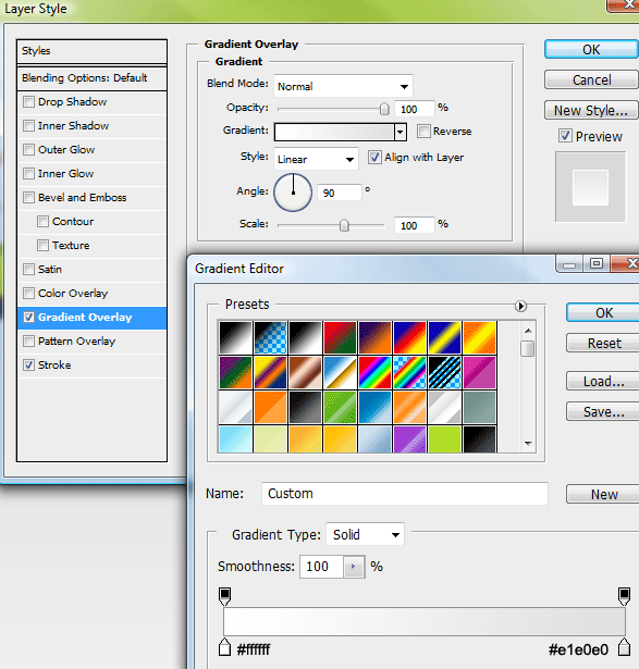
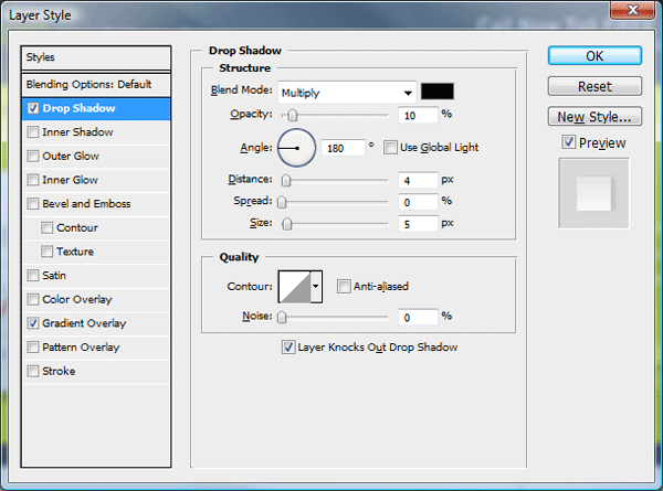
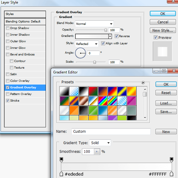
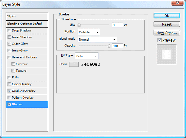
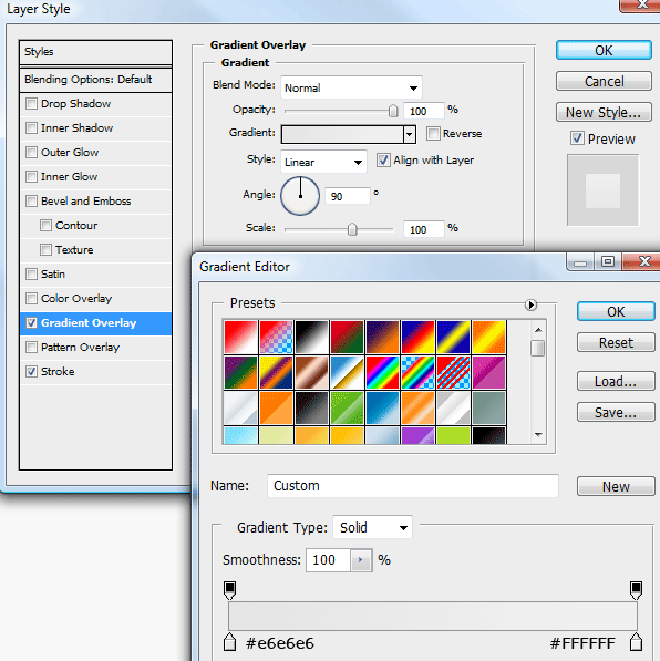
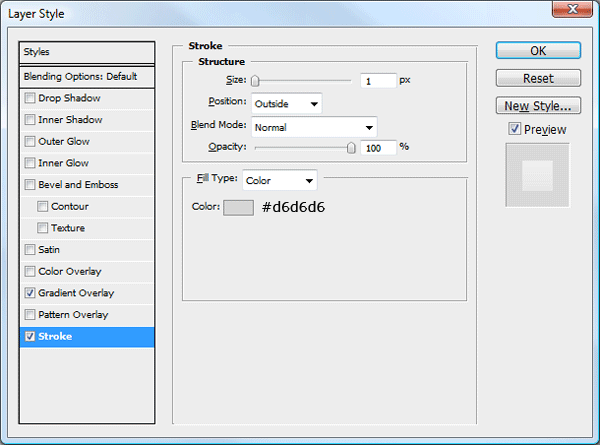
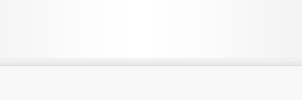
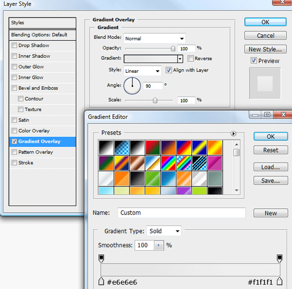
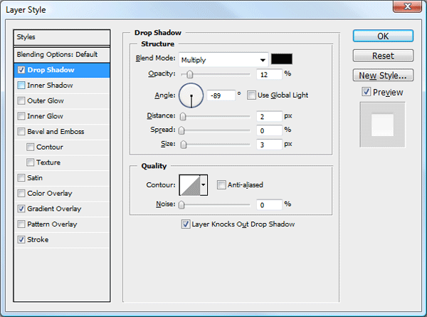
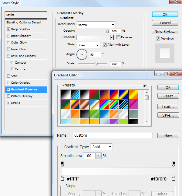
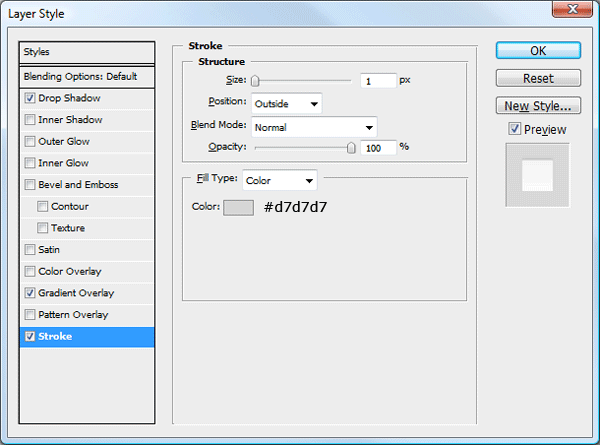
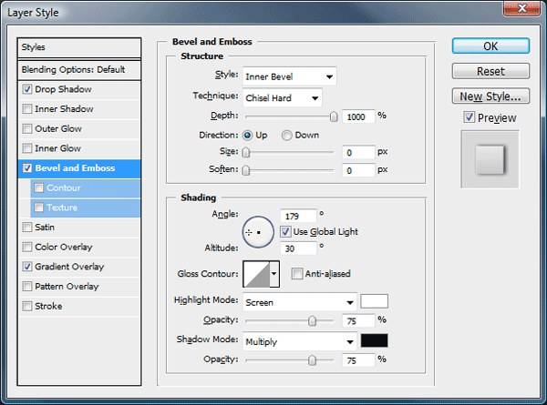
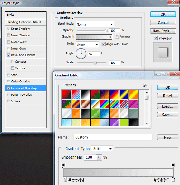
Duplicate your background layer then add these layer styles.

Step2

Step3

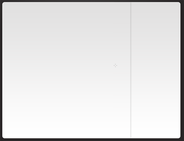
With your duplicated layer selected press CTRL + T to go into free transform mode, go to the bottom middle anchor point and drag it up about 100 pixels.

Step4

Creating The Footer

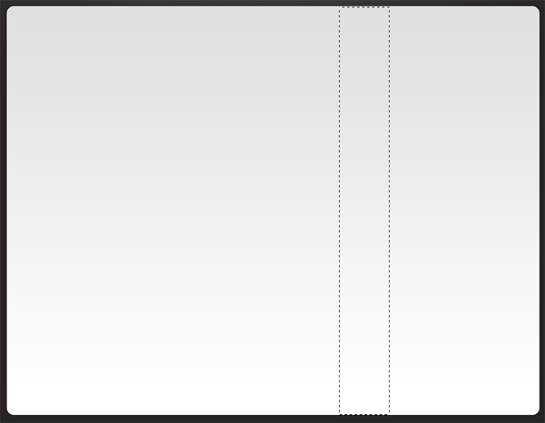
Underneath your duplicated background layer create a new layer called footer, select the rectangular marquee tool and make a selection covering the area which is now visible from where we resized the background.

portfolio layout 11 step5

Fill the selection with any color. Select the colors #0b0b0b and #222222 then with the gradient tool using a radial gradient, drag from the center towards either the left or the right of the canvas.

Step6

Create another new layer this time above your footer layer, select the elliptical marquee tool and make a selection like the image below.

Step7

Fill the selection with the color black (#000000). Now apply a guassian blur by going to “filter > blur > guassian blur”, use the settings below.

Step8

Set the layers opacity to 75% finally you should have something like this.

Step9

Creating The Title

Using the type tool add your website title and slogan too the top of the layout.

Step10

Im using a “Helvetica” style font using the settings below.

Step11

Creating The Navigation Bar

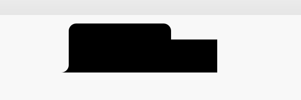
For our navigation were going to use the rounded rectangle tool, the radius of the rounded rectangle can be changed at the very top under the default menu bar. Change the radius to 10px.

Step12

Drag out the navigation shape next to your website title, fill the rounded rectangle with any color.

Step13

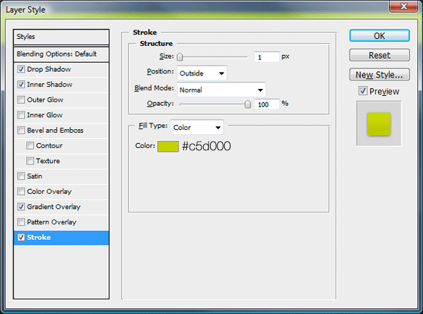
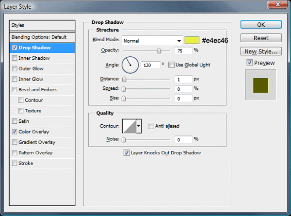
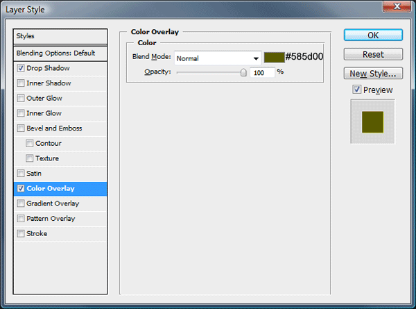
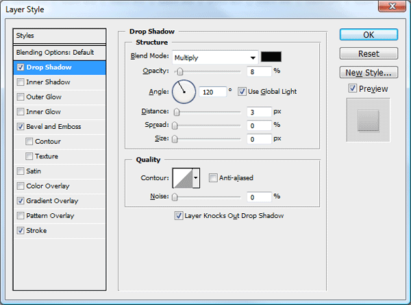
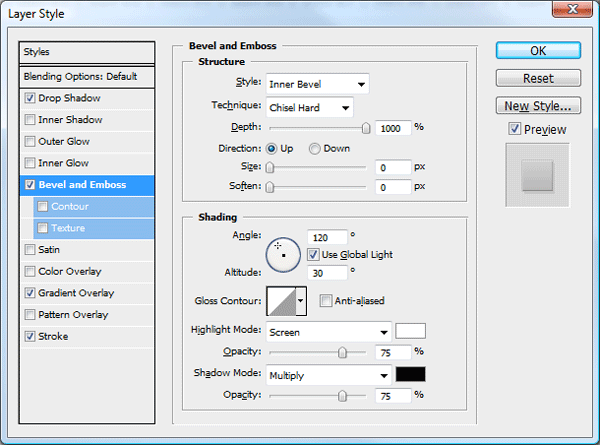
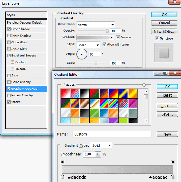
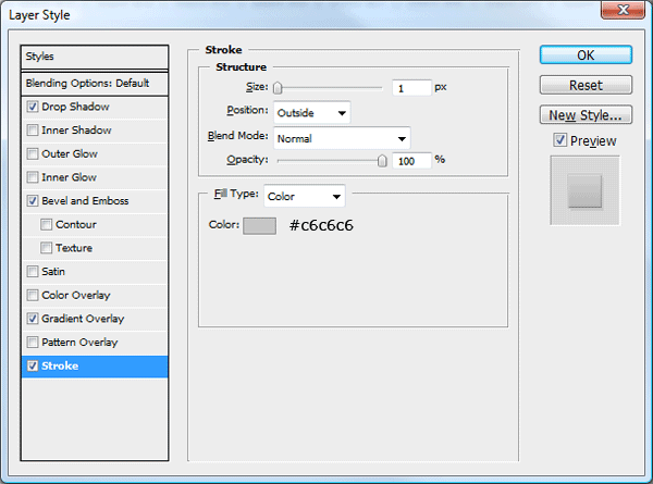
Add these layer styles to your navigation bar.

portfolio layout 11 step11

Step15

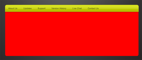
Once you’ve added the layer styles add your navigation links.

Step16

In between each navigation link add a separator using two 1px lines next to each other.

Step17

Make a selection around half of the navigation, fill the selection with the color white.

Step18

Keep the layer selected in which your white rectangle is on, click your navigation layer whilst holding down the CTRL key, this will load a selection around the navigation. Go to “select > inverse” then hit the delete key, set the layers opacity to 8%.

Step19

Creating The Featured Area

In the same way you created the separator lines for the navigation bar, do the same and create one for the featured area.

Step20

Using the rectangular marquee tool create a selection along side the two 1px lines, make sure the selection is the same height as the two lines.

Step21

While the selection is active select your background layer then go to “edit > copy merged”, on a new layer above everything else go to “edit > paste” if the selection is still be active (which it should) the background will be pasted in the same place it was copied from. Create a new layer above the copied background piece, keep the selection active then select the gradient tool with radial gradient. The gradient colors should be set to white – transparent.

Your ads will be inserted here by

AdSense Now!.

Please go to the plugin admin page to paste your ad code.

Step22

Drag the gradient over the background piece on the new blank layer, drag it from the right towards the left. Add a layer mask once your done then drag a linear gradient from the left to right. Make sure the gradient is reset to the default colors. You should have something like this.

Step23

Underneath the background piece layer that we copied, create another layer, using the elliptical marquee tool create a small ellipse.

Step24

Fill the selection with the color black then using the guassian blur filter, blur it by about 2-3px. Set the layers opacity to 75%, then remove any excess shadow from the top and bottom of the two 1px lines. Your looking for this effect.

Step25

Finally if your top and bottom parts don’t blend in like mine do then add a layer mask to the shadow and two 1px lines, drag a reflected gradient from the middle of the elements upwards, for this to work properly you need to set your foreground to white and background to black.

Creating The Featured Buttons

Using the rectangular marquee tool create 4 rectangular buttons, slot each one into the featured area, make sure all the layers are underneath the featured area layers that we created a few steps ago.

Step26

For the first button add these layer styles.

Step27

Step28

Step29

Step30

For the rest of the buttons add these layer styles

Step27

Step28

Step31

Step30

Creating The Featured Image

Next to the featured buttons on the left create a black rectangle by using the rectangular marquee tool.

Step32

Once you’ve made the rectangle go to “edit > transform > warp”. When the warp option is selected there should be a button at the top which says “custom” change this to “bulge”.

Step33

Once bulge is selected you’ll be able to change the amount the rectangle bulges out by. Change the bend to 15.

Step34

Press the enter key to apply the changes. Load the selection around the bulged rectangle by either clicking its layer whilst holding down the CTRL key or by going to “select > load selection”. Once you’ve loaded the selection go to “select > modify > contract”, contract the selection by 15px. Once the contraction has been applied hit the delete key and apply this outer glow.

Step35

You should have something like this.

Step36

Finally add your featured image inside the featured image frame, to the right of the featured image part add your featured content text.

Step37

Directly underneath your featured image, using the elliptical marquee tool make a selection like the image below.

Step38

Fill the selection with black then add a guassian blur of about 2-3pixels, finally set the opacity to around 45% Your end result should be something like this.

Step39

The Content Area

The hardest part of the layout has been completed, the content area is a little too easy as its just text. Using a combination of white and black text, black for headings and white for paragraphs assemble something like the image below. The icons are from a free set on smashing magazine.

Step40

Dont forget to add your footer text in the footer area.

Step41

The Finished Layout

Finished

Thanks for reading, looking forward to your comments.


Enjoy

Your ads will be inserted here by

AdSense Now!.

Please go to the plugin admin page to paste your ad code.

Dual Windows With Photoshop

Your ads will be inserted here by

AdSense Now!.

Please go to the plugin admin page to paste your ad code.

In this quick article i’l be showing you how to maximize your work space when working on more than one piece of artwork within photoshop.


If your the kind of person who likes spending time retouching photo’s or creating wacky photo manipulations you will know how annoying it is when you have to keep zooming in and out to check on your progress.

Wouldn’t it be nice if you could work on one photo zoomed in at 500%, yet still see the result at 100%. Well you actually can, and il show you how.

Open Up Your Document

In photoshop i’ve opened up an image of charlize theron (just for this example).

Step1

Duplicating The Window

Now we have our image open lets duplicate the window, to do this we need to go to “window” in the menu bar.

Step2

Go to “arrange” then at the bottom click “new window for “file name here”.

Step3

Providing your document window is not maximized you should have two windows. If it is maximized just restore it down.

Step4

Tiling The Document Window

Your ads will be inserted here by

AdSense Now!.

Please go to the plugin admin page to paste your ad code.

If you head back into the “window” options under the arrange tab you have two options for tiling the document windows, horizontally and vertically.

Step5

Tiling Vertically

If you click “tile vertically” your windows will be displayed like this.

Step6

Tiling Horizontally

If you click “tile horizontally” your windows will be displayed like this.

Step7

Free Too Zoom

Each window can be zoomed and edited differently but the overall result will be applied to whole image. For example if i were to change her eye color.

Step8

The changes are made in the top window and its updated in the bottom window, notice the zoom levels of each window. If you would like the zoom level to be the same in both windows you can simply go to “window > arrange > match zoom level”.

Step9

You can also match the windows location by going to “window > arrange > match location”, there is also an option to do both at the same time by clicking “match zoom and location”.

Step10

Additional Notes

For those using photoshop CS4 i do believe there may be more options to choose from and more views to choose from, more than likely any photoshop version under cs3 will be the same as this article.

Your ads will be inserted here by

AdSense Now!.

Please go to the plugin admin page to paste your ad code.

Software Layout #4

Your ads will be inserted here by

AdSense Now!.

Please go to the plugin admin page to paste your ad code.

Hello welcome to tutorial 216 by hv-designs, in this tutorial il show you how to create a sleek looking software layout, currently the 4th software layout in our database.


Setting Up Our Canvas

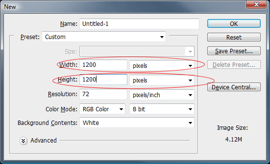
Open up photoshop and create a new document, the dimensions should be 1200 x 1200 pixels.

Step1

The background can be any color as we’ll be changing it in the next step.

Creating Our Background

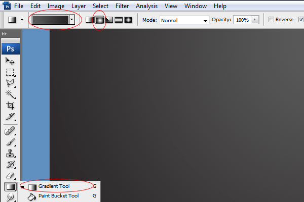
Set your forground color to #585858 and your background color to #282425. Select the gradient tool with a radial gradient.

Step2

Once you’ve selected your radial gradient drag out the gradient starting from the top middle part of the canvas dragging down towards the middle of the canvas.

Step3

Creating The Website Title

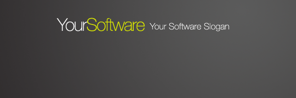
Using the colors white #ffffff and the color green #d7e400 add your website title and slogan.

Step4

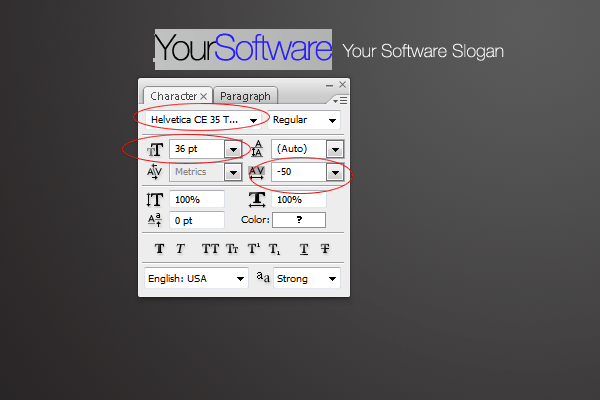
The font i used and settings are located in the screenshot below.

Step5

On the right side of the title add your simple support toll free number.

Step6

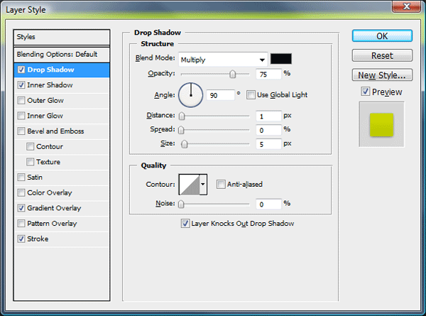
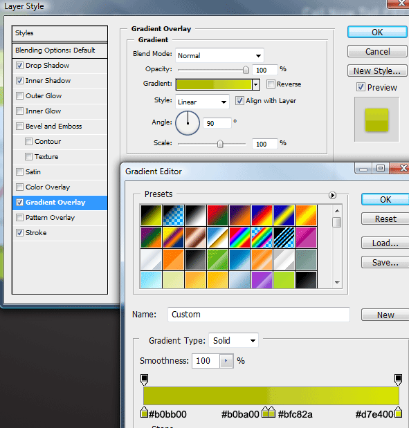
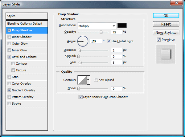
The layer styles used for the free toll number are as follows.

Step7

Step8

Step9

The text should now be transformed into something like below..

Step10

Creating The Navigation

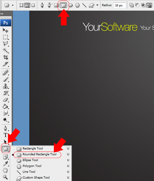
Select the rounded rectangle tool with a radius of 10px.

Step11

Drag out a rectangle underneath your website title, fill the rectangle with any color.

Step12

Zoom into one of the bottom corners of the rounded rectangle, select the rectangular marquee tool and create a selection cornering off the bottom corner.

Step13

Fill the selection on the same layer then do the same to the other bottom corner. The end result should be something like this.

Step14

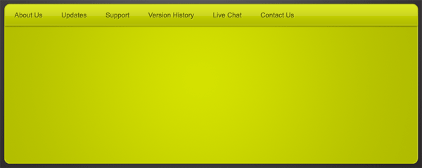
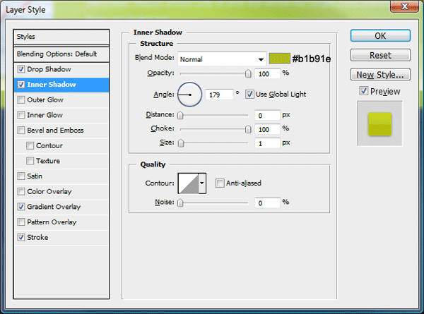
Now add these layer styles to your navigation.

Step15

Step16

Step31

Step18

You should have something like this.

Step19

Adding The Navigation Links

Add your navigation links over the top of your navigation bar using the type tool. Ive opted for a simple arial font for the navigation text.

Step20

Once you’ve added the text add these layer styles.

Step21

Step22

Creating The Software Summary Box

With the rounded rectangle tool on a layer underneath your navigation layer create a big rectangle. The rectangle itself should be the same width of the navigation and the top corners should be hidden underneath the navigation.

Step23

Now you’ve created the rectangle select the gradient tool with a radial gradient. Using the colors #d3df00 and #b4c00a add a radial gradient over your rectangle in the same way we did our background.

Your ads will be inserted here by

AdSense Now!.

Please go to the plugin admin page to paste your ad code.

Step24

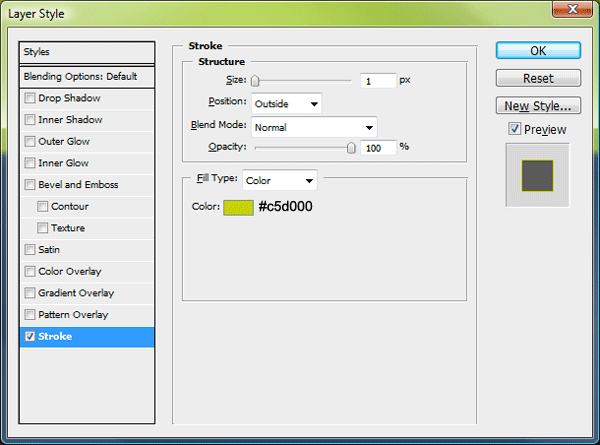
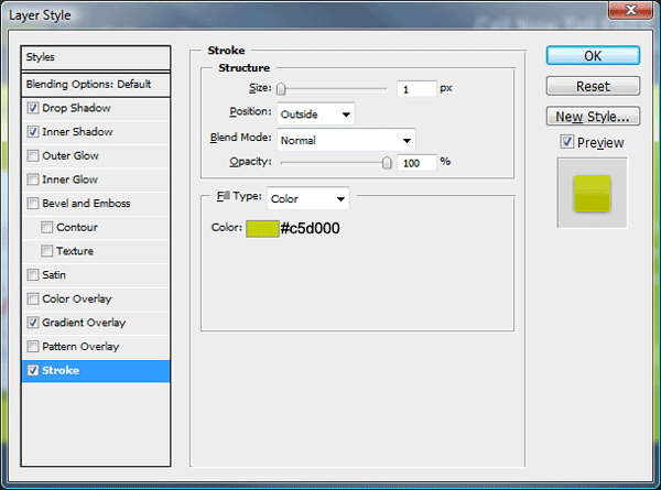
Now add this stroke layer style to complete this step.

Step25

Software Summary Box Content

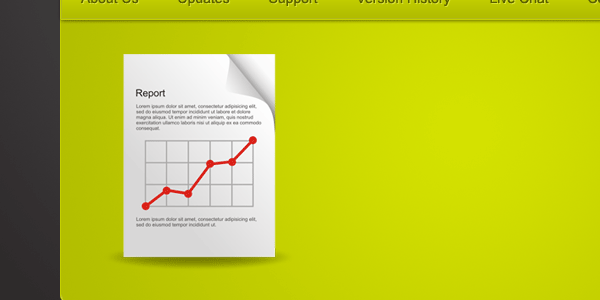
On the left side of the software summary box add an image of your software or a logo. As i dont have any software to feature ive used a report icon from smashing magazines free icon set.

Step26

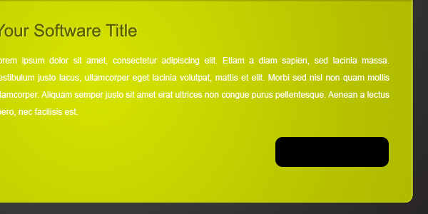
Next to the icon add a title with a paragraph.

Step27

To the title add these layer styles.

Step21

Step22

Creating The Try Now Button

Using the rounded rectangle tool still with a radius of 10px, create a small rectangle, Fill the rectangle with any color.

Step28

Now add these layer styles to your button.

Step29

Step30

Step31

Step32

Add your button text then add these layer styles.

Step21

Step22

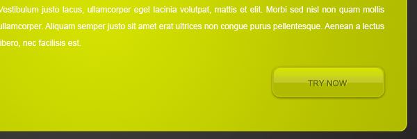
You should have something like this.

Step33

Creating The Content Area

Using the rounded rectangle tool create a big rectangle underneath the summary box. The box should be the same width.

Step34

Add these layer styles to your big rectangle.

Step35

Step36

Creating The Sidebar

Using the rectangular marquee tool make a selection the same height as the content area and any width.

Step37

Once you’ve made the selection fill the selection with any color then add the same gradient overlay as the content area.

Step35

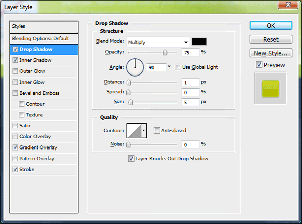
Now add this drop shadow.

Step38

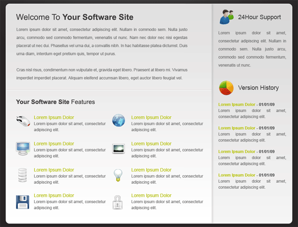
You should have something like this.

Step39

With the rectangular marquee tool again create a black square which covers the sidebar area. The layer should be underneath the other rectangle layer which contains the drop shadow which makes up the sidebar.

Step40

Set the black rectangles layer opacity to 4%. This just adds a darker shade to the sidebar area.

The Content

Your layout is now ready for its content. Using a combination of headers and paragraphs to build up your content area. Ive included some icons from “wefunction” just to spruce it up abit.

Step41

The Footer

For this design i opted for a simple text footer.

Step42

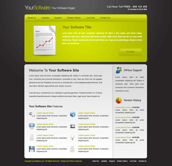
The Finished Layout

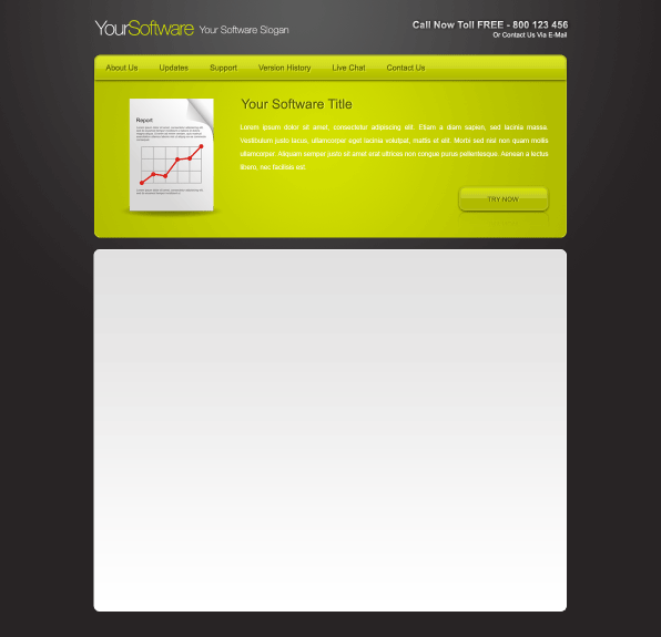
Finished


Enjoy

Your ads will be inserted here by

AdSense Now!.

Please go to the plugin admin page to paste your ad code.

Glue Stick

Your ads will be inserted here by

AdSense Now!.

Please go to the plugin admin page to paste your ad code.

Good evening welcome to another tutorial by hv-designs, in this tutorial we’ll be making a glue stick from scratch. I’ll be demonstrating just how easy it is to create simple objects. You can also download the PSD for freee.!


Setting Up Our Work Area

Lets create a new document 600 x 600 pixels, if you prefer you can make it bigger.

Step1

Fill your background with any color, ive opted for a simple grey color.

The Glue Stick

Select the eliptical marquee tool or the circle tool, which ever one you prefer, make a simple oval elipse on the left hand side of the canvas. Fill the elipse with any color for now.

Step2

Once you’ve filled with a color add these layer styles.

Step3

Step4

You should have something like this.

Step5

Create a new layer under the shape you just created. select the rectangle tool and make a selection like the image below.

Step6

Fill the selection with any color.

Step7

Duplicate your elipse layer, then right-click the duplicated layer and go to “clear layer styles”. Add a color overlay, use the same color as you did for the square. Move the elipse across to the end of the square.

Step8

Merge the square layer and the duplicated eclipse layer into one layer, you may need to hide all your other layers and go to “layer > merge visable” sometimes when just pressing ctrl + e the layer styles remain, which we dont want. Once you’ve merged the layers you should be left with one layer, make sure its underneath your first eclipse layer then add these layer styles.

Step9

Step10

You should have something like this.

Step11

Duplicate the lid body, then drag the duplicated layer underneath its orginal. Move the duplicated item across a couple of pixels to the right.

Step12

Your ads will be inserted here by

AdSense Now!.

Please go to the plugin admin page to paste your ad code.

Once again duplicate the lid body and drag the layer underneath its orginal, right-click the layer and go to “clear layer styles”. Add a black color overlay then move the object to the right.

Step13

Using the rectangular marquee tool make a selection along the left side edge. Press “ctrl + t” to free transform the object, drag the left middle anchor point all the way over to the left so it meets the glue stick lid.

Step14

The result…

Step15

More Duplicating…

Duplicate your lid body again then drag it underneath the glue stick body. Move the duplicated object to the end of the body so theres a little bit of it sticking out.

Step16

This time duplicate the glue stick body (the black object) Move the layer to the bottom of the stack then move that over a couple of pixels.

Step17

Finally duplicate the glue stick lid, drag it to the bottom of the stack then move it over quite alot so it sticks out alot.

Step18

Adding The Bottom Ridges

Using the rectangular marquee tool create two 1 pixel lines on top of each other from one end of the glue stick bottom to the other. Fill the first line with the color #DDDDDD and the other with #FFFFFF. Similar to the indented lines we make on some of hv-designs web layouts. Duplicate the line and as many times as needed moving each line down a couple of times. Merge all your lines together as one layer then add a layer mask. Using a reflected gradient start from the middle of the lines and drag outwards either left or right.

Step19

The result…

Step20

Glue Stick Highlight

Make a selection across the middle of the glue stick body.

Step21

Fill the selection with the color white and set the layer’s opacity to 20%. Now go to “filter > blur > guassian blur”.

Step22

All done you should now have something like this.

Step23

Adding Additional Elements

By adding a few simple elements you can bring your glue stick to life abit more.

Step24

How about different colors?

Step25

Your ads will be inserted here by

AdSense Now!.

Please go to the plugin admin page to paste your ad code.

Web Design Layout #10

Your ads will be inserted here by

AdSense Now!.

Please go to the plugin admin page to paste your ad code.

In this tutorial il be showing you how to create a sleek looking web design layout from scratch. The design itself will have a simplistic metal feel, with the use of alot of grey color(s).


Right lets get started!

Creating Our Document

We’ll start off with a new document, with the dimensions 1000 x 1000 pixels.

Step1

Creating Our Background

Once you’ve created your new document, fill your background using the paint tool with the color #EEEEEE. Go to “filter > noise > add noise”, use the settings below.

Step2

Creating Our Navigation

Select the rectangular marquee tool and make a selection across the top of your canvas, the height of the selection should be about 68 – 70 pixels in height but must span the width of the canvas.

Step3

Fill your selection with any color then add these layer styles.

Step4

Step5

Step6

You should have something like this.

Step7

Underneath the stroke on the navigation, create a 1pixel line spanning the width of the canvas. Fill the selection with white.

Step8

On top of your navigation add your dummy text links.

Step9

Ive left one of the links in a different color, this one will be my hover state. Using the rectangular marquee tool make a selection around your first link.

Step10

Fill your selection on a layer underneath your navigation text. Fill the selection with any color. Now add these layer styles.

Step11

Step12

You should have something like this.

Step13

Were now going to make some seperators to seperate our nav links. Using the rectangular marquee tool create two 1 pixel lines next to each other.

Step14

You should have something like this.

Step15

In the empty space which is left on the right hand side, you can fill it in with a search form.

Step16

The go button use the same layer styles as our hover button.

Our Website Title & Featured Area

Using the rectangular marquee tool make a big selection underneath everything you’ve made so far.

Your ads will be inserted here by

AdSense Now!.

Please go to the plugin admin page to paste your ad code.

Step17

Fill the selection with any color then add these layer styles.

Step18

Step19

Underneath the stroke add a white line like we did on our navigation.

Step20

Underneath our navigation add your website title. Ive used two different colors for the title, the font ive used is a star wars jedi font. Ive also added this drop shadow.

Step21

This is how mine looks.

Step22

Underneath your website title add a featured image to use in your featured area.

Step23

Once you’ve added your image, select its layer whilst holding down the CTRL key, this will load the images selection. Go to “select > modify > expand”. Expand the selection by 10 pixels.

Step24

Create a new layer underneath your featured image then fill the selection with white. Add a subtle stroke to the white rectangle. On the right hand side add a simple title and description.

Step25

Creating Our Content Area

Select the rounded rectangle tool with a radius of 30px.

Step26

Create a rectangle underneath your featured area.

Step27

Fill the rectangle with any color then add these layer styles.

Step28

Step29

Step30

You should have something like this.

Step31

Duplicate your rectangle 2 more times and place them underneath one another.

Step32

Inside your rectangles add some dummy content, im using some icons from smashing magazine with some simple lorem ipsum text. On the right side of the rectangles add a bigger one using the same styles.

Step33

Creating The Footer

Select the rounded rectangle again with a radius of 30px create a rectangle underneath your content boxes. Add the same layer styles as the rectangles in the steps above.

Step34

Add your footer content to the footer to finish off your layout. Your final layout should look something like this.

Step35

Learn To Code This Layout

You can learn to code this layout into a working CSS template by following the follow-up tutorial HERE.

Your ads will be inserted here by

AdSense Now!.

Please go to the plugin admin page to paste your ad code.

Dark Layout #2

Your ads will be inserted here by

AdSense Now!.

Please go to the plugin admin page to paste your ad code.

Welcome to tutorial 209, in this tutorial we’ll be creating a dark layout with some nice unique styling. We’ll also be making our very own custom patterns to go with the layout.


Lets get started, create a new document 950 x 1065 pixels.

Step1

Fill your background layer with the color black, then create a new document 10 pixels by 10 pixels. Select the color black with the pencil tool, with a 1 pixel size brush create something like this.

Step2

Once you have the same as the image above goto “edit > define pattern” label the pattern any thing you want. Go back to your orginal canvas and with the rectangular marquee tool make a selection at the top of your canvas, the selection should be the width of your canvas and about 170 pixels in height.

Step3

Once you’ve made the selection select the paint bucket tool, change the options in the panel at the top from “foreground” to pattern, then click the little arrow and select your pattern.

Step4

Fill your selection with the pattern, at first you won’t see nothing as the pattern is in black. When your not doing this tutorial and you want to use the pattern you’ll need to add a color overlay. But for this tutorial add the layer styles below.

Step5

You should have something like this.

Step6

Add a layer mask to your pattern layer, then select the gradient tool with a reflected gradient. Set your foreground color to white and background to black starting from the middle of your rectangle drag the reflected gradient to the edge of the canvas.

Step7

Select the type tool and add your website title and slogan. You should have something like this.

Step8

The settings i used for my website title text are shown below.

Step9

Using the rectangular marquee tool make a selection at the very top of your header area. The selection should span across the whole canvas and be about 12 pixels in height.

Step10

Fill your selection with any color then add these layer styles.

Step11

Step12

Step13

Still with the rectangular marquee create a small rectangle on the right side of the header.

Step14

Fill the selection with the color black then add this layer style.

Step15

Next to the rectangle add a small square the same height as the rectangle you just created, fill the square with any color than add these layer styles.

Step16

Step13

Your dummy search form should now be complete, label your search form and button. You should have something like this.

Step17

Were now going to make the navigation bar, select the rectangular marquee tool and create a selection underneath the your patterned header.

Step18

Fill the selection with any color than add these layer styles.

Step19

Your ads will be inserted here by

AdSense Now!.

Please go to the plugin admin page to paste your ad code.

Step20

Step21

Once you’ve added the layer styles select your desired cutting tool and cutaway 50 pixels off both ends of the navigation, you should have something like this.

Step22

On a new layer above your navigation fill in the gaps on either side where the drop shadow is missing.

Step23

Once you’ve fill both ends of the navigation create two rectangles where you deleted it from the navigation. Make the first rectangle the same height of the navigation (not including the drop shadow), create the other rectangle the same height as the drop shadow. The first rectangle should be in the color #333333 and the 2nd in the color #1b1b1b. You should have something like this.

Step24

Repeat the steps above for both sides of the navigation bar. Now label your navigation bar with some dummy links.

Step25

Inbetween each navigation link add a seperator using two 1 pixel lines next to each other. Either use the rectangular marquee tool or pen tool to create the seperators.

Step26

You should have something like this.

Step27

For this next part we need to make another custom pattern, create a new document 4 pixels by 4 pixels, using the color black and a 1 pixel brush size, create the image below.

Step28

Goto “edit > define pattern” then save it as what ever you want. Make a selection underneath your navigation bar using the rectangular marquee tool, select all the rest of the canvas, then fill the selection with your new pattern. Add a layer mask to your pattern then drag a radial gradient from the middle underneath the navigation, to the end of the canvas. Make sure your foreground is set to white and background set to black.

Step29

Once the radial gradient has been added you should have something like this.

Step30

Select the elliptical marquee tool and create a small circle on the left side of your canvas, inline with all your other elements.

Step31

Add these layer styles to your ellipse so it matches the image above.

Step32

Inside the ellipse add a arrow pointing to the left. Once you’ve added your arrow duplicate both layers then flip the layers horizontally by going to “edit > transform > flip horizontal”. Place the duplicated layers on the right side of the canvas inline with the orginal.

Step33

Using the rounded rectangle tool with a radius of 15 pixels draw out a rectangle. Goto “edit > free transform” and rotate the rounded rectangle slightly either left or right.

Step34

The rectangle has had a 3 pixel stroke added, with a subtle gradient overlay. We now need to duplicate the layer and rotate it again in the opposite direction you rotated the first rectangle. Inside the rectangle thats ontop add a “featured image”, next to the image/rectangles add a simple paragraph.

Step35

Still with the rounded rectangle create two more rectangles underneath your featured area, these rectangles are for our sidebar and main content. Fill the rectangles with the color #0a0a0a then add a 1 pixel stroke using the color #181818.

Step36

Inside the rectangles add your dummy content.

Step37

Finally duplicate your navigation bar and the left and right navigation ends. Drag them to the bottom of the canvas and add your footer information.

Step38

Only completion of the footer you should have yourself a nice template, here’s my result.

Finished Result

Hope you enjoyed this tutorial, next time we’ll be converting this template into a 1 page css template. Dont forget to subscribe via our rss feeds and twitter. Your help and support is much appreciated.

Learn To Code This Layout

You can learn to code this layout into a working CSS template by following the follow-up tutorial HERE.

Your ads will be inserted here by

AdSense Now!.

Please go to the plugin admin page to paste your ad code.

Can Ad Manipulation

Your ads will be inserted here by

AdSense Now!.

Please go to the plugin admin page to paste your ad code.

Hello welcome to another by hv-designs, in this tutorial we’ll be creating an advertisment manipulation for a soda drink.


The artwork itself is inspired by “Maxime Quoilin“, be sure to check out his portfolio he has some fantastic work. Right lets get started, create a new photoshop document your desired size, im using 800×600 pixels for the purpose of this tutorial. Set the color #008cda as your forground and the color #06446d as your background, select the gradient tool and a radial gradient. Starting from the middle of your canvas drag towards one of the edges either left or right, top or bottom. You should have something like this.

Step1

Using the elliptical marquee tool create a white ellipse at the bottom.

Step2

With the rectangular marquee tool create a rectangle on top of the ellipse.

Step3

Fill the rectangle with the color on the same layer as the ellipse, you should have something like this.

Step4

Add these layer styles to your shape.

Step5

You should have something like this.

Step6

Duplicate your can shape and move it upwards about 2-4 pixels. Leave the gradient overlay style on but add these two additional styles.

Step7

Step8

You should now have something like this.

Step9

Duplicate the duplicate of the layer you just duplicated, right click the layer and goto clear layer styles. Now add a black overlay and move the shape up 1-2 pixels. Select the rectangular marquee tool and make a selection like this.

Step10

Once you’ve made the selection hit the delete key, you should be left with this.

Step11

Duplicate your shape once more and move up again about 1-2 pixels, once moved add these layer styles.

Step12

Your ads will be inserted here by

AdSense Now!.

Please go to the plugin admin page to paste your ad code.

Step13

You should now have something like this.

Step14

Using the rectangular marquee tool create a selection over half of the can.

Step15

Select the gradient tool with a linear gradient, drag a white to transparent gradient over the can. Set the layer opacity to about 5%, Click the blue can layer whilst holding down the CTRL key on the keyboard, make sure the white gradient is selected then goto “edit > inverse” then hit the delete key. You should have something like this.

Step16

Still with the rectangular marquee tool make a selection like the image below.

Step17

Fill the selection with the color white then set layer opacity to 5%. Add a layer mask then drag a linear gradient from bottom towards the top. Your looking to get this effect.

Step18

Still with the gradient tool, only this time with a radial gradient. Select the color black to transparent, on a layer underneath everything, but above the background layer. Start from the middle of the canvas and drag towards one of the edges on the canvas. Alter the perspective of the radial gradient then drag underneath the can, your looking for this effect.

Step19

Select your desired cutting tool, on the very top of the can make a curvey cut like the image below. Personnally i think the pen tool works best.

Step20

For this next part your going to need this stock image. http://www.sxc.hu/photo/1053211 Cut away the background and begin to place the water splash inside the can. Set the splash layer opacity to 80% and blend mode to screen.

Step21

Duplicate and flip the splash image then change opacity to 100%, place the duplicated splash image on the other side of the can, you can remove bits of the water from the splash image so both sides dont look equally the same.

Step22

Continue duplicated, flipping and cutting the water untill you have something like this.

Step23

Behind some of the splash images add some little fish, ive also opted to add a shark also.

Step24

Finally label your drinks can with your brand of soda pop/water. You can adjust the label on the can by using the warp tool located in the “edit menu”. The final result should look something like this.

finished

All done, hope you enjoyed this tutorial. Dont forget to subscribe via RSS and twitter. Thanks for your support.

Your ads will be inserted here by

AdSense Now!.

Please go to the plugin admin page to paste your ad code.

Shopping Cart Design Mockup

Your ads will be inserted here by

AdSense Now!.

Please go to the plugin admin page to paste your ad code.
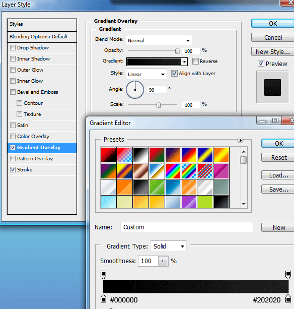
Welcome to another tutorial at hv-designs, today we’ll be mocking up a shopping cart design called shop smart.


To start were going to need a fairly big canvas, create a new document 950 x 1100 fill your background layer with the color #f8f8f8. Select the rectangular marquee tool then create a rectangle at the top of your canvas. The rectangle should be the width of your canvas and about 120pixels in height.

Step 1

Add these layer styles to the rectangle to complete the effect.

Step 2

Step 3

Underneath the stroke on the rectangle create a 1 pixel line all the way across the canvas.

Step 4

Underneath the white line create another rectangle but on a much smaller scale. Fill the rectangle with any color.

Step 5

Once created add these layer styles.

Step 6

Step 7

You should have something like this.

Step 8

With the rectangular marquee tool once again create another rectangle underneath the one you just created, the rectangle should be the width of your canvas and about 65pixels in height. Fill the rectangle with any color then add this gradient overlay.

Step 9

You should have something like this.

Step 10

Now select the rounded rectangle tool and create a rectangle any where on your canvas. Ive used a radius of 15pixels for my rectangle, this will give the rectangle some nice rounded corners.

Step 11

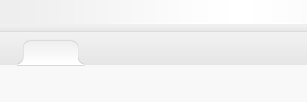
Duplicate your rectangle, then hide the layer, we’ll use this spare rectangle in a minute to make our tab’s. Select the rectangular marquee tool and create a rectangle over the top of the bottom of the rounded rectangle. Fill the selection on the same layer.

Step 12

Unhide your duplicated rectangle then add a color overlay in any color, place the duplicated rectangle next to its orginal.

Step 13

Select your duplicated layer whilst holding down the CTRL key on the keyboard. Make sure the orginal layer is still selected in the layers window. Hit the delete key then hide your duplicated rectangle. Should have something like this.

Step 14

Do the same with the other side, hopefully if done correctly you should have a tab shaped rectangle. You can resize to how ever big you want using “CTRL + T”. Add these layers to your tab shape.

Step 15

Step 16

Step 17

Place the tabbed button onto the latest rectangle you created.

Step 18

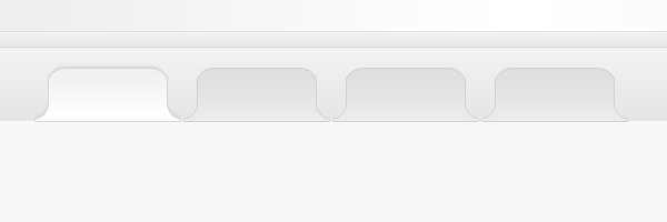
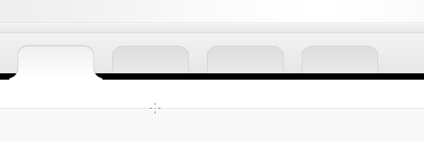
Duplicate your tab as many as needed, change the color of the duplicated ones to something darker and remove the drop shadow from the layer styles.

Step 19

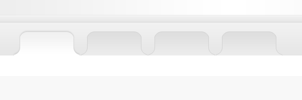
Underneath the tabs add a white rectangle, overlap the tab’s by 1 pixel, which should hide the stroke at the bottom of the tabs.

Step 20

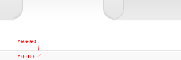
At the bottom of the white rectangle add two 1 pixel lines on top of each.

Step 21

Your ads will be inserted here by

AdSense Now!.

Please go to the plugin admin page to paste your ad code.

Using the rectangular marquee tool create a black rectangle over the darkest tab’s but underneath the first tab.

Step 22

Make sure the black rectangle spans the whole width of the canvas. Set the black rectangles opacity to about 2%.

Step 23

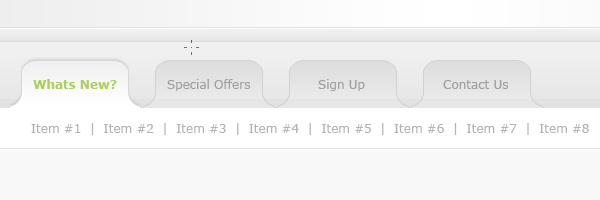
You can now label your tabbed area, in the white area underneath add a second navigation.

Step 24

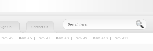
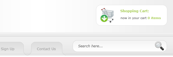
In the space ive left on the right side of the tabbed navigation ive added a simple search field, which looks like this.

Step 25

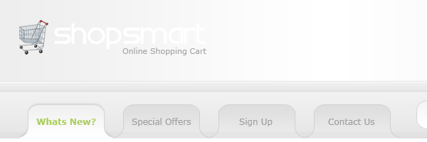
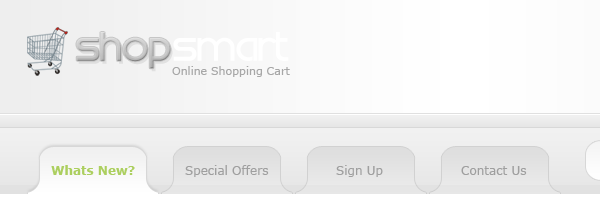
In the header part of the layout add your website title and slogan.

Step 26

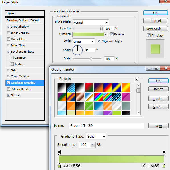
On the website title ive got two words, shop and smart. To the first word im going to add some layer styles.

Step 27

Step 28

Step 29

Step 30

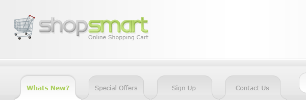
The title now looks like this.

Step 31

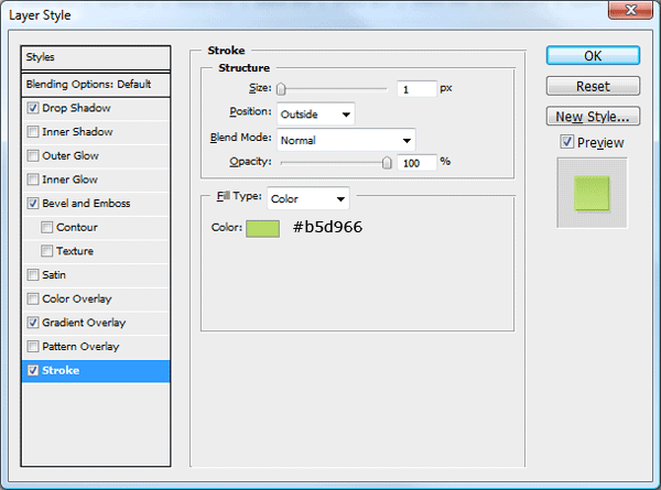
To the second word “shop” im going to add exactly the same styles part from the gradient overlay and stroke will change.

Step 32

Step 33

You should have something like this.

Step 34

On the right side of the website title, add a simple shopping basket area. Ive used the rounded rectangle tool and an icon from dryicons.

Step 35

were now going to create our shopping content boxes. Using the rounded rectangle tool draw out a rectangle on the left. Add a dark grey stroke to the rectangle.

Step 36

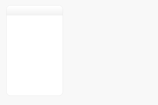
Over the top of the rectangle add a dark area for our content box title. Using a subtle gradient.

Step 37

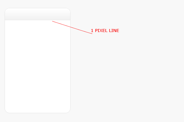
Where the bottom of the dark area ends add a 1 pixel line same color as your stroke.

Step 38

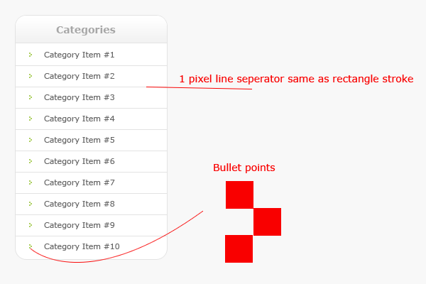
Inside your rectangle add a list of items with some nice bullet points, divide each item in the list with a seperator.

Step 39

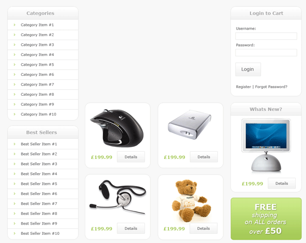
Using the methods mentioned above create more content boxes and product items, here is what ive came up with. Ive left a space at the top in the middle for some featured items.

Step 40

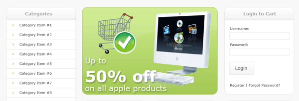
As mentioned above the space in the middle is for out featured items. Continuing with the theme, im going to use a greenish colored rounded rectangle. Similar colors to our website title. Inside the box add some simple featured items.

Step 41

Finally for the footer i duplicated our header, resized it in height, then added some simple footer information.

Step 42

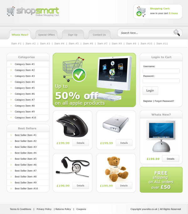
Your final product should look something like this.

Finished

All done hope you enjoyed this tutorial, dont forget to subscribe via RSS and twitter, your help and support is much appreciated.

Your ads will be inserted here by

AdSense Now!.

Please go to the plugin admin page to paste your ad code.

Design Showcase Layout

Your ads will be inserted here by

AdSense Now!.

Please go to the plugin admin page to paste your ad code.

Good evening everybody, in todays tutorial we’ll be creating a design showcase style layout. The design would/could be used to showcase inspirational websites, gallerys, etc…


To get started you first need to create a new document 900×1210.

Step1

Set the color white as your forground and the color #cdd3d8 as your background. Select the gradient tool with a radial gradient, start from the top middle of the canvas and drag down towards the middle of the canvas.

Step2

Using the type tool add your website title in the top left hand corner.

Step3

Add these layer styles to your website title text.

Step4

Step5

Step6

Select the rounded rectangle tool with a radius of 15 pixels.

Step7

Draw out a rectangle 845 pixels wide and 50 pixels in height, fill the rectangle with any color.

Step8

Add these layer styles to your rounded rectangle.

Step9

Step10

Step11

You should have something like this.

Step12

Add your navigation links to your navigation bar, also add a short navigation at the top of your navigation bar.

Step13

Add this drop shadow to all your navigation links.

Step14

If theres any space left on on your navigation bar, add a search field using the rounded rectangle tool with a radius of 15 pixels, you could also add a search icon to complete the look. Ive used the search icon from the wefunction free icon pack.

Step15

Still with the rounded rectangle tool create a bigger rectangle but keep the width the same as the navigation bar. Dont fill the rectangle with a solid color instead fill it with a radial gradient in the same way you did your background.

Step16

Add these layer styles to your big rectangle to complete the effect.

Step17

Step18

Your ads will be inserted here by

AdSense Now!.

Please go to the plugin admin page to paste your ad code.

The big rectangle will be our featured area, inside the featured area create a smaller rectangle on the left-hand side. Fill the rectangle with any color.

Step19

Once you’ve created your rectangle add these layer styles.

Step20

Step21

Step22

Step23

Inside your smaller rectangle in your featured area add an example featured image with some dummy text on the right.

Step24

Underneath your dummy text add two small buttons, create the buttons using the rounded rectangle tool. Fill the rectangles with any color.

Step25

Add these layer styles to each button to complete the effect.

Step26

Step27

Step28

Your featured area should look something like this.

Step29

Underneath your featured area create a smaller version of your featured image.

Step30

Add a title of inspiration above your image, underneath your image add some icons sort of like a rating system, ive chosen to use some hearts.

Step31

Repeat the process many times as needed.

Step32

Inbetween each peice of inspiration add a seperator, using the rectangular marquee tool create two 1 pixel lines ontop of each other. Fill the line at the bottom with the color #dee4eb and the one ontop #b1b7bc.

Step33

Underneath the very last item of inspiration add i sort of pagination then duplicate your navigation bar and drag to the bottom of the canvas.

Step34

Add your footer information to your footer.

Step35

When you’ve finished you should have something like this.

Finished


Enjoy.


Your ads will be inserted here by

AdSense Now!.

Please go to the plugin admin page to paste your ad code.

Games Layout #6

Your ads will be inserted here by

AdSense Now!.

Please go to the plugin admin page to paste your ad code.

Hello, welcome to tutorial 204, in this tutorial we’ll be creating a gaming layout with sort of metal feeling to it. We’ll be using simple indented lines and dots to make some parts look like metal panels with rivets.


Start up photoshop and create a new document 1000 x 1200 pixels. With the paint bucket tool fill your background with the color #e6e6e6.

Step1

Select the rectangular marquee tool and create a rectangle at the top spanning the width of your canvas but only about 30 pixels in height. Fill the rectangle with any color.

Step2

Add these layer styles to complete the step.

Step3

Step4

Using the type tool add some navigation links to the top rectangle, on the right side of the navigation add an RSS icon.

Step5

Inbetween the RSS icon and the actual navigation links add a separator. To make the separator you need to zoom in pretty close, select the rectangular marquee tool then make a line spanning 1 pixels in width. Fill the first line with the color #808080 move the selection over 1 pixel and fill it again with #6b6b6b. The lightest color is always first, if your making a horizontal separator then the lightest line is always at the bottom.

Step6

Select the rectangular marquee tool once again and create another rectangle underneath the top navigation, the new rectangle should be about 130 pixels in height and should span the width of the canvas. Fill the rectangle with any color then add these layer styles.

Step7

Step8

You should have something like this.

Step9

Ontop of the big rectangle you just created add your website title/name into the top left corner, im using a font called “bankgothic”. Once you’ve added your text add a simple inner shadow using the settings below.

Step10

You should have something that looks like this.

Step11

On the left side of the website title add a separator line using the rectangular marquee tool.

Step12

On the left and right side of the separator add two 4 pixel squares on top of each other by using the rectangular marquee tool. Use a shade of grey for the top square and the color white for the 2nd square. Place the squares so there corners sort of overlap, see the image below for detail.

Step13

The little squares when zoomed out will look like rivet indents. Repeat the above steps for each side of the website title.

Step14

On the right side of the header were going to add a search. Using the rectangular marquee tool create a smallish rectangle. Fill with the color #cfcfcf then add these layer styles.

Step15

Step16

You should have something like this.

Step17

Inside the rectangle you just created, create another one leaving about 3-5 pixels all the way around. Fill the new rectangle with any color then add these layer styles.

Step18

Step19

You should have something like this.

Step20

Your ads will be inserted here by

AdSense Now!.

Please go to the plugin admin page to paste your ad code.

Find yourself a magnifying glass icon, im using the one from wefunction. Place the magnifying glass next the the rectangles.

Step21

Using your desired cutting tool delete the part of the rectangles still showing past the search boxes. You should have something like this.

Step22

Remember the separator and rivet indents we created earlier?, we need to create one more for the end of the search field. Your header should now be complete.

Step23

Now for our main navigation, select the rectangular marquee tool and create a rectangle underneath your header spanning the whole width of your canvas. Fill with any color then add these layer styles.

Step24

Step25

Step26

Ontop of the navigation add your navigation text, you should have something like this.

Step27

Ive left the first navigation link in the color white as were going to add a hover state to the button. Select the rectangle tool or the rectangular marquee tool, make a selection around the first navigation link. Fill the selection with any color then add these layer styles.

Step28

Step29

You should have something like this.

Step30

Thats our navigation complete, now lets work on our featured area, select the rectangular marquee tool once again and create a big rectangle. Fill with any color then add these layer styles.

Step31

Step32

Step33

You should have something like this.

Step34

Inside the rectangle you need to add your featured image with a description and title. Place the image on the left and the description on the right, inbetween the two items add the separator and 4 rivet indents. Use the steps previously written above for the rivets and separator. Then underneath your description add a pagination and read more button.

Step35

Using the rectangular marquee tool again create another box underneath your featured area. Copy and paste the layer styles from your featured box over to your new box. Open up the layer styles option, on the gradient overlay place a tick in the box on reverse.

Step36

Inside the box add your content box title, underneath your content box title add a horizontal separator with two rivet indents either side.

Step37

Use the steps above to create more content boxes as needed.

Step38

Add your dummy content to each of your content and sidebar boxes.

Step39

Now for the footer, duplicate your header, the rivet indents on the left and right sides along with the two separators. Drag them down to the bottom of your canvas. Add all your footer information inside the footer to complete the layout.

Step40

Your layout should now be complete and look something like this.

Finished

Thanks for reading, dont forget to subscribe via RSS and twitter. Your support is much appreciated.

Your ads will be inserted here by

AdSense Now!.

Please go to the plugin admin page to paste your ad code.

Your PROject Pt.1

Your ads will be inserted here by

AdSense Now!.

Please go to the plugin admin page to paste your ad code.

Hello welcome to another tutorial series. In this series we’ll be creating a website in photoshop then later on code it into a 5 page template. We’ll also be adding a nice jquery slide effect for our featured content section using JFlow.


lets get started firstlt create a new document 900 x 1090 pixels with a black background. Select the rectangular marquee tool and create a box at the top. Fill the box with a radial gradient using the colors #202121 and #000000.

Step1

At the very bottom of the rectangle create two 1 pixle lines ontop of each other spanning the width of your canvas.

Step2

Add a layer mask to your lines layer. With the gradient tool and a reflected gradient start from the middle and drag towards the edge of the canvas. Make sure forground is white and background color is black. The edges of your lines should blend into the background. You should have something like this.

Step3

In the top left hand corner add your website title and slogan. Ive chosen to add a few layer styles to the 2nd word in my title. The layer styles are as follows.

Step4

Step5

Step6

You should have something like this.

Step7

On the same level as your website title towards the right hand side add a simple navigation using the rounded rectangle to create a hover state. The color of the blue hover is #0096ff.

Step8

Underneath the website title add some featured content text with a title. Next to the title make a simple little icon/bullet point and place it next to the title.

Step9

On the right side of the header create a rounded rectangle, just big enough to fit inside the space provided. Make the rectangle over lap the header at the bottom.

Step10

Fill your selection with a radial gradient using the same technique as we did for the header background. Once you’ve filled your selection with the radial gradient add these layer styles.

Step11

Step12

You should now have something like this.

Step13

Ontop of the rounded rectangle make a selection like the image below using either the pen tool or the polygonal lasso tool.

Step14

Fill the selection with the color white then set layer opacity to 6%. Next find an image you want to use as your featured image. Im using an image of the acer gemstone blue laptop. Resize your image to fit inside the rounded rectangle leaving a good 10-15px all the way around.

Step15

Your ads will be inserted here by

AdSense Now!.

Please go to the plugin admin page to paste your ad code.

Once you’ve postioned your image add this inner shadow.

Step16

Using the rounded rectangle tool with a radius of 5pixels create two small buttons with arrows facing left and right.

Step17

The reason why the arrows are more to the left on the buttons is because the buttons will be tucked underneath our featured image. The layer styles for the buttons are as follow.

Step18

Step19

Step20

Tuck your buttons underneath your featured image.

Step21

Using the rectangular marquee tool make a selection from the two 1 pixel lines we created down to the rest of the canvas. Fill the selection in the same way we did our header background image. (radial gradient).

Step22

Select the rectangular marquee tool once again and create a selection underneath all the header elements.

Step23

Fill the selection with any color then add these layer styles.

Step24

Step25

Step26

Now we have our content box begin to add some dummy content. We’ll start off with a simple header in capitals, underneath the header add a simple time/date stamps.

Step27

Underneath the header and time/date stamp create those two 1pixel lines on top of each other again. (divider). Stretch the divider lines across the content box leaving about 10-15px either side.

Step28

Underneath the divider line begin to add your dummy content/images to your content box. Use the steps above to create more content boxes as needed.

Step29

Now for the footer, create a selection spanning the width of your canvas. Fill the selection with a reflected gradient using the colors #202020 & #111110. Duplicate your site title and slogan then move it down towards the left hand side of the footer. Add your copyright info on the right. When you’ve finished your footer you should have something like this.

Step30

Heres the finished result

finished

Hope you’ve enjoyed this tutorial, dont forget to subscribe via rss and twitter. Also please spend 2 minutes and promote this post using the icons below. Your help and support is much appreciated. Many Thanks.

Other Parts To This Project

Download The FREE Template

You can download the FREE CSS Template by clicking HERE.

Your ads will be inserted here by

AdSense Now!.

Please go to the plugin admin page to paste your ad code.
Car Layout #5

Your ads will be inserted here by

AdSense Now!.

Please go to the plugin admin page to paste your ad code.
Good evening everybody, today i’ll be showing you how to create a car club style layout. We’ll be using two stock images and combining the two to make a cool composition.


Create a new document 1000 x 1200 pixels and fill your background with the color #0e0e0e. Your now going to need this stock image Resize your stock with the free transform tool (CTRL + T) make the stock the same width as your canvas. Place the stock at the very top of your canvas.

Step1

Dont worry about it looking really big at the moment as we’ll be moving it and making it smaller later. Goto “filter > sharpen > sharpen” to sharpen the image. Your now going to need this stock image Open up the need for speed wallpaper stock in photoshop, with your prefered cutting tool cut around the image of the car, then copy and paste it onto your orginal canvas.

Step2

Create a new layer below your car layer, with the pen tool create a selection like this. Notice how the selection is roughly in the same angle as the side of the car, and is also just a fraction below the wheels.

Step3

Fill your selection with the color #0e0e0e then goto “filter > blur > guassian blur”. Blur by 1.0 pixels and set layer opacity to 90%.

Step4

With your desired cutting tool make a selection around the side of the car. We need to make a reflection in the floor of the car, obviously flipping the car vertically wont work as the angle makes it that little bit more arkward.

Step5

Copy and paste the selection to a new layer then goto “edit > transform > flip vertically”. Line up the front of the car.

Step6

Goto “edit > transform > distort”. Using the left middle anchor point distort the image so both front and back wheels are touching the orginal’s wheels.

Step7

Drag the reflection layer underneath your car layer, select the pen tool or the polygonal lasso tool and make a selection in the gap between the top car and the reflection.

Step8

Create a new layer underneath your reflection layer and fill the selection with the color #0e0e0e.

Step9

Hide all your layers apart from the reflection layer and the layer with the shadow you just made on. Goto “layer > merge visable” this should merge both layers together, unhide all other layers. Set the reflections layer’s opacity to about 50-58%, add a layer mask then drag a linear gradient from the bottom of the reflection upwards. You may need to undo and redo a couple of times to get the right effect. Were looking to get a nice subtle reflection. Heres mine.

Step10

Add a layer mask to your background stock image, drag a radial gradient over the top.

Step11

Duplicate your background stock image, set the duplicated stock images blend mode to pin light. HIDE your background layer then goto “layers > merge visable”, all your reflection, car and shadow layers should now be merged into one layer. Unhide your background layer, then move your car upwards towards the top of you canvas, leaving enough space for some text at the top. Add a layer mask to your car layer and drag a linear gradient over the BOTTOM. You should have something like this.

Step12

Select the rounded rectangle tool with a radius of 15px create a small box above your car, fill your rectangle with the color black.

Step14

Add this stroke to your rounded rectangle layer then set opacity to about 76%.

Step13

Your ads will be inserted here by

AdSense Now!.

Please go to the plugin admin page to paste your ad code.
Inside the box add your website title. The color code for the green i used is #68994d.

Step15

Select the rectangle tool or the rectangular marquee tool and create a white rectangle the width of the canvas underneath your car.

Step16

Add these layer styles to your navigation bar.

Step17

Step18

Create another white rectangle half the height of the navigation, set opacity to 3% and place at the top of the navbar. Label your navbar to finish this step.

Step19

Inbetween each link item add a small divider. Once you’ve added the dividers merge all divider layers together and add a layer mask. Drag a reflected gradient over them using white as your forground.

Step20

Merge your navigation layer and navigation shine layer, duplicate it then flip it horizontally. Move your duplicated layer underneath its orginal, then shift the navigation down underneath its orginal. Add a layer mask to your duplicated layer and drag a linear gradient over the bottom.

Step21

Merge all your navigation layers together as one, apart from the text. Add a layer mask over the merged layer. Using a reflected gradient with your forground set to white, start from the middle of the navigation and drag towards either the left or the right of the canvas. The result will be your navigation blending into the background on both left and right sides. You might not get the desired first time, just undo and redo untill you get the best result for you.

Step22

Using the rectangle tool or the rectangular marquee tool create a small rectangle underneath your navigation. Add these layer styles to your rectangle.

Step17

Step18

Step23

Underneath your rectangle create another one, but make it taller. Fill the 2nd rectangle with the color #080808 and apply a 1pixel stroke using the color #181818.

Step24

Inside the box add some dummy content.

Step25

Using the steps and styles listed above create more boxes, as many as you desire. On the right side of the canvas create slighty bigger rectangles for bigger content.

Step26

For the footer we duplicate our navigation bar, flip it vertically then drag towards the bottom of our canvas. Select a small selection of the navigation spanning the whole wide of the canvas. Press CTRL + T and drag the selection down. Add your footer info to complete the effect.

Step27

Thats it all done, heres what mine looks like.

finished

Hope you’ve enjoyed this tutorial, dont forget to subscribe via RSS and twitter. Also please share and enjoy this post by using the box below. Many thanks for your help and support. Much appreciated.

Your ads will be inserted here by

AdSense Now!.

Please go to the plugin admin page to paste your ad code.
Business Layout #3

Your ads will be inserted here by

AdSense Now!.

Please go to the plugin admin page to paste your ad code.
In this tutorial il show you how to make a really simple clean business layout.


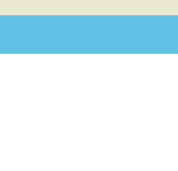
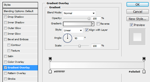
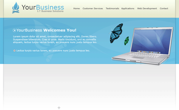
Create a new document 1000×960 pixels with a white background, at the very top of the canvas create a rectangle the width of the canvas and about 80 or so pixels in height, fill with the color #e9eacf. Do the same again but make the rectangle 3 times as big, fill with the color #62c0e6. You should have something like this.

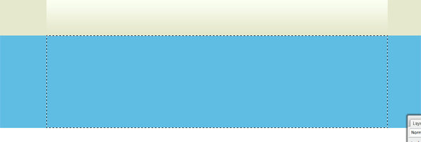
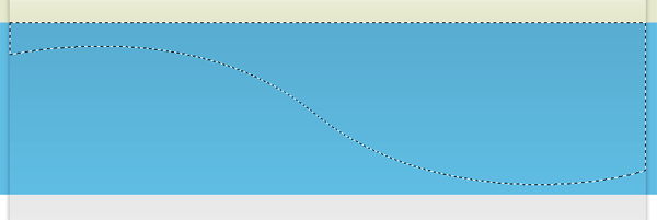
Using the rectangular marquee tool create a selection as seen in the image below.

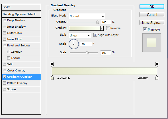
Make sure the rectangle comes level with the 1st color. Fill the selection with any color then add these layer styles.

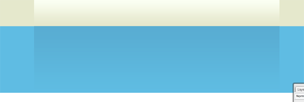
Do the same again only create a rectangle on the blue color. Make sure the rectangle is the same height as the blue line and the same width as the rectangle created above.

Fill the selection with any color then add this layer style.

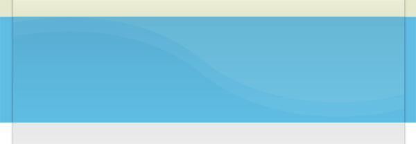
You should have some thing like this.

On the white part of the canvas do the same again, make the rectangle quite big this time, but still keep it the same width as the others. We need to make this one fairly big this time as were going to be blending it in with the white background. Fill the selection with any color.

Add these layer styles.

Create a new layer UNDERNEATH all your boxes, select the rectangular marquee tool and create a selection as tall as you want, but the same width as your other boxes.

Fill this selection with the color black, then goto “filter > blur > guassian blur” blur by 2pixels, set layer opacity to 35%. Add a layer mask to the layer, using a linear gradient drag from the bottom where your rectangle ends, upwards. This should blend in the drop shadow.

On the blue rectangle, select the pen tool and create a shape like this.

Your ads will be inserted here by

AdSense Now!.

Please go to the plugin admin page to paste your ad code.

Fill the selection with the color white then set layer opacity to 5%.

Duplicate the layer and shift it upwards abit. When the shape goes over the blue line you may need to cut the top off so you dont see it on the top rectangle.

Duplicate the shapes twice more, then flip or rotate them to create a look your happy with, heres mine.

Once you are happy with the look, go ahead and add your website title, slogan and logo. Add these at the top in the 1st rectangle, also add your navigation to the right side.

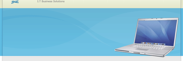
Now find yourself an image of a laptop, remove the background from the laptop then stick it into the blue area of the layout on the right.

Now the laptop could do with having a reflection of itself, just to add a little bit of detail to the whole thing. Duplicate your laptop layer, move the duplicated layer underneath its orginal. DONT flip it just move it downwards untill the bottom half is identical.

Add a layer mask to the duplicate layer, then add a layer mask. Drag a linear gradient over the bottom of the front of the laptop, once your happy right click your layer mask and goto “apply mask”. then do the same for the side of the laptop. Now find yourself some an image of a butterfly, remove the background then add it also to the blue part of the layout.

On the left side of the blue rectangle add some text about your business.

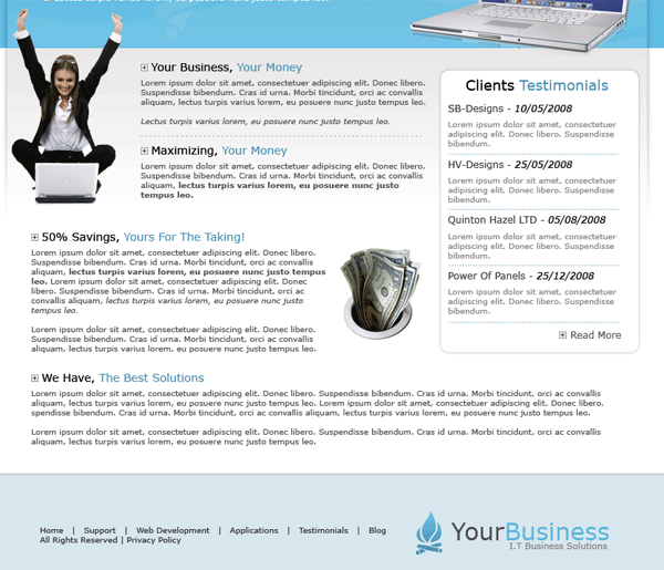
The next part in the tutorial is too fill the white content with information about your business, the reason why i havent gone into great detail is because ive only used text and a couple of images and the tools ive used are only the text tool.

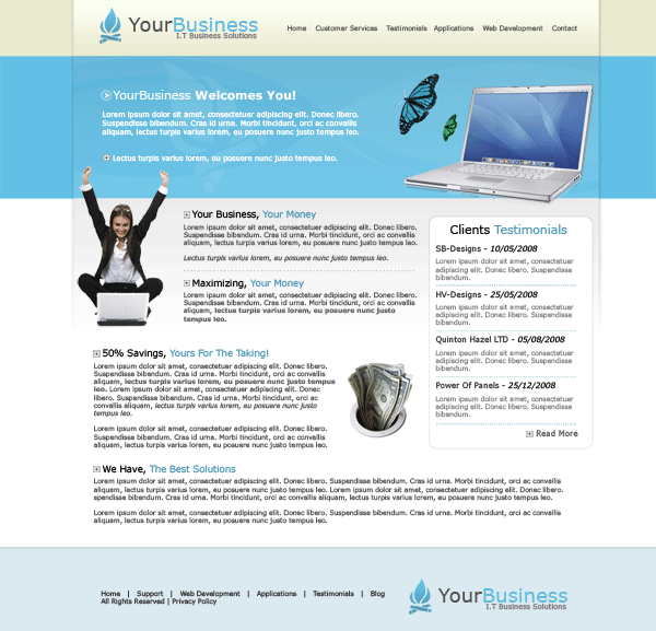
Once you’ve added your content you should have something like this.


Once you’ve added your content you should have something like this.

Your ads will be inserted here by

AdSense Now!.

Please go to the plugin admin page to paste your ad code.
NFS Pro Street, Stencil Tutorial

Your ads will be inserted here by

AdSense Now!.

Please go to the plugin admin page to paste your ad code.
Create a new document your prefered size im using 530×200 pixels, start off with a black background. Select the “rounded rectangle tool” and draw out a rectangle similar to below.

Fill with the color #bcdf4f and add a 4 pixel black “stroke” (you wont actually see the stroke at this time, obviously).

Now goto “edit > transform > distort”, select the left middle anchor point and drag downwards, you should have something like this.

Select the type tool and add your text, the font i am using is called “mactype”, color the 1st word white and 2nd word black. Right click your text layer(s) and goto “rasterize” then do the same as above “edit > transform > distort”, and distort to the same angle as your rectangle.

Now “hide” your background layer and make a selection like this.

Copy & paste to a new layer. Add the 4 pixel black stroke to the new shape and also a black color overlay. Align the shape with your green one, you should have something like this.

Your ads will be inserted here by

AdSense Now!.

Please go to the plugin admin page to paste your ad code.
Using your prefered cutting tool cut off the end of your black side rectangle.
Restore your background layer, then create a new layer above it (under everything eles) goto your paint brush tool, then at the top (1)open up your brush pallet, select the little (2)black arrow and select dry media. If you cant see the set of dry media brushes select load brushes (3).

Once you’ve clicked dry media brushes, select the very bottom brush with its original size. (number 4 on the image above). Now with the color #bde050 start to spray around your rectangle.

Create a new layer and add a darker shade of green. Try and mix it in with the ligher green.

Then do the same as above but using the color white.

</p

Your ads will be inserted here by

AdSense Now!.

Please go to the plugin admin page to paste your ad code.