All posts by admin

category-photoshop-tutorials-page-4-

Your ads will be inserted here by

AdSense Now!.

Please go to the plugin admin page to paste your ad code.

Your ads will be inserted here by

AdSense Now!.

Please go to the plugin admin page to paste your ad code.

Your ads will be inserted here by

AdSense Now!.

Please go to the plugin admin page to paste your ad code.

Userbar Tutorial

Your ads will be inserted here by

AdSense Now!.

Please go to the plugin admin page to paste your ad code.

Your ads will be inserted here by

AdSense Now!.

Please go to the plugin admin page to paste your ad code.

Your ads will be inserted here by

AdSense Now!.

Please go to the plugin admin page to paste your ad code.

Seperating Trackbacks & Pingbacks

Your ads will be inserted here by

AdSense Now!.

Please go to the plugin admin page to paste your ad code.

Hello, welcome to another tutorial by hv-designs. Today we’ll be diving into wordpress again looking at seperating our comments and our trackbacks.

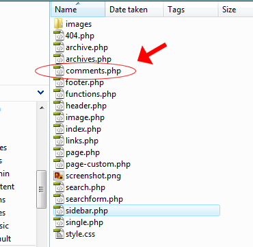
Most blogs i visit or have seen dont bother to seperate there comments and tracksbacks, personnally i think it looks better and more orgainised. It can be achived with minium effort and very little code. In todays tutorial il be seperating our trackbacks and comments using the “mywordpress theme” tha we previously created a couple of days ago. Open up your comments.php file in dreamweaver or notepad. The file should be located in the theme directory.

Step1

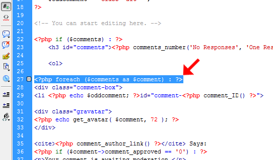
Once open locate the line “php foreach $comments as $comment”.

Step2

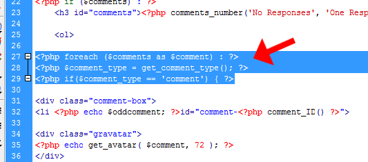
After this line paste this snippet of code.

 <?php $comment_type = get_comment_type(); ?> <?php if($comment_type == 'comment') { ?> 

Your code should now look like this.

Step3

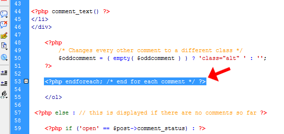
Scroll down and locate the end of comment loop. “php endforeach; /* end for each comment */”.

Step4

Your ads will be inserted here by

AdSense Now!.

Please go to the plugin admin page to paste your ad code.

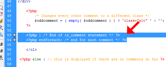
Just before the code above we need to end our “is comment statment”. Which looks like this.

 <?php } /* End of is_comment statement */ ?> 

The code should look like this.

Step5

What does all this code do i here you shout????? Basically the code will seperate all your trackbacks and pingbacks from the main comments loop. This will allow us to add a second comments loop to the comments file to display the trackbacks and pingbacks only.

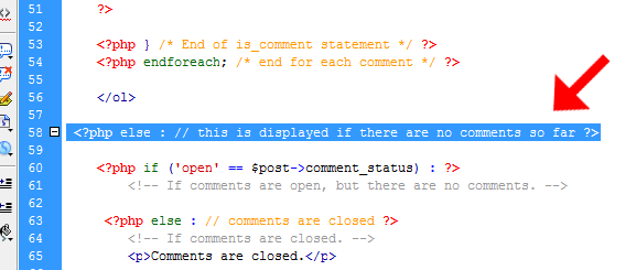
Locate this snippet of code inside your comments.php file.

 <?php else : // this is displayed if there are no comments so far ?> 

Step6

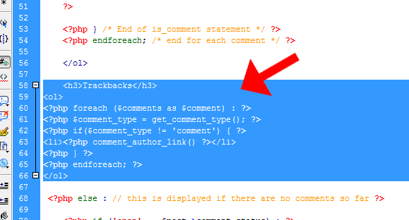
Just before it add this code.

 <h3>Trackbacks</h3> <ol> <?php foreach ($comments as $comment) : ?> <?php $comment_type = get_comment_type(); ?> <?php if($comment_type != 'comment') { ?> <li><?php comment_author_link() ?></li> <?php } ?> <?php endforeach; ?> </ol> 

Step7

If you are using the “mywordpress theme” change the H3 tag from H3 to H1 or H2. Thats it all done, the code above can then be styled as you wish, its not that different from when we styled our comments.php file in the “my wordpress theme tutorial”. If you liked this tutorial please subscribe to our twitter and RSS feeds. Thanks for reading, till next time.

Your ads will be inserted here by

AdSense Now!.

Please go to the plugin admin page to paste your ad code.

2007-10-04-pre-site-enter-tutorial-

Your ads will be inserted here by

AdSense Now!.

Please go to the plugin admin page to paste your ad code.


Create a new document 800×600 pixels (or what ever size site your doing). Fill your background layer with a gradient.

Select the “elliptical marquee tool” and draw out a capsule like shape, fill it with the color white.

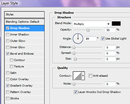
Apply the following layer styles to your capsule.

You should have something like this.

Create another capsule over the top of the capsule you just made but make it smaller, this will be a little light reflection. Color your capsule white.

Set the opacity to about 20% – 30%.

Then add a layer mask and make it blend in more.

Your ads will be inserted here by

AdSense Now!.

Please go to the plugin admin page to paste your ad code.

Now lets add some text, type your text then drag your text layer under your light reflection layer (the smaller capsule).

Apply the following layer styles to your text.

You should have something like this.

Duplicate your text layer, flip it vertically and use it as a reflection, if you dont no how to do this, read throu my “reflections tutorial”. The end result is below.

Now duplicate your bigger capsule 4 times, Press “ctrl + t” to free transform them, resize them all making one big one going down in size to a small one. (see image below).

Do the same again but this time place them at the bottom of the capsule.

Thats it all done, now use your imagination and expand the idea into something of your own. Like this.

Your ads will be inserted here by

AdSense Now!.

Please go to the plugin admin page to paste your ad code.

Archive for the ‘PSD Sitebuilds’ Category

Your ads will be inserted here by

AdSense Now!.

Please go to the plugin admin page to paste your ad code.

Your ads will be inserted here by

AdSense Now!.

Please go to the plugin admin page to paste your ad code.

Your ads will be inserted here by

AdSense Now!.

Please go to the plugin admin page to paste your ad code.

2009-01-19-jquery-fade-infade-out-comment-page-3-

Your ads will be inserted here by

AdSense Now!.

Please go to the plugin admin page to paste your ad code.

Your ads will be inserted here by

AdSense Now!.

Please go to the plugin admin page to paste your ad code.

Your ads will be inserted here by

AdSense Now!.

Please go to the plugin admin page to paste your ad code.

p-4734

Your ads will be inserted here by

AdSense Now!.

Please go to the plugin admin page to paste your ad code.

Over the last few weeks I have been saving the various awesome freebies I come across on the web.  Today I have finally gathered enough awesome freebies to make it worth a release for you guys. This freebie post will consist of awesome UI and Icon resources.

UI Kits and Elements

Icons

Your ads will be inserted here by

AdSense Now!.

Please go to the plugin admin page to paste your ad code.

Conclusion

I hope that you enjoyed this freebie post and you can always check out our Freebie Network Site, Friday Freebies, for more a new freebie every Friday. I also want to thank all those featured here for their stellar contributions to the design world.

Your ads will be inserted here by

AdSense Now!.

Please go to the plugin admin page to paste your ad code.

Header Tutorial

Your ads will be inserted here by

AdSense Now!.

Please go to the plugin admin page to paste your ad code.


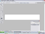
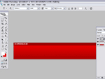
Create a new document with a width of 800 pixels X 125 pixels.

Select two colors that you want to use as your header im going to use to shades of red in this example.

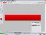
Select the gradient tool and fill you document by clicking at the bottom of the picture and draggin your mouse up towards the top. you should have somthing like this.

Now select the rectangular marquee tool and draw a rectangle round the top of your header.

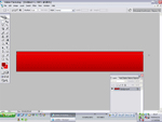
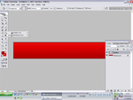
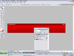
Now were going to fill the rectangle with your darkiest color that you chose for the header gradient. BUT before we fill lets create a new layer in the layers panel, once you’ve created your new layer rename it as “red bar” or what ever you want to call it then fill your rectangle with the paint bucket tool. once filled press CTRL + D to unselect the rectangle.

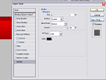
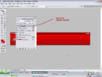
Now that you’ve filled the rectangle lets add some layer stlyes to it so double click the “red bar” layer and add a black 1 pixel stroke like this.

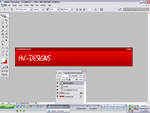
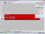
Now lets add some text, select the text tool and write your website name a the top like this. ive chosen the color white for my text as i think it works well on a red background.

ive used the font “Tahoma” size 10 and in bold
Now the opposite side add the some more text this write “home”

Now lest add some more text as the main title, im going to use a different font thats abit more funky, like this

font i used in this example is “SF Grunge Sans SC”

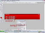
Now the main title header is in place lets add some styles.
on mine ive added

dark red 3 pixel stroke
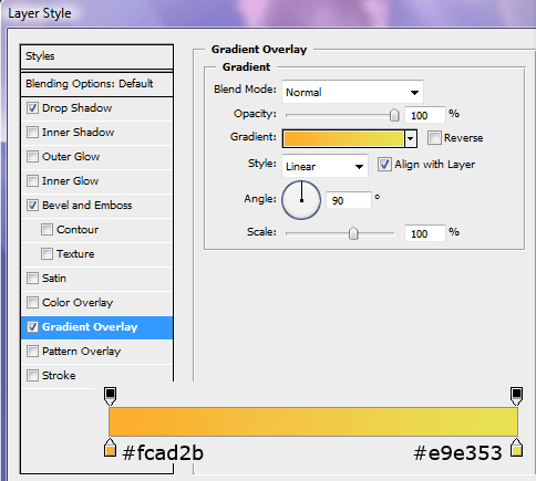
gradient overlay using 2 selections of grey
drop shadow

nows the time for you to be creative and create a style of your own.

Your ads will be inserted here by

AdSense Now!.

Please go to the plugin admin page to paste your ad code.

Now im going to add a slight reflection to my title to do this we “duplicate” our text layer and rasterize it.
to duplicate it right-click on your title layer and click duplicate layer (press okay on the follow up dialog) then right click the duplicated layer and click rasterize type.

now that its duplicated and rasterized goto “edit > transform > flip vertical”
then move the duplicated layer underneath the original layer (just click & drag)
then move the text underneath the original text like this.

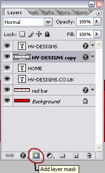
with the duplicated layer selected click “add layer mask” like this

now goto the gradient tool make sure white is selected (should be selected by default)
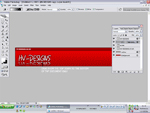
and click just at the top of text and drag down to the bottom of the document see black line on the image below.

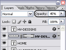
now adjust the opacity to about 45%

now lets add a simple navigation bar to our header, if you want to leave your header how it is dont continue with the tutorial.

create a new layer and label it “navbar”
with the “navbar” layer selected select the rectangular marquee tool and draw a small rectangle at the bottom right corner like this

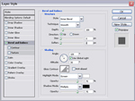
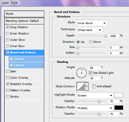
fill the rectangle with a gradient and add a “bevel & emboss” layer style with these settings.

then create a layer mask and select the gradient tool. Then click a quarter of the way down the navbar and drag towards the title text (see image below)

now thats done add some text like this

create a new layer called “lines” or somthing simlar
then zoom in by 600% and draw 2 1 pixel lines (using the rectangle marquee tool) next to each other and fill them with 2 colors the same as your site one light and one dark, like this

once you’ve done the one just duplicate the layer till you’ve put em across the nav bar then merge the line layers with CTRL + E and adjust the opacity by 50%
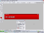
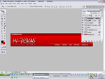
you should then have something like this.

Your ads will be inserted here by

AdSense Now!.

Please go to the plugin admin page to paste your ad code.

The Pen Tool

Your ads will be inserted here by

AdSense Now!.

Please go to the plugin admin page to paste your ad code.

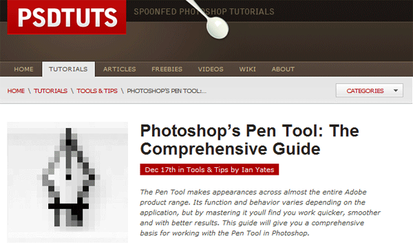
PSDTuts has just released an excellent tutorial on photoshop’s pen tool. Its a very detailed well written tutorial that i think every photoshop user should read.

Your ads will be inserted here by

AdSense Now!.

Please go to the plugin admin page to paste your ad code.

Then pen tool is a hard tool to master and i think its the only tool that people get stuck on. Take alook, have a read and give this tutorial some love.

Your ads will be inserted here by

AdSense Now!.

Please go to the plugin admin page to paste your ad code.

category-photoshop-tutorials-

Your ads will be inserted here by

AdSense Now!.

Please go to the plugin admin page to paste your ad code.

Your ads will be inserted here by

AdSense Now!.

Please go to the plugin admin page to paste your ad code.

Your ads will be inserted here by

AdSense Now!.

Please go to the plugin admin page to paste your ad code.

Dj/Music Layout Tutorial

Your ads will be inserted here by

AdSense Now!.

Please go to the plugin admin page to paste your ad code.

Your ads will be inserted here by

AdSense Now!.

Please go to the plugin admin page to paste your ad code.

Your ads will be inserted here by

AdSense Now!.

Please go to the plugin admin page to paste your ad code.

Christmas Vista Wallpaper tutorial

Your ads will be inserted here by

AdSense Now!.

Please go to the plugin admin page to paste your ad code.


Before we start this tutorial i suggest you download the tutorial contents file with all the required image needed to complete the tutorial.
DOWNLOAD IT HERE

Once you have downloaded the above file open up “snowflakes.jpg” and resize to what ever size your wallpaper is intended for, i shall be using a small resolution for the purpose of this tutorial.

Create a circle in the center of your canvas fill with the color #356699, Now click your circle layer whilst holding down ctrl to make a selection. Select your paint brush tool and change the settings to the ones in the picture below. Make sure your brush is 100px SOFT brush.

Now brush at the bottom of the orb. Then brush a single cirlce at the top somewhere.

Now add these layer styles.

Now set layer opacity to 75%. You should now have something like this.

Now create a white cirlce within the orb, add a layer mask and drag a linear gradient over it to blend it in. Duplicate this layer and flip it vertically and place at the bottom of the orb. So now you should have to white circles acting as hightlights. Your image should look like this.

Open up “logo.jpg” and drag the windows logo onto your canvas, with the pen tool or your desired cutting tool remove the background. Resize the logo to fit into the middle of your orb. Then add these layer styles.

Your ads will be inserted here by

AdSense Now!.

Please go to the plugin admin page to paste your ad code.

Your image should look like this.

Now open up “hat.jpg” and drag to your canvas, again cut the background from the hat with your prefered cutting tool. Once you have removed the background click the layer whilst hold ctrl on the keyboard to make a selection, now goto “select > modify > contract” contract the selection by 1 pixel, then goto “filter > blur > guassian blur” blur by about 3 pixels. Now resize your hat to fit the orb like in the image below.

Now create a black circle underneath your hat to act as a shadow, lower the opacity to suit also blur by about 2 pixels.

Now select a nice looking font and add some text. Add these layer styles to your text.

Thats it all done heres mine.

Your ads will be inserted here by

AdSense Now!.

Please go to the plugin admin page to paste your ad code.

Pre-Site Enter Tutorial

Your ads will be inserted here by

AdSense Now!.

Please go to the plugin admin page to paste your ad code.

Your ads will be inserted here by

AdSense Now!.

Please go to the plugin admin page to paste your ad code.

Your ads will be inserted here by

AdSense Now!.

Please go to the plugin admin page to paste your ad code.

page-16-

Your ads will be inserted here by

AdSense Now!.

Please go to the plugin admin page to paste your ad code.

Your ads will be inserted here by

AdSense Now!.

Please go to the plugin admin page to paste your ad code.

Your ads will be inserted here by

AdSense Now!.

Please go to the plugin admin page to paste your ad code.

tutorials-jquery_fade2-div

Your ads will be inserted here by

AdSense Now!.

Please go to the plugin admin page to paste your ad code.

Your ads will be inserted here by

AdSense Now!.

Please go to the plugin admin page to paste your ad code.

Your ads will be inserted here by

AdSense Now!.

Please go to the plugin admin page to paste your ad code.

CD & CD Jewel Case Tutorial

Your ads will be inserted here by

AdSense Now!.

Please go to the plugin admin page to paste your ad code.

Your ads will be inserted here by

AdSense Now!.

Please go to the plugin admin page to paste your ad code.

Your ads will be inserted here by

AdSense Now!.

Please go to the plugin admin page to paste your ad code.

Music Software Layout

Your ads will be inserted here by

AdSense Now!.

Please go to the plugin admin page to paste your ad code.

Hello everybody, today were going to be creating a very simplistic music software website. Before we start with the tutorial i suggest downloading “aesthetica version 2 icon set” from dryicons.com.

Right lets get started, create a new document with the dimensions 950 x 935 pixels. Set your forground to the color #36c8ff and background to #0090c5, select the gradient tool then with a radial gradient start from the middle of your canvas at the top and drag downwards about half way down.

Step1

In the middle of your canvas at the very top add your website title and slogan. Ive also used a CD icon as my logo. Once you’ve added your text add these layer styles to your website title.

Step2

Step3

Step4

You should have something like this.

Step5

Select the rectangular marquee tool, zoom in on your canvas. Underneath your website title and logo create two 1 pixel lines on top of each other, see image below for color codes.

Step6

Make the lines the whole width of your canvas then add a layer mask to your lines. Select the gradient tool with a reflected gradient, start from the middle of the canvas and drag towards the edge of the canvas.

Step7

The end result should look something like this.

Step8

Duplicate your line and move the duplicated layer down about 40-50 pixels.

Step9

Inbetween the two sets of lines, make a selection with the rectangular marquee tool. Make the selection the width of your canvas but dont go over the lines.

Step10

Fill the selection with the color #24b3e8, add a layer mask to the blue rectangle layer then select a reflected gradient, using the same method as we did for our lines drag from the middle towards the edge of the canvas.

Step11

Inside the blue rectangle add a simple navigation. Inbetween each link add a small bullet point using the elliptical marquee tool.

Step12

Select the rounded rectangle tool with a radius of 20px. The radius of the rectangle reflects the amount of curvature on the rectangle, the bigger the number the bigger the curves.

Step13

Create a fairly big rectangle underneath your navigation.

Step14

Your ads will be inserted here by

AdSense Now!.

Please go to the plugin admin page to paste your ad code.

Add these layer styles to your round rectangle.

Step15

Step16

Step17

Goto your favourite stock site or use google images and find an image preferably music related also with a white background. Copy your image to your canvas, the load the rounded rectangle selection by clicking on the thumbnail within the layers window whilst holding CTRL + Left mouse click. Goto “edit > paste into”. Place your image on the right side of your rectangle, blending in the edges on the left of the image if you need to by adding a layer mask.

Step18

On the left side of the rectangle add some text with some nice typography. Underneath the text add a small button using the round rectangle.

Step19

Add these layer styles to your button.

Step20

Step21

Step22

Step23

On top of the button make a small selection like this.

Step24

Fill the selection with the color white and set layer opacity to 5%. Add an icon to your button from the icon pack you downloaded. Add another button next to it, you should have something like this.

Step25

On the right side underneath your big rounded rectangle, add a content title with a little speaker icon from the icon pack, make a divider using the two 1pixel lines like we did for the navigation then add a couple of paragraphs underneath.

Step26

Select the color #009bd6 and #006b94 with the rounded rectangle create a box on the left next to your paragraph fill your box with a rounded gradient just like we did our background at the start of the tutorial.

Step27

Add these layer styles to complete the effect.

Step28

Step29

Inside the box add some content, the buttons on the bottom of my box are duplicates of the ones inside the big rounded rectangle.

Step30

At the bottom of the canvas add a simple footer, i’ve duplicated my navigation with the top divider. Stretched the actual blue navigation box down by clicking CTRL + T, then drag the middle anchor point. Thats it all done.

Finished

Hope you enjoyed this tutorial, dont forget to subscribe via RSS and twitter, your support is freatly appreciated.

Your ads will be inserted here by

AdSense Now!.

Please go to the plugin admin page to paste your ad code.
2007-09-26-respray-tutorial-

Your ads will be inserted here by

AdSense Now!.

Please go to the plugin admin page to paste your ad code.

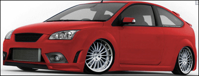
Open your image of your car, im going to use my focus st vmod that ive prevously done.
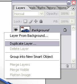
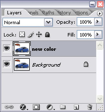
Once its opened duplicate the layer “background” and rename your duplicated layer to new color.

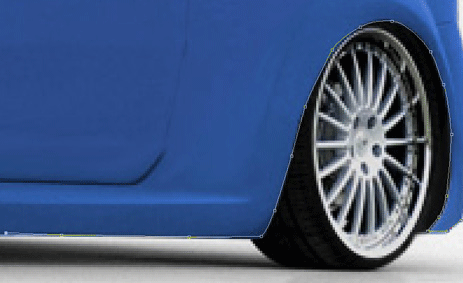
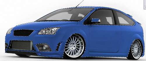
Now with the “new color” layer selected, select the pen tool and start drawing round the car, making selections to the bits you want to change the color of, also make sure you dont select other things like the grills, wheels, windows etc… and take your time, it is a slow process but you will get there. (im not going to explain how to use the pen tool, but if you got “HERE” there is a good tutorial to explain it. )

Once you’ve gone round the whole car you should have something like this.

Your ads will be inserted here by

AdSense Now!.

Please go to the plugin admin page to paste your ad code.
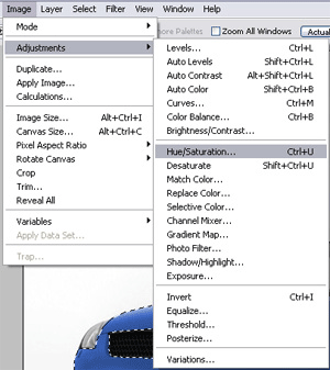
Now for the color, keep it selected and goto the toolbar at the top and click “image > adjustments > hue/saturation” or alternatively “ctrl + u”

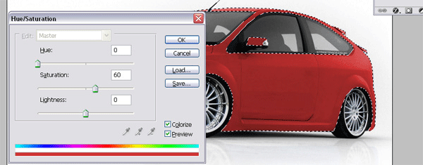
Now with the new dialog open put a “tick” in the “colorize” box. now drag the “hue” slider all the way to the left or type in “0″, now slide the “saturation” slider in the middle or type in a number, like “60″ your car should now be a red color.

Move both sliders to obtain different colors, you can basically make any color from the sliders. when your happy with your color click ok.

Now press “ctrl + D” to deselect, you might need to touch up in places where the old color shows throu, also if theres things like reflections in floors and metals dont forget to change the reflection color.
DONE!

Your ads will be inserted here by

AdSense Now!.

Please go to the plugin admin page to paste your ad code.
Drawing The Linux Penguin Tutorial

Your ads will be inserted here by

AdSense Now!.

Please go to the plugin admin page to paste your ad code.

Create a new document what ever size you see fit. Select the pen tool and draft out a shape like this.

Add these layer styles.

You should have something like this.

Select the “elliptical marquee tool” and make 2 circles for the arms like this.

Add a gradient overlay using the settings below.

You should be left with this.

Make a selection on one of the arms like the picture below.

fill with the color white and add a layer mask. Duplicate this layer and goto “edit > flip horizontal” then place onto the other side of the arm.

Select the “elliptical marquee tool” and make a selection like below

Fill with the color white and blend in with a mask. Then set the blending mode to “soft light” with an opacity of 50%. You should have something like this.

Do the same as above but for the head also leaving the blending mode to normal.

Create another circle on the head but make it bigger than the last one, also set the blending mode to “soft light”. Place this layer underneath your cirlce you created above. you should have something like this.

Still with the elliptical marquee tool make a selection like the image below.

Fill with the color white then add this gradient overlay.

You should have something like this.

Now lets make the feet, select the pen tool and draft out a shape like below. Might be easier just to create one foot then duplicate it, flip it and place on the other side.

Now add these layer styles to the feet.

Your ads will be inserted here by

AdSense Now!.

Please go to the plugin admin page to paste your ad code.
You should have something like this.

Now with the elliptical marquee tool create 2 circles one on either foot, add a layer mask and set opacity to 60%.

Underneath the above layer make a small selection like the image below.

Fill with the color white then goto “filter > blur > guassian blur” blur by about 3-4 pixels. You should have something like this.

Select the pen tool again and create a pizza slice shape for the nose.

Add these layer styles to the nose.

You should have something like this.

With the elliptical marquee tool create to shapes like this.

Add these layer styles.

Now add the pupils and fill them with the color black.

Then add a smaller circle inside the pupils, fill with the color white and add a layer mask so they blend in more.

Thats it, hope i wrote the tutorial okay enough for you all to understand. any questions just ask.

Heres the final image.

CLICK FOR BIGGER VERSION

Your ads will be inserted here by

AdSense Now!.

Please go to the plugin admin page to paste your ad code.
page-31-

Your ads will be inserted here by

AdSense Now!.

Please go to the plugin admin page to paste your ad code.

Your ads will be inserted here by

AdSense Now!.

Please go to the plugin admin page to paste your ad code.

Your ads will be inserted here by

AdSense Now!.

Please go to the plugin admin page to paste your ad code.

Funky Web Design Layout 2

Your ads will be inserted here by

AdSense Now!.

Please go to the plugin admin page to paste your ad code.

Create a new document 800×900 pixels, drag a linear gradient over the top using #e4e4e4 & white. Select the brush tool then select some cloud brushes (included in psd) Add this drop shadow to you clouds.

This should be your result.

Now goto your custom shapes library and select the “registration 2 target” shape (see image below).

Drag your shape out in the middle of your clouds, fill with the color white. Now add a layer mask to your shape and drag a “radial gradient” over the top to blend in the edges. Now add these layer styles.

You should have something like this.

Now add your title and add these layer styles.

You should have something like this.

Now using various brushes and shapes start to build up your layers like this. (see animation below) Make sure everything is one a layer of its own for easy editing later on if needed (the brushes i used are included in the PSD).

Your ads will be inserted here by

AdSense Now!.

Please go to the plugin admin page to paste your ad code.

Now select the rounded rectangle tool draw out a small navigation bar. Copy the layer styles that we used for our main title but adjust the stroke from 6 to 3.

Now add 2 arrows from the custom shapes library and your navigation text. (the arrows used have the same layer styles as the navigation bar apart from it has a different color).

Again select the rounded rectangle and draw a bigger box for some content. Copy and paste the layer styles from your naviagtion bar.

In the top left corner of the box add your content box title. Add these layer styles.

Your text should look like this.

Add a highlight using the circle tool to complete the effect.

Now add some content. Use the steps above to create other content boxes.

Now to complete the layout add your footer.

All material needed for this tutorial are available in the PSD download. Thanks for reading.

Your ads will be inserted here by

AdSense Now!.

Please go to the plugin admin page to paste your ad code.

page-38-

Your ads will be inserted here by

AdSense Now!.

Please go to the plugin admin page to paste your ad code.

Your ads will be inserted here by

AdSense Now!.

Please go to the plugin admin page to paste your ad code.

Your ads will be inserted here by

AdSense Now!.

Please go to the plugin admin page to paste your ad code.

Design Lab Layout

Your ads will be inserted here by

AdSense Now!.

Please go to the plugin admin page to paste your ad code.

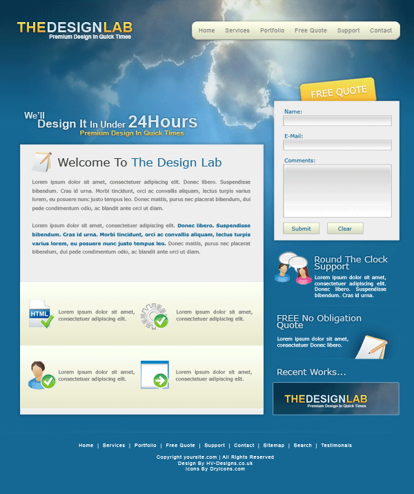
Hello everyone, welcome to another tutorial by the hv-designs team in this tutorial il show you how to create a stylish design lab layout.

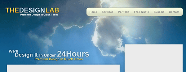
Create a new document with the dimensions 850×1012, set the colors #0b3349 as your forground and #156894 as your background select the gradient tool with a linear gradient. On your background layer begin to drag the gradient starting from the top to about a quarter of the way down your canvas.

For this next part you need this image. Save the image to your desktop then open it up in photoshop. Drag the image over to your canvas, flip and resize the clouds to fit your canvas. Add a layer mask to your clouds image then drag a linear gradient from the left side of the clouds image, right click your layer mask in your layers window and goto “apply layer mask”. Add another layer mask then drag the linear gradient from the bottom, right click the mask in the layers window then goto “apply layer mask”. Do the same for the right side. The look were going for is this.

Once you have something similar duplicate the clouds layer, then hide which ever clouds layer is on top. The bottom clouds layer we need to blur by about 4 pixels so goto “filter > blur > guassian blur” blur by 4 pixels. Unhide the top clouds layer. Set layer opacity to 80% then set blending mode to luminosity. You should have something like this.

Add your website title and slogan in the top left corner.

The layer styles for the yellow bit of the title are as follows.

The layer styles for the light blue part of the title are exactly the same as above just change the gradient overlay to.

On the right side of your canvas add your navigation box using the rounded rectangle tool.

The layer styles for the navigation are.

Add your text to your navigation.

Your ads will be inserted here by

AdSense Now!.

Please go to the plugin admin page to paste your ad code.

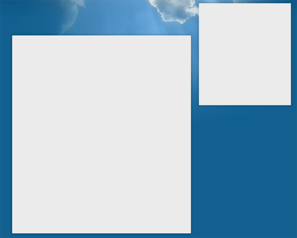
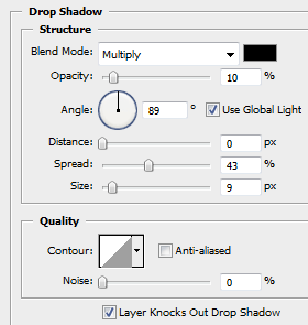
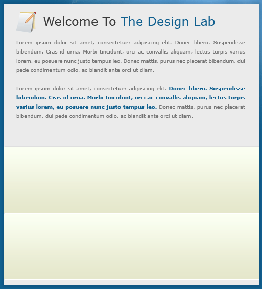
Leave quite a big gap beneath the clouds and create two white rectangles using your prefered rectangle tool. Fill them with the color #eeeeee. Then add a drop shadow.

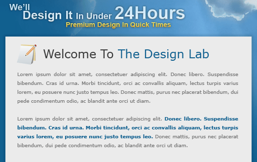
Above your biggest content box add a catchy sentance use the same layer styles as your title to make it stand out abit.

In the top bit of your big content box add some content, the icon i used next to the welcome text is from dryicons.com.

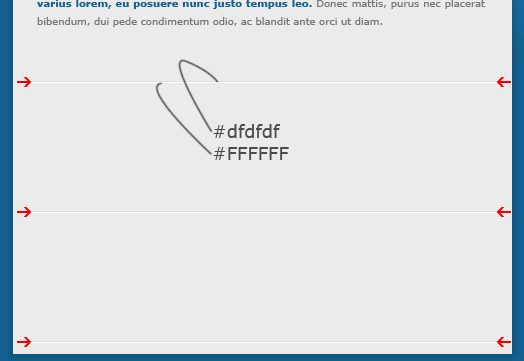
Underneath your welcome text and welcome content add 3 dividers (see red arrows). To make dividers like the ones below just create two 1 pixels lines on top of each other.

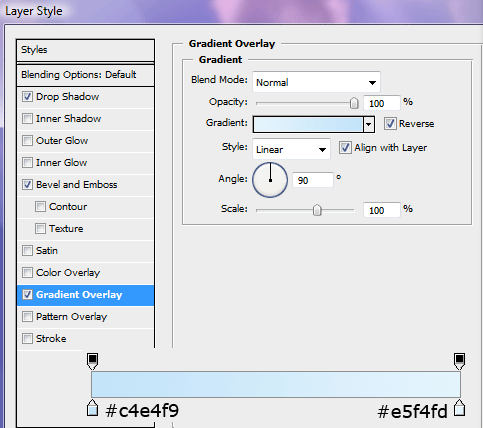
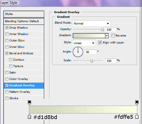
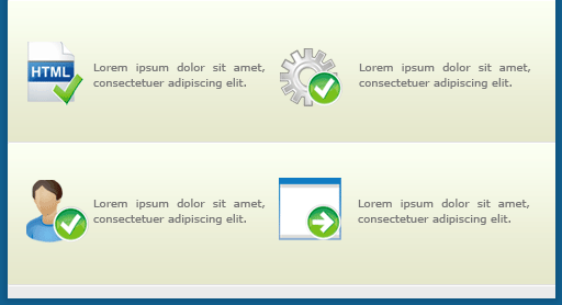
Using the rectangular marquee tool create two rectangles inbetween the dividers, fill the selections with the color white, also make sure you have two individual layers.

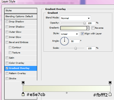
Add this gradient overlay to your two rectangles.

You should have something like this.

In your boxes that you just created add some icons and some services you may offer, again these icons are from dryicons.com.

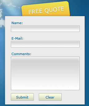
In your smaller content box add a sample form including text fields and labels. Above your smaller content box add a rounded rectangle with the wording “free quote” on it. Press CTRL+T to rotate the box and lettering slightly. The layer styles for the rounded rectangle are the same as the yellow text in the title.

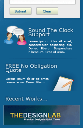
Underneath the smaller content box add some more content regarding, services, work etc… Use the divider technique explained earlier to divide each part. Maybe add some more spliffy icons from dryicons.com.

Then finally add a simple text footer. All finished.

Dont forget you can now follow us using twitter, keep up date with the latest tutorial releases and articles.

The next tutorial will be how to code this layout into a working layout. Keep your eyes peeled

Your ads will be inserted here by

AdSense Now!.

Please go to the plugin admin page to paste your ad code.

Site To WordPress Tutorial

Your ads will be inserted here by

AdSense Now!.

Please go to the plugin admin page to paste your ad code.

Your ads will be inserted here by

AdSense Now!.

Please go to the plugin admin page to paste your ad code.

Your ads will be inserted here by

AdSense Now!.
Please go to the plugin admin page to paste your ad code.