All posts by admin

tutorials-jquery-all

Your ads will be inserted here by

AdSense Now!.

Please go to the plugin admin page to paste your ad code.

Your ads will be inserted here by

AdSense Now!.

Please go to the plugin admin page to paste your ad code.

Your ads will be inserted here by

AdSense Now!.

Please go to the plugin admin page to paste your ad code.

2008-07-01-video-sharing-layout-

Your ads will be inserted here by

AdSense Now!.

Please go to the plugin admin page to paste your ad code.

Create a new document 900×1000 fill your background with the color #292929. Find yourself a picture of a film reel, i found one on google quite easily. Add you film reel to your canvas and remove the background from it using your favourite cutting tool.

Duplicate your film reel and goto “edit > transfrom > flip vertical” place your film reel underneath to act as a reflection, add a layer mask and drag a linear gradient over the top to blend it in.

Now select the round rectangle tool, with a radius of 20 draw out a long black rectangle.

Now select the color #626262 and draw some rectangles inside the rectangle using the rectangular marquee tool.

Now do the same again only this time create smaller rectangles top and bottom using the color white.

Now we have our film strip merge all your square layers you just created into one. Drag your film strip up by your film reel, set layer opacity to 50% and add a layer mask, drag a linear gradient over the top and blend it in from the right.

Now add your website title and slogan. You should have something similar to this.

Now on a new layer create a small pill shape button using the rounded rectangle tool, add these layer styles.

Your ads will be inserted here by

AdSense Now!.

Please go to the plugin admin page to paste your ad code.

Your button should look like this.

Select the ecliptical tool and make a selection like the image below.

Fill with the color white, then set opacity to 25%. Now hold ctrl and click on your button layer to make a selection then goto “select > inverse” and hit the delete key. You should be left with a nice shine. duplicate the button and shine as many time as needed. Add your navigation text. Finally duplicate all your buttons, move them down underneath, add a layer mask and lower opacity to suit.

Now added a sample video, ive just used a screenshot.

Create a smaller button like one of your navigation buttons, copy/paste the layer styles.

Still with the rounded rectangle tool draw a bigger one over the top, and add these layer styles.

Now add some content, and repeat the above steps to create more content boxes.

Now finally create a rectangle at the bottom of your canvas for your footer, copy/paste your button layers styles to it.

Your ads will be inserted here by

AdSense Now!.

Please go to the plugin admin page to paste your ad code.

category-photoshop-tutorials-page-20-

Your ads will be inserted here by

AdSense Now!.

Please go to the plugin admin page to paste your ad code.

Your ads will be inserted here by

AdSense Now!.

Please go to the plugin admin page to paste your ad code.

Your ads will be inserted here by

AdSense Now!.

Please go to the plugin admin page to paste your ad code.

Credit Card Tutorial

Your ads will be inserted here by

AdSense Now!.

Please go to the plugin admin page to paste your ad code.


Create a new document “500×300″ with a gradient background.

Select the “rounded rectangular tool”

Draw out your card shape onto a new layer, then select the pen tool, “right-click” on your rectangle and click “make selection”. Then select your card colors ive choosen #d50000 and #000000, fill your card with the gradient. Then add the following layer styles.

Should then have something like this.

Select the type tool and the font “garamond” and type your bank name and the word credit card in the top left corner. (ive also add the banks logo just by drawing out a few triangles).

Now lets create the credit cards pattern and text watermark, goto a stock images site or google images and grab your self a map of the world. (try and find a black and white map or a greyish colored map, something that aint to complicated). Copy & paste it into your document, then move the layer just above your card layer, resize your map if you have to make it smaller.

Set your maps blending mode to “color burn”. Your image should then look like this.

Now select the type tool and type out your banks name on a few lines. Then click on this icon at the top of your screen.

Your ads will be inserted here by

AdSense Now!.

Please go to the plugin admin page to paste your ad code.

Once the box opens click in the drop down menu box and select “wave”.

Your text should then be transformed like this.

Set the opacity to about 40%.

Now select your “elliptical marquee tool” and draw out 2 cirles the same size, color one red and the other orange, then the circles together so they overlap slightly.

Add the following layer style to the cirlces.

Now select the type tool again with the font “arial” change to bold/italic and type out the word “mastercard” and stick it over the top of the cirlces.

Select the type too again and type your account number, valid dates and name onto your card.

Now add these layer styles to the account number, valid dates and name.

Thats it all done. Heres the final image.

Your ads will be inserted here by

AdSense Now!.

Please go to the plugin admin page to paste your ad code.

Sketch Tutorial

Your ads will be inserted here by

AdSense Now!.

Please go to the plugin admin page to paste your ad code.


Open up your image you want to turn into a sketch, im using an image of jessica alba. First thing we need to do is desaturate it do this by press “shift + ctrl +u” or goto “image > adjustments > desaturate”.

Now goto “filter > stylize > find edges”.

Your ads will be inserted here by

AdSense Now!.

Please go to the plugin admin page to paste your ad code.

Now press “ctrl + L” to open up the levels palette these are the settings im using, but play around with them, also adjust the output settings change the lightness of the image.

and heres mine.

Your ads will be inserted here by

AdSense Now!.

Please go to the plugin admin page to paste your ad code.

page-18-

Your ads will be inserted here by

AdSense Now!.

Please go to the plugin admin page to paste your ad code.

Your ads will be inserted here by

AdSense Now!.

Please go to the plugin admin page to paste your ad code.

Your ads will be inserted here by

AdSense Now!.

Please go to the plugin admin page to paste your ad code.

2011-05-12-hv-designs-to-go-premium-

Your ads will be inserted here by

AdSense Now!.

Please go to the plugin admin page to paste your ad code.

Alright guys, we have been thinking about things a lot lately and what direction we want to take the site. Thanks to you guys for helping us get to a point where we can take the time out to make these decisions. As we started talking about different things that we want to do with the site we got on the topic of the HV-Shop and what we want to do with it. The shop is doing great, but we were thinking of giving our users something a little bit better.

While we were talking this weekend about the shop the idea of a premium membership came up. Instead of just moving the site in that direction we wanted to see what you, our readers, thought about a premium membership area. We have been churning out tutorials at least twice a week lately and are starting to build up more and more tutorials.

However, we have a lot of items in the shop and were just getting ready to release a bunch of premium tutorials in the shop. Again though we wanted to give our readers access to all the files they need, as well as the source files for every tutorial, and we are thinking about doing $5.00/mo or $45.00/yr for access to the premium area. This would be implemented via PayPal and probably be set up in a few months, but we wanted to see if you guys are interested in this or if you would rather just keep the shop and have access to individual files?

Your ads will be inserted here by

AdSense Now!.

Please go to the plugin admin page to paste your ad code.

The entire site would not go premium like Grafpedia has done. We would still have the same amount, and quality, of tutorials that we have now on the site. We would just be adding a premium area where you can get certain files and templates, as well as access to the PSD files of every tutorial, as not all our tutorials come with the PSD file.

The rest of the site would remain the same. It would basically be having the shop, but with a monthly fee, more items, and integrate more within the community/site. Like I said though the main portion of the site would remain the same.

Let’s hear from you guys as it is you that will be supporting this and you that this will effect.

Ticket Thumbnail by Orman Clark

Your ads will be inserted here by

AdSense Now!.

Please go to the plugin admin page to paste your ad code.

contact

Your ads will be inserted here by

AdSense Now!.

Please go to the plugin admin page to paste your ad code.

Your ads will be inserted here by

AdSense Now!.

Please go to the plugin admin page to paste your ad code.

Your ads will be inserted here by

AdSense Now!.

Please go to the plugin admin page to paste your ad code.

Top 10 3D Tutorials

Your ads will be inserted here by

AdSense Now!.

Please go to the plugin admin page to paste your ad code.

A small selection of tutorials which demonstrate some cool mind blowing 3D effects. Concidering photoshop isnt a 3D application, all tutorials are excuted really well.

3D Photo Effect

3D Flowery Text

Grass Text Effect

3D Mp3 Player

3D Mp3 Player

Your ads will be inserted here by

AdSense Now!.

Please go to the plugin admin page to paste your ad code.

3D Lego

3D Macbook

3D Wiimote

3D LCD TV

3D Cardboard Box

Many thanks for reading, if you’d like to write an article for hv-designs you can do so by clicking “article submission” in the top navigation bar.

Your ads will be inserted here by

AdSense Now!.

Please go to the plugin admin page to paste your ad code.

category-articles-page-4-

Your ads will be inserted here by

AdSense Now!.

Please go to the plugin admin page to paste your ad code.

Your ads will be inserted here by

AdSense Now!.

Please go to the plugin admin page to paste your ad code.

Your ads will be inserted here by

AdSense Now!.

Please go to the plugin admin page to paste your ad code.

Rocket Tutorial

Your ads will be inserted here by

AdSense Now!.

Please go to the plugin admin page to paste your ad code.


Create a new document 640×480 then select the “pen tool” and draw out the tail shape, once drawn out use stroke path. heres how mine looks, feel free to use mine as a guide.

Now lets add abit of detail to it like the booster at the back and the small wings, still with the pen tool draw the wings and the booster, fill the booster in black, you should have something like below, yet again feel free to use mine as a guide.

Doesnt look like much now, but will look good when we’ve finished, lets move onto the body, again with the pen tool draw out the body like shape, like this.

Now lets add the wings, just draw triangular shapes, try and imagine how it would look in your mind to get a good visual. heres mine. Where the wings have over lapped the body of the rocket i just rubbed the lines out with a 1 pixel rubber.

Now lets create the nose, with the pen tool just make like a half circle shape.

Your ads will be inserted here by

AdSense Now!.

Please go to the plugin admin page to paste your ad code.

Next step is add some color, create a new layer and select the “magic wand” tool and select the nose, then fill with the color white, select the body and color it grey and select the tail and color it orange. Making sure the colors are on a sperate layer to the lines we drew. Once you have filled your selections double click on the layer that your lines are on and add a 1 pixel black stroke, you should have something like this.

Looks kind of dull at the minute so lets add some shading, select the pen tool again then draw along half the side of the rocket.

Then make a selection then make a new layer called shadows and fill with a dark grey color (#515151) then set the shadows layer to overlay. you should then have something like this.

Create a new layer called “highlights” then make small selections along the top of the rocket and fill them with the color white.

You should 5 layers in total, heres how my layers pallet looks.

Thats it all done, now just add a few more things to make yours.

Your ads will be inserted here by

AdSense Now!.

Please go to the plugin admin page to paste your ad code.

Navigation Tutorial

Your ads will be inserted here by

AdSense Now!.

Please go to the plugin admin page to paste your ad code.

Your ads will be inserted here by

AdSense Now!.

Please go to the plugin admin page to paste your ad code.

Your ads will be inserted here by

AdSense Now!.

Please go to the plugin admin page to paste your ad code.

Old Photo Tutorial

Your ads will be inserted here by

AdSense Now!.

Please go to the plugin admin page to paste your ad code.


Load up your image in photoshop, Then start by clicking on the Create New Adjustment Layer icon at the bottom of the Layers palette and, from the pop-up menu, choose Hue/Saturation.

Turn on the Colorize checkbox in the Hue/Saturation dialog, and move the sliders to get the color tint you want, im going to use a light orangey color, my settings are below.

Create a new layer above the background layer and Fill it with white by using the “paint bucket tool”. Then from the Filter menu, choose “Texture > Grain” Change the Grain Type to Vertical and type in 91 for Intensity and 83 for Contrast.

Your ads will be inserted here by

AdSense Now!.

Please go to the plugin admin page to paste your ad code.

Then change the blend mode of the grain layer to Multiply and opacity to 50% or 60%.

Now click on your background layer and goto “filter > noise > add noise”

You should then have something like below.

Can you see how the 2 images differ?.

Your ads will be inserted here by

AdSense Now!.

Please go to the plugin admin page to paste your ad code.

Virtual Car Tutorial

Your ads will be inserted here by

AdSense Now!.

Please go to the plugin admin page to paste your ad code.


In this tutorial i will show you how to do your first “virtual car” using simple basic methods the topics we will be covering are,
– Lowering
– Changing the wheels
– Tinting windows
– Adding an intercooler
– Smoothing

If you want to use my image that i am using GET IT HERE.

Right lets get started. Goto “layer > new > background from layer” name your layer “original”
Select your layer and lower your car, ive already written a tutorial on lowering so go find and do my lowering tutorial. Dont make it stupidly low, Once lowered you should have something like this.

Once lowered lets add our new alloys, now im not going to do everything for you so your going to have to find your own alloys. you can find loads of donor images from google. once you have your image select the “pen tool” and draw around the face of the tyre, copy & paste it onto your image. Now more than likely your wheels will be bigger than your original wheels so press “CTRL + T” to transform them, resize them and move them into place like this.

Now duplicate the layer your new wheel is on to make another wheel for the back, press “CTRL + T” to resize and move into place. Once there in there correct postions select your very 1st layer and press “CTRL + E” which will merge them together. You will also notice the tyre hangs over the image so just select your wheels layer and move under your “lowered layer”. you should have something like this.

Now lets tint the windows, select your “pen tool” and draw around your windows.

Your ads will be inserted here by

AdSense Now!.

Please go to the plugin admin page to paste your ad code.

Then copy and paste to a new layer and label layer “tints” then goto “image > adjustments > brightness/contrast” and change brightness to -30. you should then have something like this.

Now lets add an intercooler, now as i said before your going to have to find your own donor parts.
Select your “lowered layer” and select your “pen tool” and draw around where thee intercooler shall go.

Then hit your “delete key” on the keyboard then with the selection still active make a new layer under your “lowered layer” and label it black, then fill with the color black using the “paint bucket tool”
Cut your intercooler from your donor image then copy & paste it onto a new layer above your “black” layer, name this new layer intercooler. Press “CTRL + T” to resize and rotate into place, you should have something like this.

Now lets do abit of smoothing, ive already wrote a tutorial on smoothing so go find and do my smoothing tutorial then smooth off the door handels and number plate recess on your virtual car, if successful you should have something like this.

Now the next thing to do is touch ups you will notice when we lowered it, it left gaps where the arches are.

Select your “orginal” layer and select your “paint brush” with a smallish brush just paint where the gaps are.
Thats it, hope you enjoyed my tutorial, now go do one on your own, but dont stop there use your imagination, who knows what you can come up with. heres my finished product.

Your ads will be inserted here by

AdSense Now!.

Please go to the plugin admin page to paste your ad code.

2009-02-17-sliding-jquery-menu

Your ads will be inserted here by

AdSense Now!.

Please go to the plugin admin page to paste your ad code.

Hi there welcome to another tutorial, in this tutorial il show you how to create a sliding menu button using jquery. You can see the effect in action over on the PSDtuts webpage in the top right hand corner.

Oh yes and before i forget you can download the source files for free using the button above.

When the button is clicked it rolls out a box full of links, when the button is clicked again it rolls back in. This can be done using jquery and in this tutorial il show you how to do it. Right lets get started, firstly lets get our button done out the way so we can then focus on the code. Open up photoshop and create a new document with your desired size of button, your button can be any size your wish. Im using a size of 182 x 32 pixels, double click your background layer and add a simple gradient overlay.

On the right hand side of your button add a little white arrow and a vertical divider. The divide consists of two colors #302f2f & #252525.

On the left side add your little icon and some text, i dont think i need to go into too much detail on the button design, as you’ll make your own to suit your own site. Heres how mine looks. (save your button image into your images folder)

Now for the exciting bit open up notepad and save a blank notepad document as styles.css, save the file into a folder called sliding menu on your desktop. Once saved close notepad, open up your folder “sliding menu” create two new folders one called js and another called images. Goto the main jquery webpage and download the jquery libary “jquery-1.3.1.min.js” rename the file to just “jquery” and stick it into the folder js. Open up dreamweaver and create a new HTML file save the file straight away inside your sliding menu folder. (filename for the HTML file doesnt matter call it what you like, sliding_menu.html might be a good idea.) Now your in dreamweaver click the code view tab.

The most import thing we need to do first is reference our javascript and css files we do this by typing this chunk of code within the “HEAD TAGS”.

 <link href="style.css" rel="stylesheet" type="text/css" /> <script type="text/javascript" src="js/jquery.js"></script> <script type="text/javascript" src="js/slider.js"></script> 

You will notice there are 3 files we have referenced styles.css, jquery.js and a third slider.js (but i havent got a slider.js file i hear you cry.) We need to create that now, open up notepad and save a blank notepad document as slider.js, save it inside your js folder. Open up your slider.js file inside dreamweaver and type out the code below.

Your ads will be inserted here by

AdSense Now!.

Please go to the plugin admin page to paste your ad code.

 $(document).ready(function () {     $('img.menu_class').click(function () { 	$('ul.the_menu').slideToggle('medium');     }); }); 

Let me explain the code above the 1st line means when the document is loaded run the function in our case the sliding menu. The next line means once an image with a class of menu_class is clicked the menu will slide which brings me down to line 3. The menu will toggle down at a medium speed. You can change the speed if you wish from slow, medium or fast. The second and third line are important as they hold key elements refering to our CSS file which is img.menu_class and ul.the_menu. We havent wrote these yet but will do when we begin to write out our menu. Head over to your HTML in the code view so we can begin to write out our menu.

 <img src="images/button.png" width="184" height="32" class="menu_class" /> <ul class="the_menu"> <li><a href="#">A Website #1</a></li> <li><a href="#">A Website #2</a></li> <li><a href="#">A Link #1</a></li> <li><a href="#">A Link #2</a></li> <li><a href="#">A Website #3</a></li> <li><a href="#">A Website #4</a></li> <li><a href="#">A Link #3</a></li> <li><a href="#">A Link #4</a></li> </ul> 

The first bit of code you see is a simple image which is our button, we specify the width and height of our button we also give it a class. The class will be the images unique anchor point for the js file which we have already wrote. The class also lets us apply any styles via css using the class .menu_class. After that we have a simple unordered list. If we take alook at our menu in our browser this is how it looks.

Open up your CSS file in dreamweaver. Lets set a few style for the main part of our document.

 body { 	font-family:Arial, Helvetica, sans-serif; 	font-size:12px; 	background-color: #333333; } 

Just some simple text and background styling is needed, set your font family and desired font size, ive also changed the background from white to a darkish grey color. The next bit of styling were going to add is for the ordered and unordered lists, were also going to apply a border to our button image, you may do your border in photoshop on the actual image but i find it best to add it using CSS as changing abit of code is easier then opening up photoshop to change it.

 ul, li { 	margin:0; 	padding:0; 	list-style:none; }  .menu_class { 	border:1px solid #1c1c1c; } 

The next bit of css styling refers to the menu that drops down once the button is clicked.

 .the_menu { 	display:none; 	width:300px; 	border: 1px solid #1c1c1c; } 

In these styles you can change the width of the open menu, mine has a width of 300px but this can be what ever you like. Ive also given it a 1px border the same as our button. The next bit of styling refers to the background color of our rolled out navigation and also the text colors, sizes and hovers.

 .the_menu li { 	background-color: #302f2f; }  .the_menu li a { 	color:#FFFFFF; 	text-decoration:none; 	padding:10px; 	display:block; }  .the_menu li a:hover { 	padding:10px; 	font-weight:bold; 	color: #F00880; } 

The_menu li is the color of the background when the navigation is rolled out, the text in the navigation links wont have any line underneath them as we have used text-decoration:none, we have also spaced out our links by adding 10px paddinig all the way around our links we also want to display the links in a block. The hover styles are pretty simple, padding the same as the last style, font weight bold = bold text and the color changed to a pinkish color. Thats it for the styles you menu should be ready to test. Heres mine.

Just a quick point on positioning, dont use div align to center or right align your button as the rollout will not be aligned up properly, if you want to align your menu button properly wrap it in its own div and position div how you see fit.

See what you can come up with, maybe add some icons to your list objects. Thanks for reading, dont forget to subscribe VIA rss and twitter.

Your ads will be inserted here by

AdSense Now!.

Please go to the plugin admin page to paste your ad code.

category-photoshop-tutorials-page-13-

Your ads will be inserted here by

AdSense Now!.

Please go to the plugin admin page to paste your ad code.

Your ads will be inserted here by

AdSense Now!.

Please go to the plugin admin page to paste your ad code.

Your ads will be inserted here by

AdSense Now!.

Please go to the plugin admin page to paste your ad code.

2011-03-06-4310-

Your ads will be inserted here by

AdSense Now!.

Please go to the plugin admin page to paste your ad code.

Today we are going to be making another release in our UI Series. This release consists of the PSD, PNG, and ICO files for the following Candy Icons. The icons include a Chocolate Bar, a Chocolate Roll, a Chocolate Bar, a Candy Apple, and a a set of Cherries. Check them out and download them today!

Your ads will be inserted here by

AdSense Now!.

Please go to the plugin admin page to paste your ad code.


Download on Custom Power Designs

Your ads will be inserted here by

AdSense Now!.

Please go to the plugin admin page to paste your ad code.

category-freebie-page-2-

Your ads will be inserted here by

AdSense Now!.

Please go to the plugin admin page to paste your ad code.

Your ads will be inserted here by

AdSense Now!.

Please go to the plugin admin page to paste your ad code.

Your ads will be inserted here by

AdSense Now!.

Please go to the plugin admin page to paste your ad code.

CSS Menu With Icons

Your ads will be inserted here by

AdSense Now!.

Please go to the plugin admin page to paste your ad code.

Hello, welcome to another tutorial by the hv-designs team, today we’ll be making a CSS menu with icons.

Firstly lets create our navigation in photoshop, create a new document 600×200 pixels with a black background. Create a rectangle 600×40 pixels with rectangular marquee tool, you can create specific sizes by changing the style to “fixed size”.

Fill your navigation with the color black then add these layer styles.
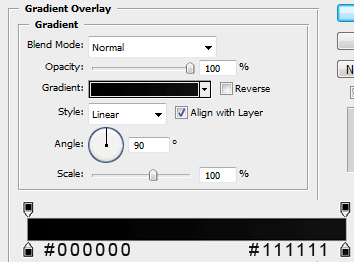
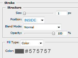
You should have something like this.

Select the rectangular marquee tool again and create a selection like this.

Fill with the color white, then click on your naviagtion layer whilst holding down the ctrl key on the key board to make a selection.

Once you have made the new selection goto, “select > inverse” then hit the delete key. You should be left with this.

Lower the opacity to about 5% then add your naviagtion text.
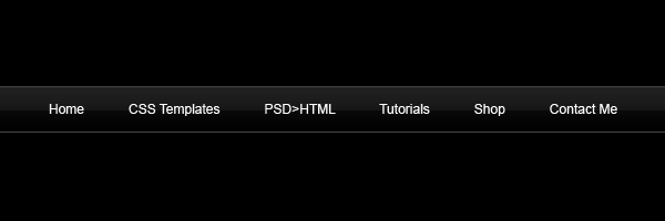
Now select the rounded rectangle tool and create a small rectangle next to your navigtation text. The icons should be no bigger than 32×32 pixels. Althou you can make them bigger if you want you just need to adjust the CSS code when we come to code it. Add these layer styles to each of your round rectangles.
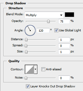
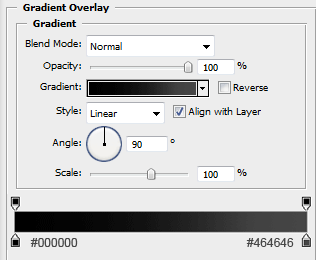
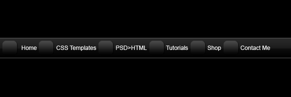
Your navigation should now look like this.
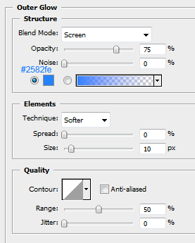
Inside the round rectangles we want to add our icons, im going to use some preset shapes in the custom shapes libary that came free with photoshop. Once you have chosen your icons and added them inside the rectangles add this outer glow.
Your navigation should looks something like this.
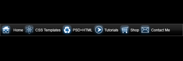
Looks abit cramped up, but it doesnt matter as we can set the spacing of each item in css. For this bit we need to zoom in abit, select the pen tool with the color #008aff, draw a line underneath your 1st item.
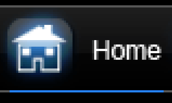
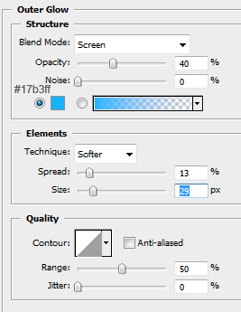
Now add this layer style to your line.
Your ads will be inserted here by

AdSense Now!.

Please go to the plugin admin page to paste your ad code.

Thats it for your naviagtion, you end result should be something like this.
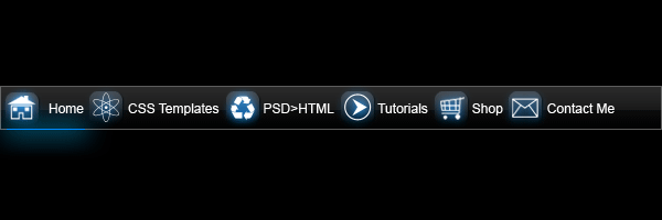
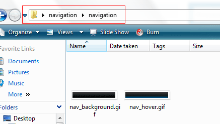
Now that we’ve finished we need to slice our navigation up, so go ahead and create a new folder on your desktop called navigation, then inside that folder create another 2 folders called “icon_images” and “navigation”. Inside the “icon_images” folder we need to save each icon as seperate images dont forget they need to be 32×32 pixels and on a transparent background, save each of them as .PNG files. Heres mine.

We also need 2 chunks of our navigation one being the main background and the other one being the mouseover. Head back over to your naviagtion which should still be in photoshop, hide all your layers apart from your main navigation and the mouse over.
Make each seperate image 300 pixels wide, you may need to stretch your mouse over line over more so it fits like the image below. Save these 2 files as “nav_background” and “nav_hover”.

Next you need to create an empty text file and save it as styles.css in your root naviagtion folder. After you’ve done that its time to open dreamweaver. Create a new html document and straight away save it as index.html or whatever you want to call it save the file in your root folder with your styles.css file. Edit your title text and link your style sheet.

 <!--CTYPE html PUBLIC "-//W3C//DTD XHTML 1.0 Strict//EN" "http://www.w3.org/TR/xhtml2/DTD/xhtml1-strict.dt--> 

After this bit of code we need to map out our navigation using the standard UL and LI tags which looks like this.

 <ul class="navigation"> 	<li class="current"><a href="http://www.hv-designs.co.uk"><em class="home"></em><strong>Home</strong></a></li> 	<li><a href="http://www.hv-designs.co.uk/hv_shop"><em class="templates"></em><strong>CSS Templates</strong></a></li> 	<li><a href="http://www.sb-designs.co.uk"><em class="psd"></em><strong>PSD>HTML</strong></a></li> 	<li><a href="http://www.hv-designs.co.uk"><em class="tutorials"></em><strong>Tutorials</strong></a></li> 	<li><a href="http://www.hv-designs.co.uk/hv_shop"><em class="shop"></em><strong>Shop</strong></a></li> 	<li><a href="http://www.hv-designs.co.uk"><em class="contact"></em><strong>Contact Me</strong></a></li> </ul> 

You will notice that next to each link there is a “EM CLASS” this will refer to our icons in the style sheet. You will also notice like the 1st navigation tutorial we have set “LI CLASS CURRENT” which basically means the link on the navigation will stay in mouseover state for that certain page.

So you HTML code should look like this.

 <!--CTYPE html PUBLIC "-//W3C//DTD XHTML 1.0 Strict//EN" "http://www.w3.org/TR/xhtml2/DTD/xhtml1-strict.dt-->    <ul class="navigation"> 	<li class="current"><a href="http://www.hv-designs.co.uk"><em class="home"></em><strong>Home</strong></a></li> 	<li><a href="http://www.hv-designs.co.uk/hv_shop"><em class="templates"></em><strong>CSS Templates</strong></a></li> 	<li><a href="http://www.sb-designs.co.uk"><em class="psd"></em><strong>PSD>HTML</strong></a></li> 	<li><a href="http://www.hv-designs.co.uk"><em class="tutorials"></em><strong>Tutorials</strong></a></li> 	<li><a href="http://www.hv-designs.co.uk/hv_shop"><em class="shop"></em><strong>Shop</strong></a></li> 	<li><a href="http://www.hv-designs.co.uk"><em class="contact"></em><strong>Contact Me</strong></a></li> </ul> 

Thats all the HTML code we need, so now head over to your styles.css file. At the top of your css file add a comment code, which looks like this /* NAVIGATION ELEMENTS */ after that we start to add our navigation css rules.

 .navigation { padding:0 0 0 20px; margin:0; list-style:none; height:40px; background:#1841c8 url(navigation/nav_background.gif); } 

padding:0 0 0 20px = A shorthand property for setting all of the padding properties in one declaration.
margin:0 = A shorthand property for setting the margin properties in one declaration.
list-style:none = removes the bullets from the list.
height:40px = height of our navigation bar.
background:#000000 url(navigation/nav_background.gif) = sets our naviagtion background color to black, and also sets the background of our navigation which refers to our image we created in photoshop.

Our next bit of css code is.

 .navigation li { float:left; } .navigation li a { display:block; float:left; height:40px; line-height:40px; color:#FFFFFF; text-decoration:none; font-family:arial, verdana, sans-serif; text-align:center; padding:0 0 0 10px; font-size:11px; } .navigation li a b { 	float:left; 	display:block; 	padding:0 16px 0 8px; } 

float:left = The float property sets where an image or a text will appear in another element. In our case left.
display:block = The element will be displayed as a block-level element, with a line break before and after the element.
line-height:40px = The line-height property sets the distance between lines.
color:#FFFFFF = Color #ffffff is white.
text-decoration:none = Defines normal text.

The next bit of css defines our “current” class and “mouseover” image.

 .navigation li.current a { 	color:#FFFFFF; 	background:url(navigation/nav_hover.gif); } .navigation li a:hover { 	color:#00CCFF; 	background: url(navigation/nav_hover.gif); } .navigation li a em { 	display:block; 	float:left; 	width:30px; 	height:40px; } 

Take note of the background: URL as the links relate to our mouse over image we created in photoshop. Also double check your image paths which is something i should of mentioned ealier, if you images dont show when we text in the browser then more than likely it will be the image path.

The last bit off css code is for our icons. Again dont for get to comment code /* ICON ELEMENTS */.

 /* ICON ELEMENTS */  .navigation li a em.home { 	background-image: url(nav_icons/home.png); 	background-repeat: no-repeat; 	background-position: center center; } .navigation li a em.templates { 	background-image: url(nav_icons/templates.png); 	background-repeat: no-repeat; 	background-position: center center; } .navigation li a em.psd { 	background-image: url(nav_icons/psd.png); 	background-repeat: no-repeat; 	background-position: center center; } .navigation li a em.tutorials { 	background-image: url(nav_icons/tutorials.png); 	background-repeat: no-repeat; 	background-position: center center; } .navigation li a em.shop { 	background-image: url(nav_icons/shop.png); 	background-repeat: no-repeat; 	background-position: center center; } .navigation li a em.contact { 	background-image: url(nav_icons/contact.png); 	background-repeat: no-repeat; 	background-position: center center; } 

Were only setting 3 simple rules for each of our icons as most of the important stuff is inherited from the other CSS RULES. The most important again is our individual images or icons that we made previously. If you look at our HTML code in our links you will see each icon has its own individual class that relates to there own snippet of code in the css file.

Your ads will be inserted here by

AdSense Now!.

Please go to the plugin admin page to paste your ad code.

Video Sharing Layout

Your ads will be inserted here by

AdSense Now!.

Please go to the plugin admin page to paste your ad code.

Your ads will be inserted here by

AdSense Now!.

Please go to the plugin admin page to paste your ad code.

Your ads will be inserted here by

AdSense Now!.

Please go to the plugin admin page to paste your ad code.

WordPress Layout #4 Tutorial

Your ads will be inserted here by

AdSense Now!.

Please go to the plugin admin page to paste your ad code.

Hello welcome to another tutorial by hv-designs, in this tutorial il show you how to create an efficient wordpress mockup layout in photoshop. Please note: The layout is inspired by soh tanaka, the layout must not be replicated in any way shape or form.

Layout inspired by soh tanaka

This tutorial is purly for learning purposes only. Ok lets get started, create a new document 900 x 1300 pixels fill your background later with the color #0f181f. Select the rectangular marquee tool and create a rectangle the whole width of your canvas and about 70 pixels in height. Set your forground color to #18222e and background color to #101921. Fill your rectangle with a reflected gradient using the gradient tool. Then add the layer styles below.

You should have something like this.

At the very top of your canvas on top of your rectangle create a 1-2 pixel single line going all the way across the width of your canvas. Fill the line with the color #1d8dcf.

Add your wordpress title and slogan to the left of the rectangle.

Add these layer styles to your website title.

The word “my” (in white) uses the same layer styles, just a different gradient overlay, using a combination of white colors. Add your navigation text on top of the same rectangle, at the start and end of the navigation add two dividers. Also add a state of hover on the navigation bar, do this by using a rounded rectangle with a radius of 10px. Fill the hover with a gradient overlay.

After your last divider add an RSS icon. Your header/navigation should look like this.

Still with the rectangular marquee tool create a bigger rectangle underneath your header/navigation rectangle the height should be about 180-190 pixels. Set forground to #0576bb and background to #3ea6e5 then drag a linear gradient over the top (make sure selection is still active). You should have something like this.

For this next part you need some “cloud brushes” ive had my cloud brushes for a long time and cant remember where i got them from, but there are loads available on the internet. Add your cloud brushes on top of your bigger rectangle, delete any excess clouds that go over it.

On top of your clouds add a quotation of some sort, or just leave it blank. The layer styles used are the same as the header title layer styles. The drop shadow has been altered a little bit so the text looks more visable.

Now for the sidebar, select the rounded rectangle tool then at the top on the toolbar change the settings to, paths, radius = 10 pixels and then add to path area (+). (OR see image below).

Your ads will be inserted here by

AdSense Now!.

Please go to the plugin admin page to paste your ad code.

Draw out a small box for our search field, make sure you fill the selection with a color that matches the bottom of the big rectangle mine is #3ea6e5.

Inside the blue box add your search field and button, and maybe a magnifying glass of some sort so people can reconise it as a search box.

Now with the rounded rectangle once again change the radius to 20 pixels. Now create two small boxes either side of your search field box fill them with the same color as the background. You should have some nice rounded corners providing your layer organisation skills are up to scratch.

Now the sidebar will pretty much follow the same rule through out, it goes like this, icon, sidebar section name then blue box underneath for content.

The icons used for the sidebar are from dryicons.com, they have a nice collection of icons to use, just remember the credited link ;) Im not going to create a major advanced sidebar, just something nice and simple with some nice icons.

Now lets create the footer, duplicate your header/navigation rectangle. Drag it to the bottom of your canvas, press CTRL+T then drag the bottom anchor tag down to expand it.

The same for your website title and slogan. Drag them down and place in the left corner, use the type tool and add your copyright info.

Still with the type tool mimic the widgets you’d have running in the footer, seperate each part with a divider.

Now your footer is in place, lets use the rest of the space for our main wordpress posts. Using the rounded rectangle tool with a radius of 20pixels draw out a rectangle make it quite long as we will be doing some masking in a moment. Fill your rectangle with the color #0b1116 and add a 1 pixel stroke using the color #15222c. Now we need to merge the styles with the layer, create a new layer above your rectangle, HIDE ALL the layers in your layers window apart from the empty one and the rounded rectangle then goto “layer > merge visable” your empty layer an rounded rectangle layer should now be merged into a single layer with the layer styles applied. You cant edit the layer styles at this point. Now add a layer mask to your rectangle then drag a linear gradient over to the top, hopefully the bottom bit of the rounded rectangle should disapear and you should be left with something like this.

Fill your rounded rectangle with your post content.

Duplicate all elements of your post to create more posts. When you’ve reached your last post add a divider at the bottom with your page numbers.

Thats it all done heres the finished peice. Dont forget to subscribe to our RSS/Twitter.

Layout inspired by soh tanaka

Your ads will be inserted here by

AdSense Now!.

Please go to the plugin admin page to paste your ad code.

2008-10-26-interior-design-layout-comment-page-1-

Your ads will be inserted here by

AdSense Now!.

Please go to the plugin admin page to paste your ad code.

Your ads will be inserted here by

AdSense Now!.

Please go to the plugin admin page to paste your ad code.

Your ads will be inserted here by

AdSense Now!.

Please go to the plugin admin page to paste your ad code.

Vista Themed Layout #1 Tutorial

Your ads will be inserted here by

AdSense Now!.

Please go to the plugin admin page to paste your ad code.

Create a new document 900×800 with a background color of #cccccc, create a new layer labeled “header” select the round rectangle tool and draw out a rectangle like so.

Once you have your rectangle right click and goto make selection. Now select the rectangular marquee tool and whilst holding the ALT key on the keyboard make a small selection at the bottom. You will notice the cursor change, it shud turn to a cross with a little minus (-) sign by it.

Your shape should now have square corners at the bottom and rounded corners at the top. Double click your header layer and apply the following layer styles.

Now add your site title and logo.

If you dont no how to do reflections….. my “reflections tutorial” can be found here. If you dont no how to do orbs….. my “simple orb” tutorial can be found here.

Your site should look like this. (see link below).

CLICK HERE TO SEE RESULT SO FAR.

Now your going to need a busyish background, im going to use a windows vista wallpaper known as vista grass feel free to use your own, the vista grass image can be found HERE. Open up your image your going to use in my case the vista grass image. Copy/paste onto your layout canvas you will need to resize it so press “ctrl + t” select one of the corner anchor points and drag down also whilst holding the shift key. (the shift key keeps the original shape). You want the image to be the same width as your header and to cover most of the canvas at the bottom but leaving sufficent space for a footer.

CLICK HERE TO SEE RESULT SO FAR.

Add this layer style to your image. (vista background).

Duplicate your header, rename duplicated layer to “footer” goto “edit > transform > flip vertical” now press “ctrl + t” and make the height abit smaller. place at the bottom of your image making sure it aligns up with the rest of the layout.

Duplicate your footer and flip it vertical again. Use this to make a reflection. If you dont no how to do reflections….. my “reflections tutorial” can be found here. Also add your footer text/info. You should have something like this.

CLICK HERE TO SEE RESULT SO FAR.

Your ads will be inserted here by

AdSense Now!.

Please go to the plugin admin page to paste your ad code.

Select the rounded rectangle and draw out a little rectangle (button size). Add these layer styles.

Your button should look like this.

Set your buttons opacity to 70%, duplicate as many times as needed and place under your header.

Hide all your layers except your button layers, select one of your button layers and goto “layer > merge visable”. Unhide everything, you buttons should now all be on one layer. Create a new layer above your buttons layer and select the elliptical marquee tool.

Draw out a big “white” circle over the top of your buttons.

Click your buttons layer whilst holding the ctrl key on the keyboard to make a selection, make sure your white circle layer is selected and goto “select > inverse” then hit the delete key. Set the opacity of the white cirlce to about 30%. Label your navigation you should have something like this, (see link below).

CLICK HERE TO SEE RESULT SO FAR.

Create two shapes similar to your header and footer (these were made exactly the same way just on a much smaller scale).

You will notice the light blue bit at the top, this was also made the same as the white circle shine on the navigation, i just used the the rectangular marquee tool instead of the elliptical marquee tool just follow the steps in step 4. Select the rectangular marquee tool and draw a rectangle inbetween the to shapes making sure the align up in the corners just like the header and footer, fill with any color. Add these layer styles.

Set the rectangles opacity to 60%. You should have something like this.

Hold the ctrl key on the keyboard and click your rectangle to make a selection. Select your vista background layer and goto “filter > blur > guassian blur” blur by 3.0 pixels.

Follow the above steps for all your content boxes and dont forget to blur the background as shown above.

Your ads will be inserted here by

AdSense Now!.

Please go to the plugin admin page to paste your ad code.

Team Fortress 2 Wallpaper

Your ads will be inserted here by

AdSense Now!.

Please go to the plugin admin page to paste your ad code.

Lets begin, firstly we need to create a new document what ever size you want your wallpaper to be, im using 1440×900 pixels. For your background layer add a simple linear gradient of your choice.

Find yourself some Team Fortress 2 fan art, im going to be using a team fortress 2 wallpaper ive found on google. Drag or Copy/Paste your fan art onto your canvas.

Select your desired cutting tool and remove the background from your fan art.

Now add a simple outer glow to your fan art, using the settings below.

Now goto your custom shapes libary and select “registration target 2″ (see image below).

Drag this shape as big as you can get it, place it behind your fan art, fill with the color white then set layer blending mode to soft light and opacity to 50%.

Your ads will be inserted here by

AdSense Now!.

Please go to the plugin admin page to paste your ad code.

Now add a layer mask and drag a radial gradient over the top so the edges of the shape blend in with the background.

Now create a selection like the image below using the ecliptical marquee tool. Fill with the color black, then goto “filter > blur > guassian blur” and blur to suit. This will be out shadow for the fan art.

Now this step is optional, select some circle brushes and place a fair few behind the fan art, then “guassian blur” them by about 3-4 pixels.

Now go back to your custom shapes libary and select an arrow, they are a fair few to choose from so pick which ever one suits you. Duplicate them a couple of times, and fill with the color blue.

Place the arrows behind your fan art and add a layer mask, use a linear gradient in the same direction as the arrows are pointing. (Just to hide there tails). Duplicate all your arrows once more, flip them horizontally and move them across. Add a color or gradient overlay to change color to red.

Thats it all done, all elements needed for this tutorial are including in with the PSD download including the TF2 font. Thanks for reading.

Your ads will be inserted here by

AdSense Now!.

Please go to the plugin admin page to paste your ad code.

Richard-Carpenter.co.uk

Your ads will be inserted here by

AdSense Now!.

Please go to the plugin admin page to paste your ad code.

Good evening everyone, this past couple of days ive been sorting out a new design for my portfolio. I’ve had loads of e-mails asking if i have one.

I did have one a while back but took it offline as i wasnt really doing much design work. Well now here is the new and improved portfolio, contains ONLY my recent work as all others were lost unfortunetly. Heres a preview.

Your ads will be inserted here by

AdSense Now!.

Please go to the plugin admin page to paste your ad code.

The portfolio is indeed online richard-carpenter.co.uk check it out and let me no what you think.

Many Thanks.

EDIT UPDATED 17/02/09 @ 17:57
+ Added lightbox support
+ Fixed menu buttons
+ Made images clickable

Your ads will be inserted here by

AdSense Now!.

Please go to the plugin admin page to paste your ad code.