All posts by admin

lamboghini-external-hdd-design

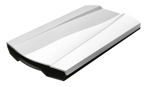
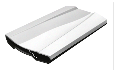
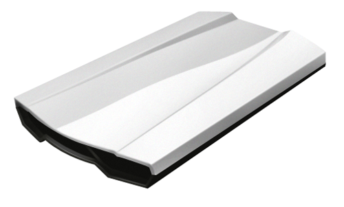
Hi! In this tutorial you will learn how to create an external Asus Lamborghini Hdd icon using some easy techniques, hope you`ll like it!


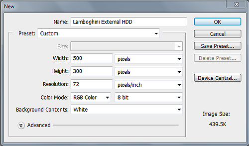
Step1: Create a new document

Begin by creating a New Document 500 px x 300 px.

Step2: Hard Disk shape

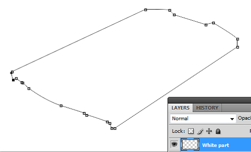
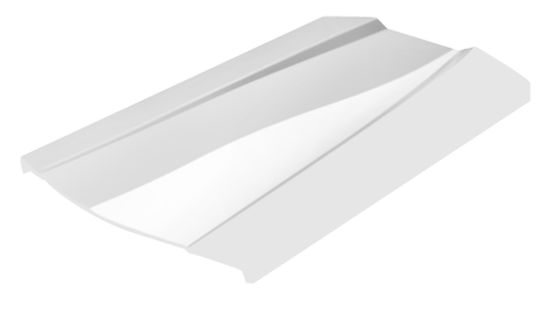
Use Pen Tool (P) to create the Hard disk shape

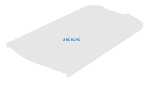
Fill the path created above with a lighten gray, i used #e6e6e6.

Step3: Adding Shadows

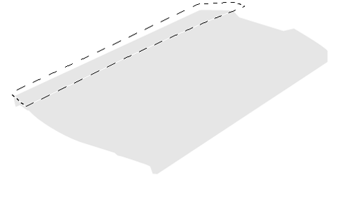
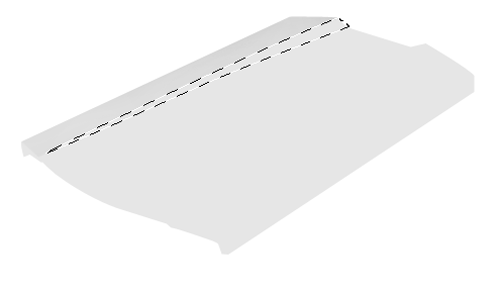
Create next selection using a selection tool (The main tool that we will use is Pen tool (P) to create selections, as it is a much more versatile tool than the lasso tool. It can be tricky to use the first couple of times, but with practice it turns into a very handy tool. I use 0.3 feather when creating selections, and have the anti-aliased button checked, so no jagged edges appear.)

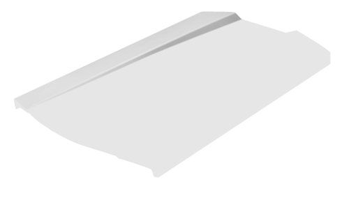
Add some shadows in the selection created above using Burn Tool (O)t

Step 4

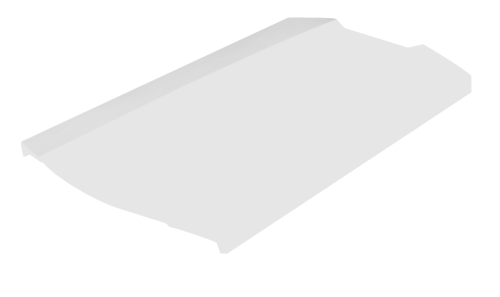
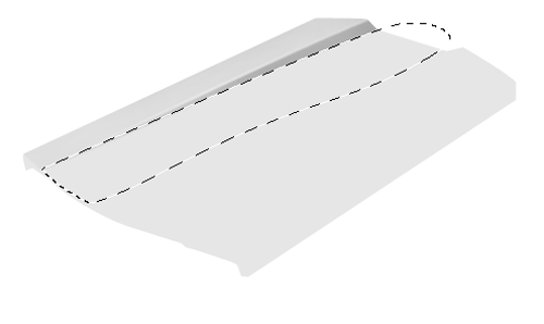
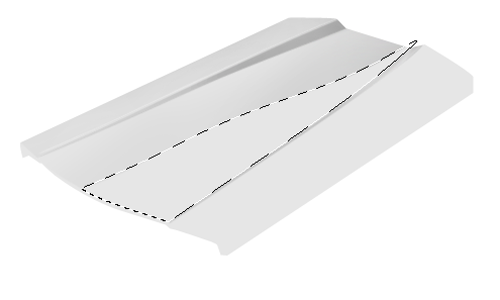
Make another selection using Pen Tool (P)

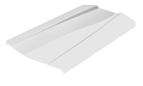
Use Burn Tool (O) and add some shadows in the selection

Strokes

Use Stroke Path technique and add a 2px white stroke like i did in the picture below.

Erase using Eraser Tool (E) to obtain a better effect

Step 5

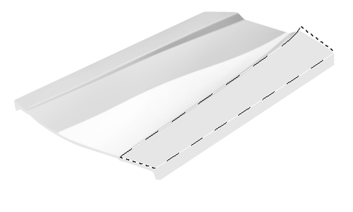
Make next selection using a selection tool

Use Burn Tool (O) and add some shadows in the selection.

Step 6

Again, do a selection like i did in the next picture

Add some shadows using Burn Tool (O).

Step 7: Reflections

Now, we`re going to creating some reflections on our Hard disk icon, make next selection using Pen Tool (P)

Pick up Dodge Tool and add some highlights in the selection

Repeat the same techniques one more time.


Step 8: Hard disk sides

Select the side of our Hard disk using Pen Tool (P)

And add some shadows using Burn Tool like i did below

Noise

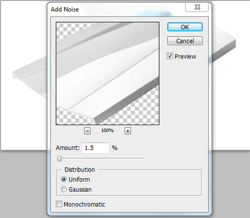
In the same selection, add some noise ( Go to Filter->Noise->Add Noise 1.5% )

Step 9: Strokes

Use Pen Tool (P) and create next path, then add a 2px white stroke

9a.png

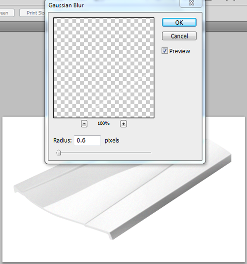
Go to Filter->Blur->Gaussian blur and make the settings below

Make a selection like i did below and add shadows on it using Burn Tool (O)

Step 10: Bottom part

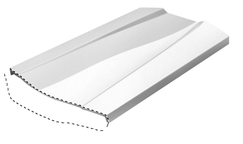
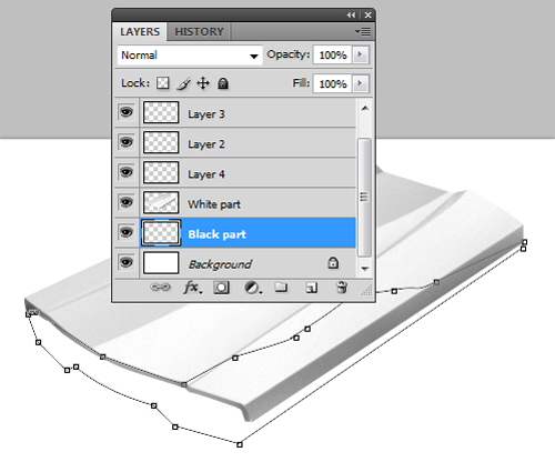
Into a new layer, over the background layer make next path using Pen Tool (P)

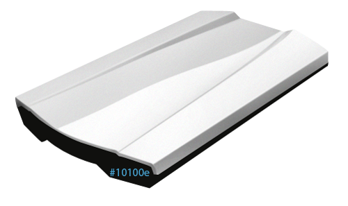
Fill the path

Fill the path created above a dark gray color, i used #10100e

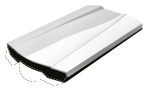
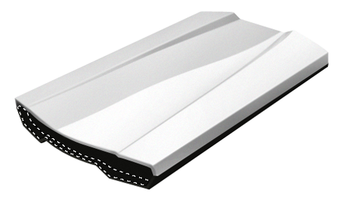
Noise

Now go to Filter->Noise->Add noise and make next settings

Step 11:Ligths

Make next selection using a selection tool

In the selection created above add some light using Dodge TOol (o)

Step 12

Repeat the step 11.

Step 13:Decrease the opacity

Create a path like i did in the next image using Pen Tool (P) and add a 1 px white stroke

Lights, again

Erase using Eraser Tool (E) or decrease the opacity of the stroke for a better effect.

Step 14

Make next selection using a selection tool

Add some light using Dodge Tool (O) in the selection created above like i did in the picture below.

Step 15:Shadow of the hard disk

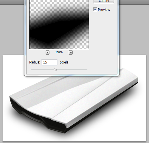
Into a new layer called “Shadow” make a path like i did using Pen Tool (P) and fill it with black color

Now go to Filter->Blur->Gaussian Blur and make the settings below for a better effect

Final

2008-05-20-psd-htmlcss-

CREATING OUR LAYOUT:

Firstly open up photoshop and create a new document 900 x 845 pixels, fill your background layer with the color white if it isnt already. For our background i also want to add some stripes to it so create a new document 4 x 4 pixels with a transparent background. Zoom in 1600%, select the “pencil” tool and a 1 pixel brush, create 4 squares like this.

Now goto “edit > define pattern” label your pattern lines or anything you see fit. close that document and revert back to your first document that you made. Create a new layer above your background layer and label it “background lines” select the paint bucket tool at the top under the menu change forground to pattern. Select your pattern from the list and fill your background with the line pattern, set layer opacity to 10%. Now im going to start designing the general layout of our site starting from the bottom and working my way up. Create a new layer labelled footer. Select the rounded rectangle tool with a radius of 20px draw out your footer, select the rectangle tool and cut off the top.

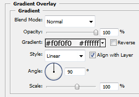
The layer styles for the footer are.
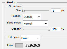
Create a new layer and label it content, select the rectangle tool and draw out our content area, fill with the color white and apply the same stroke as we did in the footer.

Create a new layer above your content layer labelled sidebar select the color #e2e2e2 and create a rectangle like the image below.
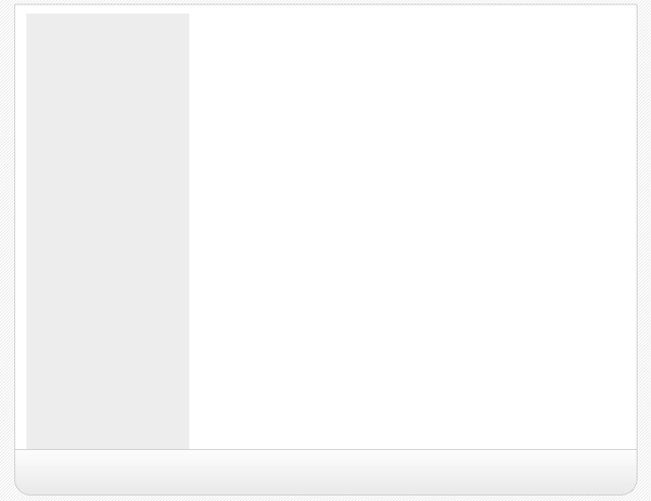
Now create yet another layer labelled navigation, select the rectangle tool and create a rectangle above your sidebar and content area, have the bottom of the navigation touch the top of our grey sidebar.
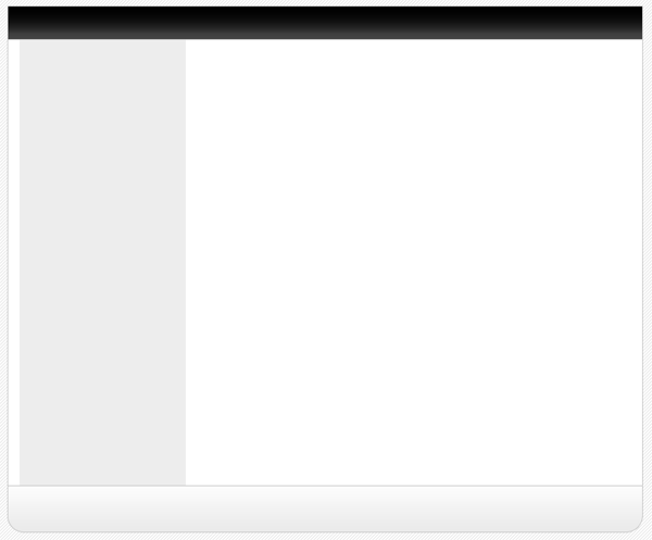
The layer styles for the navigation are.
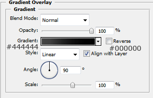
Create a new layer above your navigation labelled navigation shine. On this layer create a rectangle the same width as our navigation but half the size of the width, fill with white and set opacity to 10% this will give the navigation a shiney effect.

Now create another layer labelled header, create the header the same way as we did the footer but make it a little bit bigger, head also uses the same layer styles.

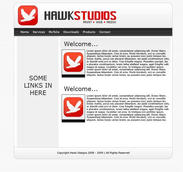
Now select the type tool and add your website title, navigation text and footer text, ive also labelled the grey sidebar box saying links here, you can leave that blank if you wish as the links will be added using html & css.
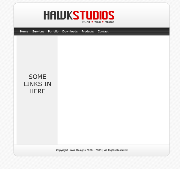
Now add your website logo, i just created a quick one using adobe’s custom shapes, obvisouly you can take more time to develop your own logo.

Now add some example content so we no what our layout will sort of look like, but most of it will be done using css and html which you will see in a moment.
SLICING AND PREPING IMAGES:

Now our website is created we need to slice and prep our images ready to be used in our website, now your going to have to bare with it as your site may be a few pixels wider or higher than mine unless you have downloaded the PSD.

Firstly we’l start with the header, hide ALL layers in your psd file except the header layer(s) create a new blank layer above your header then goto “layer > merge visable” this will then merge our layers corrosponding to our header but keep all the layer styles intact, eles everything goes abit mental. Copy and paste your header, logo etc… which should now be all on one layer to a new document. Under the header layer on your new document add your white background and your stripes, simply by filling with the bucket tool and creating a new layer and filling with your pattern, remember you pattern layer should have a opacity of 10% just like in the psd. Now i want to add a drop shadow to the header so the layout doesnt look flat onto the background when its viewed on the internet. So add this drop shadow to your header.
Your header in your new document should look like this.

Now goto your desktop create a folder called “website” open the folder website and create another folder called “images” save the header as “header.jpg” within the “website images folder” by going to “file > save as” in adobe photoshop. Thats our header done now for our navigation. Our header was 790pixels wide which also included the space around the header for the drop shadow, so our naviagtion should be the same, but without the space at the top and bottom as we only want the drop shadow around the outside of our layout. Following the steps above copy and paste your navigation to a new document, add your stipey background and drop shadow like we did with the header. Heres my navigation.

The content will be done in the same way but we dont need all of it, just a section of it as we can repeat it over and over using CSS. Make a selection like this.
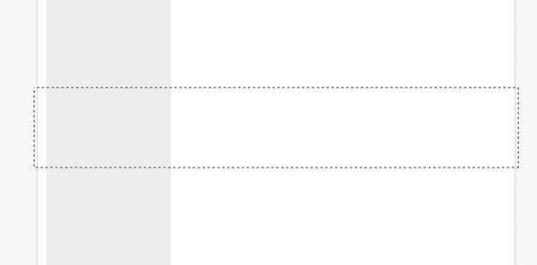
Copy and paste to a new document also note that the selection is also 790pixels wide. Once pasted to a new document we need to add our white 7 stripey background again plus the drop shadow. Heres how mine looks.

Notice how small my snippet is, mine is only actually 20pixel high as it will be repeated anyway. Now do the same with the footer.

One last thing, as we want the stripey background we also need to create our background to do this make a screen shot of your psd layout and make a selection 21x21pixels of the background save it as gif in your images folder, or save the small image below.

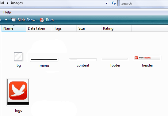
Thats all the images we need. You should have something like this in your images folder.
CODING OUR LAYOUT:

Goto your website folder then open notepad, once you have opened notepad just goto “file > save as” then save as a blank css document (see image below).
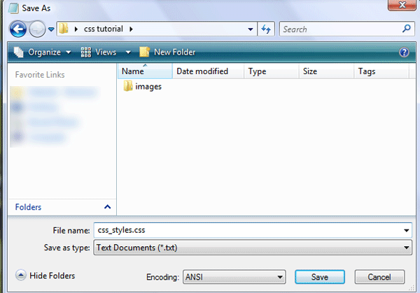
Now open dreamweaver and create a blank HTML page. Click the code button to see the source code of our blank html. Save your html file as index.html in the same directory as your css file.

Firstly lets add all our information which will include our doctype, author details, meta tags and linking of our css file.

 <!DOCTYPE html PUBLIC "-//W3C//DTD XHTML 1.0 Strict//EN" "http://www.w3.org/TR/xhtml1/DTD/xhtml1-strict.dtd">  <html xmlns="http://www.w3.org/1999/xhtml" xml:lang="en" lang="en"> <head>  <meta name="Description" content="Hawk studios, print web &amp;amp;amp; media" /> <meta name="Keywords" content="your, keywords" /> <meta http-equiv="Content-Type" content="text/html; charset=iso-8859-1" /> <meta name="Distribution" content="Global" /> <meta name="Author" content="richard carpenter - [email protected]" /> <meta name="Robots" content="index,follow" />  <link rel="stylesheet" href="css_styles.css" mce_href="css_styles.css" type="text/css" />  <title>HAWK STUDIOS | Print . Web . Media</title>  </head> 

You can pretty much see what some of the things mean, the main two id like to point out you are the stylesheet link and the title, the title being whats displayed in the browser window and the without the stylesheet the layout will look abit of a mess. Now the lets get on with marking up our “divs” for our layout, we’l have 5 main divs “header, naviagtion, content, sidebar and footer”. We mark these out like so.

 <body> <!-- wrap starts here --> <div id="wrap"> <div id="header"> <!--HEADER INFO WILL GO HERE --> </div> <div id="menu"> <!--NAVIAGTION HERE --> </div>  <!-- content-wrap starts here --> <div id="content-wrap"> <div id="main"> <!--MAIN CONTENT HERE --> </div> <div id="sidebar"> <!--SIDE BAR LINKS HERE --> </div>  <!-- content-wrap ends here --> </div> <div id="footer"> <!--FOOTER HERE --> </div>  <!-- wrap ends here --> </div>  </body> </html> 

The arrows are comment codes i cant stress enough how important it is to have these as it will tell us where everything goes. A comment code is basically a snippet of text that can be added to a html document but the browser doesnt render it, there for being invisable when viewed in a browser, you’l only see it when you view the source code. Theres 1 or 2 divs i havent mentioned yet that you might see and thats the wrap and content-wrap divs, these will be styles to keep the layout in the middle of our browser which we’ll get too in a moment. If you view your website now in the browser you wont see nothing even thou you’ve added buckets of code already not untill you’ve added the styles in the css style sheet. Goto “file > open” and open your blank style sheet, the first things we will style will be our websites background image, set the font type and size.

 /******************************************** HTML ELEMENTS ********************************************/ /* top elements */ * { margin: 0; padding: 0; outline: 0; } /*sets no padding or margin around the body of our document*/  body { background-color: #fff; /*website background color (white)*/ background-image: url(images/bg.gif); /*sets the background image, in our case the stripey background*/ background-repeat: repeat; /*repeats our background over and over*/ color: #333333; /*sets our text color for our website*/ margin: 15px 0; /*sets no padding and a 15px margin around the body of our document*/ font-family: Verdana, Tahoma, arial, sans-serif; /*sets the font family for our website*/ font-size: 70%; /*sets the font size in %, you can also use 12px or 14px etc... px stands for pixels*/ line-height: 1.5em; /*sets the height between each line of text.*/ } 

The first thing that most people style is the body. The body is the element that defines the documents’ body. It contains all the contents of the document (like text, images, colors, graphics, etc.). Next lets style our website layout starting with the header and our wrap which looks like this.

 /******************************************** WEBSITE LAYOUT ********************************************/ #wrap { width: 790px; /*width of our wrap*/ background: #CCC url(images/content.jpg) repeat-y center top; /*sets our background color to white and uses our content.jpg as a background, the background is also repeated along the Y axis*/ margin: 0 auto; /*center our margin to auto will center our website*/ text-align: left; /*aligns our text to the left*/ } #content-wrap { clear: both; /*The clear property sets the sides of an element where other floating elements are not allowed.*/ width: 760px; /*width of our wrap*/ margin: 5px auto; /*sets our top margin at 5 pixels and the rest to auto*/ padding: 0; /*sets 0 padding*/ } #header { position: relative; /*An element with position: relative moves an element relative to its normal position, so "left:20" adds 20 pixels to the element's LEFT position*/ height: 131px; /*sets our header height, this should be the same as our header image*/ background: #caced1 url(images/header.jpg) no-repeat center top; /*sets a background behind our header and sets our header image onto the page*/ padding: 0; /*no padding is needed*/ } 

If you view your website now it should look like this.
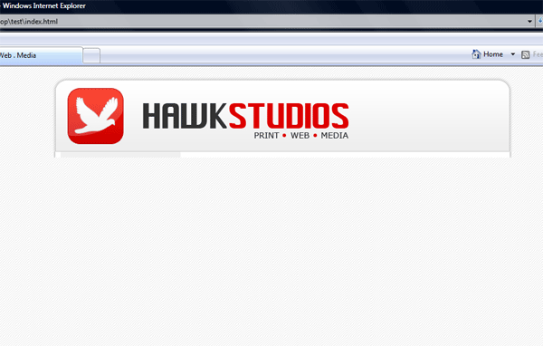
The next part to style is our navigation.

 /******************************************** WEBSITE NAVIAGTION ********************************************/ #menu { clear: both; /*No floating elements allowed on either the left or the right side*/ margin: 0 auto; /*Margins*/ padding: 0; /*Padding*/ background: #81C524 url(images/menu.jpg) no-repeat; /*Our menu background*/ height: 40px; /*The height of the menu */ width: 790px; /*The width of the menu */ font-family: Verdana, Arial, Helvetica, sans-serif; /*The font family*/ font-size: 14px; /*The font size*/ line-height: 40px; /*The line-height property sets the distance between lines.*/ } #menu ul { float: left; /*Floats our menu to the left*/ list-style: none; margin:0; padding: 0 0 0 20px; } #menu ul li { display: inline; /*The element will be displayed as an inline element, with no line break before or after the element*/ } #menu ul li a { display: block; float: left; padding: 0 12px; color: #fff; /*Font color*/ text-decoration: none; } #menu ul li a:hover { color: #E00000; /*Mouseover hover color*/ } 

If you view your website now, you will see you have your naviagtion.

Now its time to add our sidebar, content and footer styles.

 /******************************************** MAIN COLUMN ********************************************/ #main { float: right; /*floats our main content area to the right*/ width: 555px; /*gives our content area a width of 555pixels*/ margin: 0; padding: 20px 0 0 0; display: inline; }  #main h2 { padding: 0; margin-bottom: 0; color: #333333; font-family: Verdana, Arial, Helvetica, sans-serif; font-size: 180%; font-style: normal; font-weight: bold; } #main h2 a { color: #2666c3; text-decoration: none; }  #main p, #main h1, #main h2, #main h3, #main ol, #main ul, #main blockquote, #main table, #main form { margin-left: 25px; margin-right: 20px; }  /******************************************** SIDEBAR ********************************************/ #sidebar { float: left; width: 195px; padding: 0; color: #333333; margin-top: 5px; margin-right: 0; margin-bottom: 0; margin-left: 0; } #sidebar h2 { margin: 15px 5px 10px 5px; font: bold 1.4em 'Trebuchet MS', Tahoma, Sans-serif; color: #333333; } #sidebar p { margin-left: 5px; }  #sidebar ul.sidemenu { list-style: none; text-align: left; margin: 7px 10px 8px 0; padding: 0; text-decoration: none; border-top: 1px solid #A9D4EF; } #sidebar ul.sidemenu li { list-style: none; padding: 4px 0 4px 5px; margin: 0 2px; color: #333333; border-bottom: 1px solid #D2E8F7; } * html body #sidebar ul.sidemenu li { height: 1%; } #sidebar ul.sidemenu li a { text-decoration: none; color: #FF0000; } #sidebar ul.sidemenu li a:hover { color: #333; } #sidebar ul.sidemenu ul { margin: 0 0 0 5px; padding: 0; } #sidebar ul.sidemenu ul li { border: none; }  /******************************************** FOOTER ********************************************/ #footer { color: #333333; background: #caced1 url(images/footer.jpg) no-repeat center top; clear: both; width: 790px; height: 57px; text-align: center; font-size: 90%; } #footer p { padding: 10px 0; margin: 0; } #footer a { color: #FF0000; text-decoration: none; }  /* alignment classes */ .float-left { float: left; } .float-right { float: right; } .align-left { text-align: left; } .align-right { text-align: right; }  /* display and additional classes */ .clear { clear: both; } 

Your website should now look like this.
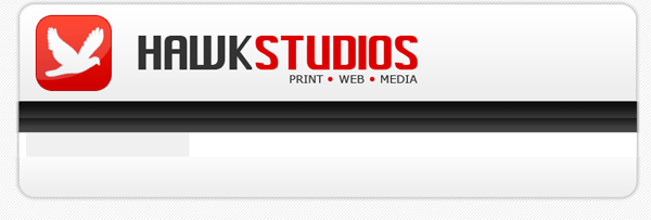
Now we need to add our content, so save your CSS file and goto the code veiw for your HTML file find the lines “naviagtion”

 <!-- navigation --> <div id="menu"> <ul> <li><a href="index.html">Home</a></li> <li><a href="index.html">Archives</a></li> <li><a href="index.html">Downloads</a></li> <li><a href="index.html">Services</a></li> <li><a href="index.html">Support</a></li> <li><a href="index.html">About</a></li> </ul> </div> 

This bit of code will add the text links “home, archives, downloads, services, support and about” to our navigation. All links point to index.html, this can be changed to what ever address you need to point them to E.G. http://www.hv-designs.co.uk. Your website when viewed in the browser should look like this.
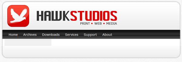
Now find the lines “MAIN CONTENT HERE” and add

 <div id="main"> <h2>WELCOME...</h2> <p><img src="images/logo.jpg" width="100" height="120" class="float-left" /> Lorem ipsum dolor sit amet, consectetuer adipiscing elit. Donec libero. Suspendisse bibendum. Cras id urna. Morbi tincidunt, orci ac convallis aliquam, lectus turpis varius lorem, eu posuere nunc justo tempus leo. Donec mattis, purus nec placerat bibendum, dui pede condimentum odio, ac blandit ante orci ut diam. Cras fringilla magna. Phasellus suscipit, leo a pharetra condimentum, lorem tellus eleifend magna, eget fringilla velit magna id neque. Curabitur vel urna. In tristique orci porttitor ipsum. Lorem ipsum dolor sit amet, consectetuer adipiscing elit. Donec libero<br /> </p>  <hr align="center" width="450" noshade="noshade" /> <h2>SOMETHING ELES...</h2> <p><img src="images/logo.jpg" width="100" height="120" class="float-left" /> Lorem ipsum dolor sit amet, consectetuer adipiscing elit. Donec libero. Suspendisse bibendum. Cras id urna. Morbi tincidunt, orci ac convallis aliquam, lectus turpis varius lorem, eu posuere nunc justo tempus leo. Donec mattis, purus nec placerat bibendum, dui pede condimentum odio, ac blandit ante orci ut diam. Cras fringilla magna. Phasellus suscipit, leo a pharetra condimentum, lorem tellus eleifend magna, eget fringilla velit magna id neque. Curabitur vel urna. In tristique orci porttitor ipsum. Lorem ipsum dolor sit amet, consectetuer adipiscing elit. Donec libero</p> </div>

Now this bit of code has a couple of things
1) H2 tages which are header tags
2) P tages which are paragraph tags
3) its has an image which is an image of our logo, the image also has a class float left meaning our text will wrap around our image.
4) HR tag which is a horizontal ruler.

If you view your site now it should look like this.
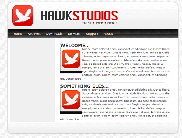
You can see from the image above that we need to set our H2 tags in our style sheet and we need to add some styling to our images so everything is no so cramped up. We do this by adding this into our stylesheet.

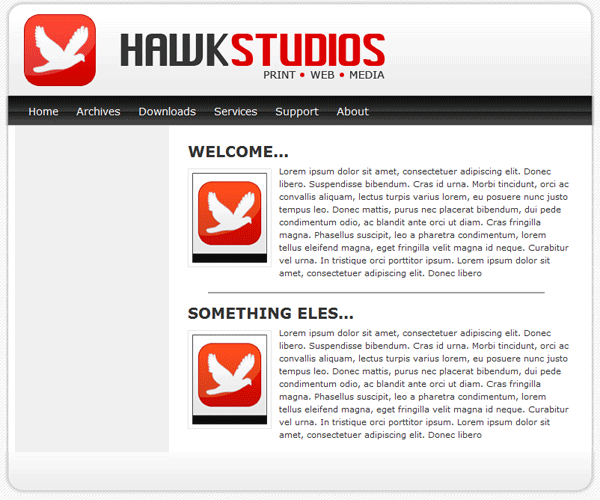
 /******************************************** WEBSITE LINKS ********************************************/ a, a:visited { text-decoration: none; background: inherit; color: #FB9233; } a:hover { text-decoration: underline; background: inherit; color: #93C600; }  /******************************************** WEBSITE TEXT HEADERS ********************************************/ h1, h2, h3 { font-family: 'Trebuchet MS', Tahoma, Sans-serif; } h1 { font-size: 180%; font-weight: normal; color: #555; } h2 { font-size: 160%; color: #88ac0b; font-weight: normal; } h3 { font-size: 135%; color: #666666; }  /******************************************** WEBSITE IMAGES ********************************************/ img { background: #fff; border: 1px solid #E5E5E5; padding: 5px; }  img.float-right { margin: 5px 0px 10px 10px; } img.float-left { margin: 5px 10px 10px 0px; }  h1, h2, h3, p { margin: 10px 15px; padding: 0; } ul, ol { margin: 5px 15px; padding: 0 25px; } 

You can now see in the image below we have padding around our title and image.
Now we need to add some content to our sidebar, so find “SIDE BAR LINKS HERE” and add the following code.

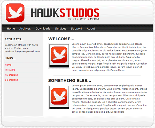
 <!-- sidebar here --> <div id="sidebar"> <h2>AFFILIATES...</h2> <p>Become an affiliate with hawk studios. Contact us at [email protected] </p>  <h2>LINKS...</h2> <ul class="sidemenu"> <li><a href="index.html">Home</a></li> <li><a href="http://www.pixel2life.com">Pixel2life</a></li> <li><a href="http://www.hv-designs.co.uk">HV-Designs</a></li> <li><a href="http://www.sb-designs.co.uk">SB-Designs</a></li> </ul> </div> 

Our sidebar is not that different from our navigation apart from our list goes down instead of across. Our sidebar now looks like this.
All that is left is to add our footer text which isnt alot of code.

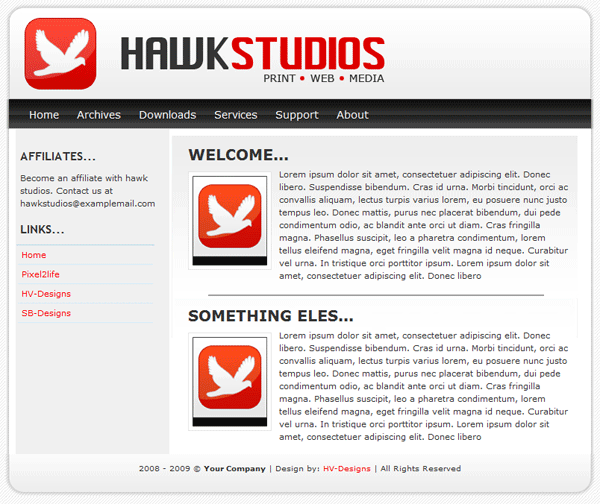
 <!--footer starts here--> <div id="footer"> <p>2008 - 2009 &amp;amp;amp;copy; <strong>Your Company</strong> | Design by: <a href="http://www.hv-designs.co.uk">HV-Designs</a> | All Rights Reserved </p> </div> 

Your website should now be finished, if you click your “design” tab within dreamweaver you should be able to see your website and add more text and images live as you go along. Your finished website should look like this.
page-33-

Computer Shop Layout Tutorial


Create a new document 800×950, fill your background with the color #21252e. Select the “rectangular marquee tool” and draw out a rectangle at the top of your canvas, fill the rectangle with the color #111419 and add a “2 pixel black stroke”.

CLICK HERE TO SEE THE RESULTS.

Select your type tool and choosing a nice looking font add your title and slogan. Add these layer styles to your “title”.

Now duplicate your title text and goto “edit > transform > flip vertical”, move the text down so it looks like a mirror image, add a layer mask. (for more information on reflections do my reflections tutorial).

CLICK HERE TO SEE THE RESULTS.

Choose a shape from your custom shapes menu OR use your own logo and place by the side of your title, also add a picture of some sort to give a good idea on what you are selling, as im doing a computer store i shall use a computer. Again duplicate your image, flip it and add a layer mask like you did for the title in step1.

CLICK HERE TO SEE THE RESULTS.

Now lets add a navigation to our header. Select the “rounded rectangle tool” and draw out a rectangle roughly the same size as the image below.

Now add these layer styles to the button.

Your button should now look like this.

Duplicate as many times as needed and place at the top of your header.

CLICK HERE TO SEE THE RESULTS.

Now label your buttons with the type tool.

Lets add some reflections to our buttons, select the “elliptical marquee tool” and draw a circle over the buttons like this.

Fill the circle with the color white.

Here comes the tricky part, “hide every layer apart from your buttons” once everything is hidden goto “layer > merge visable” all of your buttons should now be on one layer with the layer styles intact. Unhide everything then click on your buttons layer whilst holding down the ctrl key on the keyboard, now click your white circle layer and goto “select > inverse” and hit the delete key on your keyboard. You should be left with this.

Now set the opacity of your white cirle layer to about 40%.

Select your rounded rectangular tool again and draw out 3 rectangles. (see link below)

CLICK HERE TO SEE THE RESULTS.

Add these layer styles to your rectangles.

In the left rectangle add your, title/products.

Select the recangular marquee tool and draw out 2 small rectangles, fill them with 2 colors, and place them next to your categories.

Select the type tool again and just type out some full stop signs (.) and place them as dividers.

CLICK HERE TO SEE THE RESULTS.

In the very bottom rectangle put your all important foot information.


Thats it all done really, looks quite plain but with your content added aswell, it could look like this.

Software Box Tutorial


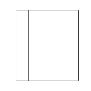
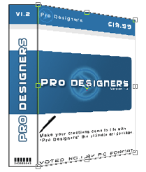
Create a new document 500×500 pixels, create 2 new layers one called “spine” and label the other “main” on the main layer draw out a box 274 x 385 pixels and on the spines layer draw out a box 66×385 pixels, draw the boxes with the “rectangular marquee tool”. Then add a 1 pixel black stroke to both and postion them like so.

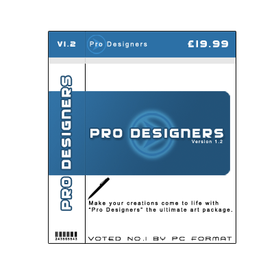
Now goto work and create your images & text for the box, keeping within the black lines. Here’s what i came up with.

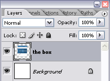
When your finished merge all layers apart from the background layer so your left with this.

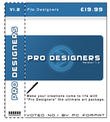
Now select your “rectangular marquee tool” and select the spine.

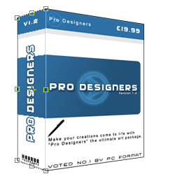
Then goto “edit > cut” then “edit > paste” you should now have the spine and the front of the box on 2 seperate layers. Repostion them side by side then select the layer your front box is on and goto “edit > transform > distort” using the two top and bottom right handles distort the box to look like this.

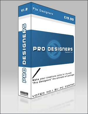
Then do the same to the spine.

Thats it all done.

page-10-

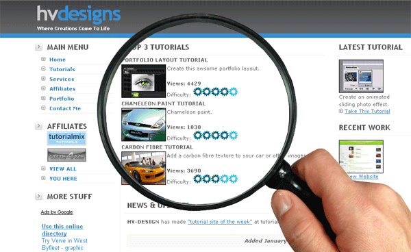
Magnify Tutorial


Firstly find an image of a magnifying glass either from google or from a stock photo site like sxc.hu Once you have your magnifying glass, cut it out including the inner lens with your prefered tool.

Now open up your image you want to magnify, resize it down as we will be using the larger version for the lens, paste your magnifying glass onto your image and resize it to suite your image dimensions.

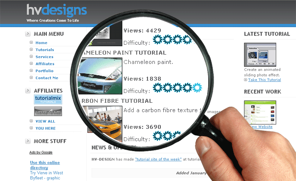
Now create a new layer under your magnifying glass layer and paste your larger version background on to it, using the “circular selection tool” draw a circle the rough shape of the magnifying glass lens then goto “select > transform selection” resize your circle and get it as close to the inner edge of the magnifying glass as you can, once your happy hit enter key. With your selection still active click your larger background layer then goto “select > inverse selection” then hit the delete key, you should then be left with something like this.

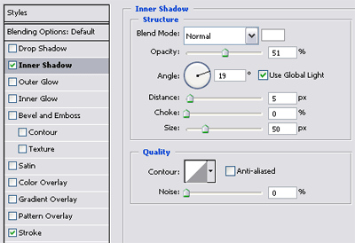
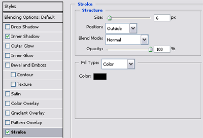
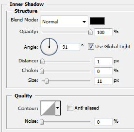
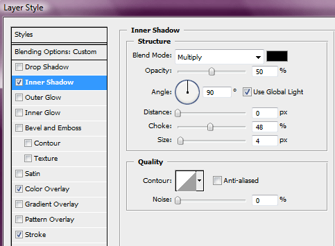
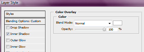
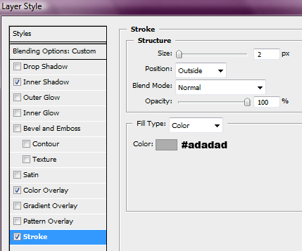
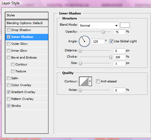
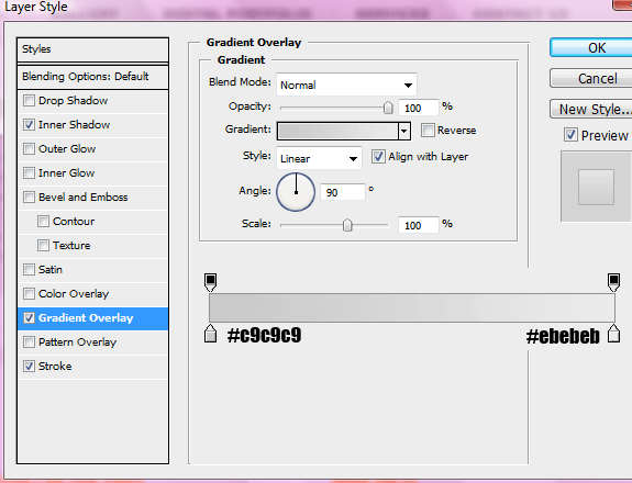
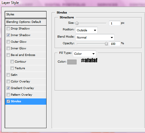
Select the blending options for your current selected layer and add a “inner shadow” and a “stroke” using settings below.

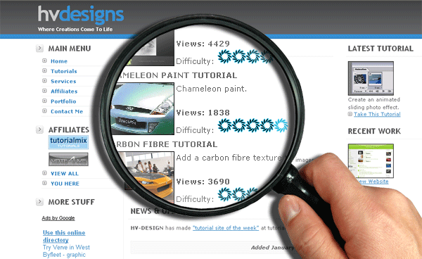
We should also add a drop shadow to give a more realistic apprearance.
ALL DONE!

Web Design Layout #4 Tutorial

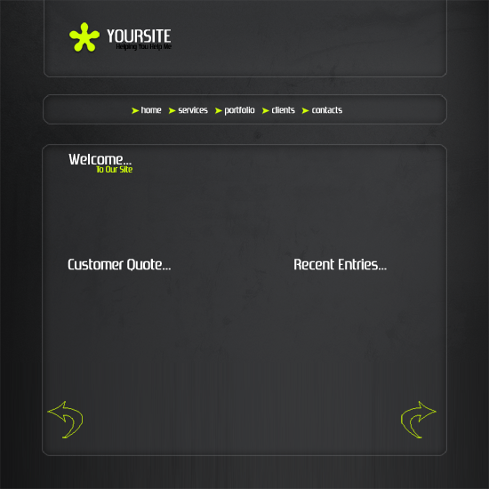
Create a new document 800×800, select the colors #2c2d2e & #47474a (or something similar) and drag a linear gradient over your canvas.

Now create a new layer, using some grunge brushes add some grunge.

Set layer opacity to 50% and blending mode to soft light. Now select your background layer and add some noise by going to “filter > disort > noise”.

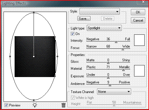
Now merge both layers together, and goto “filter > render > lighting effects” use the settings below. (sorry about quality of image)

You should now have something like this.

Now select the rounded rectangle tool and make these 3 set of boxes.

Once you have made the boxes set the all the layers opacity to 40% and add these layer styles.

You should now have something like this.

Add your site title and logo.

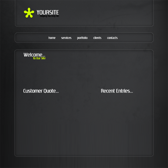
Still with the text tool add your navigation text and main text.

Now using adobes custom shapes add a selection of small arrows next your navigation text and 2 big small arrows at the very bottom (see picture below).

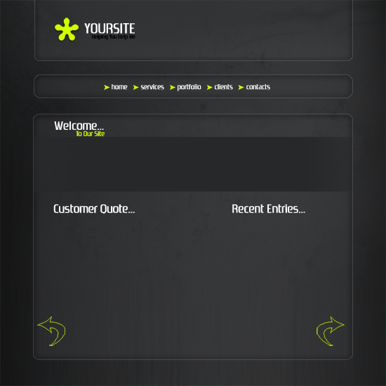
Under “welcome to our site” add a small rectangle fill with a dark shade of blue/grey.

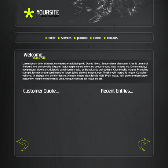
Now take abit of time to add a brief description of your website.

Now select the color white and select a grunge brush, add abit of grunge into your header on the right side.

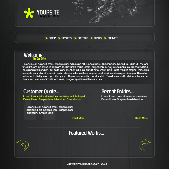
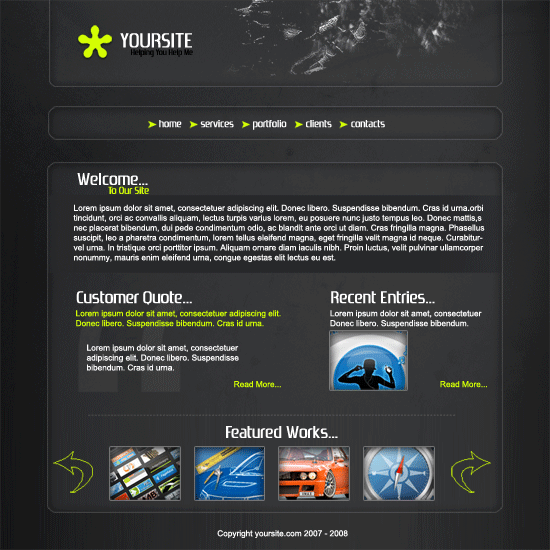
Add your text for your other 2 sections and add a third section at the bottom labeled “featured work”.

Now select a couple of pictures of your choice for your work and recent entry.

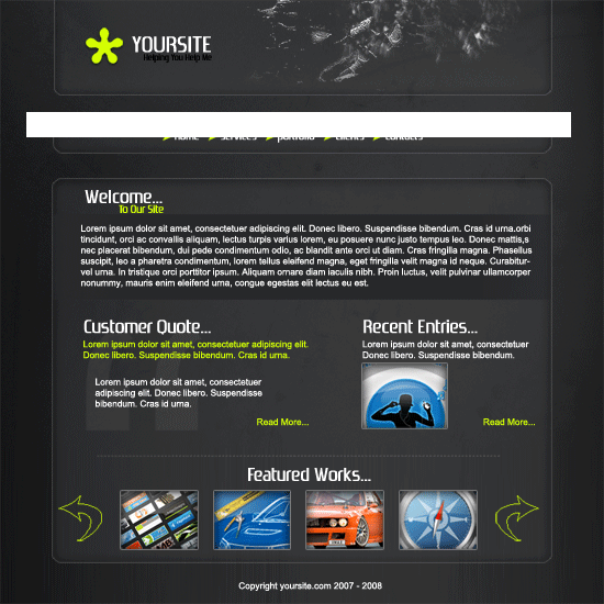
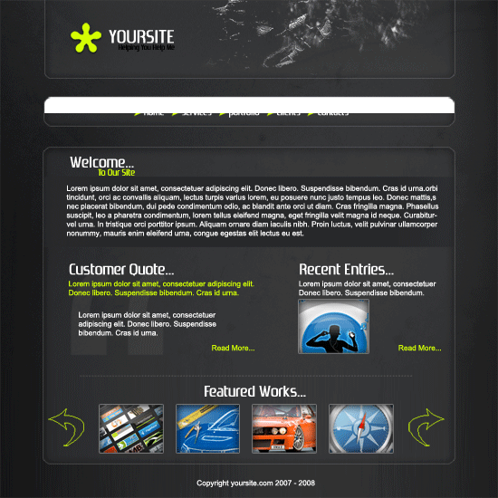
Now were going add abit of shading to our header and navigation, starting with the navigation, select the color white and the rectangle marquee tool. Draw a rectangle across half of the navigation and fill with white.

With your white box layer selected, hold ctrl and click on your navigation, now goto “select > inverse” then hit the delete key on the keyboard. you should be left with this.

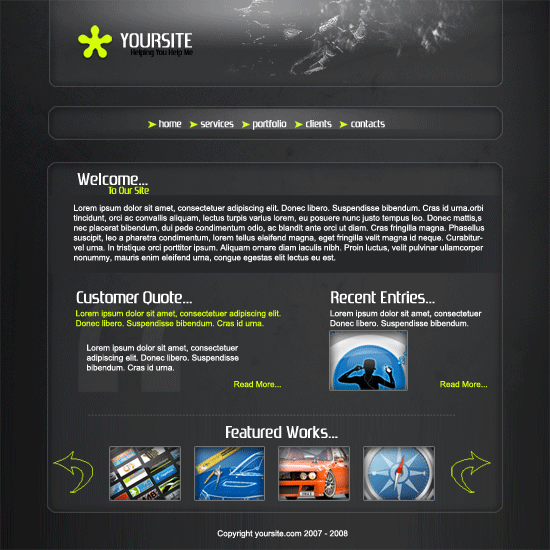
Now add a layer mask and select a reflected gradient, drag the gradient over the left side from the middle so both the left side and right side smooth into the box. do the same with the header. you should have something like this.

Software Layout #1 Tutorial

Create a new document sized 800×800 pixels with a white background. Start off with our site title and slogan and a little quick navigation. Add the title and slogan at the top left hand corner and the quick navigation at the top right hand corner. You should have something like this.

Lets also add some phone support underneath our quick navigation.

Select the rectangular marquee tool and draw out a rectangle under your title and text.

Fill the rectangle with a gradient having the color “#e5e5e5″ as your foreground, also draw out 2 1pixel lines above it coloring one line black and one line white. Put the white line under the black line.

Place your software box & cd display over the rectangle, slightly in the middle. If you don’t have a software box you can create one from a tutorial ive previously created. The cd was made using “elliptical marquee tool”.

Lets also add a reflection under our software box and cd, if you don’t no how to do reflections then i suggest you do “my reflections tutorial”. Lets also add some text and titles to sell our product.

Now lets create our buttons. Duplicate your rectangle you created in step2 and scale it down to button size and add a 1pixel stroke using the color “#cfcfcf”.

Now duplicate you button 4 times so you have 5 buttons, then place them under each other.

Place all 5 buttons next to your software box and label them.

Lets also add some logos next to them, go to your custom shapes from the shapes menu.

Select “custom shape tool” then at the top in your tool bar select shape then the type of shape you would like. Once selected drag it out onto your canvas on a new layer, select your desired color, select the pen tool then right click and go to “fill path”.

Yet again duplicate your rectangle we created in step2 and place it under your software box & information.

Label out 3 columns for your information that you will add later.

Then add some kind of a separator to separate the 3 columns and a footer. The separators are just grey lines with a masked added to them and the footer is the same but without the mask.

Now add the all important information onto the footer.

That’s it all done
here’s the final piece.

Web Design Layout #1 Tutorial

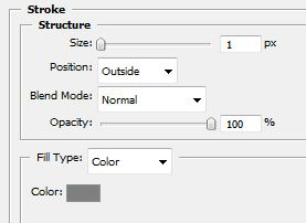
Create a new document 800 x 900 select the rectangular marquee tool and draw a rectangle at the very top using the color #288cc8. Also add these stroke settings.

Your rectangle should looks like this.

Create a new layer above your rectangle layer, select the color white and select the paint brush tool, brush some clouds over your rectangle. (If you dont have any cloud brushes download some from here)

You should have something like this.

Select the type tool and add your site title and slogan, Add an outer glow to your header text using the settings below.

You should have something like this.

Create a new layer above all the other layers, then select the rounded rectangle tool draw out a small rectangle (button size). Fill with the color white and add this layer style.

Place the button at the bottom of your clouds and blue rectangle but make the button overlap (see image below).

Now duplicate the button up how many times needed. (right-click layer > duplicate layer)

Now hide ALL LAYERS apart from the BUTTON LAYERS then goto “layer > merge visable”. Your buttons should now all be on one layer. Select the rectangular marquee tool and make a selection at the bottom of the buttons BUT underneath the stroke on blue rectangle.

Hit the delete key on the keyboard, you should then be left with this.

Label your buttons. Now save this image to your desktop (IMAGE HERE) Select the rounded rectangle tool and draw out a rectangle underneath your buttons, once drawn select the pen tool, right click the rectangle on your canvas and goto “make selection”.


Open up the image you previously saved to your desktop, goto “edit > copy” head back over to your layer then goto “edit > paste into” Move/reszie image to fit like the image below, once you’ve postioned it how you want it make a selection like the image below.


Press “ctrl + t” on the keyboard to enter into free transform mode, drag the middle anchor point all the way across to the other side (might need to do it twice). You should be left with something like this.


Add a stroke to finish it off.

Now select the rounded rectangle tool again and create a button next to your nav bar like this.

Just color it any color for now as it will shall change later. Select the the big rectangle layer with your eye image, but click it wilst holding the ctrl key on the keyboard, you should get the dotted line around your rectangle.

Now click your new button layer (the black button you just created) while the selection is still active and goto “select > modify > expand” expand the selection by 6 pixels. Once expanded hit the delete key on the keyboard. Your button should now look like this.

Add these layer styles to your new button and label it “home”.

You should have something like this.

Select the rounded rectangle tool yet again, draw out a content box and add this stroke to it.


Add your welcome text and title.


Goto your custom shapes menu and pick out the drawing pin shape.

On a new layer draw 2 drawing pins, color them with the color #288cc8. Place them either side of your welcome message.
Now add more content boxes using the same steps as above.


Once your finished add a little rectangle at the bottom using the color #288cc8, this will be your footer.

And here’s the final product.

2010-11-15-deviantart-illustrations-13-

The internet is full of great artists and in this round-up we’ve listed 18 exceptional pieces of Digital Art from deviantART. You’ll be amazed at some of this work.

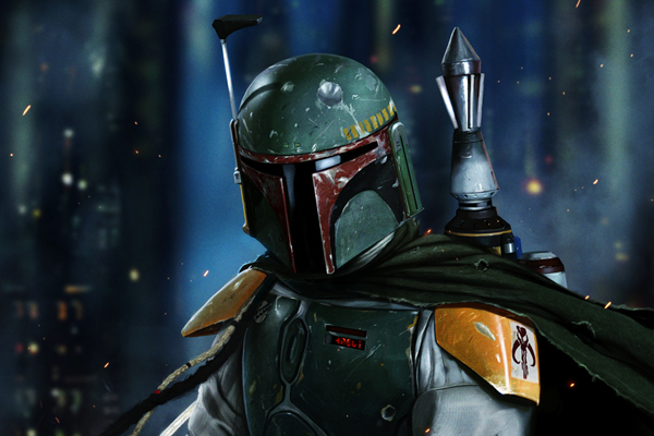
BOBA FETT – NO DISINTEGRATIONS

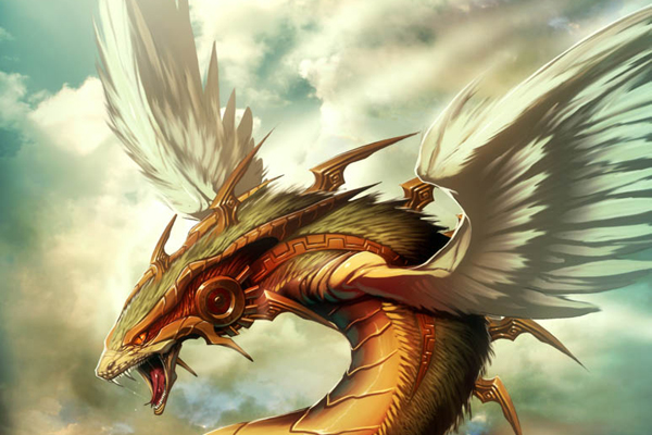
Quetzalcoatl T

Mask

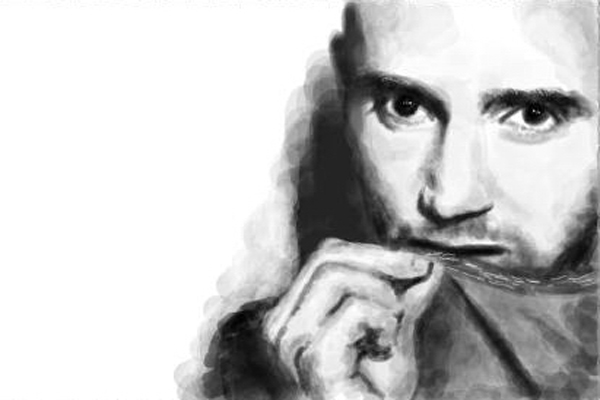
Moby

Kroca Sobeka

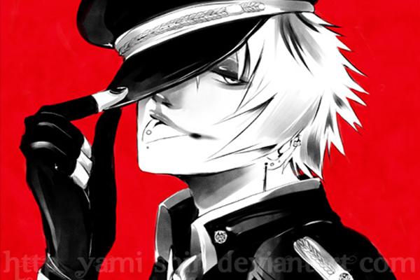
Original – Uniforme

Sippin on Some Syrup

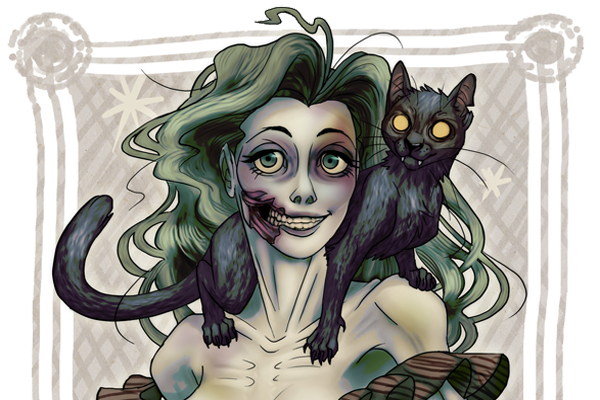
Miss Zombie

DRAMATIC SUNBLOCKING

Merlin

Nostalgic Memories

Libra

The Wizard

Pipes

Psychic Hunter

Rainy dragon

Asian Inspired VII

405

Special thanks to all the artists for sharing their work, please make sure to check out their Galleries over at deviantART.

Do you know of any other great work??? Feel free to share it with us.

Web design Layout #8

Hello, welcome to another tutorial by the hv-designs team sorry were abit late than usual. In this tutorial il show you to create a web design layout. Lets get started.

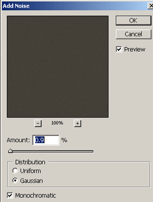
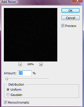
Create a new document 850×900 pixels with a black background, on the background layer we need to add some noise so goto “filter > noise > add noise. Use the settings in the image below.

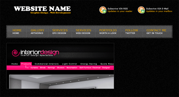
In the top left hand corner add your website title and slogan, on the right side add some RSS information, the icons i have used are from dryicons.com and the color code for the orange is #f1a904. Heres mine.

Underneath your title and RSS information draw out a rectangle for your navigation using the rectangular marquee tool.

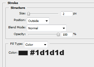
Add these layer styles to your navigation rectangle.

Set the navigation bars layer opacity to 30%. Your navigation bar should now look like this.

Create a new layer above your navigation layer, with the rectangular marquee tool make a selection like this.

Fill the selection with the color white then set layer opacity to 5%. Now add your navigation text.

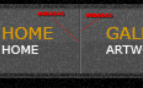
Inbetween each navigation link add a divider. Use two 1pixel lines next to each other using two different colors.

You navigation should now be complete and look something like this.

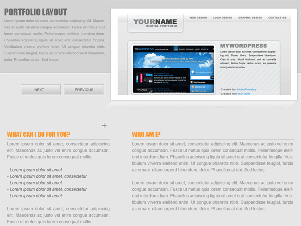
Next find an image that you find worthy enough to make it onto your first page for our little gallery. Im using one of my tutorial results. Place it underneath the navigation bar and add this layer style.

On the side of your featured image add a small white box with the opacity of 13%.

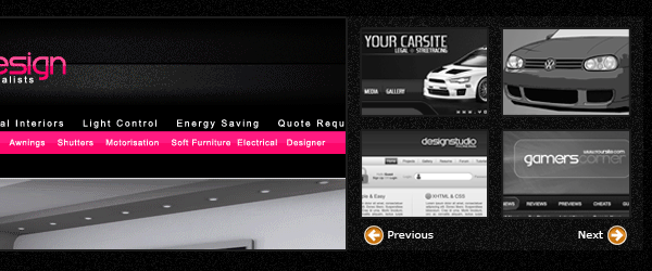
Inside the white box add some small thumbnails of past work that you may have done, space them out evenly, in the small space left over at the bottom add next and previous arrows, the icons are from dryicons.com.

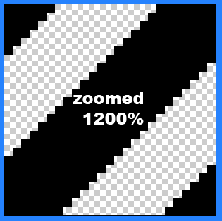
This next part requires the use of some diagonal lines, to make the lines create a new document with a transparent background 125x125pixels. Copy the image below, then goto “edit > define pattern” save the pattern for later use.

Create a small white rectangle underneath your featured image set layer opacity to 5%.

Keep the selection active, make a new layer then fill the section with your pattern. Add a white overlay to your pattern layer and also lower opacity to 5%. You should have this effect.

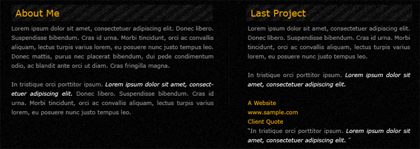
Add a title inside your white box where the pattern is, then underneath add some info, do the same next to it.

Inbetween the two paragraphs add a divider using the same technique as we did in the navigation. In the last bit of space left on the canvas we’ll add our footer, create a white rectangle with the opacity of 5% and with a 3 pixel black stroke.

Inside the footer on the left side add a few links to some sites, on the right hand side add your website title and slogan. Do this by duplicating them and draging them down to the footer. Last but no least add your copyright information.

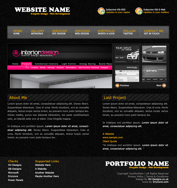
Heres the end result.

Black & White Cars Tutorial


Load up your car image and select the “pen tool”, draw around your car but not selecting your windows, grills, lights etc… so basically your just left with a shell. “copy and paste” to a new layer.

With your newly pasted layer selected goto “image > adjustments > desaturate” then goto “image > adjustments > variations” use the settings below.

To make a black car click “darker” about 2 times also marked in red on the image above. (to make your car even darker just click some more times) should have something like below.

As you can see it doesnt look very good so if we goto “image > adjustments > brightness/contrast” and adjust the lightness and contrast, the more you up your contrast the more shiny your paint becomes.

To make a white car open up your variations panel again but click original in the top right corner to reset your layer as it was, then click “lighter” you only need to click this once.

Now goto “image > adjustments > brighness/contrast” and increase the brighness to about +20, you shouldnt need to touch the contrast unless you want to make it more shineyer.

Thats it.

page-24-

Animated Magnify Effect

Cutaway Illustration Tutorial


Firstly your going to need two images, one of the car and one of the engine, i shall be using these two pictures.


Open your images up in photoshop, copy/paste your engine picture on to your car picture.
If your car picture is overly big re-size it using “ctrl + T”. Resize it to fit the engine bay, you also might need to change the perspective/angle, if that is the case goto “edit > transform > perspective”.

Once you have your engine picture at the right angle and is in postion duplicate your actual car image and drag the layer over your engine picture. Your layers pallete should look like this.
Now add a layer mask to your top car image.

Select your paint brush tool, then goto the top left corner and click the little arrow next to the brush. (see image below).

Click the “transparent red spray paint” brush, now because we have added a mask to our layer the brush wont actually be red. Start to brush on the bonnet (make sure your top layer is selected), You will notice the bonnet starts to disapear and the image underneath comes throu.

Carefully go around the bonnet making sure you dont go too far over. Finished.

You can also use this effect on other types of images EXAMPLE.

2010-10-12-freelance-cv-psdhtml-conversion-

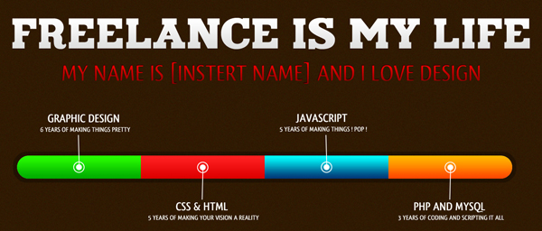
Good evening everybody, today I’ll be walking you through the process of coding your “Freelance CV / Resume” into a working HTML/CSS Template. Lets get started.

The Live Version

You can check out the Live Version of the template by clicking here. The template has been tested in the following browsers without any problems.

  • Firefox 2.0, 3.0 and 3.5
  • Internet Explorer 7 and 8
  • Chrome 3.0
  • Safari 3.0 and 4.0

Preparing Your Files

You will need to create a new folder on your desktop titled “Freelance CV”. Please create the following files: index.html, style.css, and a folder titled images. It should be set up like below:

Slicing the Document

Open your Freelance CV PSD file

Hit CTRL+ALT+I and resize to 1100*1187

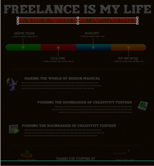
Now its time to start slicing our document. Lets start out with the header. Slice it like the image below:

Once you have got your crop region down hide your bg layer and save the image as header.png

Slice your sub-header now using the below image:

Once you have your crop region down hide your bg layer and save the image as sub_header.png

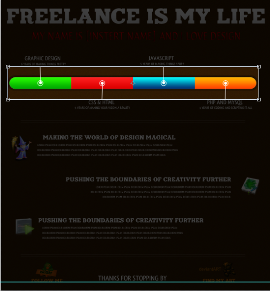
Slice your four colored squares like below:

Once you have your cropped your document hide the background layer and save the image as four_colored_squares.png

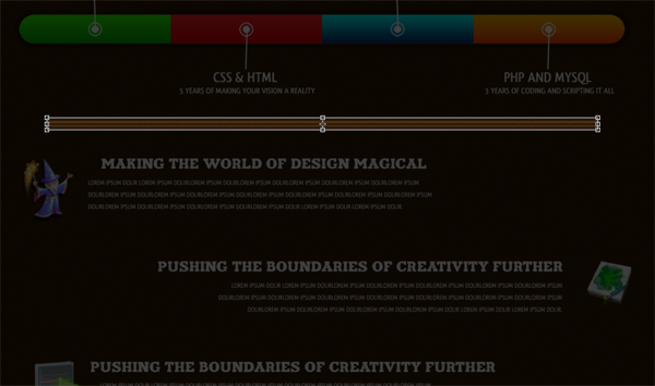
Slice your spacer lines like the below image:

Once you have cropped your document hide the background layer and save the image as spacer_lines.png

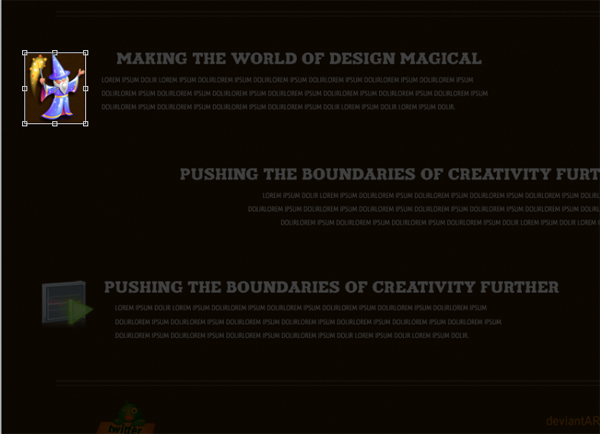
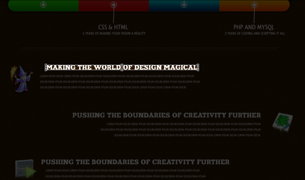
Slice your wizard icon like below:

Once you have cropped your doc hide the bg layer and save the image as wizard.png

Slice your artwork icon like below:

Once you have cropped your doc hide the bg layer and save the image as artwork.png

Slice your play button icon like below:

Once you have cropped your doc hide the bg layer and save the image as play_button.png

Slice your twitter icon like below:

Once you have cropped your doc leave the bg layer and save the image as twitter_icon.png

Slice your deviantart icon like below:

Once you have cropped your doc leave the bg layer and save the image as deviantart_icon.png

Since @fontface does not work in the majority of browsers we will not be using @fontface right now, though we will be adding the way to do use the @fontface later.

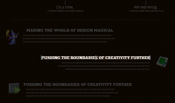
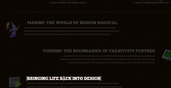
So, because we are not using it we will need to slice our four what we are good ats and our headers. You will slice them all like the images below and all will have the backgrounds hidden on them once cropped. The name to save them as will be under the respected images.


-graphic_design.PNG-


-javascript.PNG-


-css_html.PNG-


-php_mysql.PNG


-magical_design.PNG-


-creative_boundaries.PNG-


-design_life.PNG-

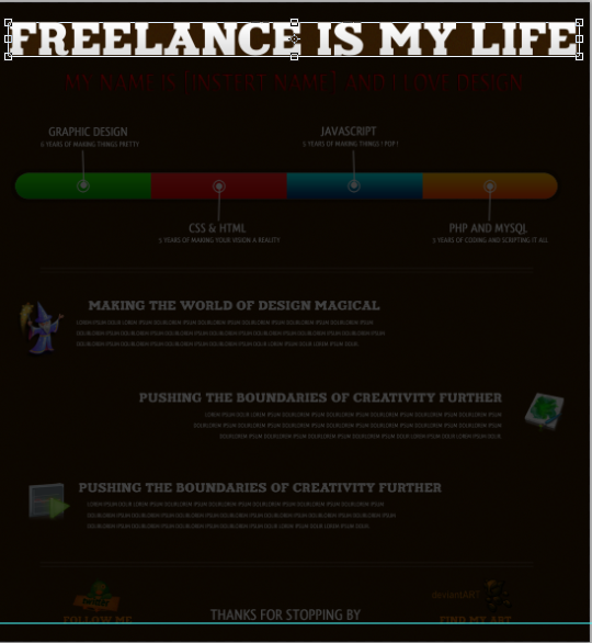
Now hide all your layers but your bg. Finally hit CTRL+S and save as FreelanceCVbg.jpg. Open your Freelance CV and crop like below:

save as bg.png

Setting Up Your CSS

@charset "utf-8"; /* CSS Document */ body { } .container { } .header { } #sub_header { } #graphic_design { } #javascript {  } .four_colored_square { } #css_html {  } #php_mysql { } .spacer_lines { } .wizard_overall { } #wizard_icon { } #wizard_header { } #wizard_header_text { } .artwork_overall { } #artwork_icon { } #artwork_header { } #artwork_header_text { } .playbtn_overall { } #playbtn_icon { } #playbtn_header { } #playbtn_header_text { } .socialnetwork_overall{ } #twitter_icon { } #deviantart_icon { }

Now, all our CSS is pretty self explanatory. I have set up the CSS in the normal way rather than to focus on page load speed.

Designing The Document

Now we will begin setting up our CSS, such as our container, header, and sub header. Please add the following CSS properties:

body {  background-image: url(images/bg.PNG);  background-repeat: repeat; } .container {  height: 1210px;  width: 1100px;  margin-right: auto;  margin-left: auto;  color: #FFF; } .header {  float: left;  height: 62px;  width: 1058px;  margin-left: 21px;  background-image: url(images/header.PNG);  background-repeat: no-repeat;  text-indent: -999px; } #sub_header {  float: left;  height: 40px;  width: 854px;  margin-left: 123px;  background-image: url(images/sub_header.PNG);  background-repeat: no-repeat;  margin-top: 35px;  text-indent: -999px; }

Now to set up our document’s html:

<!DOCTYPE html PUBLIC "-//W3C//DTD XHTML 1.0 Transitional//EN" "http://www.w3.org/TR/xhtml1/DTD/xhtml1-transitional.dtd"> <html xmlns="http://www.w3.org/1999/xhtml"> <head> <meta http-equiv="Content-Type" content="text/html; charset=utf-8" /> <title>[Insert Name]'s Online Resume / CV</title> <link href="style.css" rel="stylesheet" type="text/css" /> </head>  <body> <div class="container">  <div class="header">Freelance Is My Life!</div>  <div id="sub_header">My Name Is [Insert Name] and I Love Design</div>

Time to set up our “What I Know” rectangles and box. The CSS:

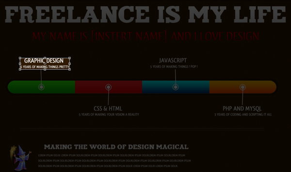
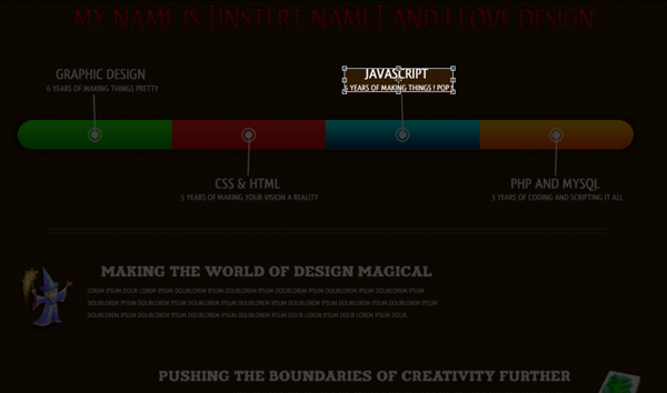
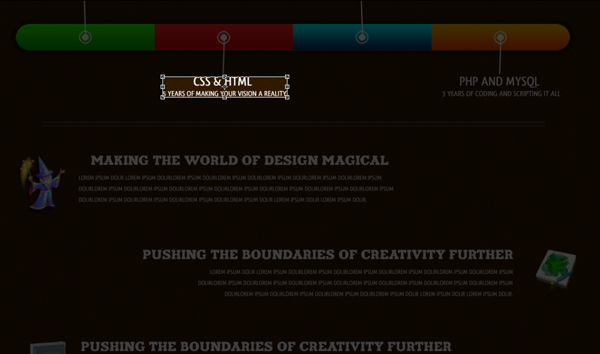
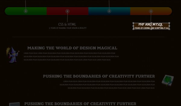
#graphic_design {  float: left;  height: 43px;  width: 185px;  margin-left: 80px;  background-image: url(images/graphic_design.PNG);  background-repeat: no-repeat;  margin-top: 70px;  text-indent: -999px; } #javascript {  float: right;  height: 43px;  width: 185px;  margin-right: 335px;  background-image: url(images/javascript.PNG);  background-repeat: no-repeat;  margin-top: 70px;  text-indent: -999px;  } .four_colored_square {  float: left;  height: 135px;  width: 1025px;  margin-top: 5px;  margin-left: 37px;  background-image: url(images/four_colored_squares.PNG);  background-repeat: no-repeat;  margin-bottom: 5px;  text-indent: -999px; } #css_html {  float: left;  height: 43px;  width: 226px;  margin-left: 315px;  background-image: url(images/css_html.PNG);  background-repeat: no-repeat;  text-indent: -999px;  } #php_mysql {  float: right;  height: 43px;  width: 217px;  margin-right: 65px;  background-image: url(images/php_mysql.PNG);  background-repeat: no-repeat;  text-indent: -999in; }

And our HTML:

<div id="graphic_design">Graphic Design -- 6 Years of Making Things Pretty</div>  <div id="javascript">Javascript -- 5 Years of Making Things POP</div>  <div class="four_colored_square"></div>  <div id="css_html">CSS / HTML -- 5 Years of Making Your Vision A Reality</div>  <div id="php_mysql">PHP and MySQL -- 3 Years of Coding and Scripting It All</div>

Now so far you are probably wondering why I have decided to add text to the divs, won’t that make it look different? No, by adding a text indent of -999px or -999in it means that the text won’t show on the website itself but the Search Engines will see the text, meaning that you are going to get better rankings because they will all be able to tell what the background image of the div actually says. I use this method when I am creating a coming soon page or something simple like this so that the Search Engines can start viewing the website right away.

Anyway, time to set up our icons and actual information. Here is the CSS:

.spacer_lines {  float: left;  margin-top: 45px;  clear: both;  background-image: url(images/spacer_lines.PNG);  height: 20px;  width: 915px;  margin-left: 90px;  margin-bottom: 45px; } .wizard_overall {  float: left;  height: auto;  width: 680px;  margin-left: 21px; } #wizard_icon {  background-image: url(images/wizard.PNG);  background-repeat: no-repeat;  float: left;  height: 109px;  width: 95px;  text-indent: -999px; } #wizard_header {  background-image: url(images/magical_design.PNG);  background-repeat: no-repeat;  float: left;  height: 18px;  width: 543px;  margin-left: 25px;  text-indent: -999px; } #wizard_header_text {  float: left;  width: 570px;  font-family: Arial, Helvetica, sans-serif;  height: auto;  padding-top: 10px;  padding-left: 5px;  margin-left: 10px; } .artwork_overall {  float: right;  height: auto;  width: 770px;  margin-right: 21px;  clear: left;  margin-top: 70px; } #artwork_icon {  background-image: url(images/artwork.PNG);  background-repeat: no-repeat;  float: left;  height: 77px;  width: 79px;  text-indent: -999px; } #artwork_header {  background-image: url(images/creative_boundaries.png);  background-repeat: no-repeat;  float: right;  height: 18px;  width: 674px;  text-indent: -999px; } #artwork_header_text {  float: right;  width: 640px;  font-family: Arial, Helvetica, sans-serif;  height: auto;  padding-top: 10px;  padding-right: 31px; } .playbtn_overall {  float: left;  height: auto;  width: 680px;  margin-left: 21px;  clear: both;  margin-top: 70px; } #playbtn_icon {  background-image: url(images/play_button.PNG);  background-repeat: no-repeat;  float: left;  height: 71px;  width: 80px;  text-indent: -999px; } #playbtn_header {  background-image: url(images/design_life.png);  background-repeat: no-repeat;  float: left;  height: 18px;  width: 440px;  margin-left: 25px;  text-indent: -999px; } #playbtn_header_text {  float: left;  width: 580px;  font-family: Arial, Helvetica, sans-serif;  height: auto;  padding-top: 10px;  padding-left: 5px;  margin-left: 10px; }

Many people will disagree with putting underscores in the CSS, but I haven’t been able to see any downside in regards to the underscores. Now for the HTML:

<div class="spacer_lines"></div>  <div class="wizard_overall">  <div id="wizard_icon"></div>  <div id="wizard_header">Making the World of Design Magical</div>  <div id="wizard_header_text">lorem ipsum dolir lorem ipsum dolirlorem ipsum dolirlorem ipsum dolirlorem ipsum dolirlorem ipsum dolirlorem ipsum dolirlorem ipsum dolirlorem ipsum dolirlorem ipsum dolirlorem ipsum dolirlorem ipsum dolirlorem ipsum dolirlorem ipsum dolirlorem ipsum dolirlorem ipsum dolirlorem ipsum dolir.</div>  </div>  <div class="artwork_overall">  <div id="artwork_icon"></div>  <div id="artwork_header">Pushing the Boundaries of Creativity Further</div>  <div id="artwork_header_text">lorem ipsum dolir lorem ipsum dolirlorem ipsum dolirlorem ipsum dolirlorem ipsum dolirlorem ipsum dolirlorem ipsum dolirlorem ipsum dolirlorem ipsum dolirlorem ipsum dolirlorem ipsum dolirlorem ipsum dolirlorem ipsum dolirlorem ipsum dolirlorem ipsum dolirlorem ipsum dolirlorem ipsum dolir.</div>  </div>  <div class="playbtn_overall">  <div id="playbtn_icon"></div>  <div id="playbtn_header">Bringing Life Back Into Design</div>  <div id="playbtn_header_text">lorem ipsum dolir lorem ipsum dolirlorem ipsum dolirlorem ipsum dolirlorem ipsum dolirlorem ipsum dolirlorem ipsum dolirlorem ipsum dolirlorem ipsum dolirlorem ipsum dolirlorem ipsum dolirlorem ipsum dolirlorem ipsum dolirlorem ipsum dolirlorem ipsum dolirlorem ipsum dolirlorem ipsum dolir.</div>  </div>  <div class="spacer_lines"></div>

Adding Social Network: Now it is time to set up the CSS for the social networking aspects of the website.

.socialnetwork_overall{  clear: both;  float: left;  height: auto;  width: 840px;  margin-left: 120px; } #twitter_icon {  background-image: url(images/twitter_icon.PNG);  background-repeat: no-repeat;  float: left;  height: 87px;  width: 129px;  text-indent: -999px; } #deviantart_icon {  background-image: url(images/deviantart_icon.PNG);  background-repeat: no-repeat;  float: right;  height: 87px;  width: 150px;  text-indent: -999in; }

And now for our HTML; of course you will want to change the twitter and deviantART links to your own. The following HTML will also close our index.html document.

<div class="socialnetwork_overall">  <a href="http://www.twitter.com/cpdpueblo" id="twitter_icon">Follow Me On Twitter</a>  <a href="http://custompowerdesigns.deviantart.com/" id="deviantart_icon">Find My Art at DeviantART</a>  </div> </div> </body> </html> 

Click To View Freelance CV Live

2007-10-10-site-to-wordpress-tutorial-


Okay so you have your website built and coded into css/xhtml and you want to convert it over to a wordpress theme. Firstly let me explain a few things.

WordPress works in a rather straightforward manner but it may seem confusing if you are completely new to the concept. WordPress relies on PHP to call on different parts of your content from the database management system it stands on. If you view my code to my site you will notice i use php to call some aspects of my page. Once you get started its pretty easy althou understanding of css/php/xhtml is essential and will guide you throu the setup of a full working wordpress theme.

Now you should already have your site designed and coded into css/xhtml before attempting this tutorial, firstly create a new folder on your desktop, name this folder what ever you want (e.g my theme). Now open up notepad dont type anything just goto “file > save as” and save it has style.css then goto “file > save as” again and save it as index.php. Now believe it or not but these are the only 2 files you actually need for a wordpress theme.

Open up your style sheet to your website, highlight it all then copy/paste into the blank “style.css” file you just created.

Now copy/paste this bit of code into the top of your style.css file.

/*
Theme Name: Replace with your Theme’s name.
Theme URI: Your Theme’s URI
Description: A brief description.
Version: 1.0
Author: You
Author URI: Your website address.
*/

Change the lines of code in red to suit your needs. These few lines of code are what wordpress uses to define it as a wordpress theme/template.

Thats the style sheet sorted. Now we need to chop up our website code. Remember how we talked about WordPress using PHP to call data from your database? Well WordPress can also use PHP to call different files from within your template folder. Imagine your current XHTML code chopped up into 4 (or more) different sections. The header, sidebar, main content and footer. Instead of keeping these 4 parts of the XHTML together in one file, you are going to put each of them in their own separate file. Then call on them one by one using PHP.

Open up notepad and create a further 3 files the same way we did with the style.css and index.php this time use the filenames “header.php , sidebar.php , footer.php” (make sure all these files are in the same directory). Load up your ftp program and go into your wordpress folder, save the classic theme folder your computer as we need to use bits of code out of the orginal files.

(/wp-content/themes/classic/)

Locate the classic themes header.php file. Notice all the PHP that is used in between the <head> tags. You will want to keep most of this code, so just copy the whole <head> section into your new header.php file. Now open up your original XHTML/CSS file and copy only the header elements or the code you have used to create the header. Paste into your new header.php file (underneath the <head> section). Save and close.

Now open up the blank index.php you created at the start, open up your website and copy only the main content code (NOT the sidebar or footer). Paste this code into your new index.php file. Save and close.

Open up the blank sidebar.php and footer.php. Copy and paste your sidebar code from your website into the blank sidebar.php file Do the same for the footer.php file.

If your original code contains any images i suggest you copy/paste them into a folder in your theme folder called “images” . Now lets put it back together using a few lines of PHP, open up index.php copy/paste these lines of code into the top of the file above everything eles,

<?php get_header(); ?>

Now goto the bottom of that file and paste these lines of code below everything eles.

<?php get_sidebar(); ?>
<?php get_footer(); ?>

These 3 simple lines of PHP are telling WordPress to fetch and display your header.php, sidebar.php, and footer.php files within your index.php file. Your code is officially put back together. Now if you want to edit your sidebar you can just edit your sidebar.php file, instead of sorting through your index.php to find it. The same goes for your header.php and your footer.php.

Your index.php is nearly complete, the final step is to insert the actual content into the code. Luckily, WordPress uses PHP for this as well. The Loop is the PHP function WordPress uses to call and display your posts from the database they are saved in. Look in your /wp-content/themes/classic/ directory and open the file index.php file. Copy everything in between <?php get_header(); ?> and <?php get_footer(); ?>to your clipboard. Now paste it into your new theme’s index.php file inside of whichever div you are using to hold your content. You just inserted a basic version of the loop into your code. WordPress will use the loop to display your posts and comments on your website.Now upload your theme folder to /wp-content/themes/. Then log into WordPress and activate your theme.


This tutorial covered the basics for converting your theme to WordPress. To further customize and enhance your theme start looking at the WordPress Codex, specifically Template Tags and Template Files. You can use template tags in your sidebar, in your header, or your footer to call menus, categories, posts, etc. As you learn more about template tags and template files you will discover the endless possiblities for customizing your new WordPress blog.

Chameleon Effect Tutorial


Open up your car image and select the “pen tool”, once selected draw around your car, NOT selecting the wheels, lights, windows, grills etc… this will be a lengthy process but you will get there in the end, once you have selected the car make the selection and copy to a new layer, and if you hide your background layer you should have something like this.

Ive done it this way because when we apply the effect we dont want the chameleon paint on the windows, grills etc…. keep your background layer hidden for now. Make a new layer and name it paint one, and then goto the menu at the top and click “select > color range” set fuzziness to about 70 and just click anywhere on your car image then press ok.

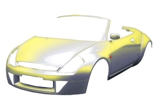
Once you have pressed ok you will notice a selection of your car has been highlighted DO NOT DESELECT the selection, now go over to your color pallete and choose your desired color for your 1st paint layer im going to choose a yellow, then fill the selection and set the “layer blending mode” to “overlay”. Then “ctrl” and click on your car image to select the selection but have the paint one layer selected and goto “filter > blur > guassian blur” and blur it by about 5 pixels.

Select your car layer and goto “select > color range” Find a space where your 1st color isnt already and select it press okay. Now create a new layer ontop of all your other layers and name it paint two. Open up your color pallete and select your 2nd color im going to use and orangy color, then fill the selection, set layer overlay and add a guassian blur at 5 pixels. (FOLLOW STEP 3 BUT WITH YOUR 2ND COLOR)

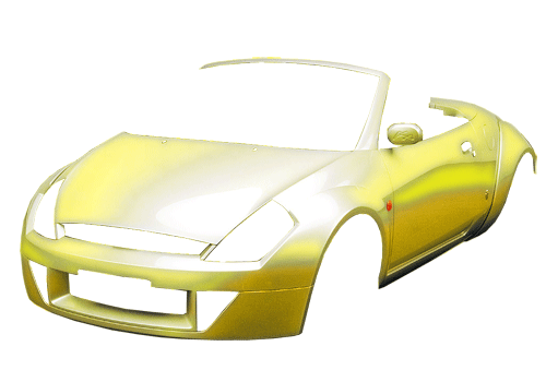
Now do the same for a 3rd, 4th or 5th color depending on how many colors you want (the more colors you have the more your car will be chameleon like following the steps above, and remembering to add the guassian blur and to set the layers to overlay. I normally do between 3-5 colors, im using 4 colors for this tutorial heres my image with the 4th color applied.

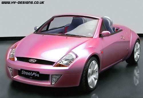
once you have finished add your paint just unhide your background layer heres how mine looks and theres a few more examples underneath.


Web Design Layout #9

Good afternoon, welcome to another tutorial by the hv-designs team in this tutorial il show you how to create a web design layout, currently the 9th one in our tutorial database.

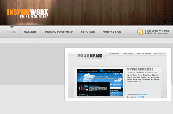
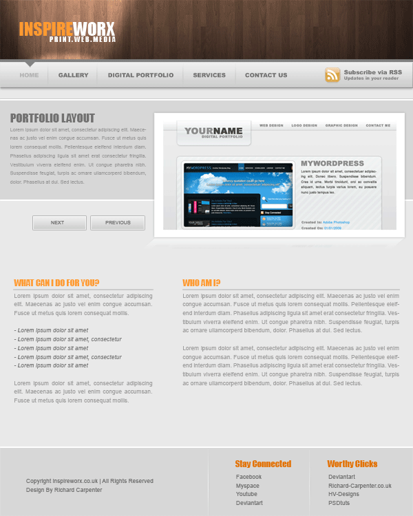
Before we start grab this “wood” texture, just save it your hard drive somewhere as we’ll be using it later in the tutorial. Right lets get started, create a new document 850×1060 pixels, fill your background layer with the color #e9e9e9. Open up your wood image then drag it over onto your canvas. Press “CTRL + T” to free-transform the image. Just resize the image a little bit so the wood texture is nearly the same width as your canvas, if you hold down the “shift” key on the keyboard whilst dragging the anchor points the aspect ratio will stay the same. Move the wood texture to the top of your canvas.

Step1

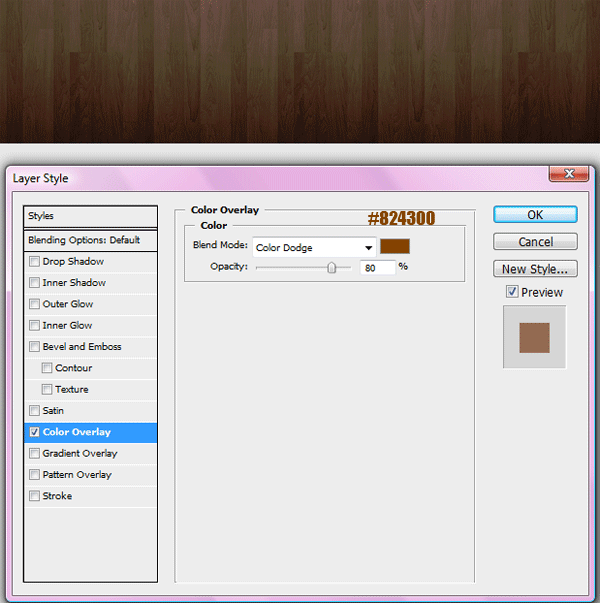
Add this color overlay to your wood texture.

Step2

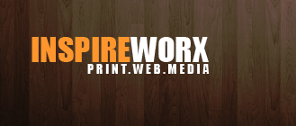
Add your website title and slogan on the left hand side of the wood texture.

Step3

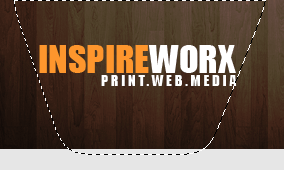
Select the pen tool or the polygonal marquee tool and create a selection like the image below, make the selection wider at the top than at the bottom, sort of like a funnel shape. The wide part at the top should be as wide if not a little wider than your website title.

Step4

Fill the selection with the color white, deselect the selection with “CTRL + D” then goto “filter > blur > guassian blur” blur by about 13 pixels then set layer blending mode to overlay. You should end up with this.

Step5

Select the elliptical marquee tool and create a selection like the image below.

Step6

Fill the selection with the color white, deselect the selection then guassian blur by 5 pixels. Set layer blending mode to overlay and opacity to 75%. You should have something like this.

Step7

Select the rectangular marquee tool and the color #828282, create a rectangle underneath wood texture.

Step8

On-top of the grey rectangle add another rectangle only this time move it down about 4 or 5 pixels.

Step9

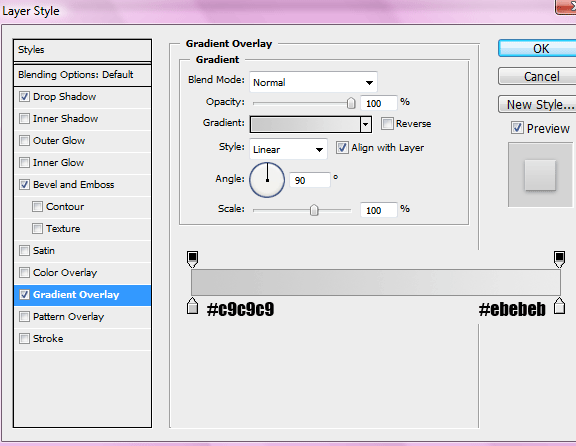
Add these layer styles to the rectangle that sits ontop.

Step10

Step11

Step12

You should have something like this.

Step13

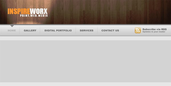
Add the your text links for your navigation to the navigation bar, in between each link add a little divider. Also add a hover state to one of your buttons. Just create a small triangle point downwards, fill it with the same color as your 1st rectangle that you created (#828282).

Step14

With the rectangle marquee tool create a big rectangle the width of your canvas underneath your navigation. Fill the rectangle with the color #d7d7d7.

Step15

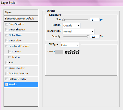
Add this 1 pixel stroke to the rectangle.

Step16

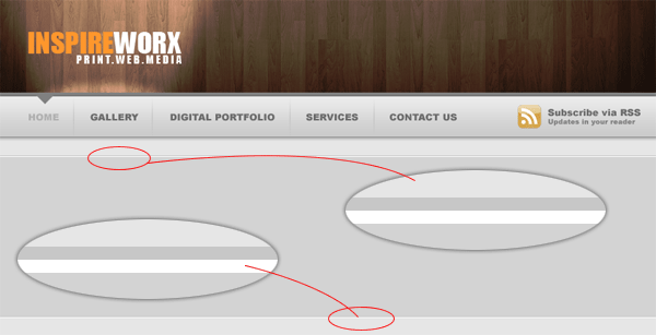
Zoom into the stroke situated at the top of the rectangle, underneath the stroke at a 1pixel white line. Do the same with the bottom line, make sure it goes underneath the stroke. Stretch the lines so they are the whole width of the canvas.

Step17

Add your featured image to the canvas, Add a nice thick white border and a nice subtle drop shadow. Dont place the image directly inbetween the grey area, place it so it slightly overlaps the greay area.

Step18

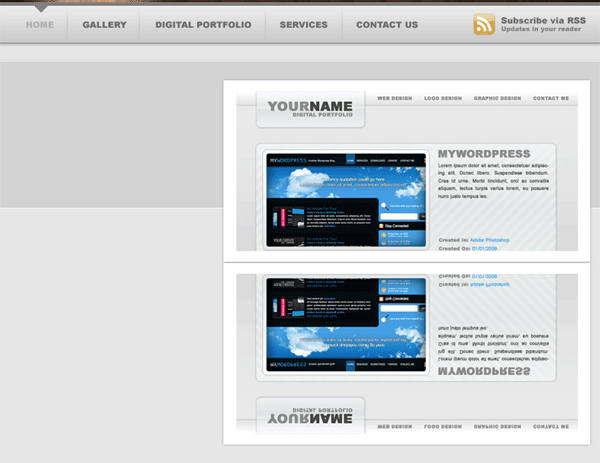
Duplicate your featured image, drag the layer underneath the orginal then goto “edit > transform > flip vertical” Move the duplicated image so its directly underneath its orginal.

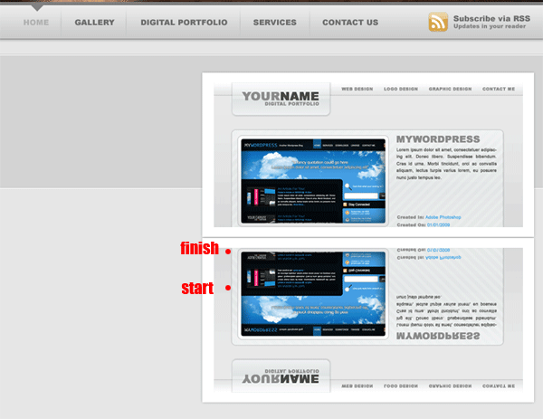
Step19

Hide all your layers in your layers window, apart from your duplicated image. Create a new blank layer then goto “layer > merge visable” unhide all your layers. Add a layer mask to your duplicated image Then drag a linear gradient over it see image below.

Step20

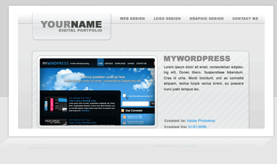
Next goto “edit > transfrom > perspective” Move the middle anchor point at the bottom towards the left. You may need to resize your image after messing with the perspective. You should have something like this.

Step21

On the left side of your featured image add some dummy text. Also add some dummy text and titles underneath.

Step22

The layer styles for the next and previous buttons are…..

Step23

Step24

Step25

Finally at the bottom of your canvas add your footer. We make the footer in the same way we did the grey area behind our featured image, only this time you only need to add the white line underneath the top stroke only.

Step26

The end result looks like this.

End Result

Hope you’ve enjoyed this tutorial, please subscribe via RSS and twitter. See you next time.

Learn To Code This Layout

You can learn to code this layout into a working CSS template by following the follow-up tutorial HERE.

Army Swiss Knife Tutorial

Create a new document 600×400 fill the background with a color of your choice OR use an image like a wood texture. Im going to use the wood texture feel free use it.

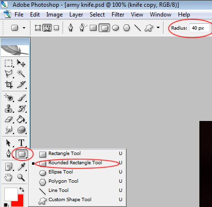
Select the rounded rectangle tool, change the radius to 40px (see image below).

Draw out your rectangle and fill with the color black.

Add these layer styles to our black rectangle.

Your image should now look like this.

Now using the pen tool create a selection like selection one (see image below), using the rectangular marquee tool create a selection like selection two (see image below). Fill the selections with white and set layer opacity to 4% or 5%.

You should have something like this.

Select the ecliptical marquee tool and create a small cirlce, this will act as a small screw. Fill the top half with the color #e0d1c2 and the bottom half #462d13. Add this bevel layer style style to your screw.

Your screw should look like this.
Duplicate the screw a further 3 times and place in the corners of your knife.

Now goto your custom shapes libary and select one of the shields.

Draw out a smallish sheild, select the pen tool and instead of going to “fill path” goto “stroke path”. Use the rectangle marquee tool and make a small cross for the middle of the sheild. Now rotate your sheild and place at the end of the knife.

Now select the pen tool and create a shape like this.

Fill with the color white, then add these layer styles.

Move your shape behind the the knife.

Now create a small shape like this (see image below), again with the pen tool.

Fill with a darkish grey color and then add this layer style.

Now duplicate your knife blade, flip it 180 degrees and then place at the bottom of your knife. Your final image should look like this.