Your ads will be inserted here by
AdSense Now!.
Please go to the plugin admin page to paste your ad code.
Good afternoon, welcome to another tutorial by the hv-designs team in this tutorial il show you how to create a web design layout, currently the 9th one in our tutorial database.
Before we start grab this “wood” texture, just save it your hard drive somewhere as we’ll be using it later in the tutorial. Right lets get started, create a new document 850×1060 pixels, fill your background layer with the color #e9e9e9. Open up your wood image then drag it over onto your canvas. Press “CTRL + T” to free-transform the image. Just resize the image a little bit so the wood texture is nearly the same width as your canvas, if you hold down the “shift” key on the keyboard whilst dragging the anchor points the aspect ratio will stay the same. Move the wood texture to the top of your canvas.

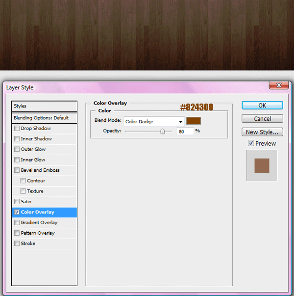
Add this color overlay to your wood texture.
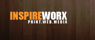
Add your website title and slogan on the left hand side of the wood texture.
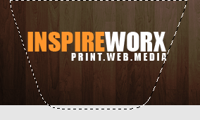
Select the pen tool or the polygonal marquee tool and create a selection like the image below, make the selection wider at the top than at the bottom, sort of like a funnel shape. The wide part at the top should be as wide if not a little wider than your website title.
Fill the selection with the color white, deselect the selection with “CTRL + D” then goto “filter > blur > guassian blur” blur by about 13 pixels then set layer blending mode to overlay. You should end up with this.
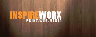
Select the elliptical marquee tool and create a selection like the image below.
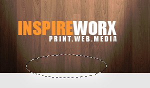
Fill the selection with the color white, deselect the selection then guassian blur by 5 pixels. Set layer blending mode to overlay and opacity to 75%. You should have something like this.

Select the rectangular marquee tool and the color #828282, create a rectangle underneath wood texture.

On-top of the grey rectangle add another rectangle only this time move it down about 4 or 5 pixels.

Add these layer styles to the rectangle that sits ontop.
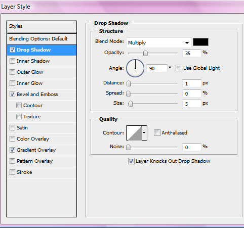
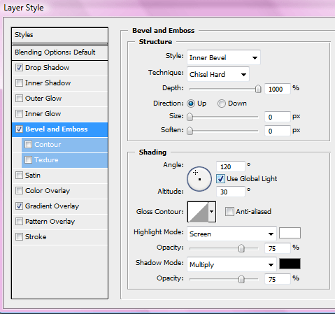
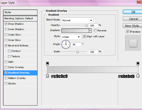
You should have something like this.

Add the your text links for your navigation to the navigation bar, in between each link add a little divider. Also add a hover state to one of your buttons. Just create a small triangle point downwards, fill it with the same color as your 1st rectangle that you created (#828282).
Your ads will be inserted here by
AdSense Now!.
Please go to the plugin admin page to paste your ad code.

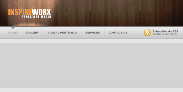
With the rectangle marquee tool create a big rectangle the width of your canvas underneath your navigation. Fill the rectangle with the color #d7d7d7.
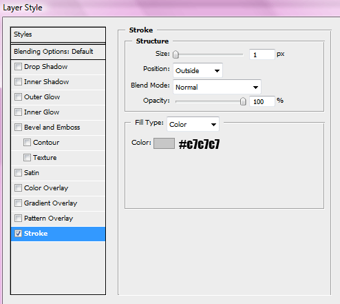
Add this 1 pixel stroke to the rectangle.
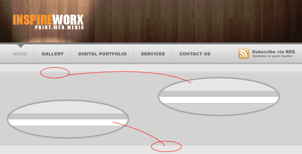
Zoom into the stroke situated at the top of the rectangle, underneath the stroke at a 1pixel white line. Do the same with the bottom line, make sure it goes underneath the stroke. Stretch the lines so they are the whole width of the canvas.
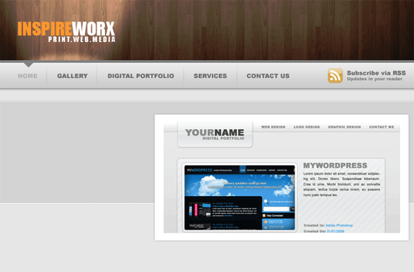
Add your featured image to the canvas, Add a nice thick white border and a nice subtle drop shadow. Dont place the image directly inbetween the grey area, place it so it slightly overlaps the greay area.
Duplicate your featured image, drag the layer underneath the orginal then goto “edit > transform > flip vertical” Move the duplicated image so its directly underneath its orginal.
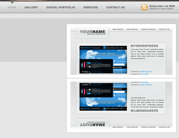
Hide all your layers in your layers window, apart from your duplicated image. Create a new blank layer then goto “layer > merge visable” unhide all your layers. Add a layer mask to your duplicated image Then drag a linear gradient over it see image below.
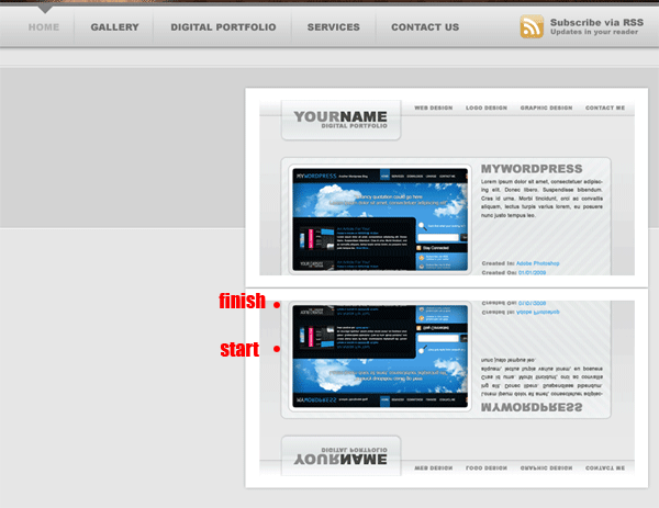
Next goto “edit > transfrom > perspective” Move the middle anchor point at the bottom towards the left. You may need to resize your image after messing with the perspective. You should have something like this.
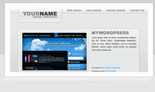
On the left side of your featured image add some dummy text. Also add some dummy text and titles underneath.
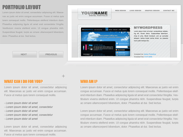
The layer styles for the next and previous buttons are…..
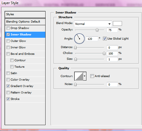
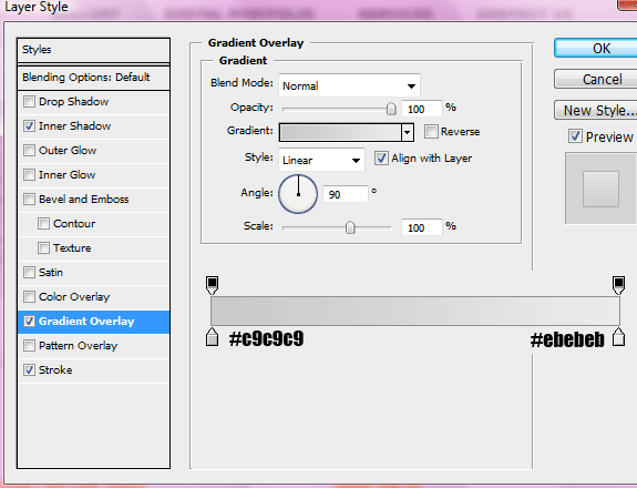
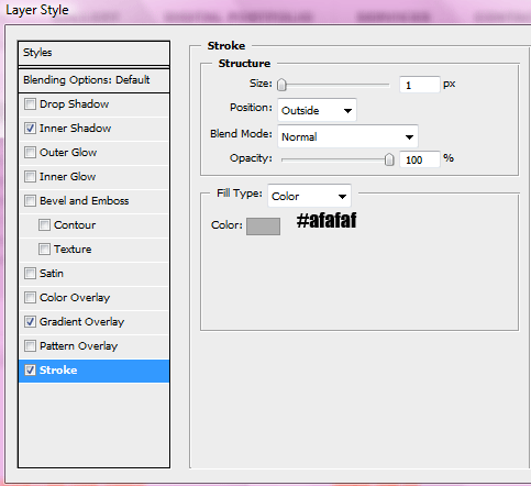
Finally at the bottom of your canvas add your footer. We make the footer in the same way we did the grey area behind our featured image, only this time you only need to add the white line underneath the top stroke only.

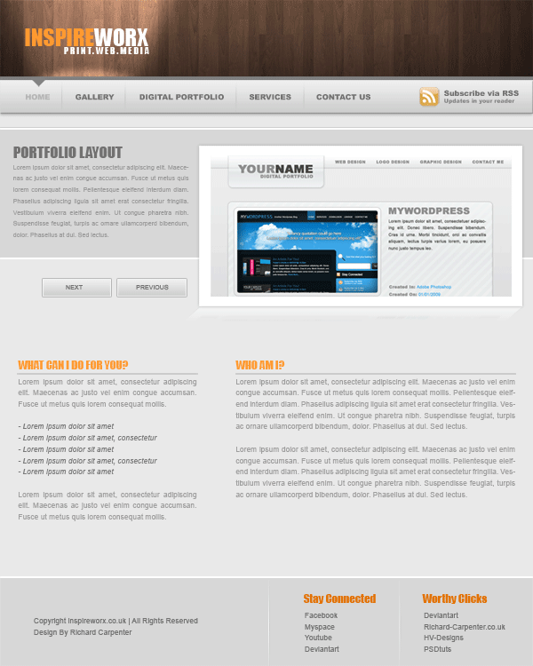
The end result looks like this.
Hope you’ve enjoyed this tutorial, please subscribe via RSS and twitter. See you next time.
Learn To Code This Layout
You can learn to code this layout into a working CSS template by following the follow-up tutorial HERE.
Your ads will be inserted here by
AdSense Now!.
Please go to the plugin admin page to paste your ad code.