Your ads will be inserted here by
AdSense Now!.
Please go to the plugin admin page to paste your ad code.
Good evening everyone, today il be showing you how to make a colorful web design company layout. The website features multiple enlightening colors and a simplistic navigation with a 3D hover.
Creating Our Document & Guides
Create a new document 1200 x 1055 pixels with a white background.
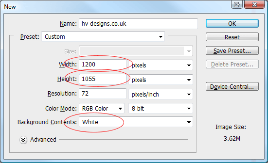
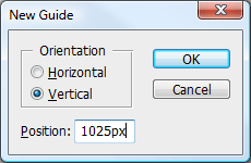
Once you’ve created your document we need to create two guides. Go to “view > new guide” enter the settings below.
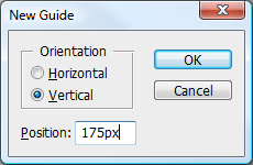
Repeat the steps above only this time use the settings below.
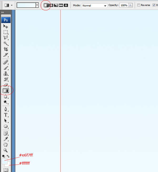
Now select the gradient tool with a linear gradient, set your foreground color to #e6f7ff and background color to #ffffff. Drag the gradient over your canvas starting from the top and ending towards the middle.
Creating The Website Title
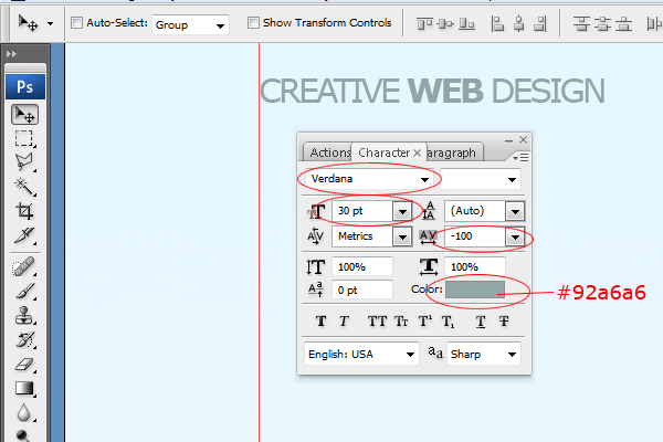
Select the text tool with the font verdana, set the font size to 30pt then set the color to #92a6a6. Add your website title at the top of the canvas.
Once you’ve created your title text add the following layer styles.
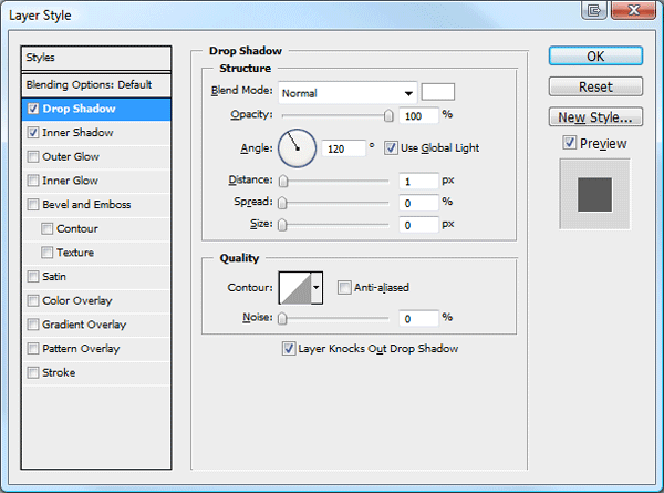
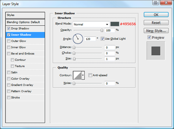
You should have something like this.
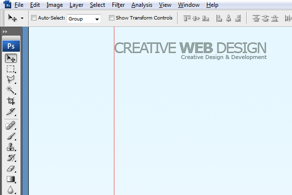
Creating The Search Field
Select the rounded rectangle tool with a radius of 10px.
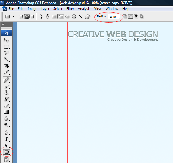
On the right side of the canvas inline with the website title create a long rounded rectangle.
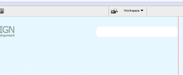
Once you’ve created your rectangle add the following layer styles.
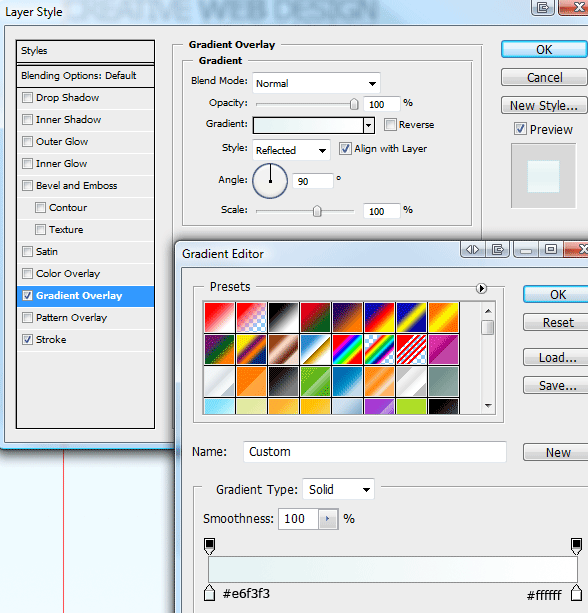
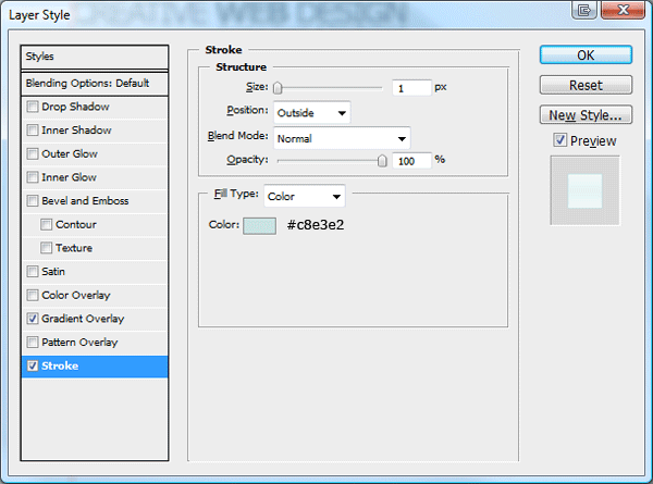
You should have something like this.

Were now going to create a 3D search button, create a rounded rectangle with a radius of 10px, create the rectangle about 80 x 50 pixels.

Using the rectangular marquee make a rectangle over the top half of the rectangle. Fill the rectangle the same layer as the rounded rectangle.
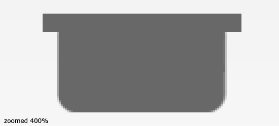
Duplicate the rounded rectangle then rotate the duplicated layer 180 degrees by going to “edit > transform > rotate 180″. Finally, place the shapes next to each other making sure there level

Make a selection around the bottom half of the duplicated shape using the rectangular marquee tool. Once you’ve made a selection, hit the delete key.

Align the duplicated shape next to the orginal shape, making sure they are not directly overlapping. Once moved into place, Ctrl + click your duplicated shape layer’s thumbnail within the layers window to load a selection around it.
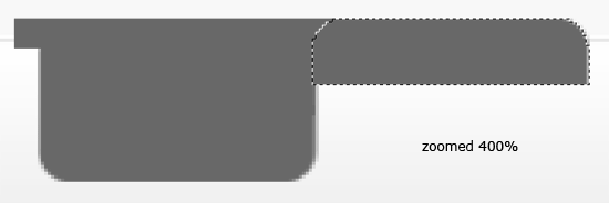
Select the orginal shapes layer then hit the delete key to remove the selection. Repeat the steps above for the other side of the shape then finally you should have something like this.
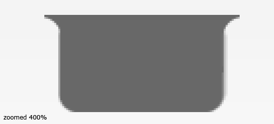
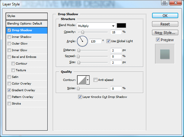
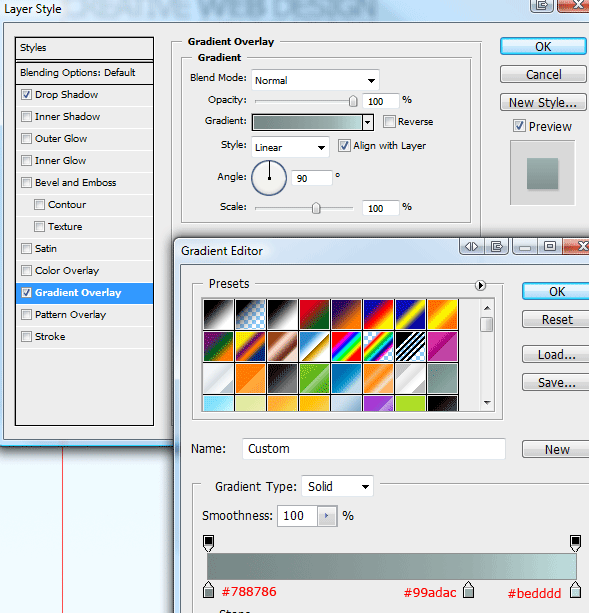
Now add these layer styles to your shape.
Your ads will be inserted here by
AdSense Now!.
Please go to the plugin admin page to paste your ad code.
Resize and place your shape over your search field.
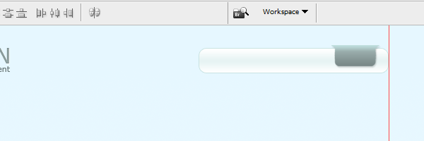
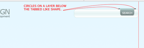
On a new layer below your shape create two small circles where either side where the shape bends out. Finally label the tab like shape with the word search.
Creating The Navigation
Create a big rounded rectangle 850 x 250 pixels, fill the rectangle with the color white then add a 1 pixel stroke using the color #cfeaea.
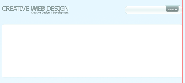
Using the same methods as we did for our 3D part on the search field, do the same for the rectangle you just created. The rectangle will be a featured area and navigation all rolled into one.
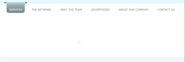
Adding A Splash Of Color
Using the rounded rectangle with a radius of 5 px create another rectangle inside the bigger rectangle you just created. Fill the rectangle with any color.

Now add a gradient overlay using the settings below.
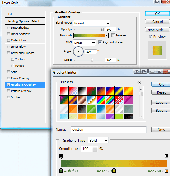
You should have something like this.

Click your multicolored rectangle whilst holding down the CTRL key on the keyboard, this should load a selection. Create a new layer then go to “filter > render > clouds”.

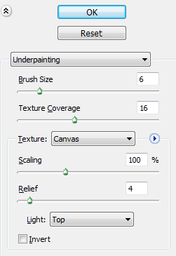
Now go to “filter > artistic > underpainting”, use the settings below.
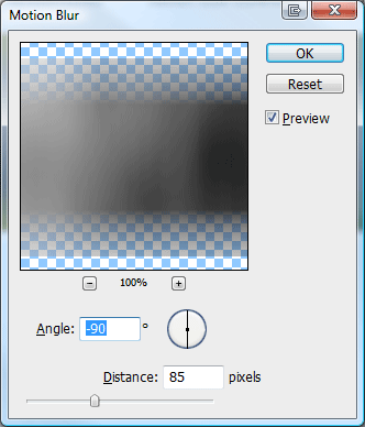
Were now going to add abit of blur, go to “filter > blur > motion blur”. Make sure your selection is still active or else the motion blue will evade the rectangle and cover the bigger rectangle, which we dont want.
Finally set the opacity to 50% and layer blending mode to “vivid light”. You should have something like this.
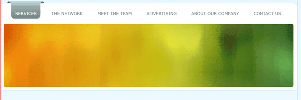
Using the text tool add some nice looking text, if you add a heading like on mine add an outer glow to it using the default settings. Finish off by creating like a shine effect using the pen tool.

Creating The Service Boxes
Using the rounded rectangle tool with a radius of 10px create 3 boxes next to each other totalling 850 pixels, be sure to leave a gap inbetween each rectangle.
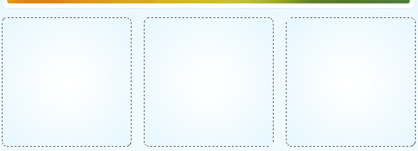
Fill the rectangles with any color then add these layer styles.
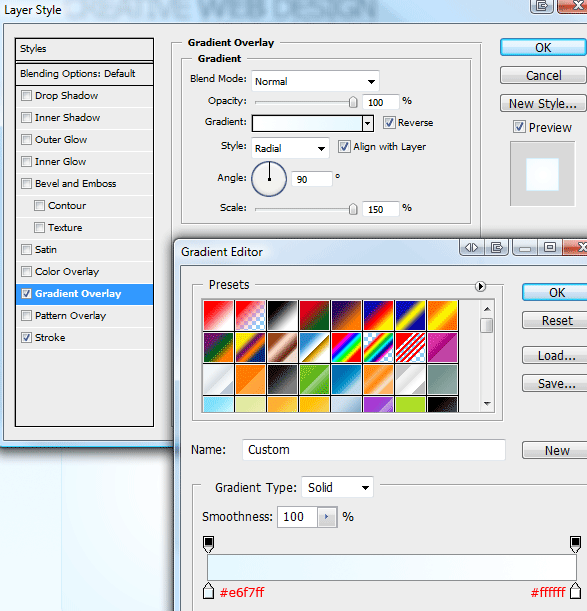
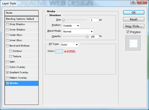
Im now going to use a few icons from “wefunction” to build up my service’s sections. Im going to start by adding a little icon then a heading, the color of the heading will picked from the colorfull featured area using the eye dropper tool.

After the heading im going to add a short paragraph using lorem ipsum text, after the paragraph im going to create a short list using the circle tick icon from wefunction as the list bullet. Im then going ti finish off the services section by creating a read more button, created with the rounded rectangle tool.

Creating The Main Content Box
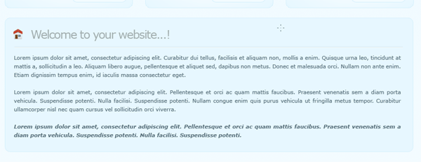
Once again with the rounded rectangle tool create a full size rectangle with a width of 850px, fill the rectangle with the color #e7f7ff then add a 1 pixel stroke using the color #d5f0fc.
Add the little home icon from the wefunction icon set to the top left corner of the rectangle, next to it add your welcome message. Finally fill the rectangle with your dummy text.
Creating The Footer
Finish off the layout with a plain white small round rectangle underneath the main content rectangle, add a 1 pixel stroke to the footer using the color #d5f0fc. Finally add your copyright information to the footer.

The Finished Layout
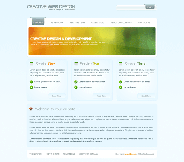
Thats it all done, heres the final product.
Final Note
Thanks for reading through my tutorial, hope you enjoyed it. Dont forget to re-tweet and digg this turtorial, your help and support is much appreciated. Cheers…
Your ads will be inserted here by
AdSense Now!.
Please go to the plugin admin page to paste your ad code.