Software Layout #6
Your ads will be inserted here by
AdSense Now!.
Please go to the plugin admin page to paste your ad code.
Hello everybody, welcome to another tutorial by HV-Designs. In this tutorial I’ll be showing you how to create a simplistic product layout with a green theme. Lets get going…
Resources Used In This Tutorial
The Finished Layout
This is what we’ll be creating, click image for a bigger view.
Creating The Document
Create a new document 1200 x 1200 pixels with a white background. Set your foreground color to #d6d6d6 and background color to #efefef then select the gradient tool with a linear gradient.

Drag the linear gradient over your canvas starting from the top, drag the linear gradient about 250 – 300 pixels down.

Creating The Header
Select the rectangular marquee tool, then drag out a selection the width of the canvas and about 160 – 170 pixels in height.

Before filling the selection set your foreground color to #483f38 and background color to #1e1916. Select the gradient tool then this time set your gradient type to reflected.
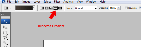
Drag the reflected gradient from the middle of the rectangle towards either the left or the right side of the canvas. Once you’ve filled the rectangle add some noise by going to “Filter > Noise > Add Noise”.


Creating The Template Title
Using the type tool add your website title and slogan inside the rectangle.

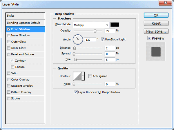
Once you’ve add your title and slogan add a drop shadow to the title using the settings below.
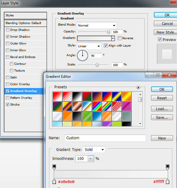
To one of the words in your title add a gradient overlay using the settings below.

You should have something like this.

Creating The Small Navigation
Select the rounded rectangle tool with a corner radius of 10px.

Drag out a small rounded rectangle on the right side of the canvas inside the header rectangle.

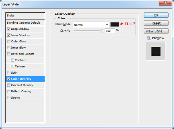
Now add the following layer styles to your rounded rectangle.


Inside the rectangle add a small selection of textual links, you should have something like this.

Creating The Main Navigation
Before creating the main navigation using the rectangular marquee tool or the single row marquee tool create two 1px lines on top of each other. Color the top line in black and the bottom line in white. Place the two lines directly underneath the header rectangle.

Using the rounded rectangle tool drag out a rectangle, keep the rectangle in the center of the line between the background and header.

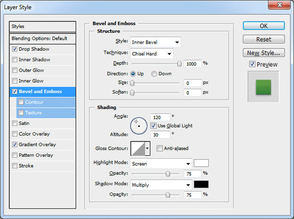
Add the following layer styles to your navigation rectangle.

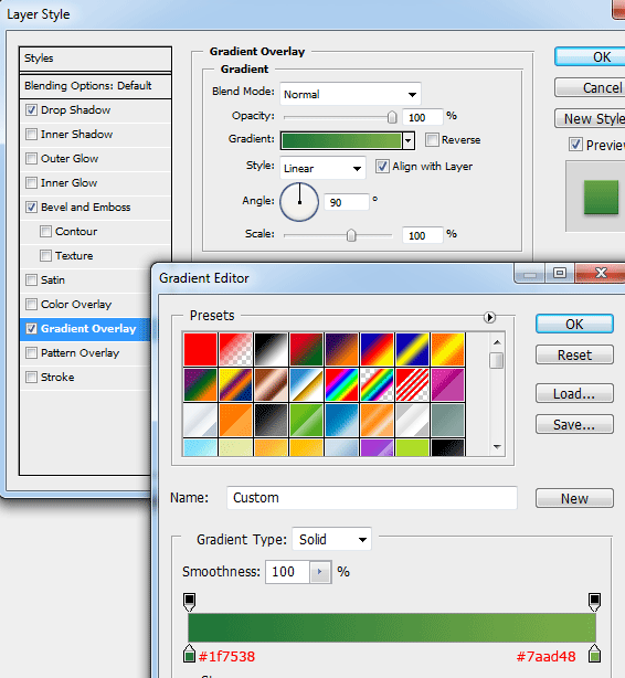
Still with the rounded rectangle tool create another rectangle inside the main navigation rectangle. The rectangle should be the color white and should only be half the size or smaller than the main rectangle.

Set the opacity of the small rectangle to 5%. For this next part you need to create your own custom pattern.
Create a new document 25 x 25 pixels, zoom in as much as you can then select the pencil tool. Using the pencil tool and the color black mimic the image below.

Once you’ve created the pattern go to “Edit > Define Pattern”, save the custom pattern has “Diagonal Lines”.
Head back over to your original canvas and load a selection around the main navigation rectangle. You can load a selection by selecting the layer inside the layers window then go to ” Select > Load Selection”.
Once you’ve loaded the selection fill your selection on a new layer using the paint bucket tool (Don’t forget to set paint bucket option to pattern). Finally set the pattern layers opacity to 1%.

Creating The Search
Using the type tool add your navigation items, in the space left over on the right hand side this is where we’ll be adding our search field.
Using the rounded rectangle tool with a radius of 5px create a small rectangle in the space.

Add the following layer styles to your search field rectangle.
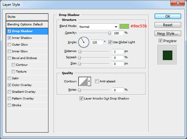

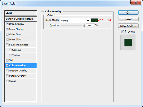
Inside your search field add some text and a little icon on the right. I’ve chosen a small magnifying glass from the custom shapes library.

Creating The Featured Area
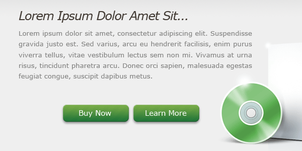
Underneath the main navigation were going to create a featured area to feature the product in question. Start off with the text tool and add a nice big title followed by a couple of paragraphs.

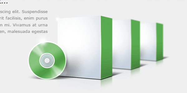
On the right side of the text create your product in the form of a software box. For this tutorial I’ve just used a blank software box from HERE. You can take more time in creating your very own custom software box, or simply use the icon from the link above.

Once you’ve added your content box duplicate it, then drag the duplicated software box behind its original. Free transform the software box by pressing “CTRL + T”, resize your duplicated box by a fraction or two then blur it by 1px by going to “Filter > Blur > Guassian Blur”.

Finally duplicate your blurred software box then drag the layer behind its original. Blur the third software box by 1 px once more then resize it again by a fraction or two. You should have something like this.
Were now going to create two small buttons, select the rounded rectangle tool with a radius of 10px. Drag out two small button sized rectangles then add the same layer styles as the main navigation.
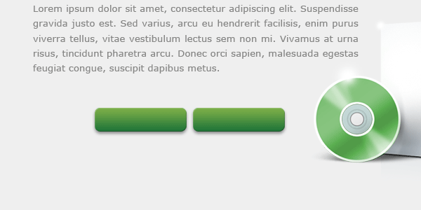
On your two buttons add the diagonal pattern the same as the main navigation then label the two buttons accordingly.
Creating The Divider
Using the single row marquee tool or the rectangular marquee tool create two 1px lines on top of each other, color the top line in #c9c9c9 then the bottom line in white (#ffffff).

Make a selection directly underneath your two lines using the rectangular marquee tool.
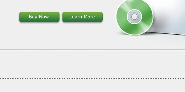
Set your foreground color to #e6e6e6 and background color to #efefef then select the gradient tool with a linear gradient. Drag downwards from the top of the selection releasing the mouse button just short of the bottom of the selection.

We now need to blend the two lines and the little gradient we added into the background on both the left and right sides.
Add a layer mask to one of the layers, set your foreground color to white and background color to black. Select the gradient tool with a reflected gradient then drag the gradient from the center of the element you have chosen first outwards to either the left or right. The element you have chosen should be blending in with the background on both sides, left and right.
Do this for all 3 layers, top line, bottom line and gradient.

Adding The Content
On the left side of the canvas underneath the divider create a rounded rectangle with the rounded rectangle tool. The rectangle doesn’t have to be big as it will just hold a small list of features.
The layer styles are as follows.


Inside the rounded rectangle add a simple list with green bullet points, separate each list item with its own divider.

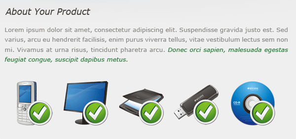
On the right side of the box add a heading with a short paragraph underneath. Then underneath the paragraph add some icons, I’ve used the “Classy Icon Set” from “Dryicons”.
Creating The Footer
Duplicate the header and the bottom divider then drag it all the way down to the bottom of the canvas. Select the duplicated header layer then press CTRL+T to free transform the header. Resize the height of the rectangle to fit your footer content.
Move the duplicated divider line to the top of the duplicated header. Finally add your footer text to your footer.

That’s it all done, hope you enjoyed this tutorial. If you did enjoy this tutorial then maybe you would consider digging and retweeting it.
Your ads will be inserted here by
AdSense Now!.
Please go to the plugin admin page to paste your ad code.
