WordPress Layout #6
Welcome to tutorial 230, in this tutorial il be showing you how to create a sleek, clean and spacious wordpress blog.
Setting Up The Canvas And Guides
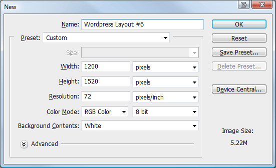
Create a new document 1200 x 1520, fill your background layer with the color #e6e6e6.
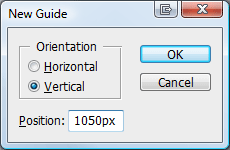
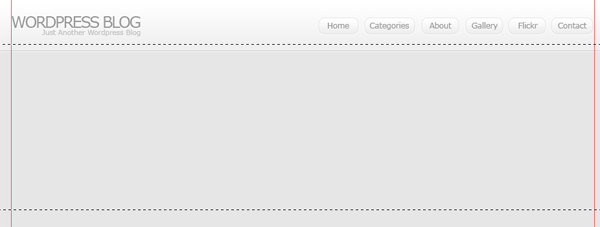
The layout were making is going to be 900px wide, so were going to need to setup some guides. Go to “view > new guide” from the menu at the top, in the box that pops up enter the following settings.
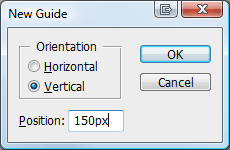
Do the same again only this time enter these settings.
Creating The Header
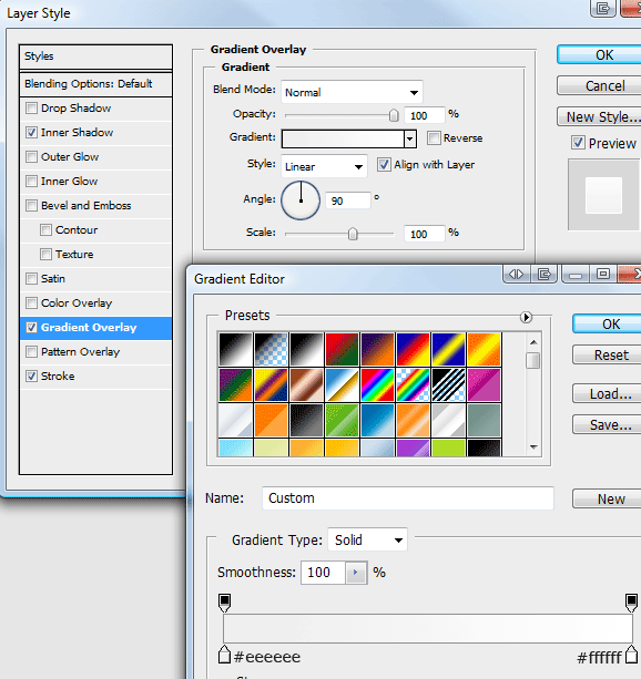
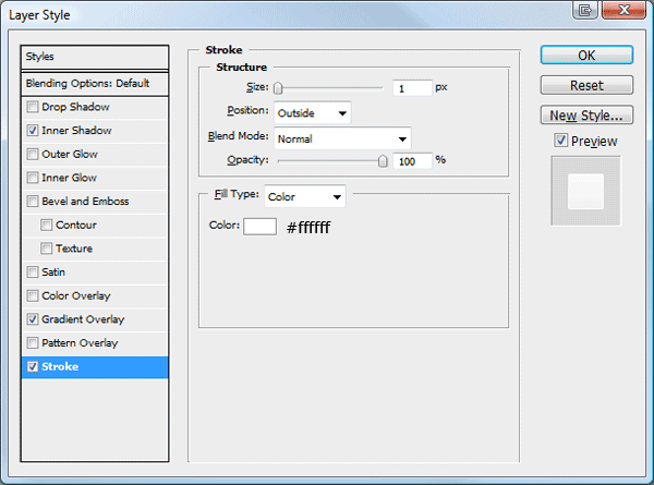
Select the rectangular marquee tool, then create a rectangle the width of the canvas and about 80 pixels in height. Fill the rectangle with any color then add these layer styles.
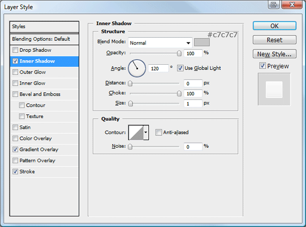
You should have something like this.

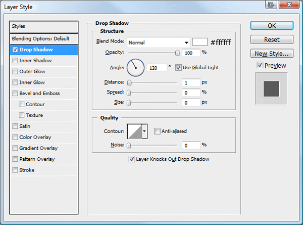
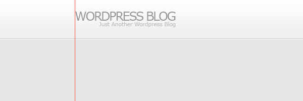
On the left side add your wordpress website title and slogan, fill the text using the color #979797. Once you’ve added your title and slogan add a drop shadow using the settings below.
You should have something like this.
Creating The Navigation
Using the text tool add some dummy links to the right side of the header.
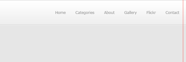
Using the rounded rectangle tool make a selection around each navigation link.
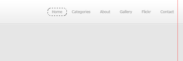
Fill the rectangles in any color then add these layer styles.
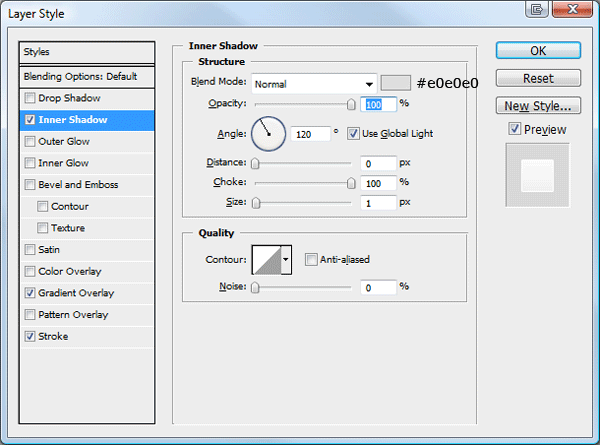
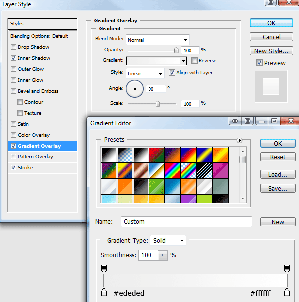
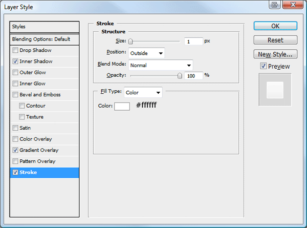
You should have something like this.
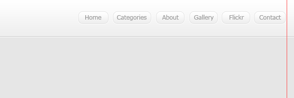
Creating The Welcome Area
Using the rectangular marquee tool make a selection underneath the header, make sure the selection is on a new layer underneath the header.
Fill the selection with any color then add these layer styles.
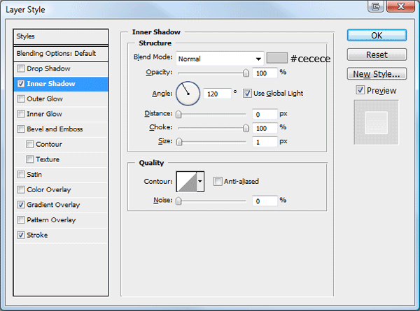
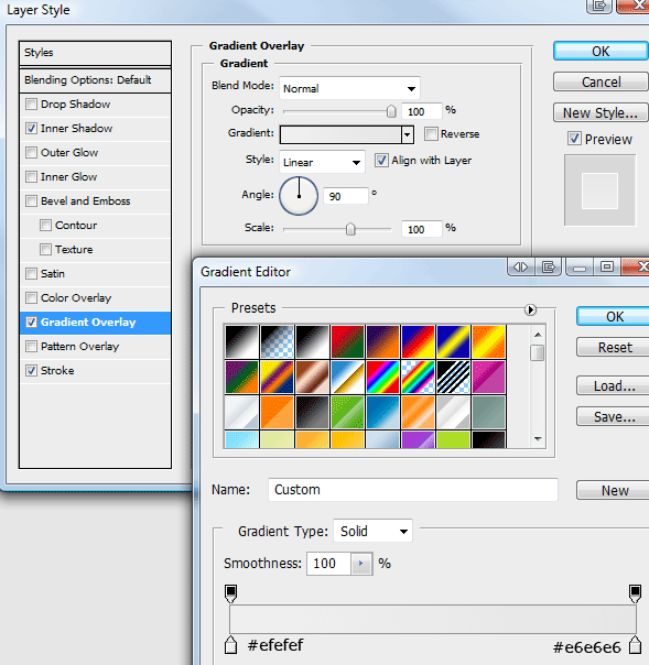
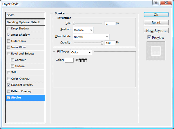
You should have something like this.

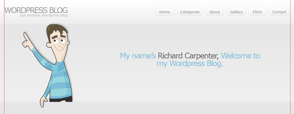
Were now going to add a character from wefunction, click here (http://wefunction.com/2008/11/free-character-pack/) and download the character pack. Once you’ve downloaded it, extract it too your hard drive then open up “002__002.eps” in photoshop. Drag the character over onto your canvas and position it like the image below.
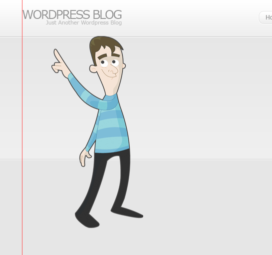
Chop the characters legs off just below the stroke on the welcome area.
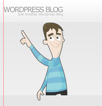
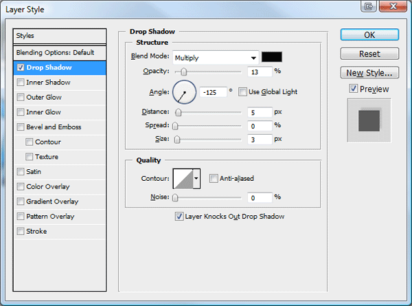
Finally add a drop shadow using the settings below.
On the right side of the character add a simple sentance about your blog.
Creating The Content Area
Select the rectangular marquee tool and make a selection on the right side of the canvas against the right guide. the rectangle should be about 600 pixels in width and as long as you see fit, you can always resize the rectangle later to fit the content.
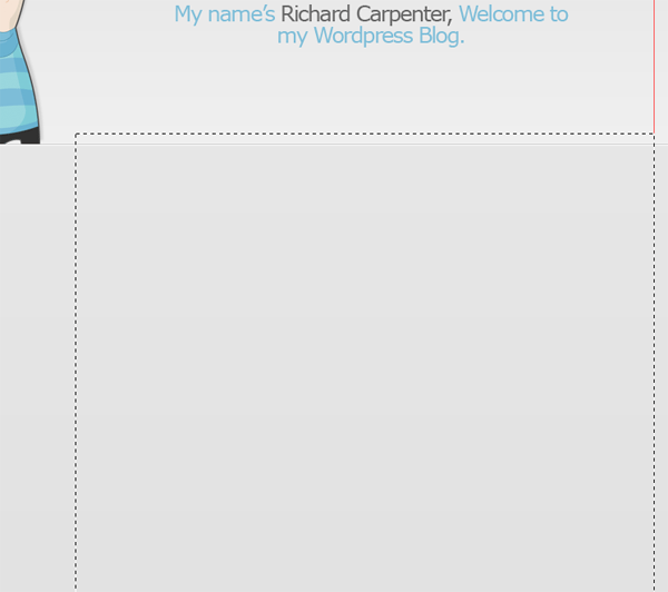
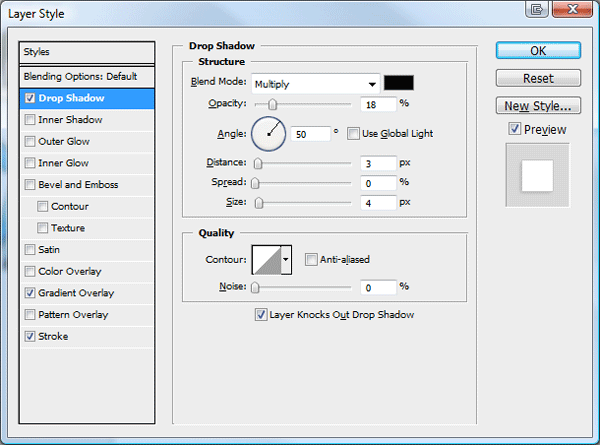
Fill the selection with any color then add these layer styles.
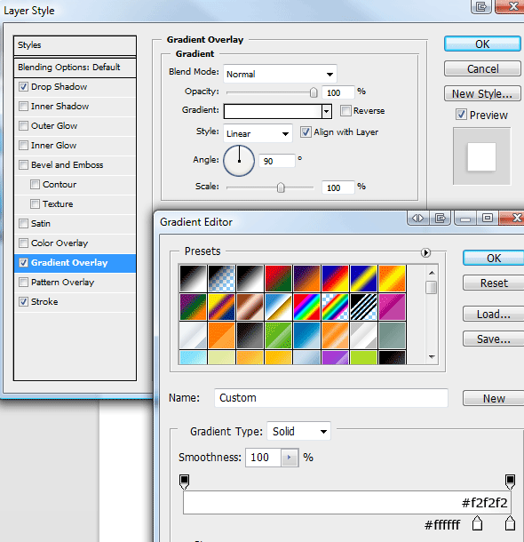
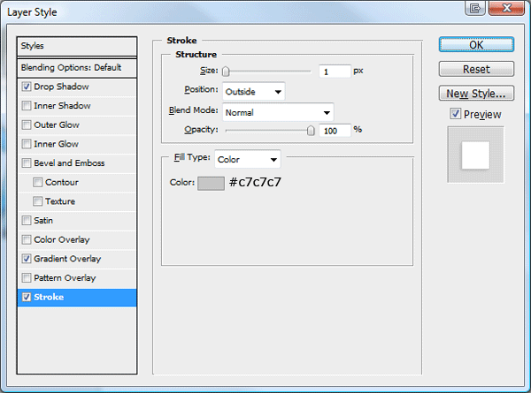
Create a new layer underneath the content rectangle, then select the polygonal lasso tool. On the corner of the content rectangle create a triangular shape like the image below.
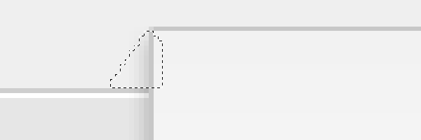
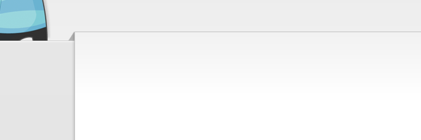
Make sure the selection doesn’t go below the welcome area’s stroke. Once you’ve created the selection fill it with the color #a9a9a9. You should have something like this.
Mocking Up The WordPress Posts
Inside our content area, lets begin to mock up our dummy posts. Select the type tool and add an example posts title using the color #666666 and font size 24pt. Underneath the post title add some meta data (E.G post time, post date, author and category).
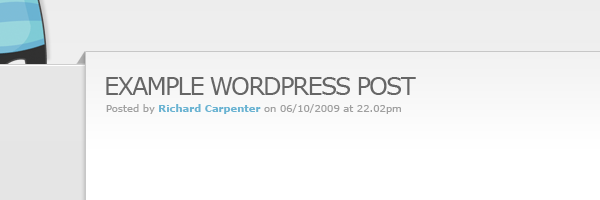
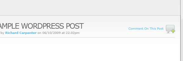
Underneath the post meta data add a 1 pixel line using a light grayish color. Now head over to woothemes and download this icon pack (http://www.woothemes.com/2009/09/woofunction-178-amazing-web-design-icons/). On the right side of the post title add the speech bubble icon with some text saying comment here.
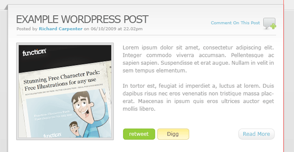
Finish off the post with a dummy image and some dummy text. After you’ve added the dummy text add a read more button using the buttons from the navigation. Ive also thrown in some social buttons for good measure.
Creating The Sidebar
The sidebar will be located on the left side, opposed to many blogs which display it on the right. In the sidebar im going to add a flickr gallery first, create a heading using a font size of 18pt, use the color #666666 for the heading color.
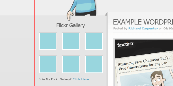
Underneath the flickr gallery title add some small thumbnail like images to act as our dummy flickr gallery. Before we continue adding our sidebar elements let seperate each part using a simple separator. Select the rectangular marquee tool, then create two 1 pixel lines on top of each other. Fill the lines in two different colors, the line thats on the bottom fill with white and the line that sits on top fill in a grayish color darker than the sidebar background. Finally drag the separator lines layer underneath the content box layer so they disapear nicely behind the content box.

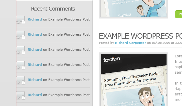
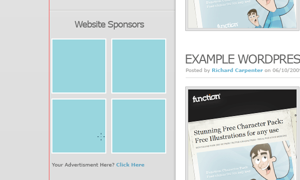
Continue to bloat out your sidebar with the elements you’d want in the sidebar, ive added a simple recent comments list and some website sponsors.
Creating The Footer
Duplicate your welcome area background then drag it down to the bottom of the canvas. Open up the layer styles window then switch the colors between the stroke and the inner shadow. You need the make sure the white line is underneath the dark gray line else you wont get the indented effect.

On the left side of the footer add a nice twitter icon with speech bubble next to it. The speech bubble was from the custom shapes libary from within photoshop.
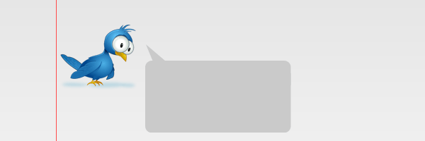
Add a dummy twitter post inside the speech bubble then stick a header over the top. On the right side of the footer add your copyright information and maybe another little character image from wefunction.

Creating The Pagination
Select the rectangular marquee tool or the rectangle tool and create a couple of square boxes just over the footer stroke. Using the same method as we did for our content box , add the little triangular grey shapes to make them look as if they are wrapping around the footers stroke.
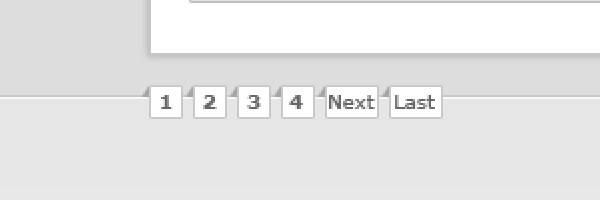
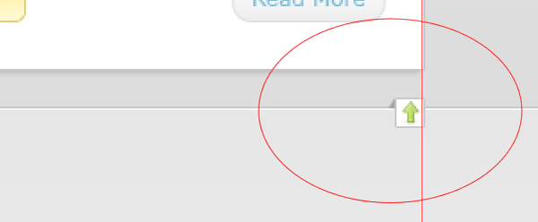
On the right side of the footer add 1 single square with a little arrow inside it, again use the same method as above to get the 3D effect.
Well Done… Finished
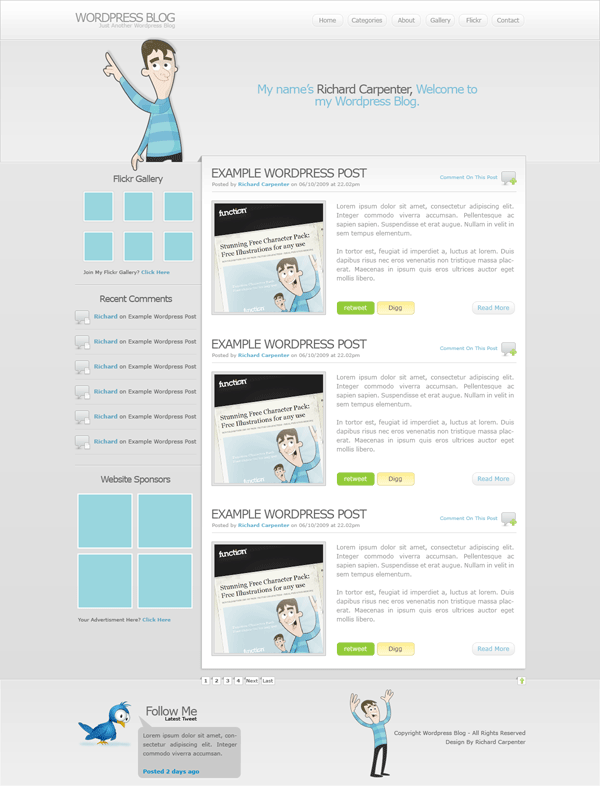
Thats it all done, heres the finished layout.
Final Note
Thanks for taking part in this tutorial, il look forward to your comments. Also look out for the finished wordpress theme which will be available to download for FREEEE. Subscribe via our RSS feeds to stay tuned.
Thank You.