Your ads will be inserted here by
AdSense Now!.
Please go to the plugin admin page to paste your ad code.
Welcome to another tutorial at hv-designs, today we’ll be mocking up a shopping cart design called shop smart.
To start were going to need a fairly big canvas, create a new document 950 x 1100 fill your background layer with the color #f8f8f8. Select the rectangular marquee tool then create a rectangle at the top of your canvas. The rectangle should be the width of your canvas and about 120pixels in height.
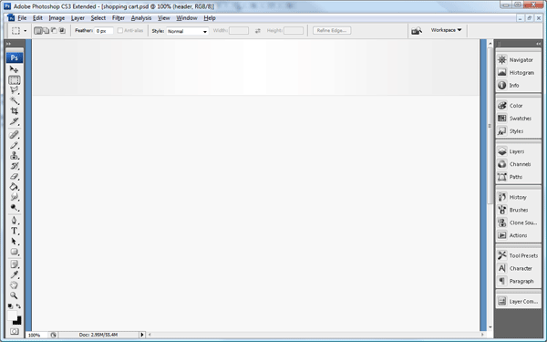
Add these layer styles to the rectangle to complete the effect.
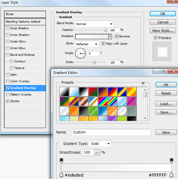
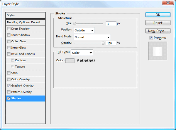
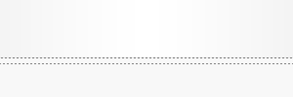
Underneath the stroke on the rectangle create a 1 pixel line all the way across the canvas.
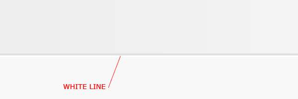
Underneath the white line create another rectangle but on a much smaller scale. Fill the rectangle with any color.
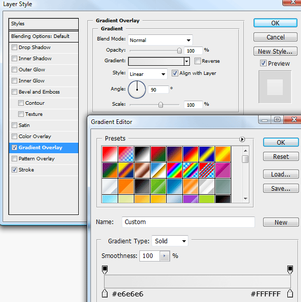
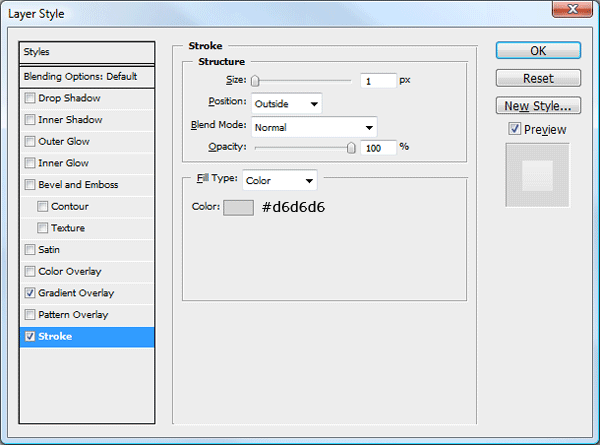
Once created add these layer styles.
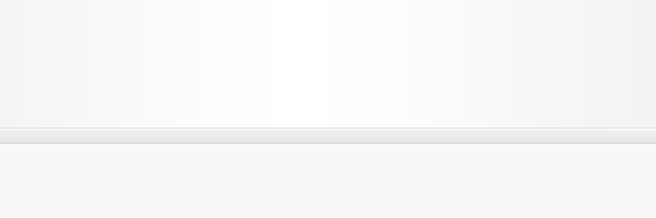
You should have something like this.
With the rectangular marquee tool once again create another rectangle underneath the one you just created, the rectangle should be the width of your canvas and about 65pixels in height. Fill the rectangle with any color then add this gradient overlay.
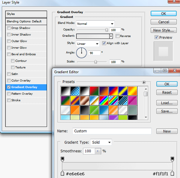
You should have something like this.
Now select the rounded rectangle tool and create a rectangle any where on your canvas. Ive used a radius of 15pixels for my rectangle, this will give the rectangle some nice rounded corners.
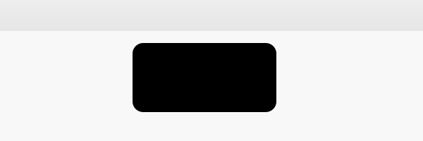
Duplicate your rectangle, then hide the layer, we’ll use this spare rectangle in a minute to make our tab’s. Select the rectangular marquee tool and create a rectangle over the top of the bottom of the rounded rectangle. Fill the selection on the same layer.
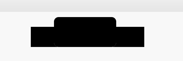
Unhide your duplicated rectangle then add a color overlay in any color, place the duplicated rectangle next to its orginal.
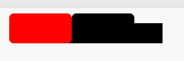
Select your duplicated layer whilst holding down the CTRL key on the keyboard. Make sure the orginal layer is still selected in the layers window. Hit the delete key then hide your duplicated rectangle. Should have something like this.
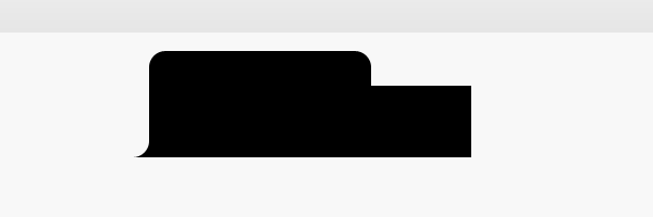
Do the same with the other side, hopefully if done correctly you should have a tab shaped rectangle. You can resize to how ever big you want using “CTRL + T”. Add these layers to your tab shape.
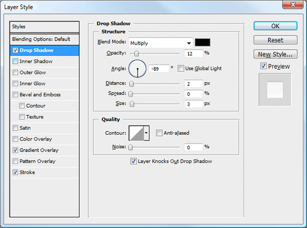
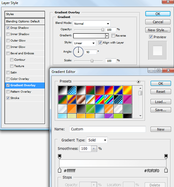
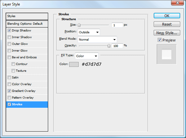
Place the tabbed button onto the latest rectangle you created.
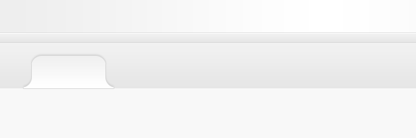
Duplicate your tab as many as needed, change the color of the duplicated ones to something darker and remove the drop shadow from the layer styles.
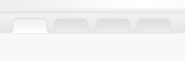
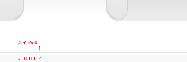
Underneath the tabs add a white rectangle, overlap the tab’s by 1 pixel, which should hide the stroke at the bottom of the tabs.
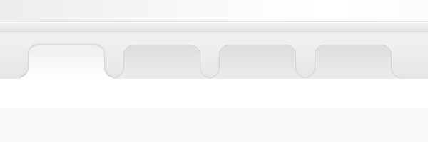
At the bottom of the white rectangle add two 1 pixel lines on top of each.
Your ads will be inserted here by
AdSense Now!.
Please go to the plugin admin page to paste your ad code.
Using the rectangular marquee tool create a black rectangle over the darkest tab’s but underneath the first tab.
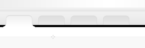
Make sure the black rectangle spans the whole width of the canvas. Set the black rectangles opacity to about 2%.

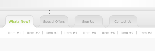
You can now label your tabbed area, in the white area underneath add a second navigation.
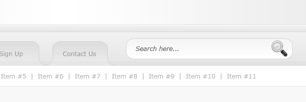
In the space ive left on the right side of the tabbed navigation ive added a simple search field, which looks like this.
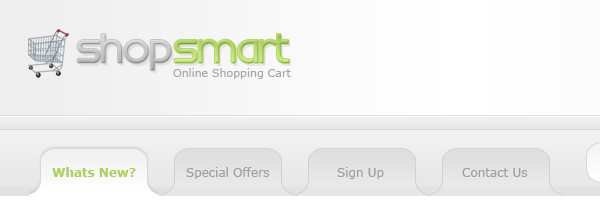
In the header part of the layout add your website title and slogan.
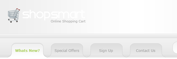
On the website title ive got two words, shop and smart. To the first word im going to add some layer styles.
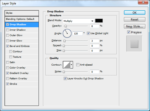
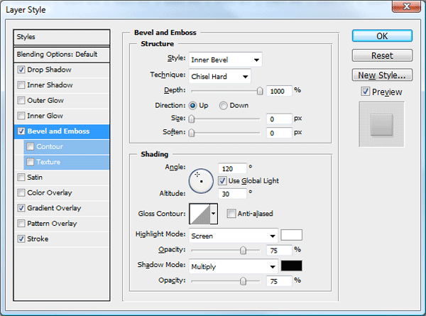
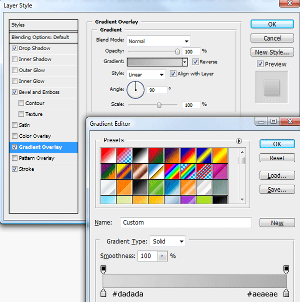
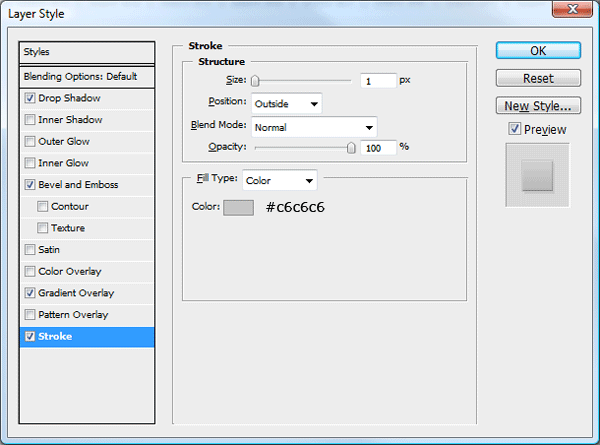
The title now looks like this.
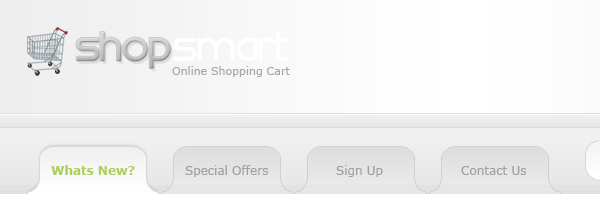
To the second word “shop” im going to add exactly the same styles part from the gradient overlay and stroke will change.
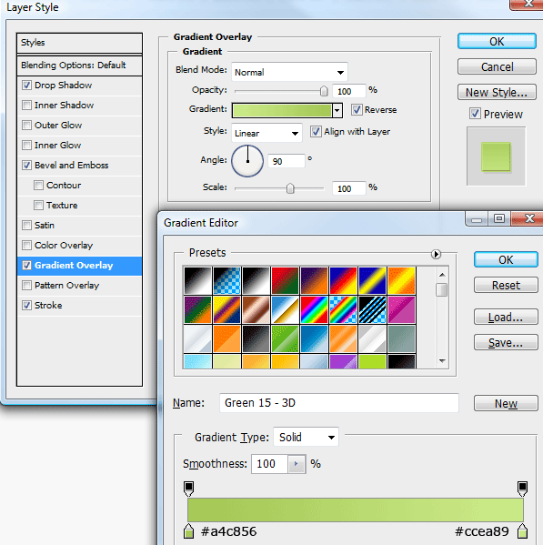
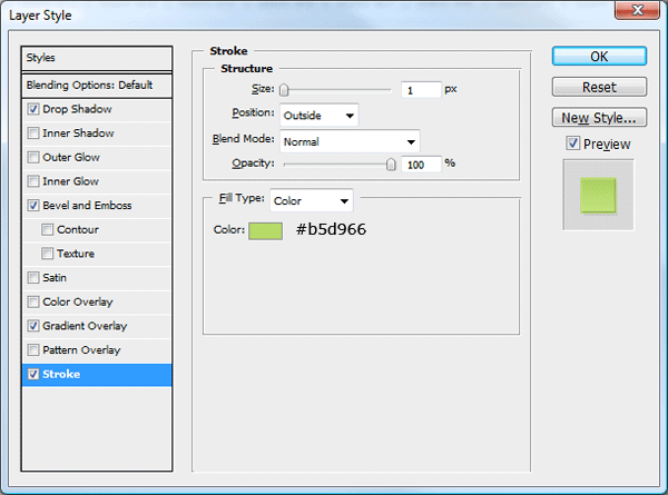
You should have something like this.
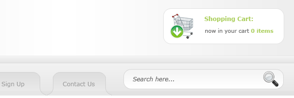
On the right side of the website title, add a simple shopping basket area. Ive used the rounded rectangle tool and an icon from dryicons.
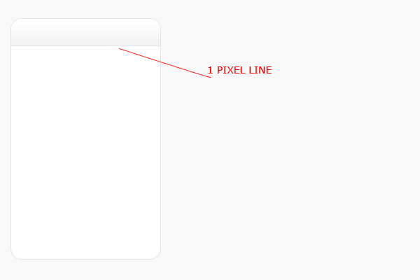
were now going to create our shopping content boxes. Using the rounded rectangle tool draw out a rectangle on the left. Add a dark grey stroke to the rectangle.
Over the top of the rectangle add a dark area for our content box title. Using a subtle gradient.
Where the bottom of the dark area ends add a 1 pixel line same color as your stroke.
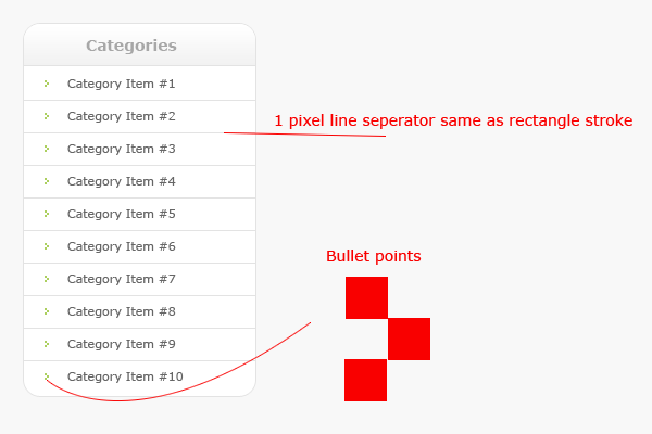
Inside your rectangle add a list of items with some nice bullet points, divide each item in the list with a seperator.
Using the methods mentioned above create more content boxes and product items, here is what ive came up with. Ive left a space at the top in the middle for some featured items.
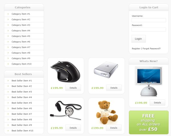
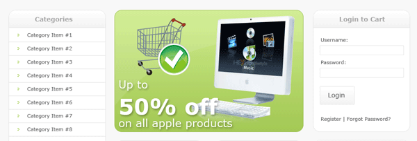
As mentioned above the space in the middle is for out featured items. Continuing with the theme, im going to use a greenish colored rounded rectangle. Similar colors to our website title. Inside the box add some simple featured items.
Finally for the footer i duplicated our header, resized it in height, then added some simple footer information.

Your final product should look something like this.
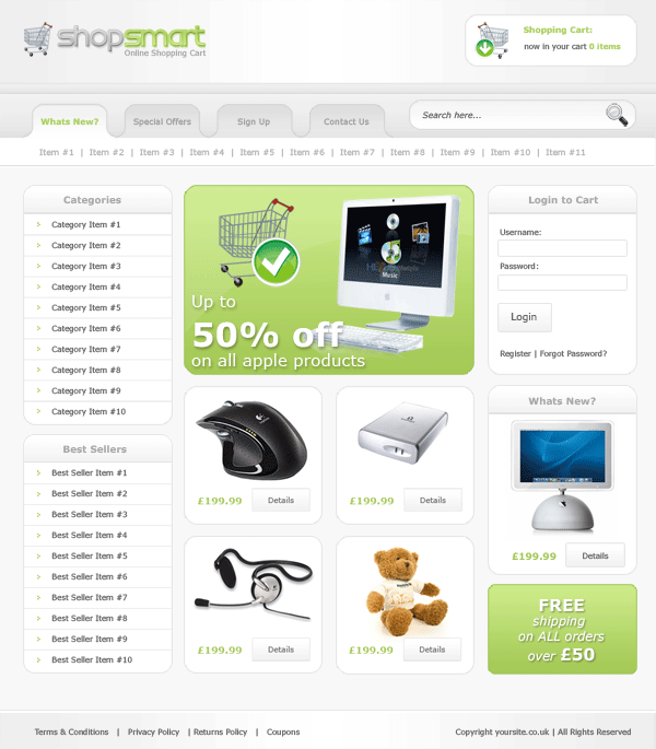
All done hope you enjoyed this tutorial, dont forget to subscribe via RSS and twitter, your help and support is much appreciated.
Your ads will be inserted here by
AdSense Now!.
Please go to the plugin admin page to paste your ad code.