Good evening everybody, today i’ll be walking you through the process of coding your “Digital Curriculum Vitae” into a working HTML/CSS Template. Lets get started.
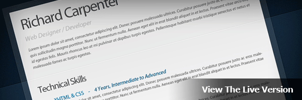
The Live Version
You can check out the Live Version of the template by clicking the image below. The template has been tested in the following browsers without any problems.
- Firefox 2.0, 3.0 and 3.5
- Internet Explorer 7 and 8
- Chrome 3.0
- Safari 3.0 and 4.0
Preparing Your Files
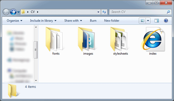
Create a new folder on your desktop called “Digital Curriculum Vitae”, within this folder create three more folders called “fonts”, “images” and “Stylesheets”.
The “Fonts” folder will be used for our fonts, if you can remember from part #1 of the tutorial we used a font called “Myriad Pro”. This font won’t work on a live webpage unless we use some CSS3 (@font Face), more on this later.
The “Images” folder will be for our template images, all images will be saved in PNG format.
Finally the “Stylesheets” folder will contain our stylesheets, i this template there will be two stylesheets. A “Reset.CSS” and “Styles.CSS”.
Once you’ve created your folders, create a blank HTML file called “Index.HTML”. Save the blank HTML file inside the main folder. Next create two blank CSS files inside your stylesheets folder.
Setting Up The HTML File
Open your HTML file in your favorite code editor, in the “HEAD” section of the HTML file add your template title and link your CSS document.
<title>Digital Curriculum Vitae - Richard Carpenter - HV-Designs.co.uk</title>
<link href="stylesheets/styles.css" rel="stylesheet" type="text/css" />
In the “BODY” of your document add a DIV called “Container”, the container will be our main DIV in which our template will be held.
<div id="container">
</div><!--CONTAINER ENDS-->
Inside the container DIV were going to create 3 more DIV’s, “Frame-Top”, “Frame-Middle” and “Frame-Btm”.
<div id="container">

<div id="frame-top">
</div><!--FRAME TOP ENDS-->

<div id="frame-middle">
</div><!--FRAME MIDDLE ENDS-->
<div id="frame-btm">
</div><!--FRAME BOTTOM ENDS-->

</div><!--CONTAINER ENDS-->
The 3 DIV’s will each contain the top, middle and bottom portions of the transparent box which is behind the white rectangle on our layout.
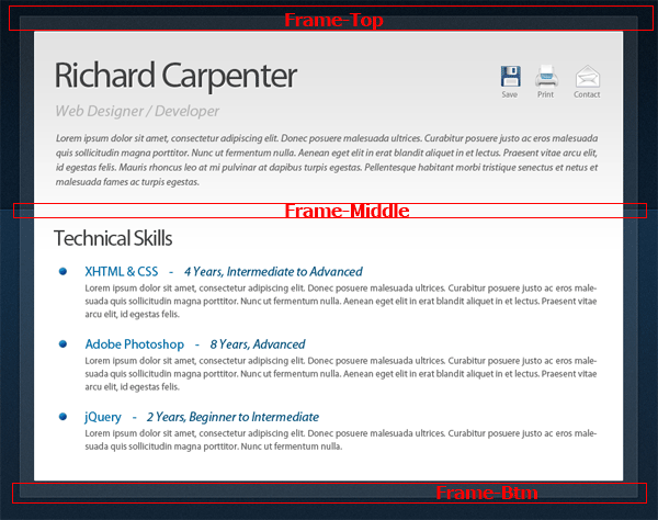
Finally the actual white rectangle on our layout we can do all in CSS, so we’ll just create 1 more DIV called “Page”. Place the DIV inside the “Frame-Middle” DIV.
<div id="container">

<div id="frame-top">
</div><!--FRAME TOP ENDS-->

<div id="frame-middle">

<div id="page">
</div><!--PAGE ENDS-->

</div><!--FRAME MIDDLE ENDS-->
<div id="frame-btm">
</div><!--FRAME BOTTOM ENDS-->

</div><!--CONTAINER ENDS-->
So just to recap then we have our “Container DIV” which will contain a whole template, “Frame-Top”, “Frame-Middle” and “Frame-Btm” which will contain our transparent rectangle cut into 3 separate images. Then finally our “Page” DIV which will contain our white main rectangle for our content.
Slicing The Background Image
Now our HTML mark-up is finished lets start slicing our images, We’ll start with the background. Select the rectangular marquee tool then drag out a selection about 50 pixels wide and the whole length of your background.
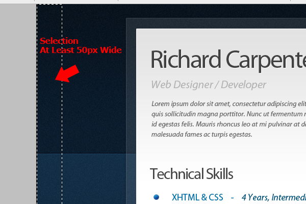
Once the selection has been made go to “Edit > Copy Merged”, then go to “File > New” and create a new document. (The size of your selection should automatically be entered into the dimension boxes)
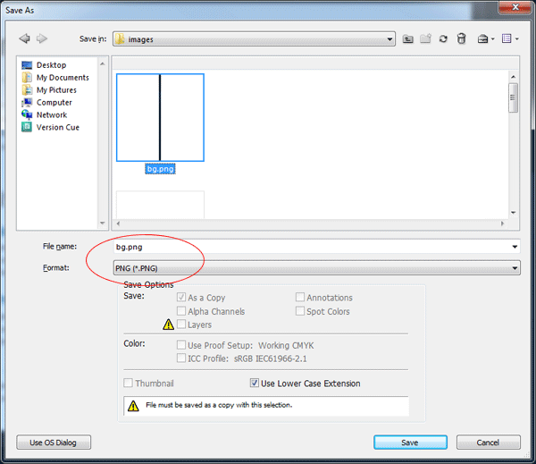
Save the background image as “bg.PNG” inside the images folder.
Slicing The Transparent Rectangle
Hide all your layers apart from the background layers and the transparent rectangle. Select the rectangular marquee tool then make a selection around the top half of the rectangle.
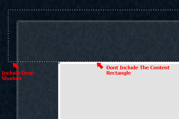
In the selection include your drop shadow, but don’t include the content rectangle. Once you’ve made the selection hide the background layers and go to “Edit > Copy Merged”, paste the selection into a new document then save the file as “frame_top.PNG”.
Repeat the process for the bottom of the rectangle and also the middle, make sure all slices are the same width.
Slicing The Template Title
Still with the rectangular marquee tool make a selection around your website title.
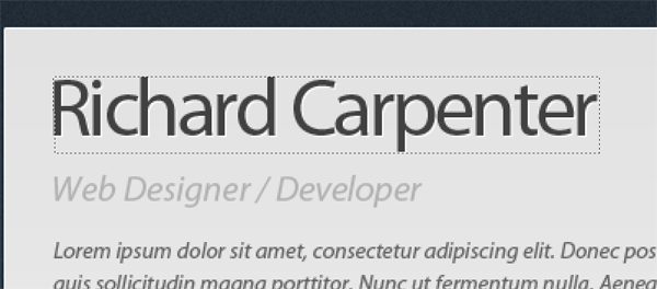
Once you’ve made the selection hide all your layers apart from the title layer itself then go to “Edit > Copy Merged”. Create a new document by going to “File > New” and then paste your selection into the new document.
In your new document hide the background layer then go to “File > Save As”, save the image as “title.PNG” inside the images folder.
Slicing The Navigation
For our little 3 button navigation were going to keep all the buttons as one image, we’ll then use CSS to adjust the background image for our template.
Start off by making a selection around all 3 buttons using the rectangular marquee tool.
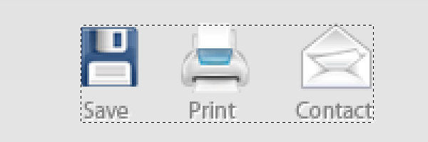
Hide all your layers apart from the 3 button icons and there text, once you’ve hidden your layers go to “Edit > Copy Merged”.
Paste your copied selection to a new document, hide the background layer then save the images as “right_navigation.PNG” inside your images folder.
Slicing The Page Background
Using the rectangular marquee tool make a selection 1 pixel wide starting from the top of your white rectangle. The starting point should be underneath the 1 pixel white border.
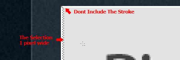
Drag the selection all the way down until you come into the white portion of the rectangle. You can use the eye dropper tool to make sure the selection ends on white (#ffffff). The reason for this is because where the background image ends the color white will continue on down the page which will be set in our stylesheet.
Slicing The Bullet Points And Divider Line
Make a selection around one of your bullet points using the rectangular marquee tool.

Once you’ve made the selection hide all your layers apart from the bullet layer itself then go to “Edit > Copy Merged”. Create a new document by going to “File > New” and then paste your selection into the new document.
In your new document hide the background layer then go to “File > Save As”, save the image as “bullet.PNG” inside the images folder.
For our divider line you only need to make a 1 x 2 pixel selection as the image will be repeated using CSS. Make a selection on your divider line as shown in the image below.
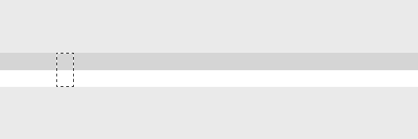
Once the selection has been made go to “Edit > Copy Merged”. Paste the selection into a new document then save the image as “divider.png” inside the images folder.
Slicing The Social Icons
Finally we need to slice our individual social icons. Using the same methods listed above slice each button, then save each button on a transparent background inside your images folder.
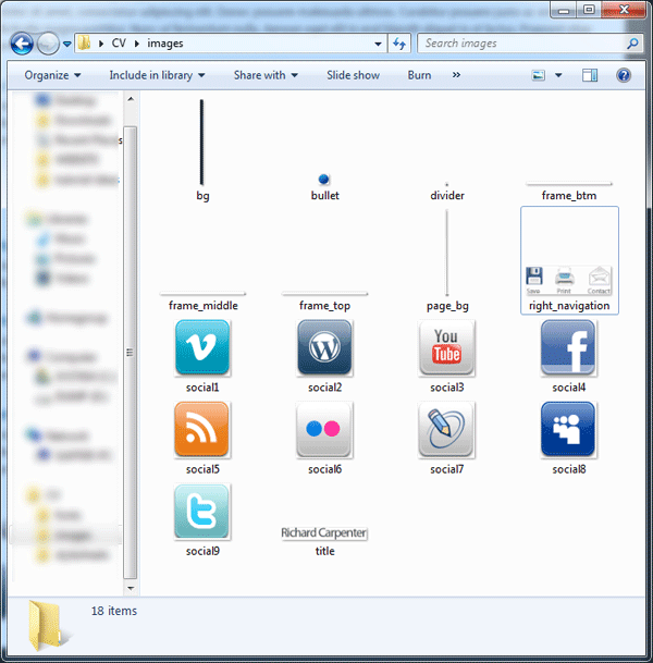
Once your finished thats all the slicing done. Here’s a screen shot of all my images inside the images folder.
The Background CSS
Open up your styles.CSS stylesheet inside your favorite code editor, then add the body as your first style.
body {
}
Inside your body style we need to set our background image, to do this we add your “bg.PNG” image as a background then repeat the background horizontally (X-Axis).
We don’t want the background to move when scrolling down the page so we also set the background to fixed. Finally we need to push our template downwards so its not flush with the top of our browser, we do this by adding a top margin. The CSS code looks like this.
body {
background-image: url(../images/bg.png);
background-repeat: repeat-x;
background-attachment: fixed;
margin-top: 35px;
}
Styling The Container
The next set of DIV’s we need to style are the foundations of our template, these DIV’s are the main container and the transparent rectangle which goes all the way around our template. We’ll start with the container DIV.
We first set our container width, to find out the width of the container you can check the size of your transparent rectangle images.
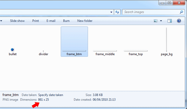
Notice the width of 861px, this will be our container width. We then set our containers margins to auto, doing this will center our template in the browser.
#container {
margin: auto;
width: 861px;
}
Styling The Transparent Rectangle
Inside your HTML file locate the DIV’s “frame-top” and “frame-btm”. Inside the frame top DIV insert your frame top image from your images folder.
<div id="frame-top">
<img src="images/frame_top.png" alt="Curriculum Vitae" />
</div><!--FRAME TOP ENDS-->
Repeat the same for the frame btm DIV.
<div id="frame-btm">
<img src="images/frame_btm.png" alt="Curriculum Vitae" />
</div><!--FRAME BOTTOM ENDS-->
For our top and bottom frame DIV’s we need to float them left then add a fixed height and width. The width and height of our DIV should be the same width and height as images which we sliced earlier.
Instead of creating two separate styles for frame top and frame btm we can join them together as both DIV’s share the same styles. We do this by separating the DIV’s with comma’s in our stylesheet.
#frame-top, #frame-btm {
float: left;
height: 25px;
width: 861px;
}
Styling Frame Middle DIV
Our “frame-middle” DIV is styled in a similar way as body background, the only difference being we repeat the background vertically (Y Axis), float the DIV to the left and add a fixed width. The fixed width should match the frame middle image, which should also be the same width as our container DIV.
#frame-middle {
background-image: url(../images/frame_middle.png);
background-repeat: repeat-y;
float: left;
width: 861px;
}
Styling The Page DIV
This DIV is the final DIV we need to style, we should then have the foundations of our template ready for our content.
Float the DIV left, add a fixed width of 809px (the width is the same size as our content rectangle in our PSD file) then set a white solid 1 px border.
#page {
float: left;
width: 809px;
border: 1px solid #FFFFFF;
}
Set your “page_bg.PNG” as the DIV’s background repeating it horizontally (X Axis), set the DIV’s background color to white (#ffffff) then set a top and bottom margin of 30px.
#page {
float: left;
width: 809px;
margin-left: 25px;
border: 1px solid #FFFFFF;
background-image: url(../images/page_bg.png);
background-repeat: repeat-x;
background-color: #FFFFFF;
padding-top: 30px;
padding-bottom: 30px;
}
Adding Some Content
In your HTML file inside the “#page” DIV add a “H1″ heading tag then insert your “title.PNG” file inside. Add a link to your image if you wish.
<h1><a href="#"><img src="images/title.png" alt="Richard Carpenter CV" /></a></h1>
Underneath your “H1″ tag add an unordered list “UL” with a class of “right-nav”. Inside your list add your 3 list items also known as your 3 button navigation each with there own classes to represent that list (LI) Item.
<ul class="right-nav">
<li class="save"><a href="#" title="Save">Save</a></li>
<li class="print"><a href="#" title="Print">Print</a></li>
<li class="contact"><a href="#" title="Contact">Contact</a></li>
</ul>
Underneath your small navigation add a simple paragraph “P” tag with a class of “job-title”. Inside your “P” tag add your desired text.
<p class="job-title">Web Designer / Developer</p>
Finally we need to add our intro text, create another “P” tag but with a class of “intro”.
<p class="intro">INTRO TEXT GOES HERE</p>
Styling Our Header Content
We’ll start with our “H1″ tag, set a fixed width and height the same dimensions as your title image, float the title left then add a bottom margin of 10px. To push the tag over from the left add a left margin of 30px.
We could of added the left padding to the “page” DIV which would automatically push everything from the left over 30px, but if we used this method then our little lined divider would also have 30px padding which we don’t want. We want the divider to start and end at either side of the page layout. We’ll add the 30px left margin to all items inside the “page” DIV.
h1 {
height: 47px;
width: 334px;
margin-bottom: 10px;
float: left;
margin-left: 30px;
}
Styling Our P Tag Classes
There are two “P” tag classes we need to style, “P class job-title” and “P class intro”. The styles for these classes are just changes in the way the text looks. Notice we haven’t set any font-family yet as we’ll be doing this at the as it requires some CSS3.
The “P” class “job-title” looks like this.
p.job-title {
color: #b1b1b1;
font-size: 20px;
letter-spacing: -1px;
font-style: italic;
clear: both;
margin-left: 30px;
}
The “P” class “intro” styling looks like this.
p.intro {
font-style: italic;
color: #646464;
font-size: 12px;
margin-top: 20px;
text-align: justify;
margin-left: 30px;
margin-right: 30px;
line-height: 18px;
}
Styling The Navigation
For our navigation start off by styling the unordered-list “UL”. Simply float the navigation to the right then add 30px of right margin.
ul.right-nav {
float: right;
margin-right: 30px;
}
The next few styles are for our navigation list “LI” items and the link “A” associated with our buttons. For our list “LI” items we float each of them left, to add spacing in between each button we add a left margin of 22px.
For our list “LI A” links we display each of them as a block and add a text-indent which will push the text off the page (We’ll be using images don’t forget).
Finally we need to add a fixed width and height to our buttons to find out how big you need to set them you have to measure each button then use the biggest one as your fixed width and height.
.right-nav li {
float: left;
margin-left: 22px;
}

.right-nav li a {
display: block;
height: 46px;
text-indent: -9999px;
width: 38px;
}
We now have to style our list “LI” classes, each list class will have our navigation background image set as a background. You can merge these styles into one by separating each style with a comma.
li.save a, li.print a, li.contact a {
background-image: url(../images/right_navigation.png);
background-repeat: no-repeat;
}
All’s we have to do now is adjust our list background image position so that the buttons display correctly. Your positions might be different to mine depending on how big your buttons are.
li.save a {
background-position: 5px top;
}

li.print a {
background-position: -44px top;
}

li.contact a {
background-position: -101px top;
}
Adding The Divider
Inside your HTML file create an empty DIV with a class of divider. The DIV should live underneath your intro text inside the “page” DIV.
<div class="divider"></div>
Inside your stylesheet add the divider class then set the “divider.PNG” image as a background repeated horizontally (X Axis). Float the DIV left with a top and bottom margin of 27px. Finally add a fixed width and height, the height should be 2px the same height as the image the width should be the same width as the “page” DIV.
.divider {
clear: both;
background-image: url(../images/divider.png);
background-repeat: repeat-x;
float: left;
height: 2px;
width: 809px;
margin-top: 27px;
margin-bottom: 27px;
}
Adding Your Section Titles
Inside your HTML file, underneath your divider simply add an “H2″ tag. Inside the “H2″ tag add one of your section titles I.E – Technical Skills.
<h2>Technical Skills</h2>
Inside your stylesheet add your “H2″ tag then set the text color, font size, letter spacing and some bottom margin to separate the title from the content which will lie underneath. Finally add a left margin of 30px to push the title over inline with everything else.
h2 {
margin-left: 30px;
font-size: 25px;
color: #414141;
letter-spacing: -1px;
margin-bottom: 15px;
}
All your section titles should be wrapped within the “H2″ tag.
Adding Your CV Details
All the CV information/details will be added using an unordered list “LI”. In your HTML file underneath your H2 tag create an unordered list “LI” with a class of “details”.
<ul class="details">
</ul>
Inside the unordered list add a list “LI” item containing an “H3″ tag. Inside the “H3″ tag add your title E.G XHTML & CSS – 4 Years, Intermediate to Advanced.
<ul class="details">
<li>
<h3>XHTML & CSS - 4 Years, Intermediate to Advanced</h3>
</li>
</ul>
Inside the “H3″ tag where you have the details of the “H3″ tag E.G 4 Years, Intermediate to Advanced, add a span class of “color2″. Doing this will enable us to add additional styling to that specific bit of text.
<ul class="details">
<li>
<h3>XHTML & CSS - <span class="color2">4 Years, Intermediate to Advanced</span></h3>
</li>
</ul>
Underneath the “H3″ tag create a “P” tag will your text.
<ul class="details">
<li>
<h3>XHTML & CSS - <span class="color2">4 Years, Intermediate to Advanced</span></h3>
<p>TEXT GOES HERE</p>
</li>
</ul>
When adding more details simply create another list containing the “H3″ and “P” tags.
<ul class="details">
<li>
<h3>XHTML & CSS - <span class="color2">4 Years, Intermediate to Advanced</span></h3>
<p>TEXT GOES HERE</p>
</li>

<li>
<h3>Adobe Photoshop - <span class="color2">8 Years, Advanced</span></h3>
<p>TEXT GOES HERE</p>
</li>
</ul>
Styling Our Details
Inside your stylesheet you need to add your unordered list classes, start with the “UL” Attribute.
Float your list to the left then add left and bottom margins. The left margin will push the list over inline with everything else and the bottom margin will space out the lists.
ul.details {
float: left;
margin-left: 30px;
margin-bottom: 10px;
}
For your list elements add your “bullet.PNG” image as a background then using some left padding push the list elements over so the text is by the side of the bullet. Finally add a bottom margin which will space out the list elements.
.details li {
background-image: url(../images/bullet.png);
background-repeat: no-repeat;
background-position: left 6px;
padding-left: 35px;
margin-bottom: 20px;
}
Finally, we need to style our “P” tags within our list. Set your font size and color along with any thing else you want to add. Don’t forget to add a right margin of 30px which will push the text over from the right.
.details li p {
margin-right: 30px;
text-align: justify;
color: #646464;
font-size: 12px;
line-height: 18px;
}
Using a combination of H2, H3 and the list items make up the rest of your CV details.
Adding Your Custom Font With CSS3
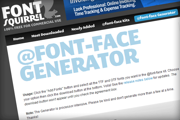
Move your desired font to your desktop then go to “Font Squirrel” and convert your font into a “TrueType”, “EOT” and “SVG” file. These 3 types of fonts are needed for the custom font to work in our browsers.
Once you’ve converted the font move the 3 files into your fonts folder. Open your CSS file then add the @fontface code to the top.
|
1
2
3
4
5
|
@font-face {font-family: 'MyriadProRegular';src: url('myriadpro.eot');src: local('Myriad Pro'), local('fonts'), url('myriadpro.ttf') format('truetype'), url('myriadpro.svg#MyriadPro-Regular') format('svg');} |
Also inside your CSS file add the font family to your “page” DIV.
|
1
|
font-family: MyriadProRegular, Verdana, Arial; |
Test your template in your browser and see how it looks. I’ll be releasing the template for download soon along with the PSD file.
Take care and thanks for reading.
