Your ads will be inserted here by
AdSense Now!.
Please go to the plugin admin page to paste your ad code.
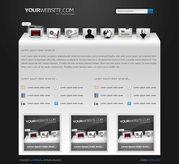
Good evening ladies, gents, boys and girls. Welcome to another tutorial from hv-designs, today il be showing you how to make a creative 3D layout. The layout features a sleek navigation inspired by the mac and has a nice subtle look with subtle grey colors.
What We’ll Be Creating
Let’s Begin
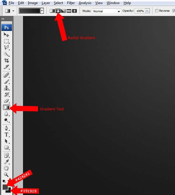
Create a new document “1200 pixels X 1200 pixels” with any color background. Set your foreground color to “#424241″ and background to “#191919″ then select the “Gradient Tool” with a “Radial Gradient”.
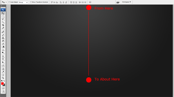
Drag the radial gradient from the middle of the canvas down to about half way down.
Creating The Website Title Text
Select the “Text Type Tool” and type out your website title and slogan, place your title and slogan in the top left side of the canas.

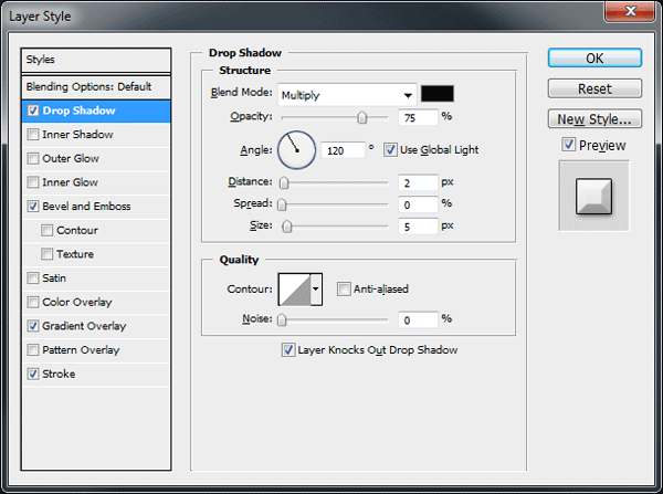
On your main title layer add the following layer styles.


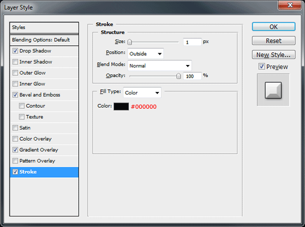
You should have something like this.

Creating The Search Box
Select the “Rounded Rrectangle Tool” with a radius of “15px”. Drag out a medium sized rectangle on the right side of the canvas.

Once you’ve created your rectangle add the following layer styles.


You should have something like this.

With the “Rounded Rectangle Tool” once more drag out a smaller rectangle inside the last rectangle you created. This time change the radius to “5 px”. Once you’ve create the inner rectangle “Cut & Paste” the right end of the rectangle for later use.
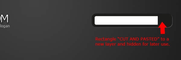
Now add the following layer styles to the inner rectangle.
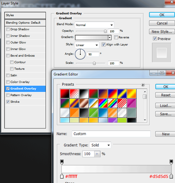
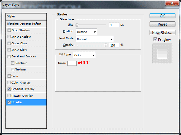
You should have something like this.

Un-hide the part of the rectangle that you cut earlier, if it isn’t already place it back into its orginal postion.
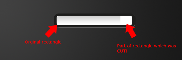
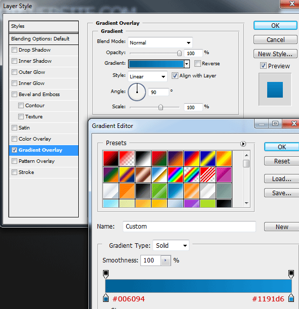
Now add a gradient overlay to the end of the rectangle in which we cut earlier.
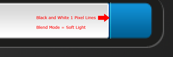
On the top of the blue button where it meets the search field (the white rectangle) add a two 1 pixel lines. The first line should be colored in black then the second in white. Once you’ve created the lines set the layer blend mode to “Soft Light”.
Your ads will be inserted here by
AdSense Now!.
Please go to the plugin admin page to paste your ad code.
Finish off the search area by labelling your submit button and search field. You should have something like this.

Creating The 3D Navigation
About 100 pixels down from the search box and website title create two 1px lines on top of each other. Both lines should be 950px wide or as wide as your layout is intended. Fill the top line in black (#000000) and the bottom line in white (#ffffff). Set the layers blend mode to overlay.

Select the “Rectangular Marquee Tool” or the “Rectangle Tool” then create a rectangle the same width as the line we created in the previous step. Fill the rectangle with the color white then go to “Edit > Transform > Perspective”.

Drag the left top anchor point inwards until you have something like the image below. Also make sure the black and white 1 pixel lines are directly above the rectangle leaving no space at all between the two objects.

Once you’ve finished add a gradient overlay using the settings below.

Select the “Elliptical Marquee Tool” and drag out a big ellipse. The ellipse should cover just under half of the rectangle we recently created.

Fill the ellipse in black (#000000) then set opacity to “50%”. Load a selection around your rectangle, inverse the selection then select the ellipse layer and hit delete. You should have something like this.

Adding The Navigation Icons
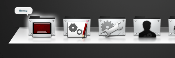
For the navigation i used some folder icons by “Scott Copeland“, i chose my prefered icons and placed them on the navigation area. On the first icon i added a subtle outer glow to indicate its hover state.

Duplicate each icon then merge all the duplicated icon layers into one layer single layer. Drag the duplicated layer underneath all the icon layers then flip the icons vertically “Edit > Transform > Flip Vertically”. Finally blur the merged icons by 2px by going to “Filter > Blur > Guassian Blur”.

Add a layer mask to the duplicate icons layer, then drag a linear gradient from the bottom of the icons to about half way up. Your only going for a nice subtle look, you should have something like this.

To finish the navigation off simply label your first icon, or the one which has the hover state added. Ive chosed for a small speech bubble, if i were to code this id use a jquery tool tip script for the navigation hovers.
Creating The Content Area
Using the “Rectangle Tool” or the “Rectangular Marquee Tool” create a big rectangle for your content area. The rectangle should be the same width as the bottom of the navigation and should also directly underneath leaving no space between the two objects.
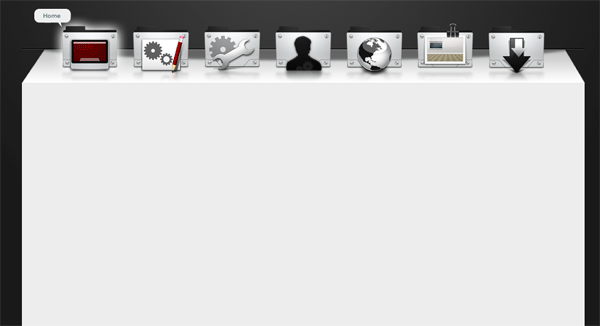
Now add a gradient overylay to your content rectangle using the settings below.

You should now have something like this.

Now its time to add some dummy content, i havent exactly gone into perfecting the content for the layout so if you think the content area looks rubbish “I Agree With You”.
For the content area i chose some indented style titles and simple long paragraphs. Underneath each title i added a simple seperator using two 1px lines just like on the navigation bar. Finally ive added a simple list with some icons and a image gallery using 3 big thumbnails.
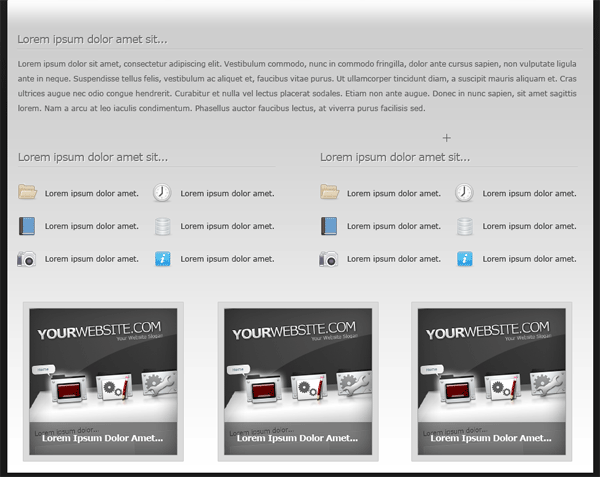
Obviously you can take more time to perfect your content area, mines purley for example.
Creating Our Footer
We finish off the layout by adding a simple text style footer, above the footer text i added a divider. The divider was created by using two 1px lines on top of each other, one colored black and the other white. Just like our navigation, the layer blend mode is then set to overlay.

All Done
Congratulations you’ve completed the tutorial you should now have something like this.

Hope you enjoyed this tutorial, dont forget to promote this tutorial by submitting to Digg and maybe Re-Tweeting on twitter. Thanks.
Your ads will be inserted here by
AdSense Now!.
Please go to the plugin admin page to paste your ad code.