Portfolio Layout #12
Your ads will be inserted here by
AdSense Now!.
Please go to the plugin admin page to paste your ad code.
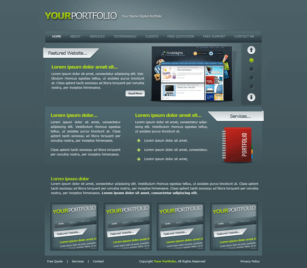
Hello everybody, hope you all had a nice christmas and new year. The tutorial to start 2010 is a portfolio layout with a green theme, the layout features some nice styling and 3D elements.
What Were Creating
Lets Get Started
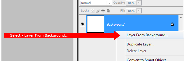
Create a new document 1200 x 1200 pixels with any color as the background. Right-Click your background layer in the layers palette and select “layer from background”.
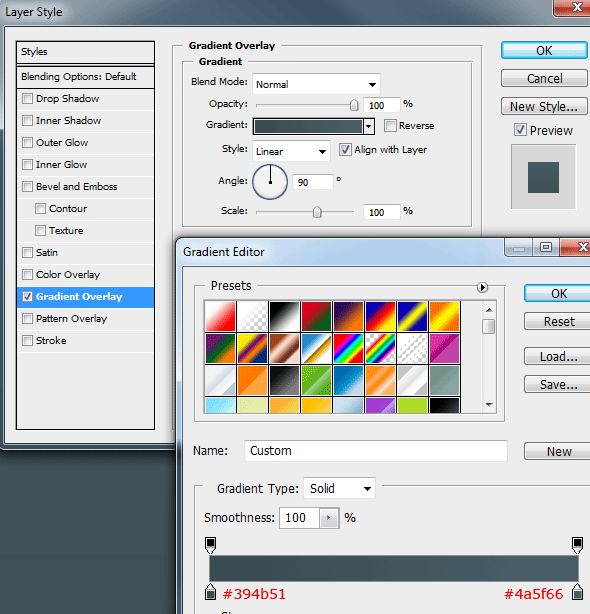
Rename the layer back to “background” then add a gradient overlay using the settings below.
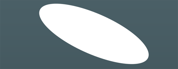
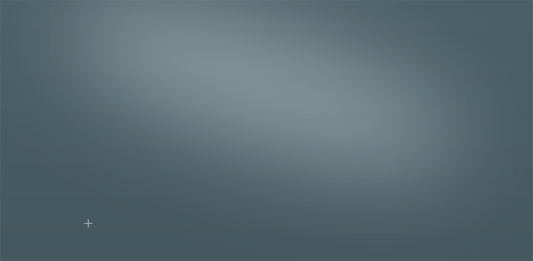
Select the “Elliptical Marquee Tool” then drag out a big oval, fill the oval with the color white (#FFFFFF). Press “CTRL + T” to free transform the oval, rotate clockwise to match the image below.
Rename the oval’s layer to “Soft Light” then in the blending mode options set the oval to “Soft Light”. Finally blur the oval by 70px using “Guassian Blur” from the filter menu. You should have something like this.
Creating The Website Title
Before we begin this step let me talk about guides. In this tutorial I’ve setup two vertical guides, the two guides will allow me to accurately create my layout at a maximum width of 850 pixels. If you would like to add guides to your PSD file then you need to create the guides at “125px” and “1075px”. Make sure you add the “px” at the end else the guides will be created in “cm”.
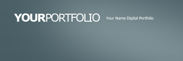
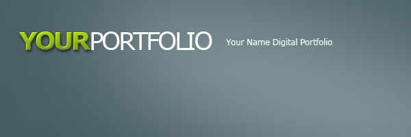
Select the “Type Tool” and create your website title and slogan. I’ve used the words “your portfolio” then the little slogan by the side. Both words “Your” and “Portfolio” are on separate layers as i want to add different layer styles to each word.
On my first word “your” I’m going to add the following layer styles.


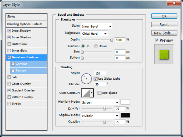
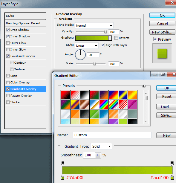
The first word now looks like this.
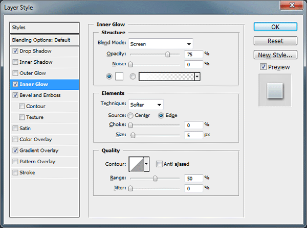
On the second word “Portfolio” I’m going to add the following layer styles.



On your slogan just add the same drop shadow as the other two words. You should now have something that looks like this.

Creating The Navigation
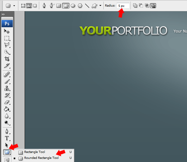
Select the “Rounded Rectangle Tool” from your tools area then change the radius of the rectangle to “5px”.
Now your set to go, drag out a rectangle 850px wide and about 50px in height, fill the rectangle with any color on a new layer. Add the following layer styles to your rectangle.


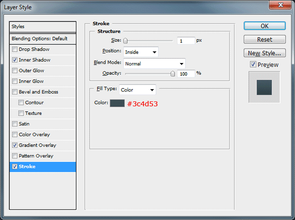
Your navigation should look something like this.

Using the “Rounded Rectangle Tool” once again create another rectangle inside the navigation rectangle.

Fill the rectangle with the color white, set the layers opacity to 5% then rename the layer “Navigation Shine”.
Using the “Type Tool” add your navigation links to your navigation. Once you’ve added your links create “Two 1px Lines” next to each other, color the first one white (#ffffff) and the second one in black (#000000). Both lines should be equal height to the navigation.
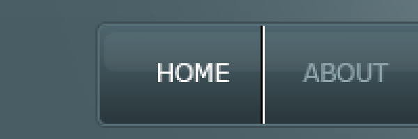
Set the blend mode to “Overlay” and opacity to “25%”. Now duplicate the lines and place in between each link. You should have something like this.

Creating The Featured Area
Select the “Rectangle Tool” and drag out a rectangle which is 850px wide and about 147px – 150px in height. Place the rectangle directly underneath the navigation bar leaving a 1px gap in-between each element.
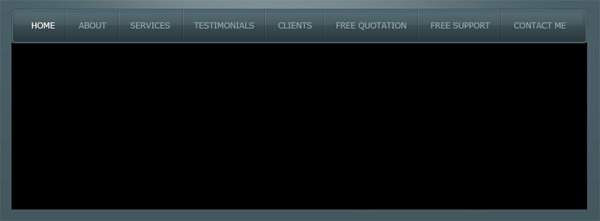
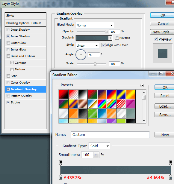
Add the following layer styles to your featured box.


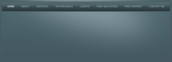
Earlier in the tutorial we created a big ellipse and blurred it by 70pixels, we named the layer “Soft Light”. Duplicate your “Soft Light” layer then drag the duplicated layer above your featured box layer.
Click the little thumbnail located on the duplicated layer whilst holding down the “CTRL” key on the keyboard, this should load a selection around the featured box. Highlight the duplicated soft light layer by left clicking on it then go to “Select > Inverse” then finally hit the “Delete” key on keyboard.
Doing this just simply removes the top half of the duplicated ellipse, leaving the bottom half inside the featured box. You should have something like this.
Creating The Featured Area, Slider Control Panel
On the right hand side of the featured area add a vertical divider. The divider is made exactly the same way as our dividers on our navigation bar. (Two 1px lines next to each other colored black and white) Just make sure the opacity is set to “25%” and blend mode is set to “Overlay”.
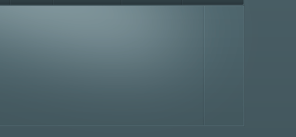
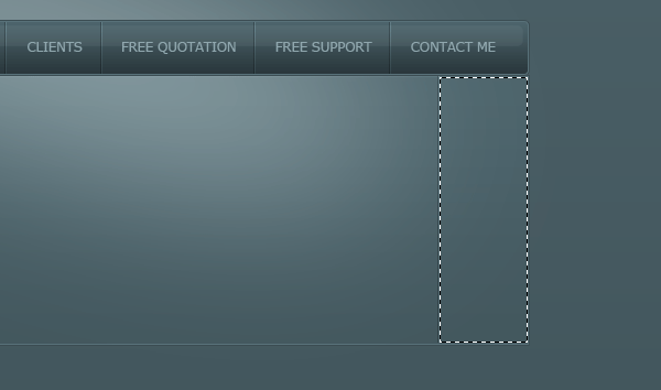
Using the “Rectangular Marquee Tool” make a selection from the divider we just created up to the end of the featured box.
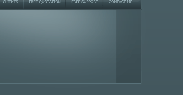
Fill the selection in the color black (#000000) then set opacity to 15%.
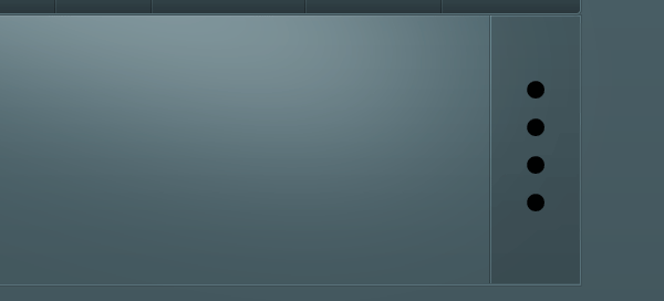
Using the “Circle Tool” create 4 black circles spaced out evenly on to the right side of the featured box.
In the space left over above and below the smaller rectangles, create two more but slightly bigger.
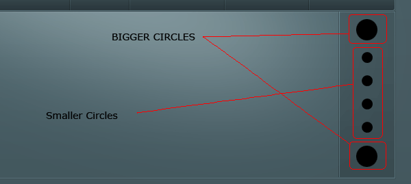
Add the following layer styles to the two big circles.

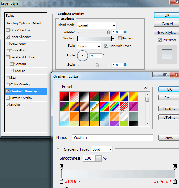
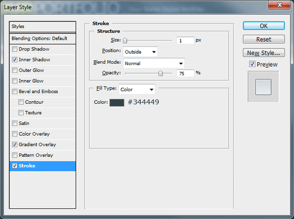
Now add an arrow in both top and bottom bigger circles, then Add these layer styles to your “First” small rectangle only.
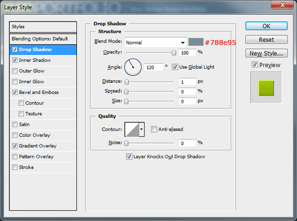

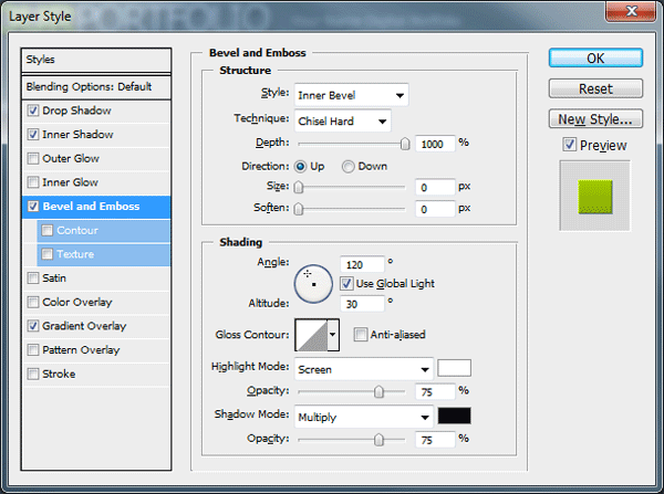
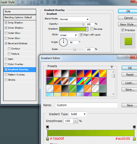
To the last 3 smaller circles add the following layer styles.

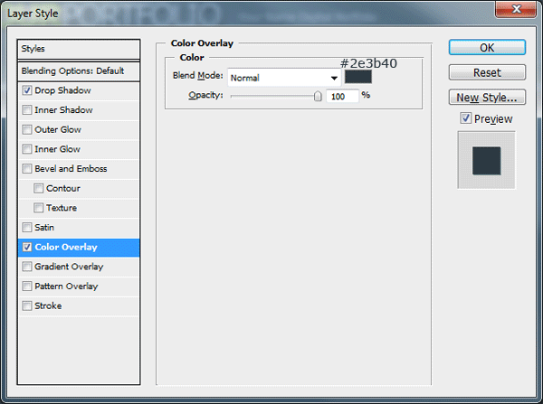
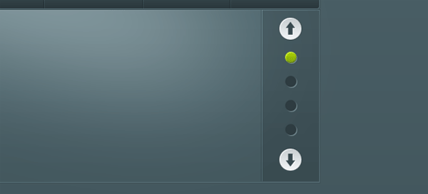
You should have something like this.
Finishing The Featured Area
On the left side of the featured area create a small rectangle which slightly overlaps the content box. Cut off the right side of the box diagonally using your favorite cutting tool.

Add these layer styles to your rectangle.

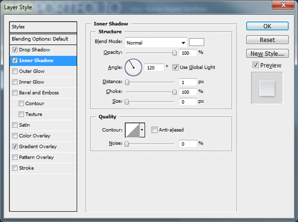
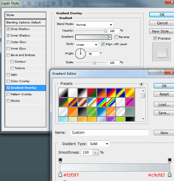
You should have something like this.
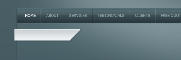
Using the “Polygonal Lasso Tool” join up the left side of the rectangle to the content box, giving the rectangle a 3D look. You can use the same layer styles for the 3D part also.
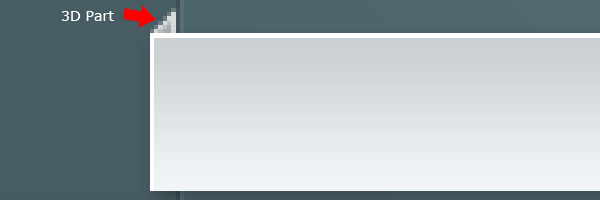
Fill the featured area with your dummy content. You could have something like this.

Creating More Content
Duplicate your featured area then move the rectangle underneath leaving a 2px – 3px gap in between each element. Rename the layer to “Services Box” then create a new blank layer above it.
Select both layers in the layers window so both layers are highlighted. Right-Click the little “Eye” icon on the side of one of the layers then go to “Show/Hide All Other Layers”, all layers should now be hidden apart from the blank layer and the services box layer. Now go to “Layer > Merge Visible”, finally un hide all your layers.
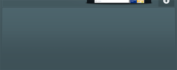
Add a layer mask to the services box layer then drag a linear gradient from the bottom of the rectangle to the top of the rectangle. You should have something like this.
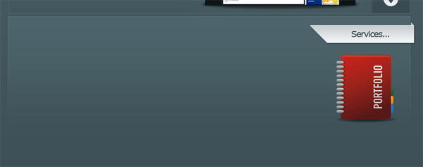
On the right side of the services box add your 3D title by simply duplicating it and flipping it. Add a title inside the box then add an icon of some sort underneath.
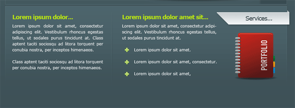
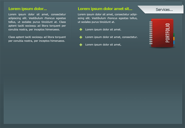
Finally fill the rectangle up with some dummy content. You could have something like this.
Creating The Gallery
Duplicate your services box then flip it vertically. Move the duplicated box down towards the bottom of the canvas.
In-between the two boxes add a dividing line, the line is made in the same way as our navigation separators. Once you’ve created the dividing line add a layer mask to the layer then drag a reflected gradient starting from the middle and ending up on either the left or right side. (Make sure foreground color is set to white).

Underneath the dividing line add some more dummy text.
Now select the “Rectangle Tool” and make a square, fill the square with the color #324348 then add a 1 pixel stroke using the color #4a626a.
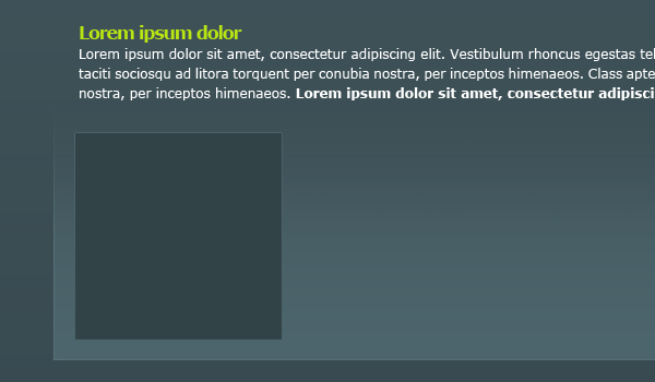
Load a selection around the square box. (To do this click the little thumbnail in the layer whilst holding down the CTRL key) Then go to “Select > Modify > Contract”, contract the selection by 10px.
Either copy and paste an image into the selection or make up your own image then paste it into the selection.
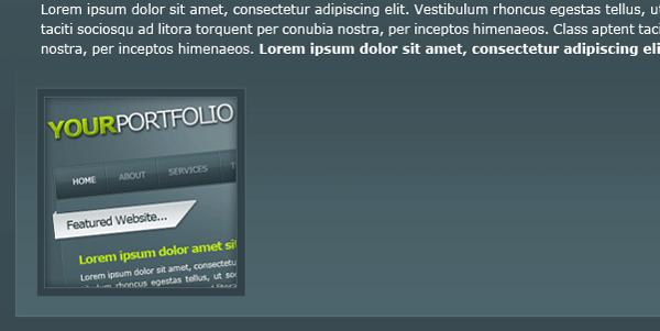
Using the pen tool create a white shine over the images, once you’ve created the shine duplicate each image to create more gallery entries.
Finally add some important footer information underneath the final content box.

You have now completed the tutorial, you should have something like this.

Thanks
Thanks for taking the time to read my tutorial, hope you liked it. Il look forward to your comments.
Your ads will be inserted here by
AdSense Now!.
Please go to the plugin admin page to paste your ad code.