Your ads will be inserted here by
AdSense Now!.
Please go to the plugin admin page to paste your ad code.
Hello welcome to tutorial 216 by hv-designs, in this tutorial il show you how to create a sleek looking software layout, currently the 4th software layout in our database.
Setting Up Our Canvas
Open up photoshop and create a new document, the dimensions should be 1200 x 1200 pixels.
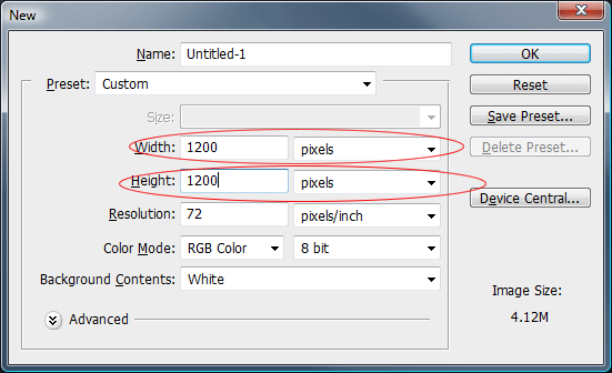
The background can be any color as we’ll be changing it in the next step.
Creating Our Background
Set your forground color to #585858 and your background color to #282425. Select the gradient tool with a radial gradient.
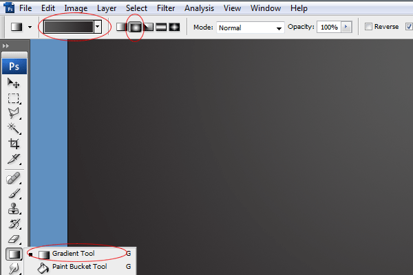
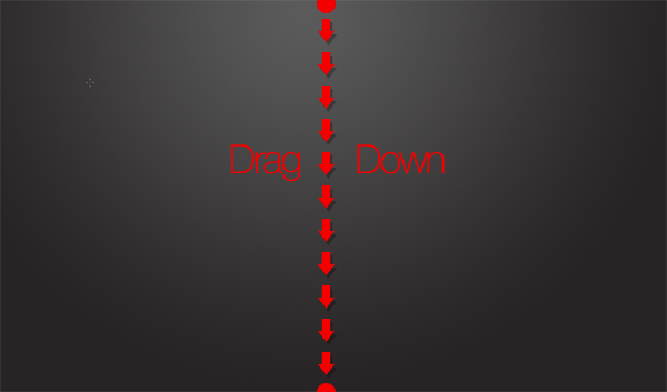
Once you’ve selected your radial gradient drag out the gradient starting from the top middle part of the canvas dragging down towards the middle of the canvas.
Creating The Website Title
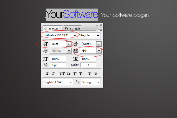
Using the colors white #ffffff and the color green #d7e400 add your website title and slogan.

The font i used and settings are located in the screenshot below.
On the right side of the title add your simple support toll free number.

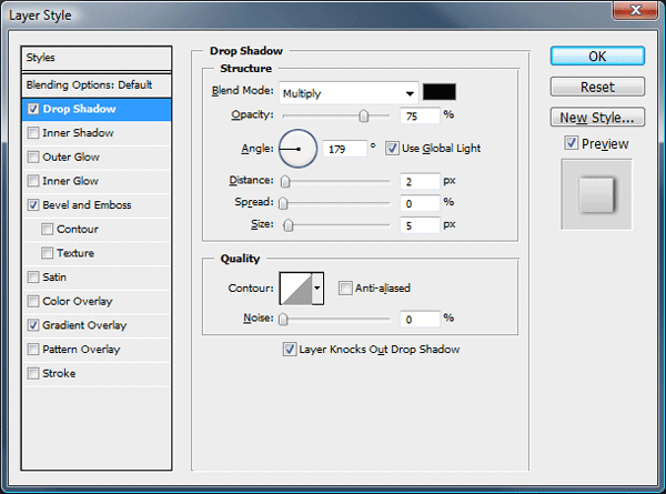
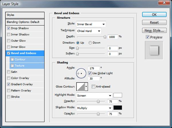
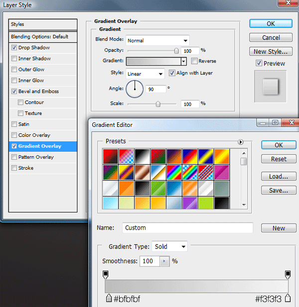
The layer styles used for the free toll number are as follows.
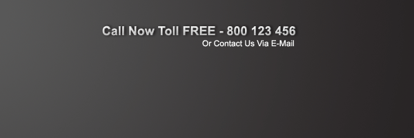
The text should now be transformed into something like below..
Creating The Navigation
Select the rounded rectangle tool with a radius of 10px.
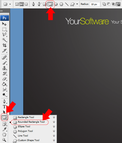
Drag out a rectangle underneath your website title, fill the rectangle with any color.

Zoom into one of the bottom corners of the rounded rectangle, select the rectangular marquee tool and create a selection cornering off the bottom corner.

Fill the selection on the same layer then do the same to the other bottom corner. The end result should be something like this.

Now add these layer styles to your navigation.
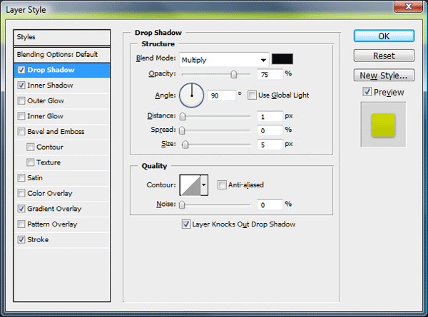

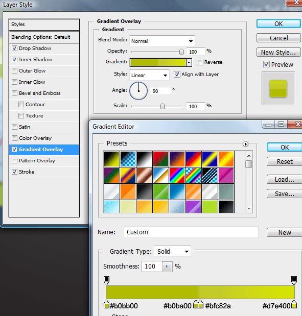
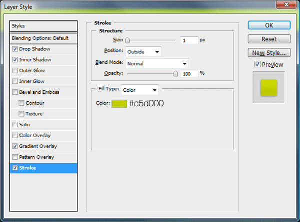
You should have something like this.

Adding The Navigation Links
Add your navigation links over the top of your navigation bar using the type tool. Ive opted for a simple arial font for the navigation text.

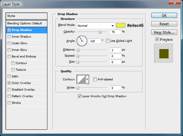
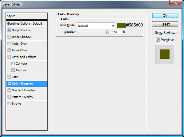
Once you’ve added the text add these layer styles.
Creating The Software Summary Box
With the rounded rectangle tool on a layer underneath your navigation layer create a big rectangle. The rectangle itself should be the same width of the navigation and the top corners should be hidden underneath the navigation.
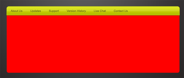
Now you’ve created the rectangle select the gradient tool with a radial gradient. Using the colors #d3df00 and #b4c00a add a radial gradient over your rectangle in the same way we did our background.
Your ads will be inserted here by
AdSense Now!.
Please go to the plugin admin page to paste your ad code.
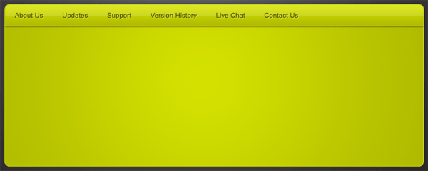
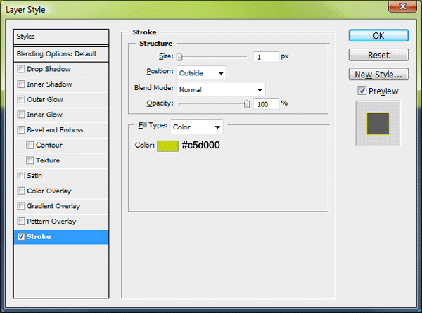
Now add this stroke layer style to complete this step.
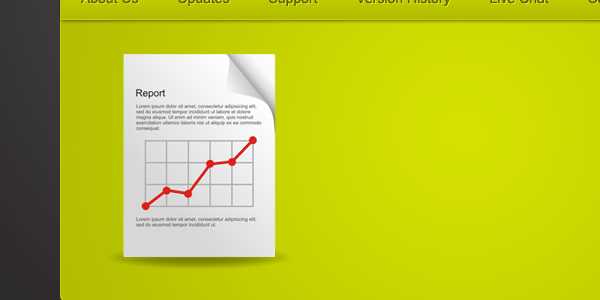
Software Summary Box Content
On the left side of the software summary box add an image of your software or a logo. As i dont have any software to feature ive used a report icon from smashing magazines free icon set.
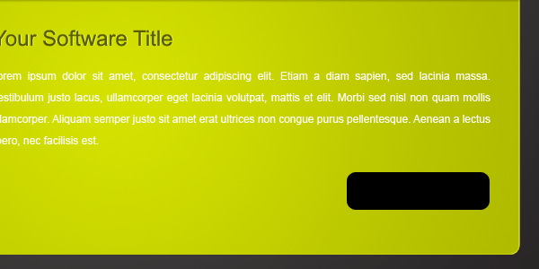
Next to the icon add a title with a paragraph.

To the title add these layer styles.


Creating The Try Now Button
Using the rounded rectangle tool still with a radius of 10px, create a small rectangle, Fill the rectangle with any color.
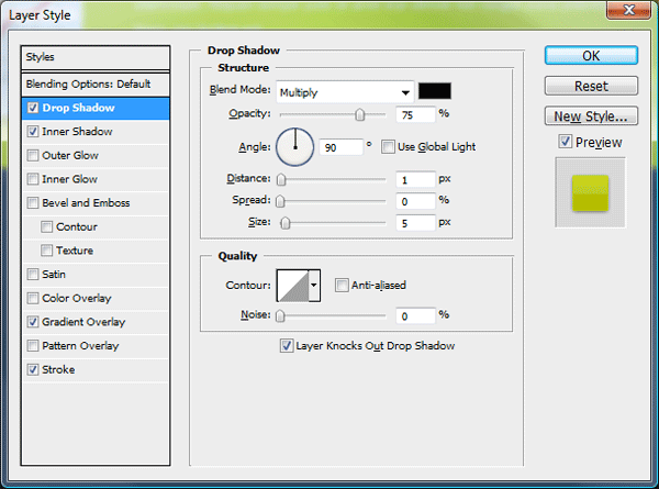
Now add these layer styles to your button.
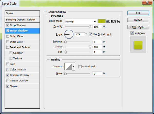

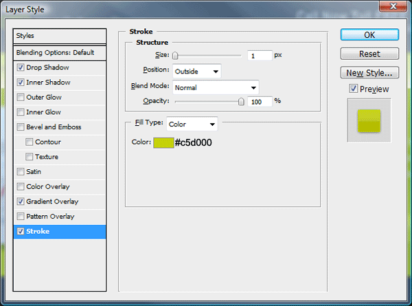
Add your button text then add these layer styles.


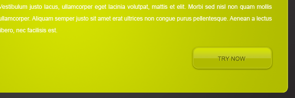
You should have something like this.
Creating The Content Area
Using the rounded rectangle tool create a big rectangle underneath the summary box. The box should be the same width.
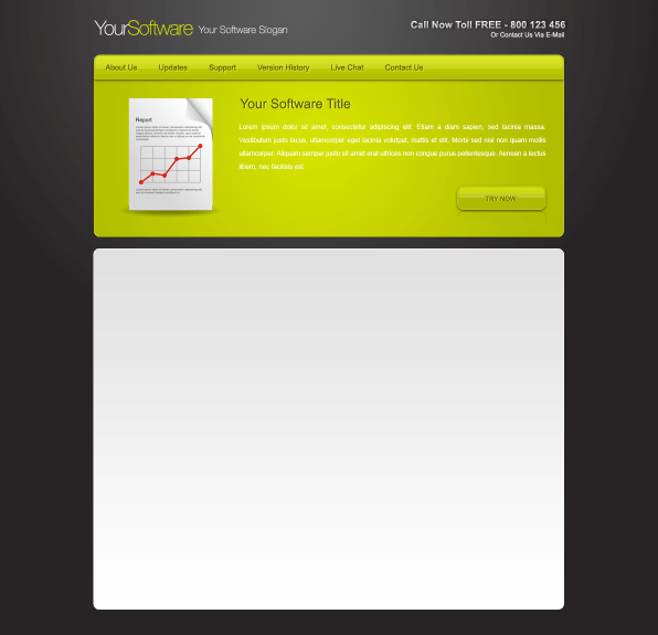
Add these layer styles to your big rectangle.
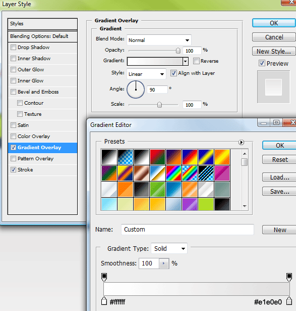

Creating The Sidebar
Using the rectangular marquee tool make a selection the same height as the content area and any width.
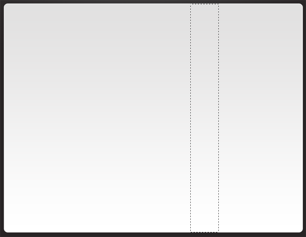
Once you’ve made the selection fill the selection with any color then add the same gradient overlay as the content area.

Now add this drop shadow.
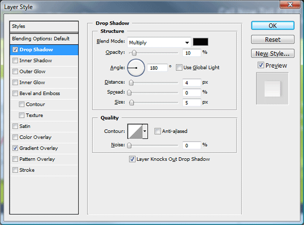
You should have something like this.
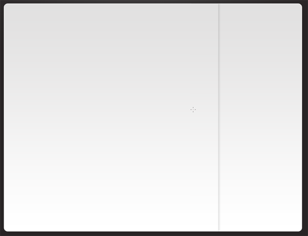
With the rectangular marquee tool again create a black square which covers the sidebar area. The layer should be underneath the other rectangle layer which contains the drop shadow which makes up the sidebar.
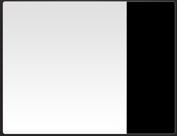
Set the black rectangles layer opacity to 4%. This just adds a darker shade to the sidebar area.
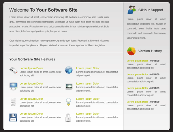
The Content
Your layout is now ready for its content. Using a combination of headers and paragraphs to build up your content area. Ive included some icons from “wefunction” just to spruce it up abit.
The Footer
For this design i opted for a simple text footer.

The Finished Layout
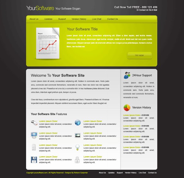
Enjoy
Your ads will be inserted here by
AdSense Now!.
Please go to the plugin admin page to paste your ad code.