Subscribe Via RSS

3268 Subscribers

Subscribe Via RSS
Subscribe Via Twitter

Followers

Subscribe Via Twitter
Business Layout #3

December 21st, 2008 in Photoshop Tutorials by Richard Carpenter

Business Layout #3

1 Star2 Stars3 Stars4 Stars5 Stars17 Votes, Rating: 4.59
Loading ... Loading ...
About The Author

About The Author: Richard Carpenter

Hi im Richard Carpenter im a freelance web and graphics designer from England. I am also a regular Blogger, Tutorial Writer, and owner of HV-Designs. You can follow me on twitter HERE. You may also view my portfolio HERE.


Richard Carpenter has written 331 posts.

In this tutorial il show you how to make a really simple clean business layout.

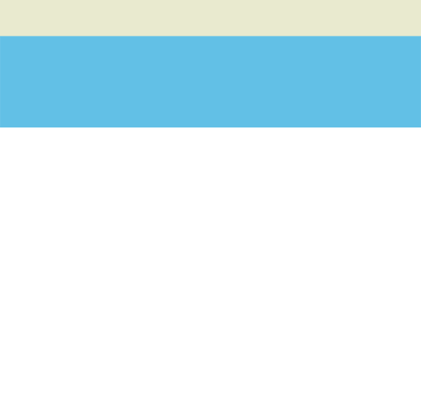
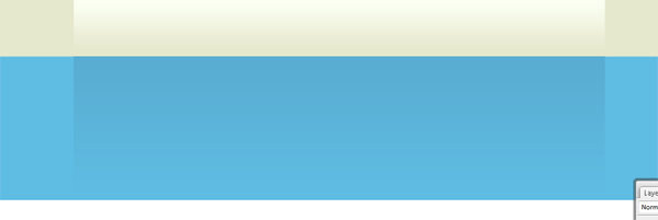
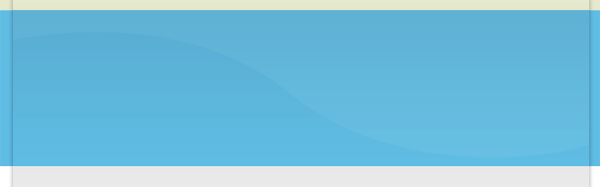
Create a new document 1000×960 pixels with a white background, at the very top of the canvas create a rectangle the width of the canvas and about 80 or so pixels in height, fill with the color #e9eacf. Do the same again but make the rectangle 3 times as big, fill with the color #62c0e6. You should have something like this.

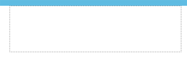
Using the rectangular marquee tool create a selection as seen in the image below.

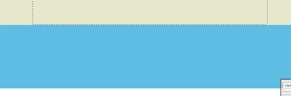
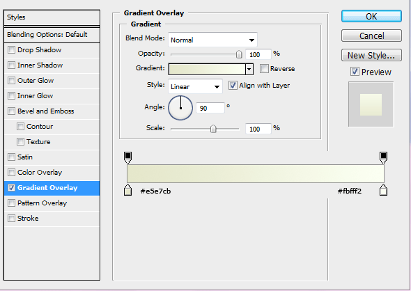
Make sure the rectangle comes level with the 1st color. Fill the selection with any color then add these layer styles.

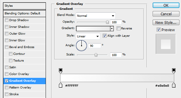
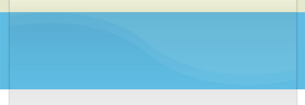
Do the same again only create a rectangle on the blue color. Make sure the rectangle is the same height as the blue line and the same width as the rectangle created above.

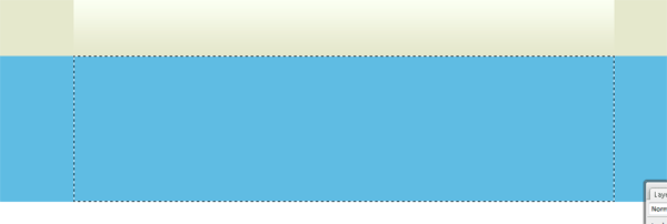
Fill the selection with any color then add this layer style.

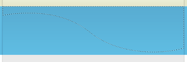
You should have some thing like this.

On the white part of the canvas do the same again, make the rectangle quite big this time, but still keep it the same width as the others. We need to make this one fairly big this time as were going to be blending it in with the white background. Fill the selection with any color.

Add these layer styles.

Create a new layer UNDERNEATH all your boxes, select the rectangular marquee tool and create a selection as tall as you want, but the same width as your other boxes.

Fill this selection with the color black, then goto “filter > blur > guassian blur” blur by 2pixels, set layer opacity to 35%. Add a layer mask to the layer, using a linear gradient drag from the bottom where your rectangle ends, upwards. This should blend in the drop shadow.

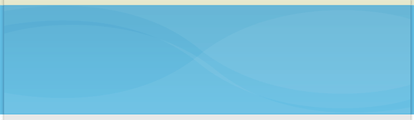
On the blue rectangle, select the pen tool and create a shape like this.

Fill the selection with the color white then set layer opacity to 5%.

Duplicate the layer and shift it upwards abit. When the shape goes over the blue line you may need to cut the top off so you dont see it on the top rectangle.

Duplicate the shapes twice more, then flip or rotate them to create a look your happy with, heres mine.

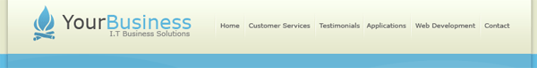
Once you are happy with the look, go ahead and add your website title, slogan and logo. Add these at the top in the 1st rectangle, also add your navigation to the right side.

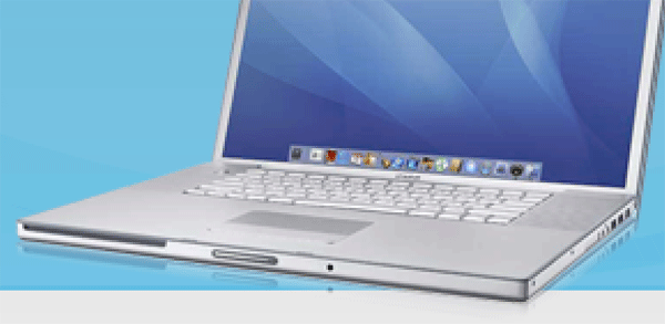
Now find yourself an image of a laptop, remove the background from the laptop then stick it into the blue area of the layout on the right.

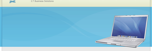
Now the laptop could do with having a reflection of itself, just to add a little bit of detail to the whole thing. Duplicate your laptop layer, move the duplicated layer underneath its orginal. DONT flip it just move it downwards untill the bottom half is identical.

Add a layer mask to the duplicate layer, then add a layer mask. Drag a linear gradient over the bottom of the front of the laptop, once your happy right click your layer mask and goto “apply mask”. then do the same for the side of the laptop. Now find yourself some an image of a butterfly, remove the background then add it also to the blue part of the layout.

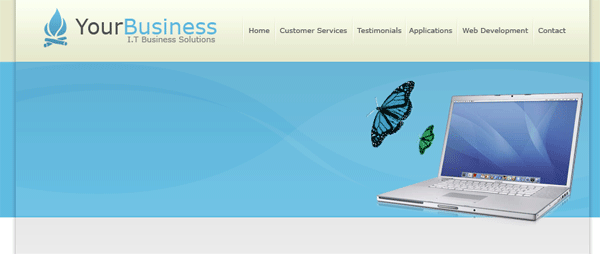
On the left side of the blue rectangle add some text about your business.

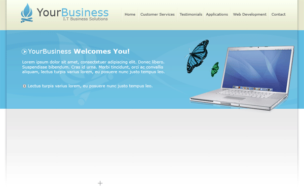
The next part in the tutorial is too fill the white content with information about your business, the reason why i havent gone into great detail is because ive only used text and a couple of images and the tools ive used are only the text tool.

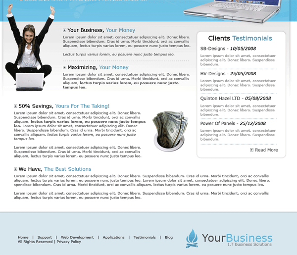
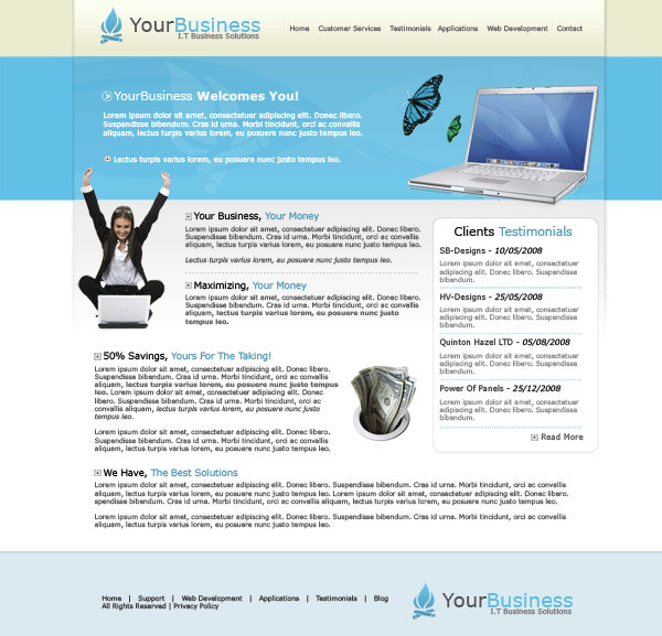
Once you’ve added your content you should have something like this.

Be Part Of The Community!

Become part of the hv-designs community.

Subscribe Via RSS or Follow Us On Twitter.

Subscribe Via RSS Follow Us On Twitter

73 Responses to “Business Layout #3”

  1. Flipsyde says:

    The logo’s not very appropriate, isn’t it ? But it’s a beautiful design :)

  2. ADMIN says:

    just space filling :)

  3. Alien among us says:

    Wow. Real Nice tut. Thanks.

  4. xphunt3r says:

    I really like this web template and ready to try out now. Thanks for creating such great photoshop tutorial

  5. york says:

    I like it

  6. hippoman says:

    Good job!

  7. tinusk says:

    Well done.

  8. Ejaz says:

    Great Tutorial!

  9. The logo’s not very appropriate, isn’t it ? But it’s a beautiful design :)

  10. Houdini says:

    Thiis is excellent stuff, but what should I save i as and how do I use it in my web page?

  11. ADMIN says:

    you need to hard code it in HTML/CSS for it to work as a webpage

  12. Houdini says:

    Thank you so much for your reply.
    I know HTML/CSS (not such a pro in Photoshop), however, this is a complete interface design; how would I actually approach hard coding it in HTML/CSS. I really would like to use this design. I have completed it but don’t know what to do next. I hope you don’t think I’m dumb, it’s just that is style of designing is much different from the traditional notepad designing that I’m accustomed to.

  13. ADMIN says:

    check out my next tutorial when its released, it will give you a good insight to wahts involved

  14. james says:

    Nice tutorial!

  15. tamtam says:

    cool….

  16. Azhar says:

    very cool
    Thanks

  17. Learner says:

    Nice info. thanks :)

  18. Jovan says:

    Can we put: copyright(c) Jovan | All rights reserved Designed and developed by Mihailo webb design

  19. ADMIN says:

    if its identical to mine THEN NO YOU CANT.

  20. Jovan says:

    I AM AN IDIOT SORRY FOR POSTING SUCH STUPID IMATURE STUFF ON YOUR WEBSITE.

    -edited by admin-

    Dont use stupid language like that in your comments, or il just ban you sitewide. choice is yours

  21. alfares050 says:

    Thank you

  22. d3nika says:

    hi…great tutorial…I only have one request: the shadows on the side, I can’t make them look like yours and I followed the tutor on the letter… did you skip a step??…can you give a more detailed example plssss…

    thanx in advance

  23. Jim Blake says:

    I like it

  24. This is a really nice layout. The colors are very cool and pleasing to the eyes. The layout is neat and simple. Thanks for sharing this tutorial!

  25. taha says:

    hey thnx excellent tutorial i am going to use this for a project for school. but just like d3nika i have problems with the shadows on the side. sry i am not very good in photoshop.. i created the layer mask but the gradiant step wont make the drop shadow effect… can u help plz? thnx again

  26. taha says:

    i just figured it out just:

    1. create a layer underneath the layers on which u applied a gradient
    2. make a selection as described above
    3. deselect
    4. add layer mask
    5. finally use a white-to-black gradient and apply from top(!) to bottom

    hope it helps ;)

  27. taha says:

    forgot the gaussian blur step my bad.. just do that after step 3.

  28. mi42 says:

    Can any body send to me a ready psd file? I can’t make this step

    “Fill this selection with the color black, then goto “filter > blur > guassian blur” blur by 2pixels, set layer opacity to 35%. Add a layer mask to the layer, using a linear gradient drag from the bottom where your rectangle ends, upwards. This should blend in the drop shadow.”

  29. otyek Ronald james says:

    thanks Richard. loved the tutorial and ive learnt more about how to improve my designs with your simplicity …. keep it up man !!!

  30. be good to include splicing to round upop the tut gd stuff though and tx b

  31. pawel says:

    This is a really nice layout. The colors are very cool and pleasing to the eyes. The layout is neat and simple. Thanks for sharing this tutorial!

  32. xXAimanXx says:

    simple n clean layout.very nice!

  33. AlBern says:

    Thanks, it’s very nice and not really complicated, even for beginners like myself.

  34. MeMyselfAndi says:

    Hi,

    Great tutorial,though the step where you create those back borders
    doesnt seem to work.

    I have done it the other way arround,by creating a big black spot over the entire page,and cut out the borders.

    Yeah its kinda ugly way arround,but it whas the only way i figured to get it to look well.

Leave a Reply